Shannon McSheehan - LoL FX + Knowledge Share

Edit: New thumbnail! I wonder how it will look…
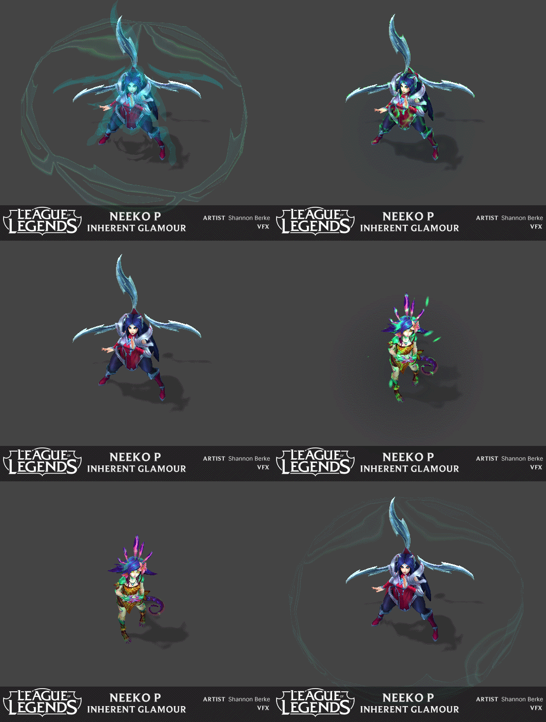
shannon-berke-neeko-p

Heyo FX buddies! Over the past few years I’ve been working at Riot Games on League. I haven’t posted much and want to change that. I made a demo reel of some of the work I’ve done on the good ol’ Champion Update. The VFX team at Riot is full of awesome, collaborative individuals so everything you see here has gone through many iterations and feedback sessions. I wouldn’t be where I am without them and wouldn’t want to take full credit for their additional inspiration and feedback. The other art assets such as animations and characters were created by other wonderful individuals at Riot, only the FX were created by me. Gameplay is king for League so nothing is too flashy or contrasting, perhaps I’ll make a personal reel someday and go ham. All of the camera shake! :smiley:

I’m slowly working on building out this gif collection of my work as I hope to add to the amount of reel time FX references there are out there :slight_smile:

Hopefully this is useful to someone other than myself :slight_smile: If there are any questions on how anything was made please let me know, I’d be happy to answer.
235 Likes

Really awesome stuff! The taric ult and gp barrels are so cool. :slight_smile:

2 Likes

Thanks so much. I can’t wait to see your demo reel! Hint hint nudge nudge :smiley:

2 Likes

Hey, really nice to see your work here! :smiley:

Some of my favorite effects in League! The gifs are especially helpful. Studying them frame by frame is gonna be great!

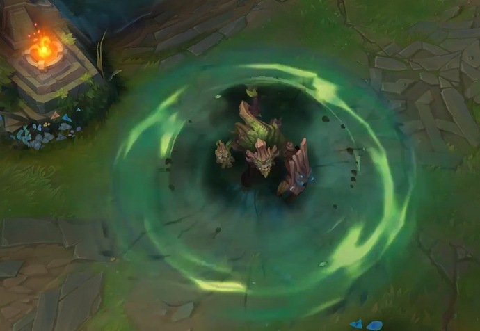
I’m really interested in knowing how the Sion ultimate’s trail was made. How are the textures set-up? How do they tile and do they have a special UV animation or shader trickery ? :slight_smile:

Really inspiring work!

4 Likes

Woh, love the strong themes you have here. They look awesome!

How do you guys go about making those nice windy swooshy textures btw? Their so smooth and crisp

Nothing crazy, just a panning texture :slight_smile:

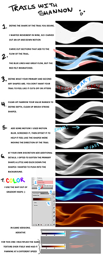
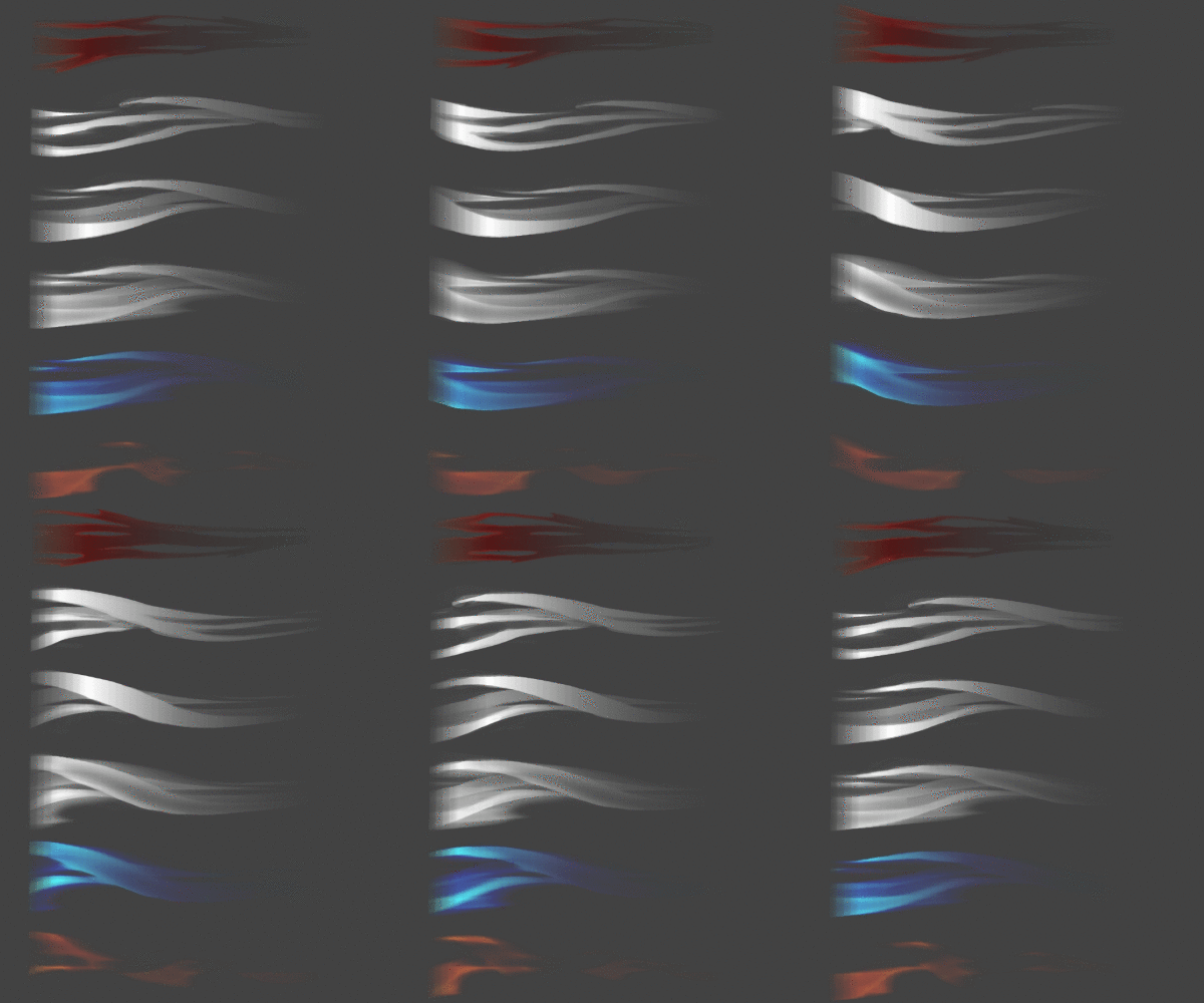
I made this tutorial to show overall how I paint textures though.


167 Likes

If you can give me an example of the windy swooshy textures I could probably show you!

1 Like

Huge thanks for this mini-tutorial. It’ll definitely be helpful! :smiley:

3 Likes

Holy shit! sorry for the language, but I was not expecting a tutorial that wicked. I will study this in detail tonight! I used to find making these textures such a pain in the ass!

You’re the best!

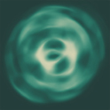
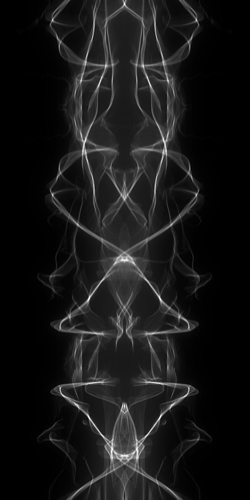
Another example of textures I was talking about was this one. Always found fluid looking shockwaves like this a pain in the butt to do. The colours you guys use are very nice btw.

7 Likes

Very impressive!!

side note for abstract trails, I have used this in the past, works pretty well.

3 Likes

I love flame painterrr!! I haven’t actually used it straight up for a texture, would love to see any examples of what that would look like though. Do you use it a lot Lee?

2 Likes

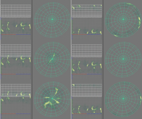
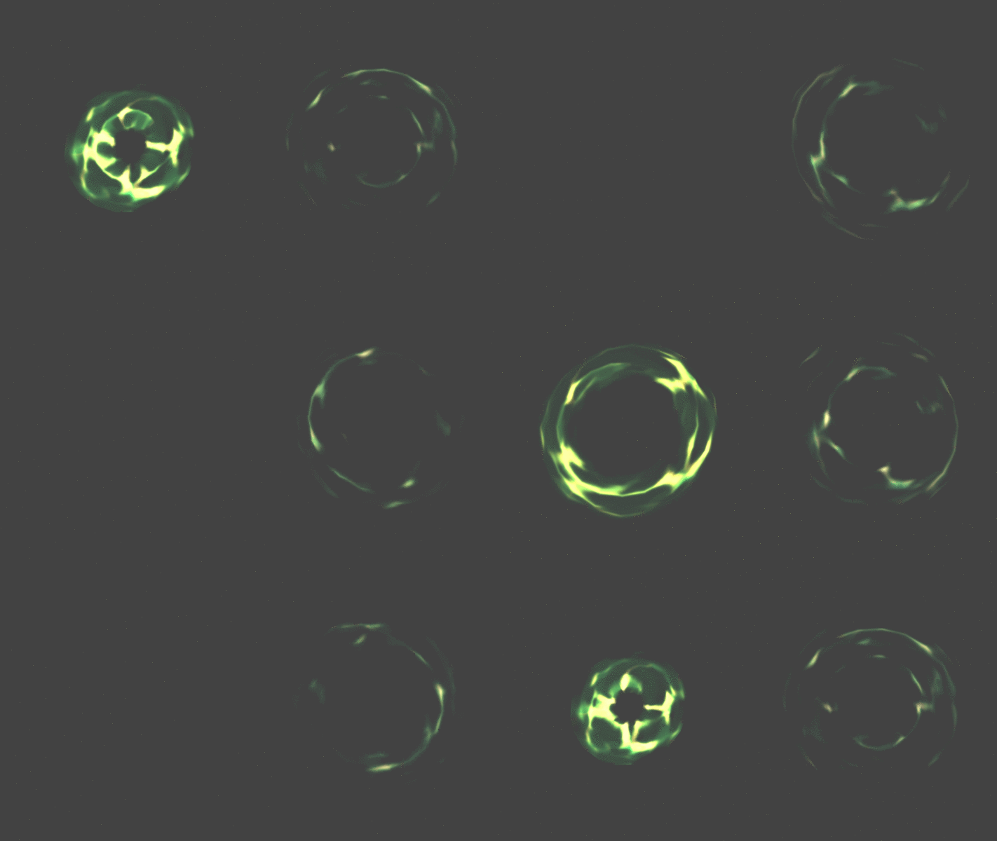
typically the same scroll x2 textures applied to a circle mesh that simply scales and is attached without local inheritance, but the number of facets can break fluidity due to the triangle/UVs

can also use a XZ flat procedural trail orbiting(+translating out) around the character for a ‘snake like’ propagation… or a typical trail that extend world-up for a wall of fire to be painted around them

2 Likes

Gorgeous work Shannon! Love the colors :blush:

1 Like

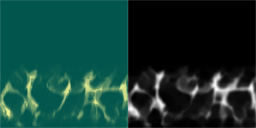
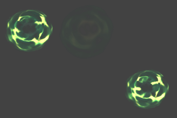
@Augie I used a texture: diffuse / alpha

scrolling across a mesh with crunched UV’s like this gif:

I had a quad under the mesh with another texture, with similar colors:

Scale at a different speed :
Then add all the other stuff

I edited a few elements so the gif wasn’t too long, so it does look a little different. O well!
Nothing too fancy :3

I believe the method Torbach mentioned I used in the second half of Maokai’s ult, not illustrated in the video, so I made a gif of the two ways side by side. I didn’t take the time to loop the second way haha, sorry!

They are both using the same mesh, the second just has the same texture scrolled at half the speed in the opposite direction. Like Torbach said your texture can look like butts if you don’t have enough tessellation.

@Torbach I’ve never used that second method, though I THINK I understand how you would do it. If you have an example I’d like to see!

104 Likes

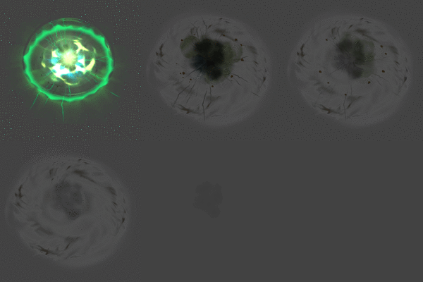
I used it to build textures like this. Though I feel there is a look that you consistantly get out of these programs that makes them a little limited They always have a sharp spindly look. Still pretty cool though.

Im talking about programs like flame painter btw. Just realised it doesnt show which post im quoting.

Thanks so much for showing all this stuff. I think im going to work on some more spell stuff tonight. You inspired me!

Also those decals look super cool!

3 Likes

here’s a version slowed

18 Likes

O that’s great! Looks really cool, I’ll have to try it!!

2 Likes

I have used it in the past, the full version worked well for 1 project. the trick was to use a wacom and keep the curves somewhat straight. Filter forge is mostly used for my texture enhancements these day :slight_smile:

@ShannonBerke fantastic breakdowns, we need to add these to the resource library
@Torbach awesome movement!

1 Like

Shannon. You are the force multiplier. You are able to take the original effects on your re-works so much further, it’s awesome!

3 Likes

AHHH TROOYYY I miss you! This really means a lot, thank you so much!! :slight_smile:

3 Likes