Battlerite FanArt VFX Ver.2

Hello again! After my first 2D FX’s I decided to do something in 3D to find a job. Also @RandomStroke thinks it’s good idea too.

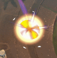
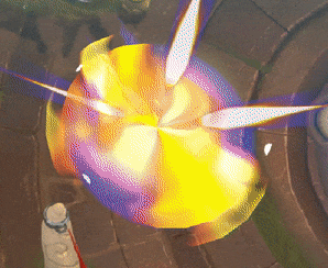
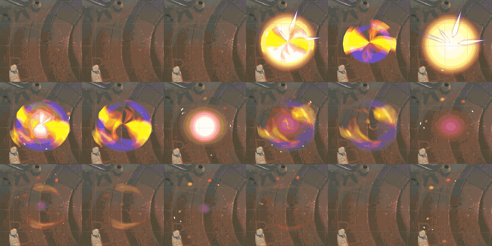
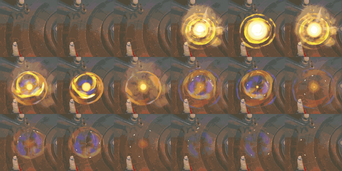
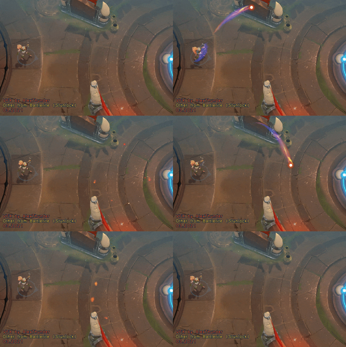
Clarity potion (FanArt fiery version # 2) NEW
Alex_New_

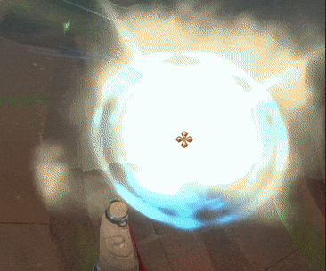
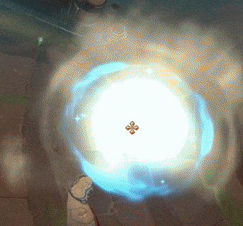
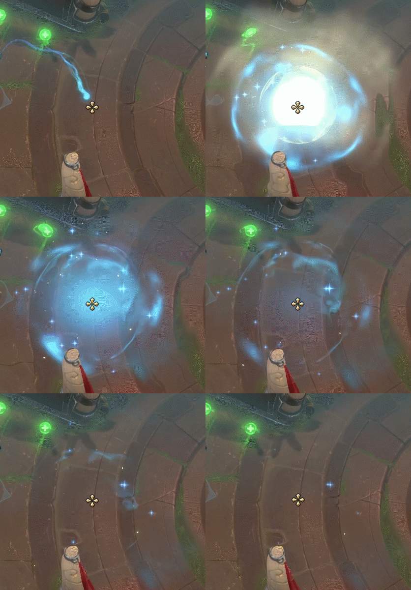
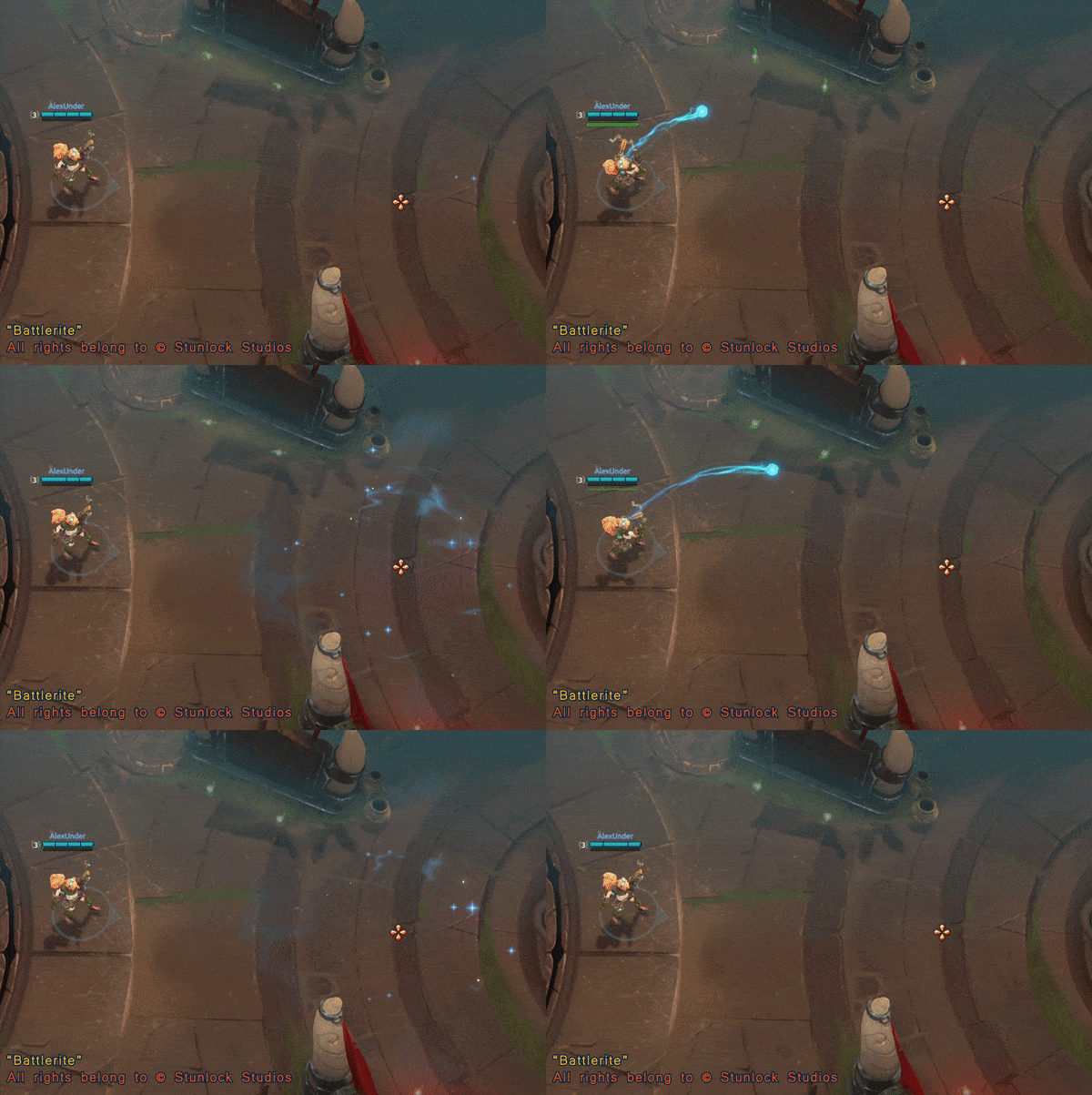
Original “Clarity potion”

Reference from “Battlerite” Stunlock Studios © Battlerite_Low comr 600x401
Clarity potion (FanArt fiery version # 1)

I tried to keep all the functionality of the ability. Alex_Clarity_Low comp 600x401, 100%
Ability description

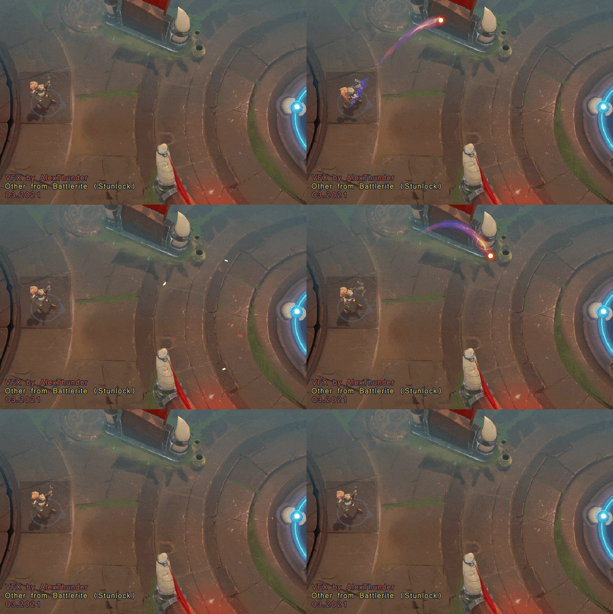
Hero: Lucy Ability:Clarity Potion Throw a Clarity Potion to target location knocking nearby enemies away. The impact also removes positive effects from enemies and negative effects from allies.

Also will do a little breakdown.

Slow-mo versions:1) Full vortex 2) 2 main flames + Blue additive 3) Flares
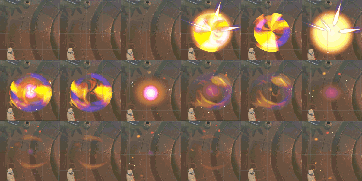
Slowmo_media_Small 600x200

2D mesh, little stretched to the edges + Fire texture + little bit rotation on 2D scene. I made the gradient using the vertex colors, but you can use a simple gradient in the shader.

For this flames big thanks to at least two people: @ShannonBerke for old but gold post when I find the way to make this flames. And @pamar for cool video about how to make simple mesh in houdini I’m still only a junior and I don’t know what I would do without you, guys.
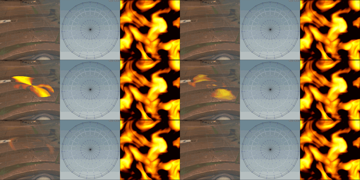
Mesh_Wide_Small 600x200

Trail, Back layer: Moving texture + Saturaion + Alpha Blending
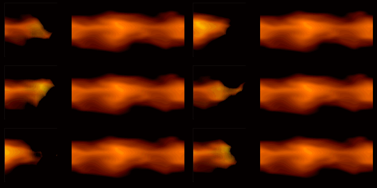
Trails_Media_Alpha_small

Trail, Front layer: Moving texture + Saturaion + Additive Blending
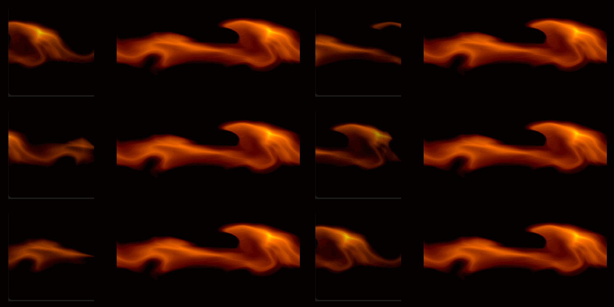
Trails_Add_Small

And again, big thanks to @pamar, with his videos about how to make textures for trails, flares, and other things in Substance Designer.
His channel is amazing, and I think is still very underestimated

In the end, what do you think, did I manage to redo the ability or I did something different?

And, finnaly i have 2D FX and 3D FX in portfolio, can i get a job now, please?
Artstation
#Stunlockgivemeajob
7 Likes

the original (blue) has follow-through and also specifically truncates the use of overlapping action to soften the effect. i.e. it backloads the motion and makes sure all ‘impact’ is in frame 1 and the remaining time on screen is pure resolution.

this could be due to video capture (because this is a flip book? the slow mo version makes it noticeable more-so), but let me show you screen shots that I think illustrate what is hurting your effects motion in terms of it being jarring
1aimage 2aimage
the bright glow for frame 1 is ‘too small’ i.e. does not delineate the area of effect instantly and also holds size for 2 frame captures.
too much overlapping, the orange mesh element also beings too small; this makes the entire initial impact spend 3 frames ‘too small’, then it expands to nearly the full size but lacks as much follow through. so this becomes very harshly stair-stepping in terms of the motion

3a image
lacks follow through of contrasting VFX that connect the spell to environment

1b image
2b image

notice

  1. area clearly defines perimeter with blue on frame 1
  2. blue holds near this position with some shrink, then expansion; it is a small amount of double-burst feel
  3. dust /environmental perturbation with desaturated VFX; almost no overlapping action but a lot of follow-through to soften the motion that your eye would expect.

value analysis

for their spell the dust follow through is pale medium yellow to contrast blue, while purple in your effect has a lot of chroma; This seems connected with your spells primary energy rather than a contrast and becomes a polar color selection

hope this helps because these demonstrations of re-creation are a great way to build out portfolio for jobs

5 Likes

Thanks a lot for this.
You are the first who give me professional feedback. I hope I can assimilate it quickly and fix it.
If hunger doesn’t get me first. :smile:

P.S. Also I hope I can ask you for feedback again after few fixes

Hi!
Thanks again for the feedback.
I tried one more time. Based on your feedback.
It was an attempt to copy the main timing and motion and work with overlapping and color. But still trying to deliver a new visual style.

Fiery version #2

Alex_New_

Original from Battlerite

Battlerite_Low comr

Fiery version # 1

Alex_Clarity_Low comp

Slow-mo versions

Fiery version # 1

Slowmo_small_15

Original from Battlerite

Slowmo_Battlerite

Alex_New_Small_15

Also, add the new hemispheric mesh for middle flames.

I’m not very proud of the final result especially because of perceptible texture cutting a little upper from the middle (and don’t think this ver. is better than the first).
But I think that this time timing and forms really closer to the original.

The progress is looking good (even though you feel it has diminished the final feel) a little polish is all that will be needed

however - you must fix the UV issue to get the mesh seamless; any discernable break like that ruins it being approved for use on a team and becomes a blemish on a VFX portfolio

I read 2 things that inhibit motion from what the eye naturally expects.

  1. dust deceleration is harsh; amount of screen time is fine but it’s diameter might need to increase 50%

  2. vortex motion suggests much more velocity then it travels so it also feels too contained, that violates our brains ‘explosive’ expectation

how to resolve the vortex is subjective but my suggestion

  1. Give it ~1 second longer screen time
  2. Decelerate the orbit speed using a far steeper curve
  3. Push distinction between yellow from the violet
  • let the violet retain expansion speed and approach a size ~30% wider than the yellow to clearly overtake it

other suggestions not pose/time related nor required imo

  • perhaps tune violet down 1/3 of the saturation so it does not compete with the brighter central yellow portion
  • violet can alpha on a steeper curve so it feels like it has lost potency quicker

hope that helps,

1 Like

remove the rotation (for now) (it feels out of place)
redo the explosion-sphere mesh so that you don’t notice that seam.

Don’t focus on secondary and tertiary movement/parts of the effect until the rest is rather set in stone.

1 Like