G’day mates,
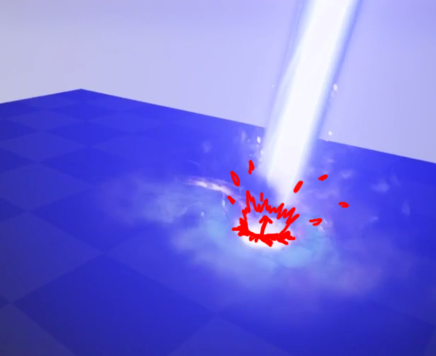
I’m currently working on an art test in Unreal 4, I’ve been given permission to share my progress and receive feedback on my effect.
The quality and level I am aiming for is AAA realistic style (Think Gears of War)
I am creating an Orbital Laser, as giant lasers are pretty sweet 
https://youtu.be/Sox96MJbOAQ
Thus I would love to hear your thoughts on how I can both improve the effect and any tips you might have for VFX in Unreal as I am a little rusty (Haven’t used it much the past 3 years). It’s been good fun to get back into it, most things are where I remember them.
Cheers
4 Likes
Initial impression and quick feedback;
- The laser shaft feels to big compared to the impacted area
- Camera shake feels detached from the object and doesn’t feel powerful enough
- Colors feel flat, cold and de-saturated
- The cracks on the surface seem like they pop in and out, some cracks occurring far away from the impacted area
- Ground smoke is too radial, add some speed/scale and life variations
- More context to what the ground is, is it concrete you are cracking? if so some debris bits flying out with collision etc…
- Also there is some weird particles that seem to gravitate to the sky?
1 Like
Laser texture downward panning texture could use more speed, makes it look more powerful.
Additionally additional fall-off on the edges of the laser (downwards) will also add more oomph.
More sparks/moving erratic from impact source.
- Everything Gareth said

One thing that I’m definitely missing is better interaction with the laser and the ground. I can see what looks like a depth test used to brighten the mesh, but there’s not enough feeling of force or angular shapes. Also definitely agree with Gareth’s comment re: more context to the ground. It doesn’t feel like its interacting enough with the surface that it’s hitting.
Good start! Keep it up 
Thanks for the awesome feedback guys  I’ll be getting stuck right back into it.
+1 everything. I wouldn’t make the camera shake more intense, I’d personally get rid of it. Also presentation-wise, fullscreen your window and get in closer to the effect so we can really see what’s happening there 
The shaft of the laser needs a bit of variety in color and brightness, to allow for moving shapes to read clearly. When you stack too many additive groups on top of each other like that, they get blown away, and the overall impact is lost.
Also, it’s odd that the one place where there’s a visual break in the shaft of light is right at the bottom, where the energy should be most intense. I like @Gareth_Richards feedback about the shaft being too big compared to the explosion. By making the overall shaft skinnier, you can make the impact feel more… impactful :^]
work with a reference bro you will be fine 
https://youtu.be/HbJwFE319Yk?t=1m32s
3 Likes
I’ve made a series of adjustments based on the feedback, however time restraints are causing me to wrap this up sooner rather than later.
- The cam shake is now much subtler and fades out with distance to the beam.
- More variance in the beam + added pulsing effect to it to lend some weight
- Broke up the dust rings a little bit, but kept the general ring shape to help the pulsing feeling
- Added a lot more sparks and ground effects
- Removed heat distortion effect (as it was so invisible it was just a perf sink)
- Took the video full screen for better presentation
Thanks for the help guys 
https://youtu.be/GucHqhMYNWo
I agree with @dbruington on wanting to see some defined angular shapes at the base of the laser. Right now, you’ve got a very uniform kind of glowy smoke at the base that could benefit from more definition. I really like the sparser smoke that’s pulsing out a bit farther though. Also, the laser drawing on top of that bright smoke is really bugging me, haha.
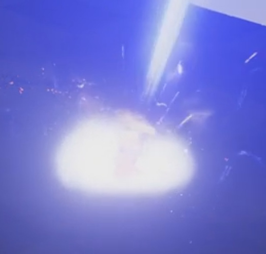
Also take a look at ~15 seconds — looks like there are some other sorting issues where the small glowing projections are drawing on top of your laser (screenshot below, but better seen in the video)

2 Likes
![]()

