Oops yes sorry ![]() , so there is a little preview about remap
, so there is a little preview about remap 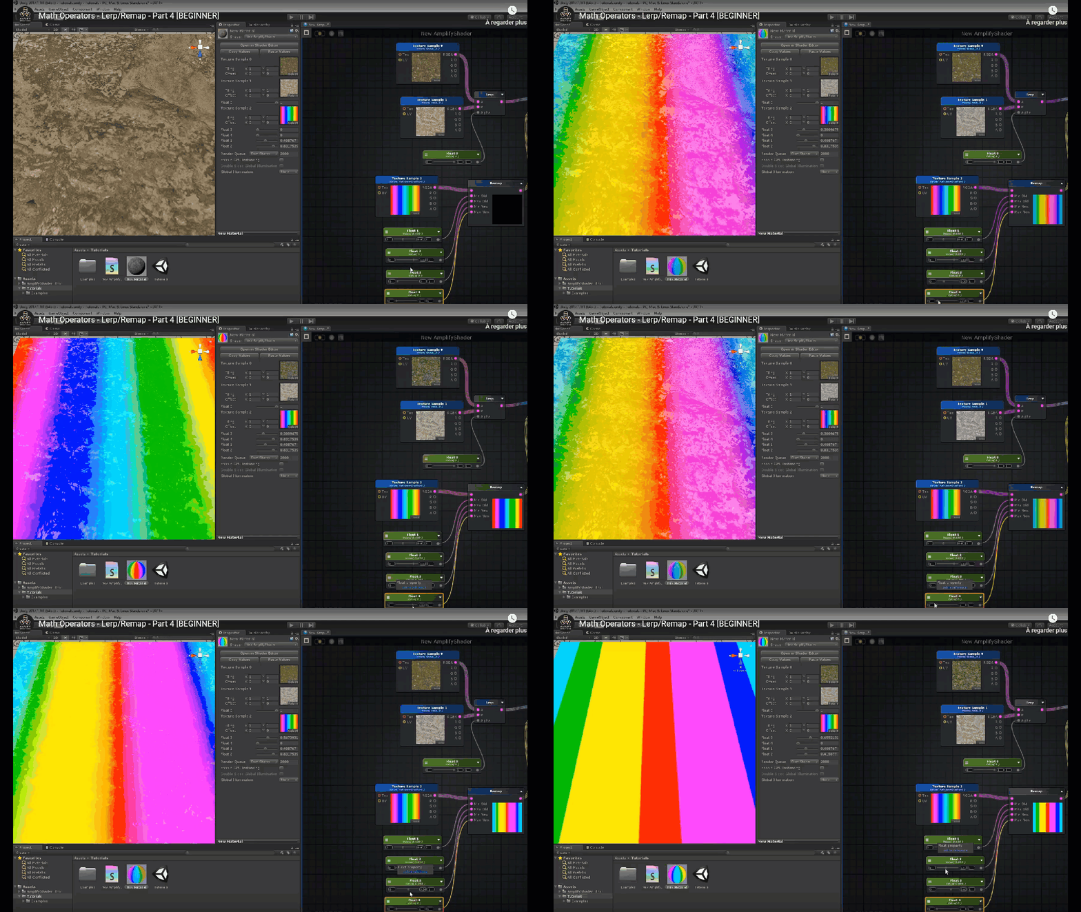 .
.
Sorry the gif is low def. but same nodes as the screen I showed to you.
I suggest you to keep an eye on this website to understand nodes too : Shader Forge
Oops yes sorry ![]() , so there is a little preview about remap
, so there is a little preview about remap  .
.
Sorry the gif is low def. but same nodes as the screen I showed to you.
I suggest you to keep an eye on this website to understand nodes too : Shader Forge
thanks a lot man!! I’ll definetely check it out ![]()
I’m back! Best wishes to everybody and create some awesome stuff in 2019.
Last few weeks were pretty hectic regarding work so I had to drop some 3D studies ![]() but I’m here again with an update everybody
but I’m here again with an update everybody ![]()
I finally have made some time free in my schedule and already checked out some of the shaders and the meaning behind diffuse, specular etc. Still some baby steps but I’m trying out things to experiment.
Is it possible you can send me a screenshot from the full shadergraph ?
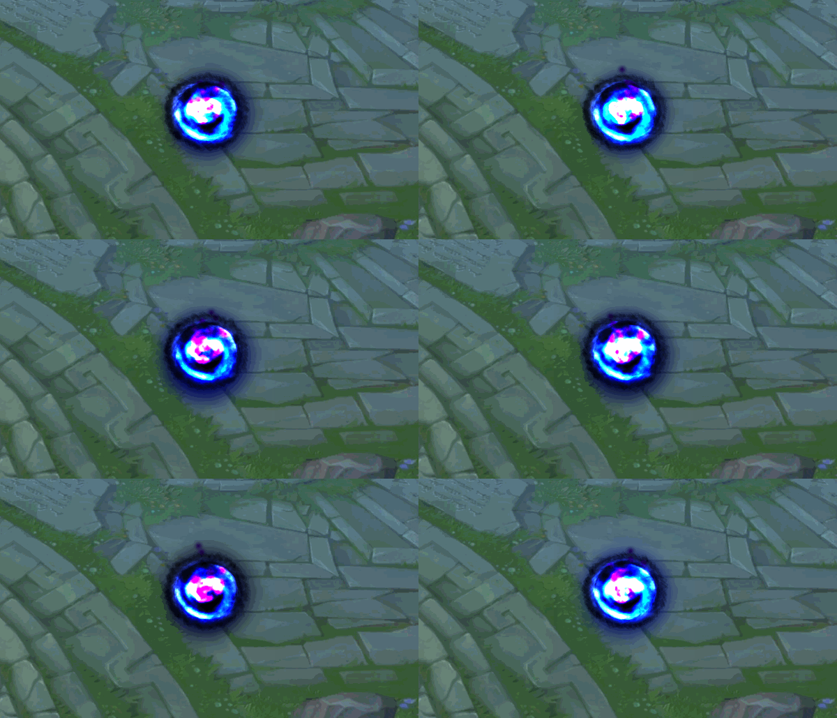
Created a little groundportal from the dark orb. To feel more comfortabel I’ll start from the beginning with the Unity VFX tutorials from SirHaian ![]()
Laserbeam idea I have in mind, this will be the lock ons for the startup, the lock ons will appear apart from each other with timing.
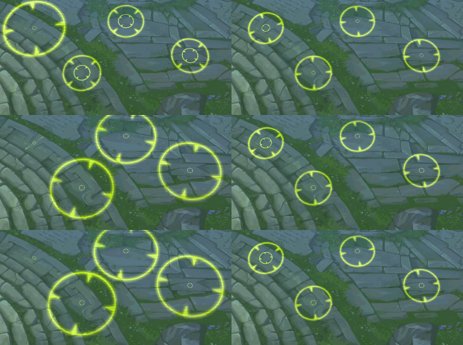
Trying some things to see how I want to approach the laser, but I’ve to say that I love how shaders work from what I know so far
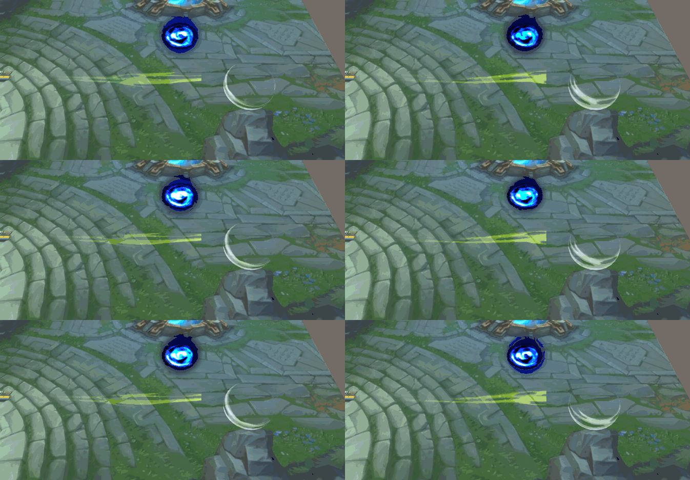
Good stylized swooshy stuff! I especially like the contrasting black/white slash
Thanks travis :D, I took the idea of the black/white slashes of the game smash bros ultimate. I love the game and the fx are some great reference too
New update :D. I checked out some tutorials for lasers in Unity to see how it actually works. I like how the node system works and it’s fun trying to solve it out yourself first before googling it. I plan to windup the tornado before it slows down and bursts out.
And I’ll make the effect also more juicy with a nice particle system that emits the impact of the laser. Looking forward to share more!
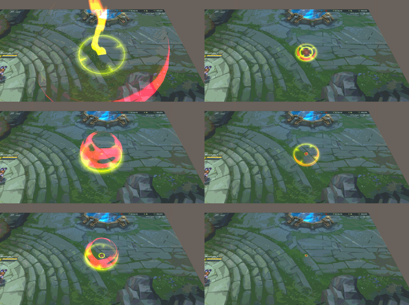
sneaky little update !
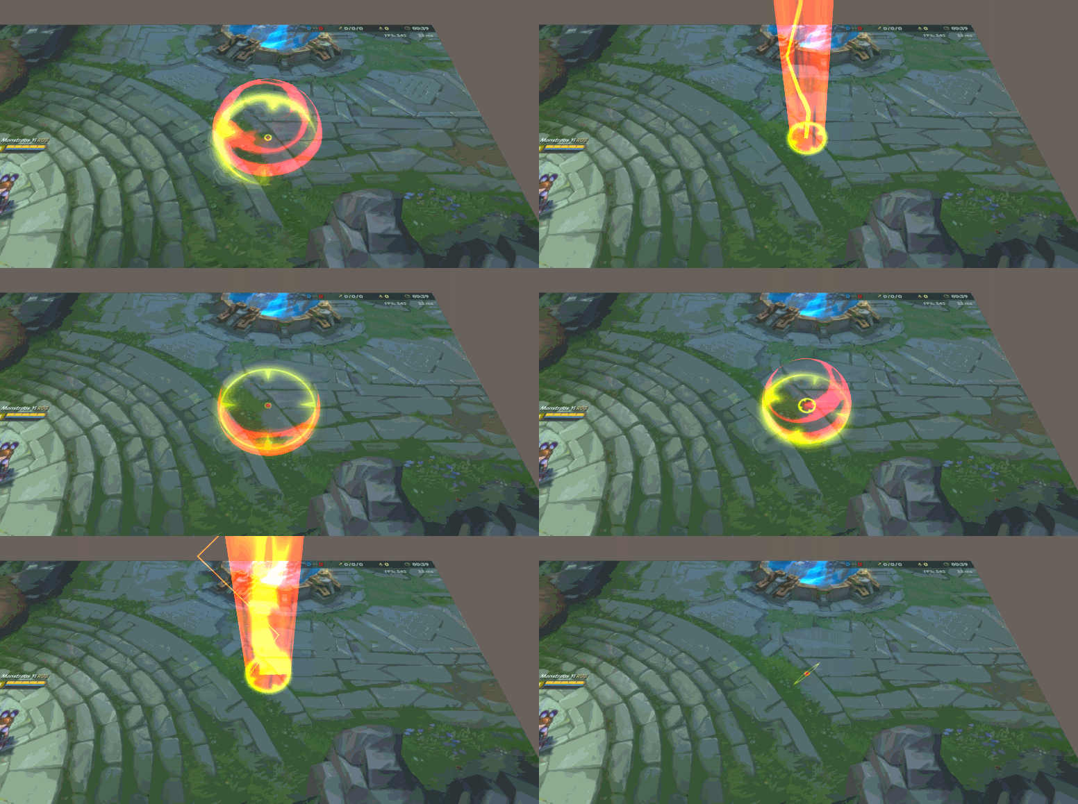
New update everyone :D, I added some blur effects to the beam to make it more snappier. Also created a new texture for the beam that pans over the Y speed. I’m still struggling to create a nice beam feeling so if anyone has some feedback would be amazing ![]()
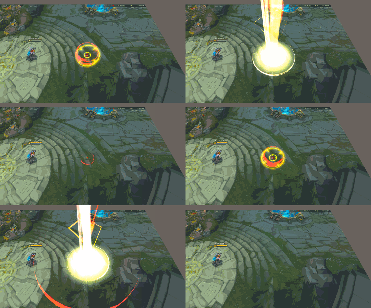
Coming along real nice man! For me I think the beam works quite well id like to see more breakup in it perhaps, (more gaps in the beam - noise but that matches your other shapes)
Espicially at the end as it disappears think that would help it disappear off screen even better (almost eroding away slightly as it disappears)
![]()
These are some really good points. I still kept the texture of the beam very rough to see how it feels. This is the texture 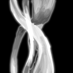
Indeed what you said, maybe some more gaps and more movement in the beam itself. And it would be very cool to do a dissolve or something like that at the end.
Thanks alot ![]() !
!
So I tried a different kind of beam as I was not happy with the previous one. So I tried a new one leaning toward more downwards movement, adding some rotating particle that go up will create a nice big picture.
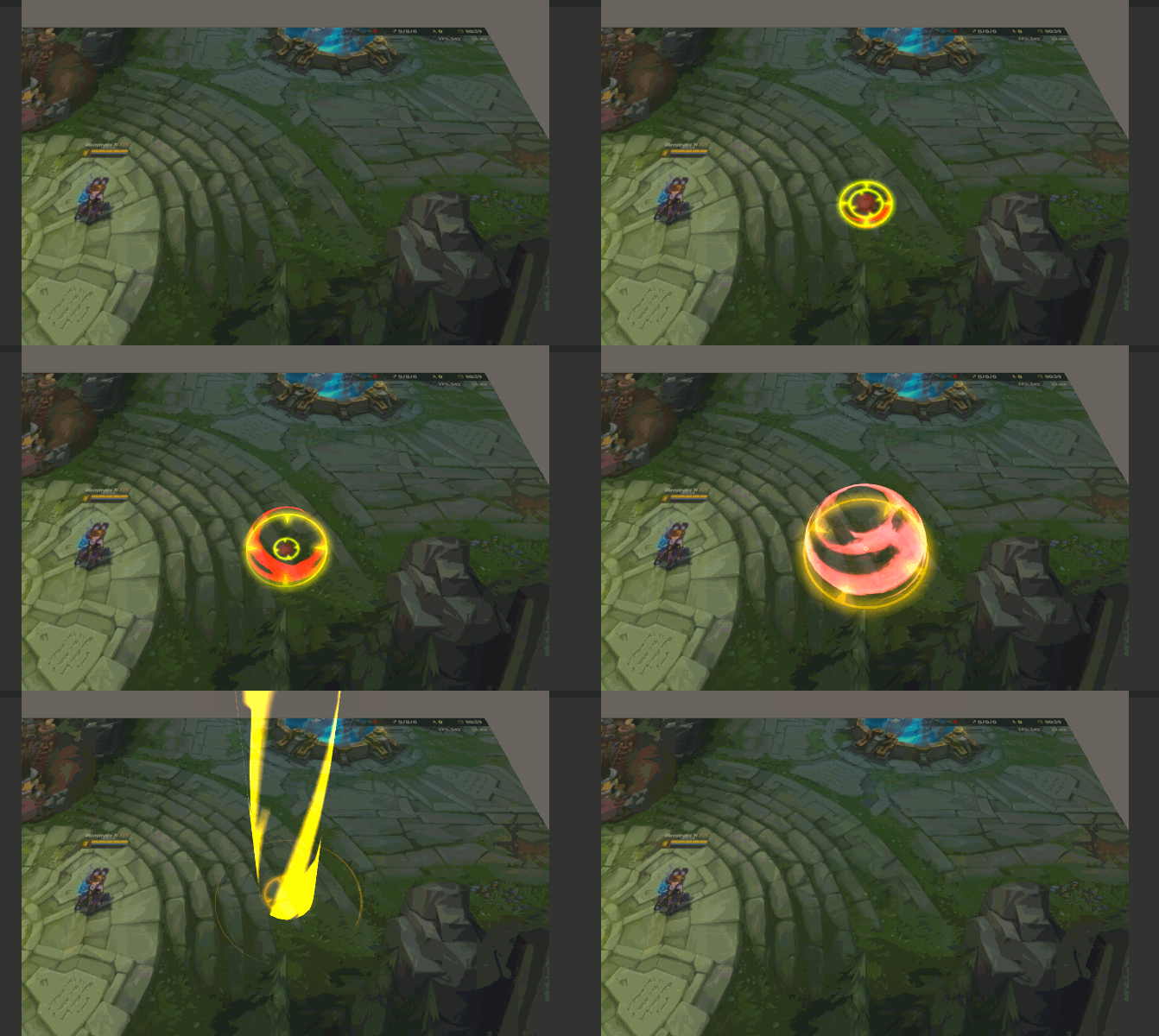
I really liked this version. I would perhaps add some downward motion and more range in the colour palette. The lighting and swirl currently look like they move in and out.
There’s good motion at the beginning but as it dies you can see it fades out and stays static. Follow through would be great here.
Really liking this thread though, keep going, it’s coming along really well
Thanks alot!, I see it know yea that the electric is staying static that’s actually a very important point to keep in mind. And with the colors, do you mean that the colors are just popping between 2 colors instead of actually changing?
I think I’ll do a combination from the V2 laser beam and the recent one I posted, and add some more downwards motion with it then. Do you maybe have some tips on increasing the downwards motion from the beam?
More that perhaps the lightning is blown out. Where as you could keep the same palette but increase the range for the value.
Let me know if you want any pointers on this. I notice a lot of your work is beautiful stylised, hard edge stuff.
V2 has some nice behaviour, I would perhaps lower the tiling. It currently looks like noise that has it’s Y co-ordinates set to something super low and gives it that stretched look.
Along with the lightning having colour range I would spread the range in the filler beam in V2 or animate the spread. So it starts wide and white and then narrows in over time, whilst keeping the edges orange. Along with your downward lightning, noise in the filler beam and the focus narrowing it’ll help pull the eye in.
Also something else to perhaps consider…
@GregorySilva posted a great version of a ‘fire tower’ a while ago. Check out his artstation. Great example of the residual follow through at the end. He has embers that swirl and continue the emotion. A nice way of transitioning as well.
Awesome. I’ll check it out and I’ll definetely reply to you if I need more help ![]() , still some things Im not quite familiar with so alot of questions will be asked haha !
, still some things Im not quite familiar with so alot of questions will be asked haha !