Simon Kratz: Sketch #28

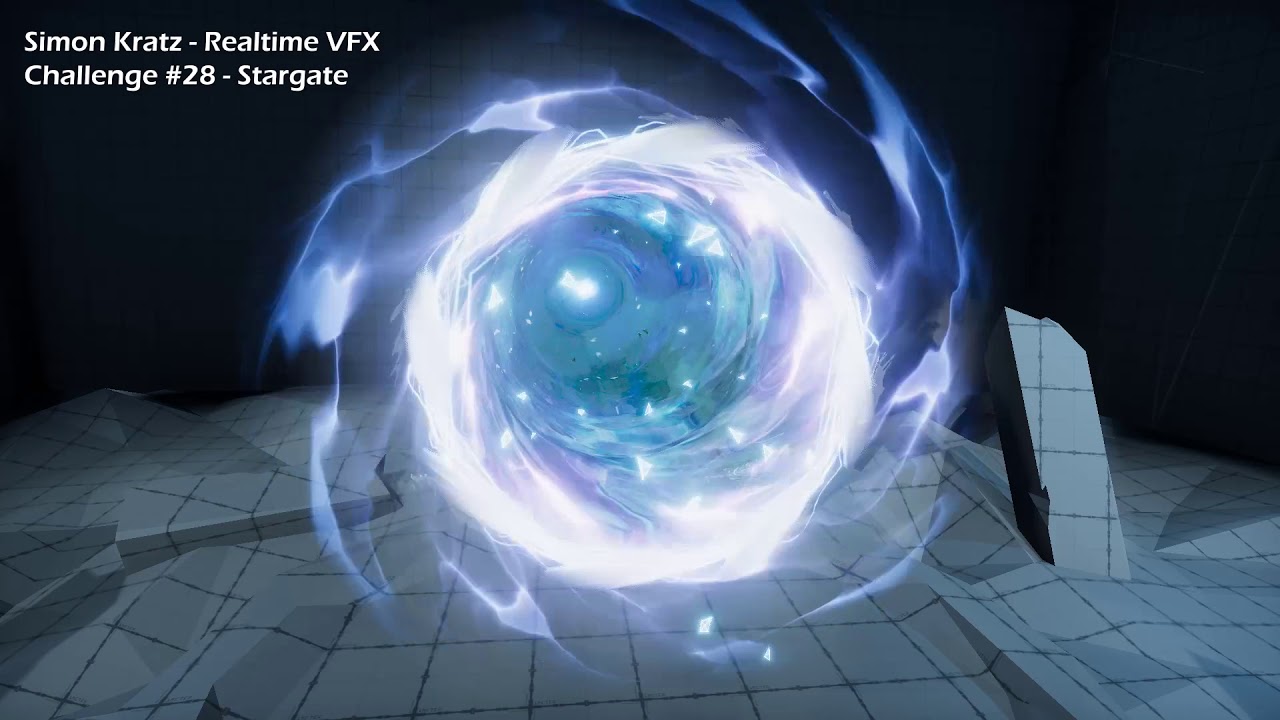
Final Effect

And the full asset is live on the Unity Asset Store!

Hey guys!

I just started and happy to join the sketch for this month! :smiley:

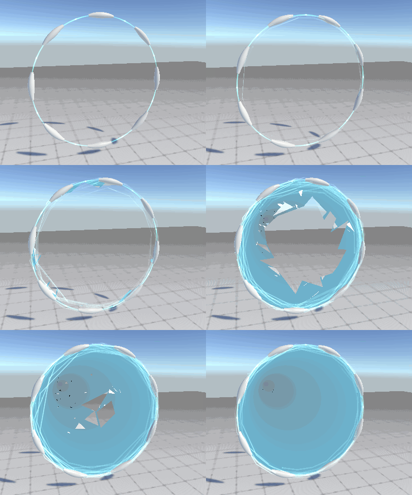
My approach is to create something like a colapsing space effect when the warptunnel builds up.
This is pretty early and I tried to get some shader tech done first to see if it works out the way I wanted it.

stargate_01

So far the collapse is done solely via shader math (took a bit to figure out independant per-triangle rotation hehe) and itā€™s great to save some iteration time. Gonna add some more elements on top of it to make it more interesting in the process.

Iā€™ll probably try for a bit stylized but still sci-fi look for the effect. Gonna try to get something like the glitch effect from the Spiderverse movie:
https://youtu.be/pmYFzSutYlY?t=223

Hope I can post something a bit more refined in the upcoming days :blush:

Happy challenging everyone!

58 Likes

Hey guys, quick update! :slight_smile:
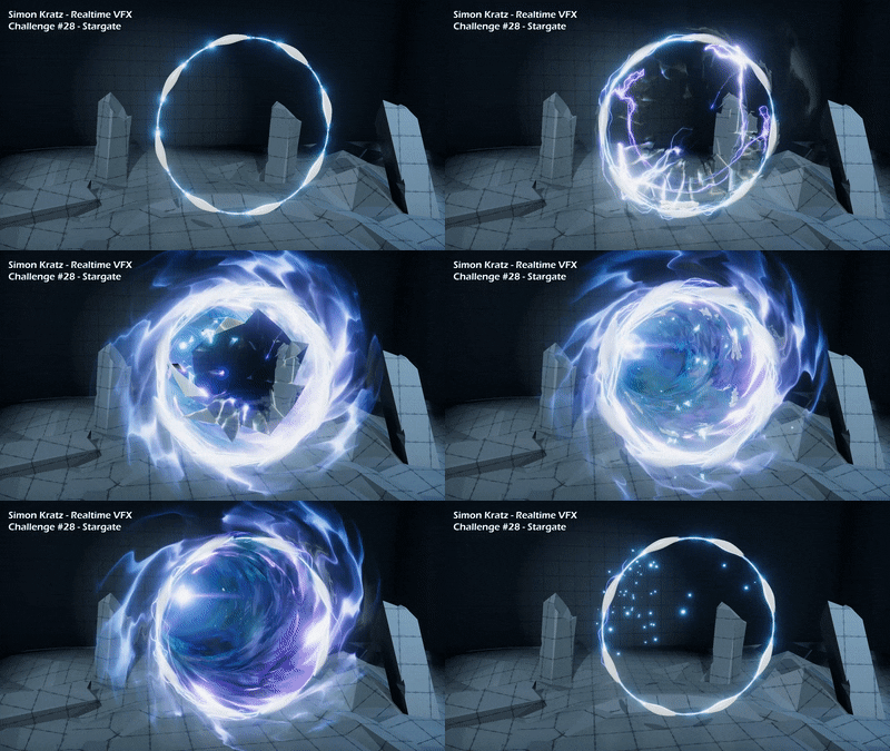
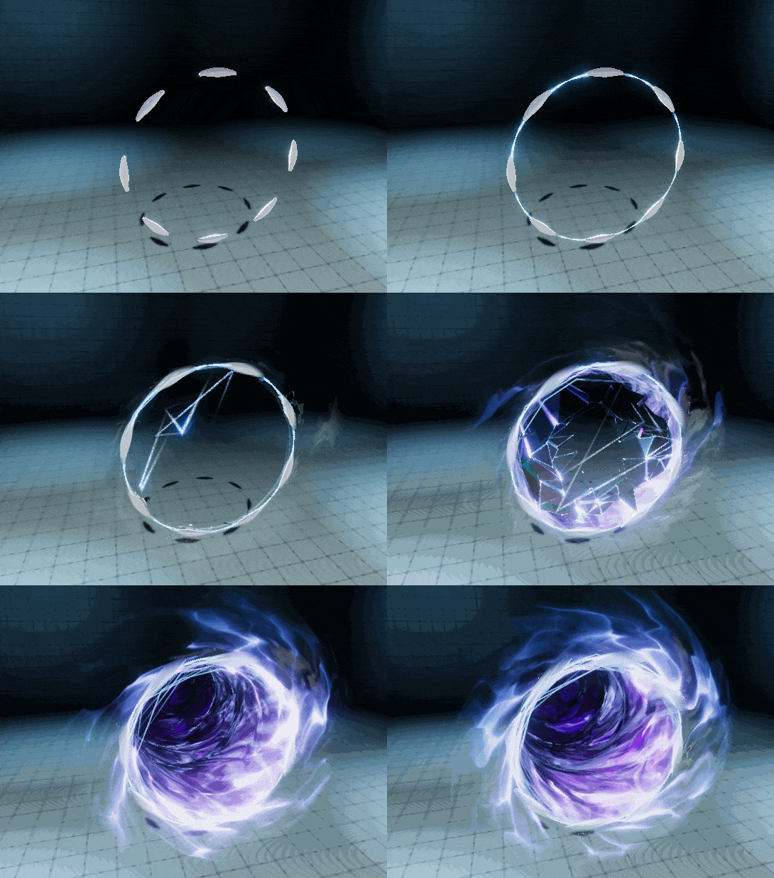
Managed to work a bit more on this today, basically tried to get some piepline stuff done and basic elements set up.
I blockoutet some startup vfx and worked a bit on the spacial dissolve.
Everything is still pretty linear but I wanted to try and see how far I can get without setting up to much specifically that will change later on.
If youā€™re interested in some of the elements feel free to ask. Also, sorry for the crappy gif, itā€™s just much faster than a video :sweat_smile:

stargate_02

Still a lot to do for the coming weeks, gonna block out the tunnel effect next and try to get a bit of more power into the whole process.

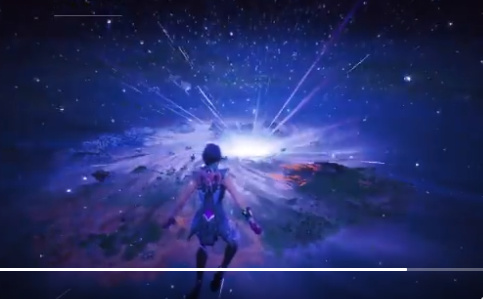
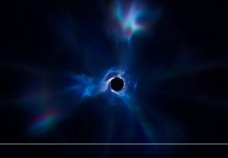
Also found a lot of inspiration in the very Epic (:upside_down_face: ) Fortnite final season finale thatā€™s been all around Twitter for the last couple of days.
image
image

This is so beautiful and just perfect for this challenge <3
Wish you lots of fun, everyone! For me it was really enjoying so far.

3 Likes

Hey guys!
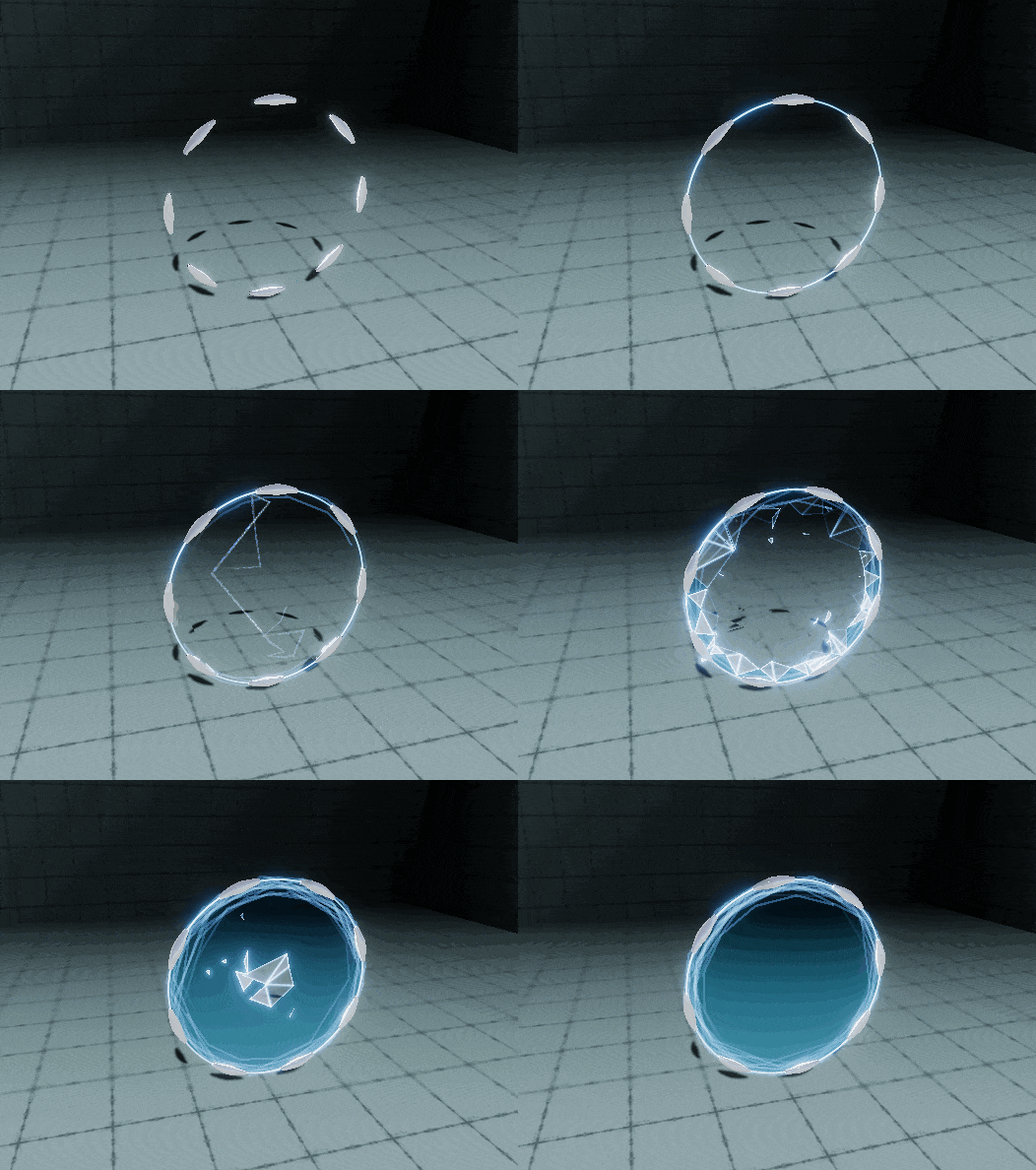
Hereā€™s another update. I worked quite a bit on the inner tunnel and the look of the spacial collapse.
I know animation is still pretty rough, gotta adress this in the next week. Just wanted to get the basic elements together at first :no_mouth:
I also have a basic close/end setup effect that collapses the tunnel and restore space, but for now itā€™s only blockouted and I canā€™t seem to find a good way at the moment to integrate it into the rest of the sequence.

Probably gonna polish some of the elements as well in the upcoming days and really have to work on the motion as a whole.

com-optimize%20(2)

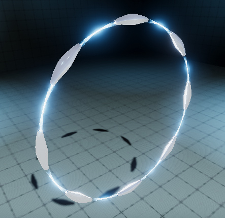
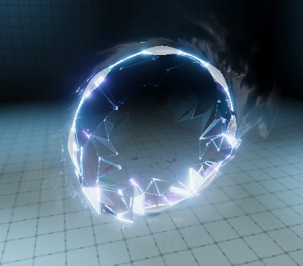
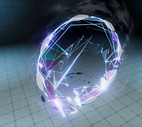
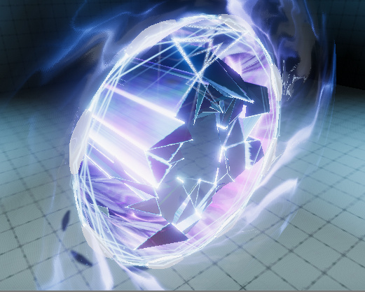
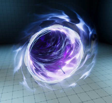
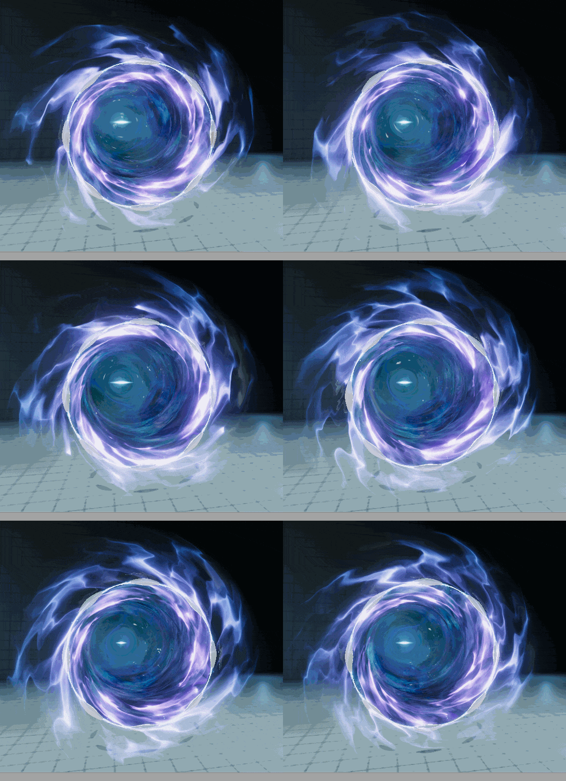
And finally, here are some beauty shots without gif compression:

image
image
image
image
image

Is anyone interested in a breakdown?
If anyoneā€™s interested in anything Iā€™m happy to show some behind the scenes stuff :grin:

As always wishing everyone else lots of fun, motivation and creativity for the final days! So many interesting anmd skilled entries so far, Iā€™m really happy I joined this month :smiley:

33 Likes

Oh man itā€™s look amazing ! :open_mouth:

Iā€™d really be interested in a breakdown !

Do you work in Unity or Unreal ?

This is so cool. I want to know how to realize it.

Are you using UE4 or U3D?:åæƒēœ¼:

Hey guys, thanks for the positive feedback :smiley:
@Orion, @x.Le Itā€™s all done in Unity.
Thereā€™s still some stuff Iā€™d like to change and add and I need the remaining time to complete everything, but Iā€™m happy to do a breakdown of the final thing then :slight_smile:

2 Likes

Quick follow-up progress post since Iā€™m mostly still creating and polishing some elements and smashed some of the current sequence in the process :sweat_smile:

Al least thereā€™s a German saying that claims ā€œitā€™s gotta get worse before it gets betterā€. Guess Iā€™ll have to trust that one this time :upside_down_face:
So Iā€™ll just show a bit of the current interior of the gateā€™s space warp for now.

com-optimize%20(3)

And again, since people liked it, hereā€™s another beauty shot of it:
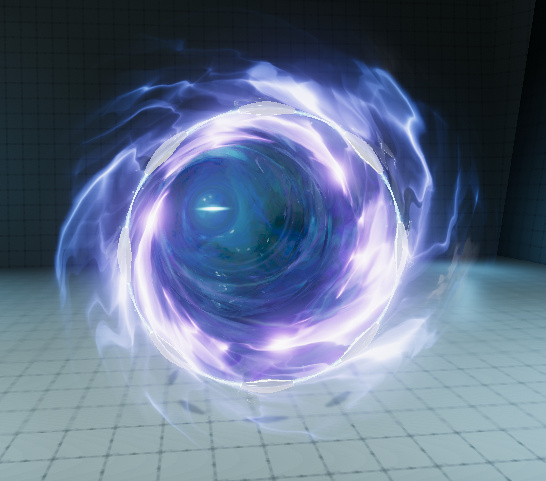
image

Also a great inspirational video I randomly found on Twitter and felt it was perfect for the feel of the tunnel:

Hope I can get that wave-y build-up done in some way, but weā€™ll see :ocean:

Love the entries so far and thereā€™s still a bit to go so best of positive energy to everyone! :slight_smile:

8 Likes

:open_mouth: this is looking really nice great job man

1 Like

hey fellow VFXā€™ers, happy to announce Iā€™m calling this done! :partying_face:
It was a real pleasure to do this challenge and thanks a lot for your interest in the progress which kept me really motivated!

Here you can find the final video, Youtube and Vimeo videos are identical, so watch whichever you like better :slight_smile:

I used the last couple of days to get the timing done, finish the closing effect and add some of the final fluff as well as a simplistic environment to enhance the mood of the final presentation.

And since there are still a couple of days left I might start with an early-on breakdown, depending on the time I can invest next week. But thereā€™ll definitely be one in the end :grin:

Thanks again for all your positive response and good luck to all the fellow participants for the final days!

16 Likes

BREAKDOWN STARTING HERE

I actually have some spare time right away so letā€™s go with a basic introduction :grin:

Polycount and basic mesh anatomy

Letā€™s start simple:
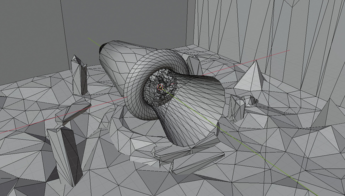
I used a couple of really low-poly meshes for this one. Nothing really complex here, I just used a couple of basic shapes, lots of vfx textures + custom shaders and a bit of vertex painting and UV stretching to control how stuff works.

The whole scene has ~14k tris, composed of:

  • 1.6k for the environment,

  • 6.7k for the physical portal elements (the floating ring),

  • and 5.5k for all the effects elements.

The scene in Blender

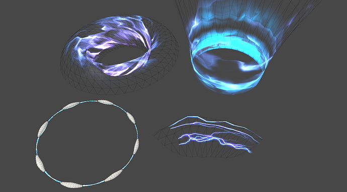
Here are some of the meshes with materials in Unity. You can see how simple that stuff is. As mentioned most of the look comes from textures and shader work. I just vertex-painted the mesh edges to get some fading in and out different parts of the overall effect and stretched the UVs a bit to control speed and stretching of the textures moving over the surfaces.

The gate element doesnā€™t have much special stuff going on. It uses the Unity standard shader and a very simple custom fresnel glow shader that I fade in via animation.

Meshes with materials

Next time I show a couple of textures and breakdown the tunnel element. :smiley:

18 Likes

Meshes and Textures under the Shell

And hereā€™s the continuation of the breakdown!
I also hope you post a couple of questions for stuff youā€™d like to know more in detail since I canā€™t really cover everything that happened over this month :slight_smile:

After looking at the meshes and some ideas about their constitution letā€™s get more into detail!
And Iā€™d like to start with the original idea of the effect, the spacial collapse in the center of the gate.

The whole idea was heavily inspired by the recent and pretty amazing Fortnite finale. Though I donā€™t play the game you could hardly miss the amazing vfx if you stumbled across Twitter this month.

My take on this is probably a lot simpler and Iā€™m just using a couple of pretty common concepts that should probably be possible to replicate in any common engine out there.

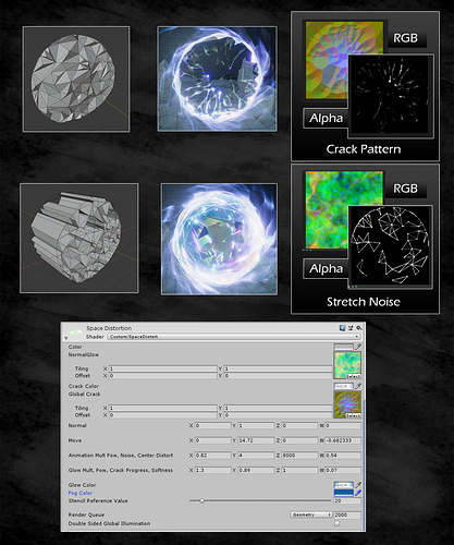
First, lets look at the interior mesh of the gate. In my case itā€™s a fractured triangulated circle that matches the bounds of the gate. I originally wanted to create this in Houdini but I felt that I didnā€™t get the amount of iteration time back compared to the amount time I had to spend to create a truely satisfying generator. So I went back to Blender, created a bit more manually but was satisfied in the end.
The triangle pattern was just a style decision and didnā€™t serve any other purpose. As mentioned earlier I was also inspired by Spiderverse and I just wanted to go with something that felt ā€œout of this worldā€ compared to the starting point :smiley:

Then with the mesh being setup I created a shader that basically grabs the content of the screen and packs it into a runtime texture, Unityā€™s ā€œgrabpassā€ feature. I had the mesh unwrapped with a flat projection so it basically filled the UV 0-1 space and created a texture in Substance Designer for it:
A crack pattern with derivate Normals that serve as a xy distortion, a gradient to fade it in (blue channel), and with visual cracks in the Alpha channel.

I later distorted the grabpass content based on the normals as directions and the blue channel as intensity over time and added the alpha channel on top of the grabpass to create visual cracking.

Thatā€™s basically the idea of the starting part. But we also have the shattering parts being sucked into the gate. And for that part I needed an additional set of geometry. I basically extruded the front part into the Z axis, and created a second texture for the look which just contained a couple of noises and a masked wireframe of the original UVs.

At first I thought about splitting this new part since the behaviour would be quite a bit different from the front part. But I came to the conclusion that it would be a pain later on to make the two parts feel connected and syncing their behaviour properly so I just went with masking one of them via vertex colors and this way branching a couple of features in the shader while having one common ā€œtimestepā€ in the material.
I fiddled a bit with additional uv sets to get some more data encoded into the meshes like the position and a gradient into the Z axis. This way I could animate the individual parts like simplified particles and make them get sucked in from the border.

At this point I could also iterate on the mesh quite a bit since the process of texture creation and behaviour was basically pipelined as long as I baked the position and Z gradient into the two additional UV sets each time (this would have been nicer in Houdini but itā€™s just a couple of clicks in Blender :grin: ).

As you can see in the progress images it worked quite nice and I thought to go with the approach until the end. Finally you can see the shader as well, which is rather simple. Itā€™s just there to blend a couple of things together and control the motion animated by a single parameter.

Hope all this rather techy stuff was interesting to read and next time Iā€™ll show a bit more of the textures I used for this project. Until then, Iā€™m happy to answer any questions if there are any :blush:

16 Likes

Hey, this effect is awesome. Do you plan to release the source?

Thanks, man! :slight_smile:
And yeah, I thought about releasing it one way or another. Might turn it into a full asset with a bit more control and ease of use improvements. But it will probably take a bit after this challenge. Gotta admit I made a couple of things a bit hacky at the end that could probably be solved better and Iā€™d like to get this fixed as the next step. Also some more shader commenting and cleaning up some things wouldnā€™t hurt the project.

Until then Iā€™ll continue with the breakdown so people can get a grip of the basic ideas and can start getting creative with it. :smiley:

wow the final result came out great! i really like how it builds itself to form the portal

1 Like

This turned out fantastic! I love the triangular shapes in your build-up, and the depth and contrast are really fantastic.

1 Like

Thanks a lot, man!
I was uncertain about the triangles until the end but Iā€™m happy that people seem to like them. :slight_smile:

This looks amazing! I love the shards in the beginning.

1 Like

Thank you! :blush:
I originally wanted to make them a bit more snappy to emphasize the force behind it but then felt it was a bit too much quick motion so made it a bit more linear in the end. So Iā€™m always relieved when people say it looks nice :grin:

Texture Creation Process and Use

Hey guys, found time to add another bit to the breakdown!
This time Iā€™ll show a bit about my texture creation workflow :slight_smile:
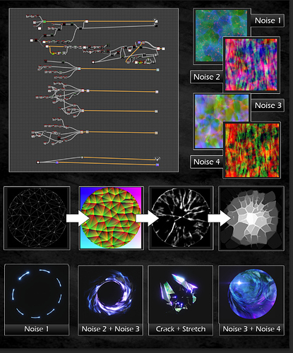
First of all, for almost all of my work I use Substance Designer. Just love the fast and iterative workflow and the control you have over the final result. The main elements of the portal only use these 6 textures ( + 1 special one that deserves its own breakdown for the more detailed tricks).
So apart from the crack pattern and stretch noise that I posted earlier there were only four more noises created for this project and re-used for each element.

I also added a bit of detail for the creation of the crack pattern. Basically I rendered a wireframe of the portalā€™s interior triangle mesh and created the cracks from it. This helped to make the cracks ā€œkind-ofā€ follow the topology of the triangle mesh, but it was also intended to vary a bit and make this part of the effect more closer to a realistic look with the rather stylized triangle collapse following afterwards :slight_smile:
The final texture ended up containing derivate normals in RG, a crack progress in B and the visible cracks in A channel of the texture.

As you can see here I only used a combination of these textures to make the overall look of the portal. It actually helped to re-use the textures to make the elements flow into each other and feel more connected. The technical use for these noises is rather simple, I always used one noise to distort the other, controlled via vertex colors and UVs, but Iā€™ll cover that more in detail when we talk about shaders.

Next time Iā€™ll talk a bit about the shader work since it builds on these textures and the meshes. Iā€™ll also post a bit of insight on the particle effect textures but there isnā€™t a lot of magic to them and that post can stand separately for itself. Might be able to do it during this weekend and hope it was interesting so far :slight_smile:

9 Likes

Hey guys, unfortunately I didnā€™t manage to get the shader topic covered this weekend. Really sorry for that, I was just too busy :frowning:
But I worked a bit on a more staged and polished version of my initial entry video with a couple of cuts and environmental assets to knot a bit of a story into it. Wanted to at least share this with all of you until I get the next post written.

5 Likes