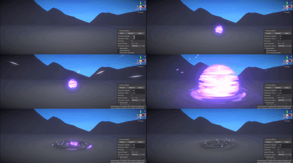
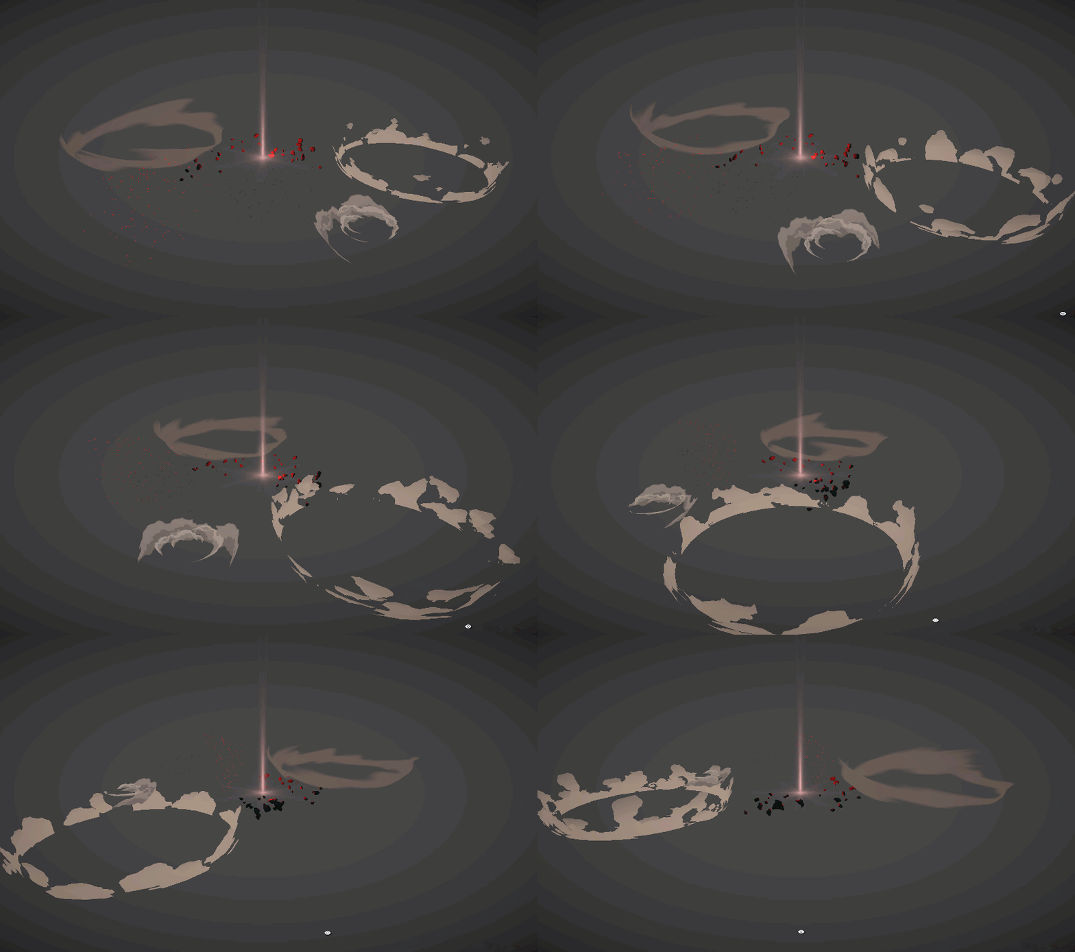
Sig - Sketch#50

I imagine it’s kinda late to join the train, but I hope it’s not TOO late!
This is gonna be my first time participating, yaaay \o/

I was working on a similar effect for the second course of Gabriel Aguiar on Udemy…but, on the last couple weeks, I ended up derailing myself from the course while messing around with Fresnel and Alpha Clipping.

Alpha Clipping did not work on Shader Graph when using the Fresnel effect along with it, then I had to move back to Shuriken and redo the whole effect.
Parallel to that, I saw everyone posting their Sketches for the event and got excited for that, but couldn’t join because all the stuff I had in hands were made before March :pensive:

Though, having in mind I would have to redo the whole effect on Shuriken, I decided to start fresh retaining only the main body - the rotating sphere (is that an issue?)

My idea is to make a damaging skill in form of an explosion. I don’t know if it’s gonna be a persistent skill or a one hit skill, but the key thing is that I want it to SPIN!

References & Inspirations:
Edit: for some reason it doesn’t link the right folder on Pinterest. I’ll leave direct links instead.

FINAL:
.MP4

Original gif posted before due time
PURPLE EXPLOSION PRE FINAL GIF

Youtube video with more Angles! (finally!)

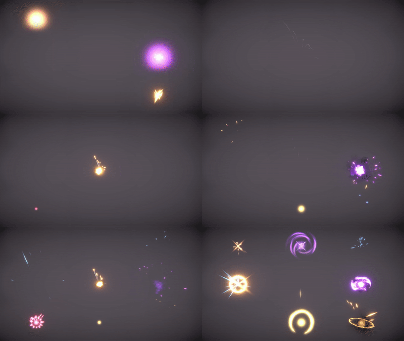
Sparks:
The Sparks are Stretched Billboards with a simple faded circle, like the Default Particle found within Unity.
Under Velocity over Lifetime, I apply Radial + Orbital on Y axis for this Whirl Motion.
It works, but it gets sucked in and out repeateadly if I let them live for too long. Is there a better way to achieve that in Shuriken?

Sphere:
The Sphere uses a sphere mesh and is essentially a Shader thing.
I grab the Texture I selected as base color and multiply by the Fresnel Effect. The result is then linked into Alpha. For the clean cuts, I use the Alpha Clipping.
To make it fade in and out, I mess with the textures Power values by using Custom Vertex Streams.

Energy Spinning on the Floor:
Same technique used on the Sphere, but now it’s projected as Horizontal Billboard.
There are 2 versions of this on the floor. One of them is smaller and brigther - I use Alpha Clipping on that one - and the other is a really low opacity and bigger - this one does not use any Alpha Clipping.
In order to get the bright center spot, I used a Remap node just like Torbach shown us here: Best 'Polar' option to save pinched triangles

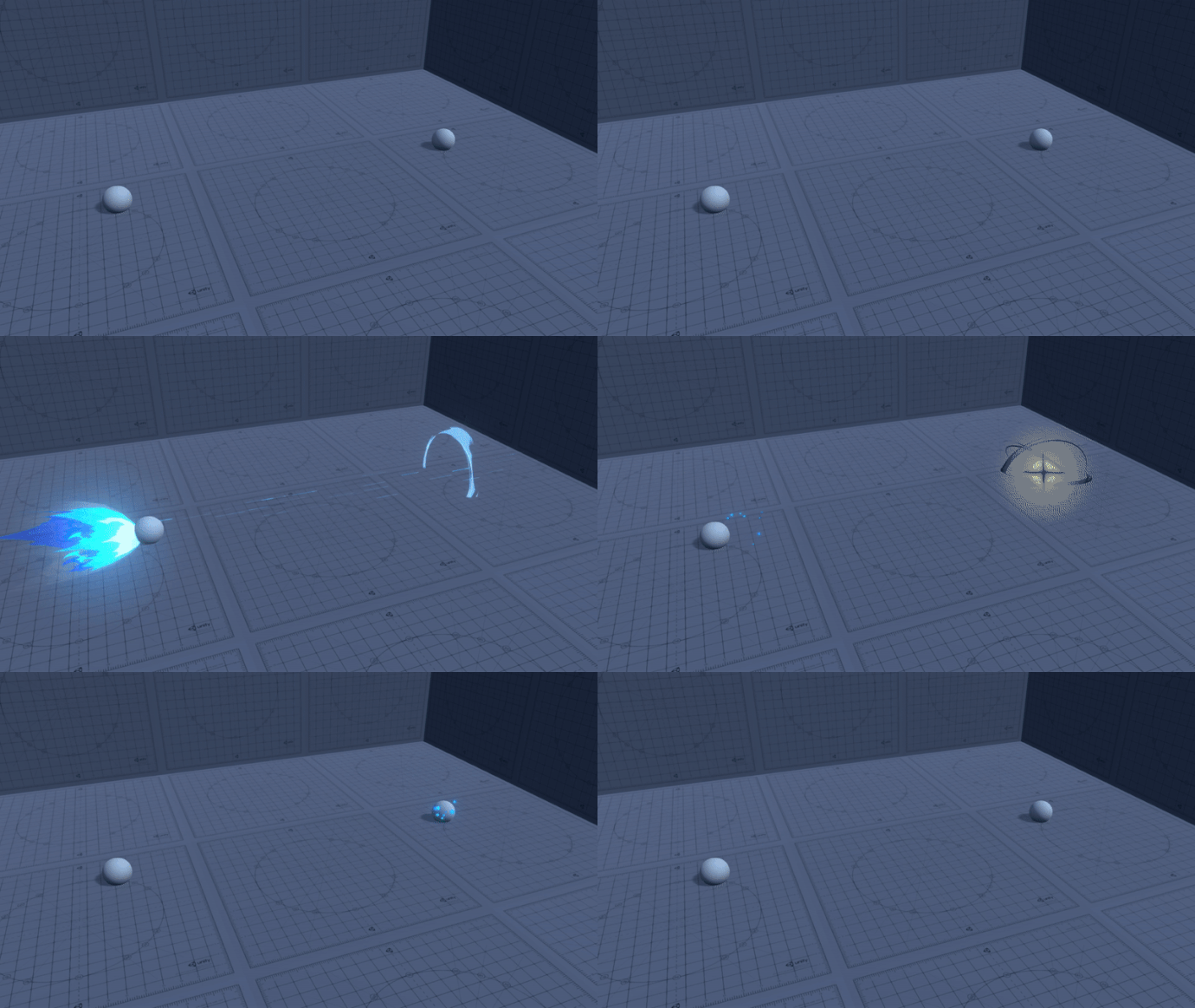
Air/Dust
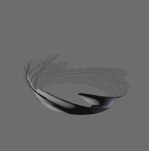
Same technique as the one used on the Sphere, but now it’s a uncapped cone Mesh :sweat_smile:

Flares, Glows and etc:
The rest are either Vertical, Horizontal or View Aligned Billboards + Set the size over Lifetime.

If anyone wants a more detailed explanation and Screenshots, I’ll be happy to provide!

Many thanks to the community and special thanks to Torbach! He kinda mentored me on this process hahaha

Things I wanna change in the future:
Sphere:


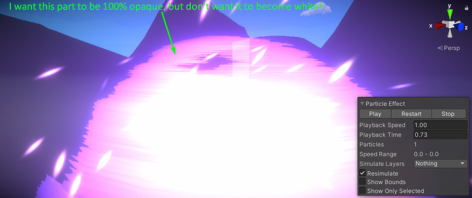
If you look closely, you will notice the pink parts are not fully opaque, and I want them to be fully opaque, as the white parts are, but retaining the pink color.
I’ve been messing around with my shader for about 3 days and couldn’t get it right. If I force the overall opacity value of the texture, I end up with one of these (or both):

  1. Pink becomes white, expanding the “core”, which is something I don’t want.
  2. I lose the big cut outs it’s currently making on the “borders” of the Sphere, due to me messing with the overall opacity values…which results on Alpha Clip Threshold having less stuff to cut out. Just raising tha Alpha Clip Threshold doesn’t give me the same results though.
4 Likes

additive or pre-multiplied blending?
additive won’t let you make the pink opaque (FYI), premultiplied will be a bit trickier and you’d need to finesse the Fresnel power to account for the texture

Hmmm I see.
And yeah, I’m currently using the Additive Blending. I never really tried the premultiplied one. I mean, I’ve set it and quickly tweaked the values only to see what happens, how it looks, but didn’t really try achieving something with it for real.

I love the dissolve effect you have going on! It has a really nice timing to it.

As for your opacity problem, aren’t you setting those holes in your alpha? If you still want the alpha to look like your texture but you don’t want holes, you can try the clamp node. Add it right after your last node (for the alpha) and see if setting the minimum clamp value to 0.5 will change anything.
(Or, you could always do a custom alpha texture in a paint program where you take your texture and then add white where you want opacity.)

Also with smoke effects, I have been playing around and I noticed if you follow Gabriel Aguiar’s slash tutorial, you can repurpose the same shader for smoke if you make the mesh horizontal. It spins around and you can apply nice noise to it.

this is already looking amazing! good luck going forward :slight_smile:

Just tried that and it won’t do :pensive:
Thing is I need the Dissolve Texture to send in the opacity values to so the borders get cut out by the Alpha Clip. If I Clamp, I lose the Opacity information and the cuts won’t happen :worried:

I’ll try one more thing (Torbach suggestion about Premultiplied Blending). If that doesn’t do, I might try making some kind of mask.

You mean this one here?

1 Like

Ah I’m sorry to hear the solutions haven’t been working so far. You could try lerping the texture with something else and see if there’s a nice middle ground with another noise. I found this extremely good noise pack for free (praise 1MAFX) and I’ve used it in (almost) every shader graph I’ve made so far. Link if interested: noise pack

Also yes, thats the tutorial. I’ll edit my post to show my recent update, but also here’s a snippet, it has smoke in it that is based off the shader that GA made. edit I posted the video on my sketch that shows the slash used as a smoke, so I took off the gif!

1 Like

Hello hello!
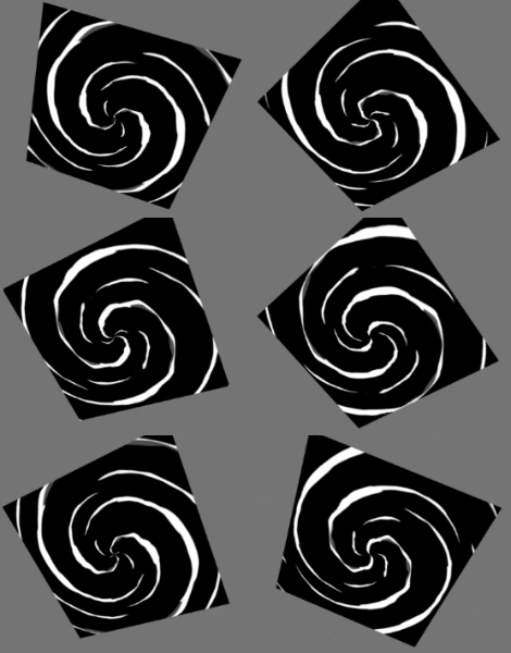
I’m currently trying to implement a texture that will be spinning on the ground and I wanna have it being scrolled from the inside to the outside.

Something like that: Animated GIF - Find & Share on GIPHY
Shivanna (League of Legends)

As I was experimenting some textures, I stumbled on this issue:

I think that you can do a simple scroll over time but you can swirl the UVs of your actual mesh. Here is a link to sberke’s deviantart post where they show an interesting UV technique: Flower scroll 02 by Sberke on DeviantArt

But this is just one type of solution xD seems very hard for me.

1 Like

it is the same technique but the texture is panned side-ways as well as in/out for the vortex.

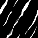
sig make your texture seamless like this
image
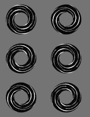
applied to a revolved plane → ring you get this
slantedLight

if you use a polar shader you get a vortex and wil enjoy spinning the shapepolar_light

2 Likes

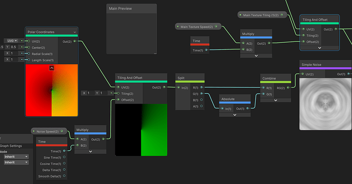
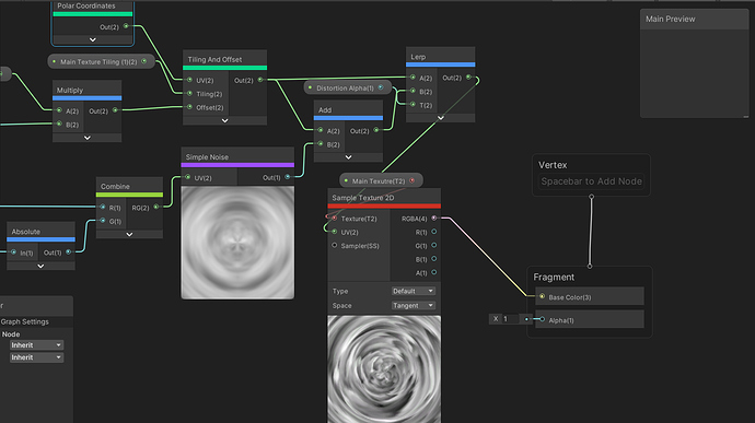
For this night I decided to experiment with Polar Coordinates.

Here is how I wired things up on the Shader


To be honest, I copied some of it from you, from one of yours Screenshots you sent here: Most common / Bread & Butter Shaders and Materials "techniques"? - #24 by Sig

I’m heading to bed now, but how would you go about making it rounded? I aim to project it on the ground using Horizontal Billboard, but no way I can leave it looking like a quad!

Ohhh it’s a pretty inteligent solution. For this night I experimented with Polar Coordinates, but will try this one too. It ocurred to me that, in this method, the smoothness of the roundness is dependent on the amount of geo, right?

Oh my, I think I went past by this when I first read your reply! Thanks for sharing it :star_struck:

you can

  1. model a circle that is flat rather than revolved and use vertex color to feather it. provided you already use vertex color which is good for particles.
  2. a texture of a ring/circle (not polar uv that) to make the whole thing a mask
  3. more circle math objects which can be attached with sliders/variables to play with feathering and size etc
1 Like

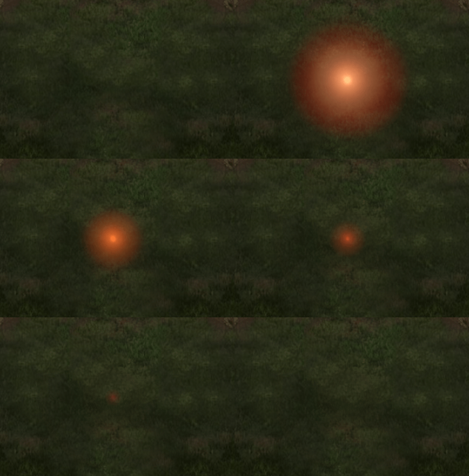
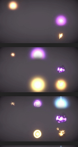
Tonight’s progress was:

Additions:

  1. Shockwave
  2. Energy spinning below the dome/on the floor
  3. Marks on floor for after the sphere dissipates
  4. Sparks flowing off the floor marks

I like the overall structure and the looks, but I feel there is plenty of room to make it better…specially when it comes to timing. For me it lacks that “snap”, that “kick” when it goes boom.

2 Likes

I ended up going down this route and it worked nicely!

For me it lacks that “snap”, that “kick” when it goes boom

mm yes that pop - to noddle that needs some classical animation timing on the initial burst

Jason Kyser has a very succinct video

anticipation without a buildup object is a touch tricky so here is a break down of its beat(s)
blast_01

here slowed down - it’s pretty much a Flam, a double-wack intended to be the same effect that thickens the crunchy feel.
blast_02_slow

this is not a prescription for exactly how it works, that is you don’t need a big white ball with harsh edges, sometimes you can use rings and dark colors as well

some links from around the forums @GabrielAguiar

note @SrRubfish use of darks contrast & screen flash for the strike against the target

3 Likes

Oh my I never noticed it! I didn’t even know what a Flam is.(thanks for the illustrative video, it was key for my understanding)

I usually put things together thinking it if they go boom all at the same time, it would actually increase it the pop feel.

The Flam also happens in most of the effects here, right?

I watched many videos of VFX Apprentice, including this one here and the rest of the playlist. I really like it!

I will watch it again because I might have let something slip by. Plus, I watched it right after I started messing around with VFX…meaning I might be able to get more of it now than when I first watched it :sweat_smile:

Hmmm yeah, it does increase the impact/pop. I like it, but, in my mind, I aim to make the effect as close as possible as it will be in the game (the imaginary game in my mind hahaha).
Is it really okay to go all in on these more “intrusive” effects, like big flash and contrasty stuff, camera shake…?

The Flam also happens in most of the effects here, right?

it is
Gab has those shapes start as burst/dots bigger than the shockwaves at first - if you use Chrome “Gif scrubber” let’s you go through gif by right clicking. neat plugin

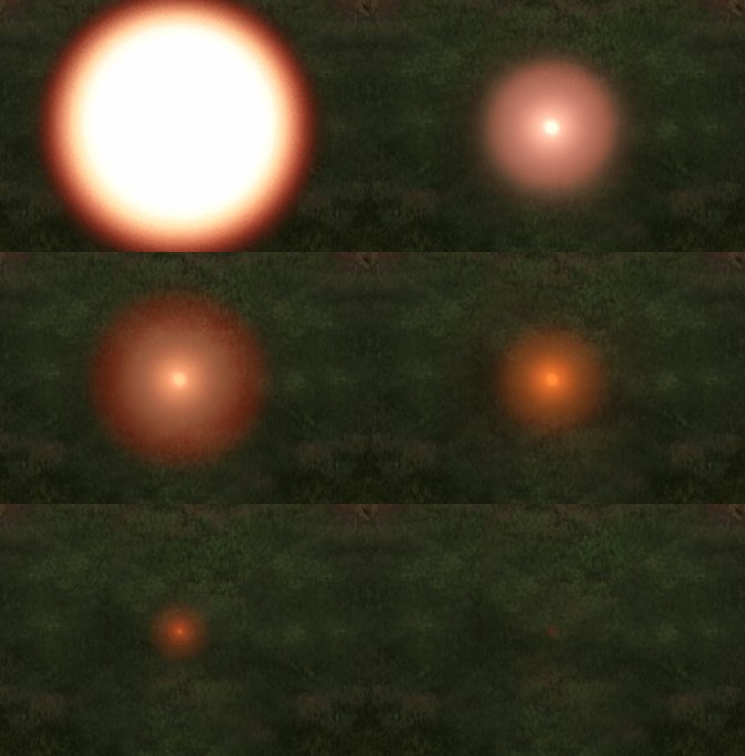
it’s an exaggeration of scope - the object seems bigger; like a supernova

  • light hits first and overpowers the eye
  • then colors compensated by your brain regain fidelity and you get the energy/shockwave after

like putting your hand in super hot water and you’re not sure if it’s cold at first.

here’s a crude mock contrast of shape and color
blast_anticipaction_01

frankly I don’t think the bright yellow works, it’s too much but something to experiment with, having 2-4 frames of POP in the beginning might be what you are looking for.

1 Like

Thanks for the breakdowns!

I straight out downloaded Gif Scrubber, pretty useful :open_mouth:

I think I got it, dunno hehe

I will try a hand made animation as a Re-Sketch.
If I put my hands on my pen tablet now, I’ll end up drawing the whole night hahaha.

Update:

Any tips on how to improve the Pop? Looking at the gif now…I feel I should make the sphere get to it’s full size a little bit sooner.

I think I got an ok Pop for now, but the Anticipation is… :poop:
Though I want to improve the Climax with some air/dust elements to exaggerate the rotation.

p_02
Do you have any clue on how to achieve similar results to these 3 Dust/Smoke Rings? Specially the 2 big ones.

timing on the pop is good, what is hurting the effect is the clipping, you can try a lensflare object instead so it sorts over the ground,
or set the ground to have sorting / depth test check that places it on a priority like -1 behind your VFX

both of those rings have some tricks I can’t quite nail down from experience, but I have some ideas

smoke - 2 cone mesh

  • soft cloud texture
  • subtraction operates vertically to erode the texture as it pans up,
  • i say subtraction first then multiplication with the output clamped to sharpen the shape into outlines while the top is also darker from the static reduction.

the one with angles i think is sawtooth shapes

  • the panning is largely unified to rotate against the rotation of the mesh
  • mesh is rotating with some UV stretching to get the shapes to pull fwd and back
  • panning interference is offset with a small sin wave that caues 1 texture to undulate fwd and then back

but the exact method we need a better set of eye that has seen this before to break it down accurately


HA well there it is interesting! i get that now

1 Like

By clipping you mean the hard edge the sphere is making in contact with the floor?

That is something I’m completely unfamiliar with :sweat_smile:
Any directions? :star_struck: