UPD: Breakdowns added! =)
Hi! Decided to participate in this month’s sketch. The theme is very cool.
Here’s a quick proof-of-concept and current progress.
Current state:
First step:

UPD: Breakdowns added! =)
Hi! Decided to participate in this month’s sketch. The theme is very cool.
Here’s a quick proof-of-concept and current progress.
Current state:
First step:

I like the colors of the fire - so cozy and warm!
Cool effect, would love to see this ball in movement
@yarpoplar @Arakismo thank you very much! =)
Here is some progress. Flame distortion, particles, movement tweaks.
this is looking very cool.
that’s fantastic! are you going to show your shader networks? would be interested how you pulled it off. it looks like heavy uv distortion - are you using a lot of blank space around your white circle in the texture to avoid cutting of the distorted texture at the texture-borders?
@simonschreibt thank you very much!
Yes, I definitely will post full breakdown of everything here after the effect is finished (but now it is far from that, just a beginning). So the breakdown will be complete and consistent.
But for now - there is no heavy distortion here. All patterns are created using circle texture, tiling it differently, panning and subtracting/multiplying between each other.
There is some distortion but very subtle. For that I use very low mip level of tiling circle texture so I get soft and blurry mask for distortion.
There was something very synthetic and elegant about your first iteration.
The second one feels more messy, I’d say try to bring back some of that concision in your composition.
(less particles or less randomness in places maybe)
@mkalt0235 I totally agree with you. It needs to be a lot cleaner. First iteration was cool in its minimalism but I want to create some evil angry magical fire and some messiness and chaos in motion will really sell this mood I think. Yet it needs to be more readable I agree.
Thank you for feedback! =)
Ah, I didn’t know you wanted to go for angry. The first one is more of an idle sort of thing.
Before working on the particles, I’d say try to get that mood on your base. You are still using the same I think, and the pace of it is quite soothing.
Thank you for the great feedback! =)
The first iteration was really lovely, I want you to blow our minds with the final result!
There is this moment in the .gif where it shows some spooky faces.
I love em.
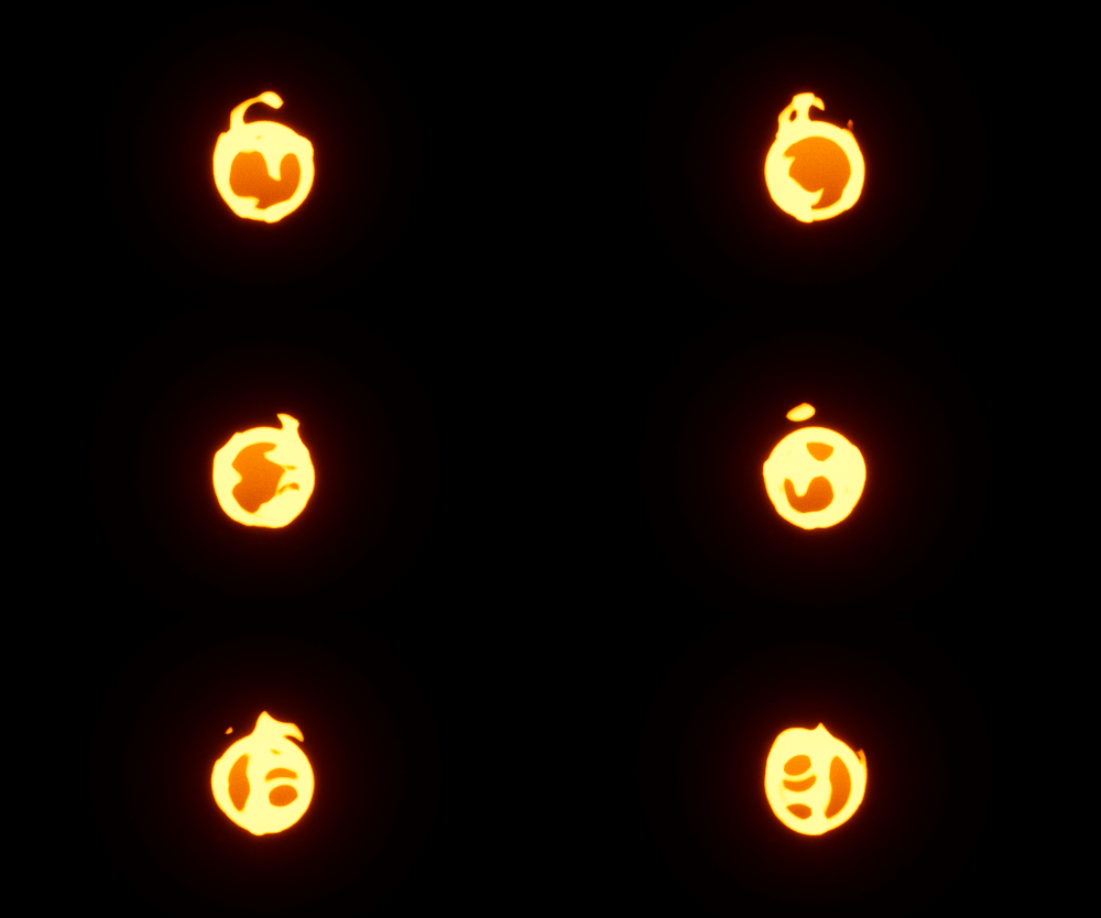
I had a thought: what could be more magical than a living screaming scared fire? So here it is.
Still just circles, no noises.
The background circle really lends a nice framing element to the whole thing in my opinion. Love this so much ![]()
One thing I’d mention is maybe exploring adding some value range throughout the flame - my initial thought is it feels uniformly bright contrasted with the background.
Killer work ![]()
wow i’m not only who decided to make a character (you posted it while i was registering on the forum to post my blinking flame )
Did you just put mickey mouse on fire? ![]()
great idea to give it a face ![]() i wonder how it would look if it actually enjoys being on fire
i wonder how it would look if it actually enjoys being on fire ![]() like a little happy flame.
like a little happy flame. ![]() good job!
good job!
Thank you everyone for the kind words! =)
Here is an update:
Smoke, embers, face distortion, fire drops and spell circle were added.
Now I can say what it is - small scared fire demon trapped in a spell circle. =)
More or less I am considering this done. In next updates will be breakdowns.
Love it! The drips add so much! <3