Hey @TashNerd!
From the thumbnail image it looked pretty real to me! You’ve got a good starting point here.
What I would suggest is to play with the speed. I think the flames might look cooler if they rise faster.
Also, keep in mind that the smaller the fire, the less detail it tends to have, as air and temperature won’t affect the flames in the same way. Compare the flame of a candle with the fire coming out of an olympic torch. Even the colors change!
Lastly, maybe darken the smoke and let those embers glow just a ted bit.
Have a great day!
Hey @Lush,
thanks for the feedback - it’s much appreciated!
Yeah, the speed was bugging me a bit! Would you suggest having bits of the flames break off at the top of the fire if it was sped up or just fade? (Hope that makes sense)
Ahh cool! I’ll need to check out more references. Fantastic, thank you!
Sorry, one last thing as well - Is the refraction at the right amount? I have a feeling it’s maybe a bit to strong.
Thanks again, you too!
Hi @TashNerd!
Looks pretty overall. Small suggestion: I think it’s too noticable how the flames popping out from nowhere at the bottom. Try to smooth them out a bit i think, cuz now you can clearly see the edge of the particles.
Yes! The heat haze looks fine to me.
If you want to go even further, you could try to create a noisy texure for the refraction too, as I believe that hot air around the campfire behaves like a “secondary invisible flame”. But that is just personal preference, and I’m assuming the effect is going to be seen on a PC build and not on mobile.
Finally updated the fire effect based on the feedback I was given. There is still refraction, although it’s so subtle it isn’t really showing up. I feel the overall shape of the flames is much better as well as the speed and colour!
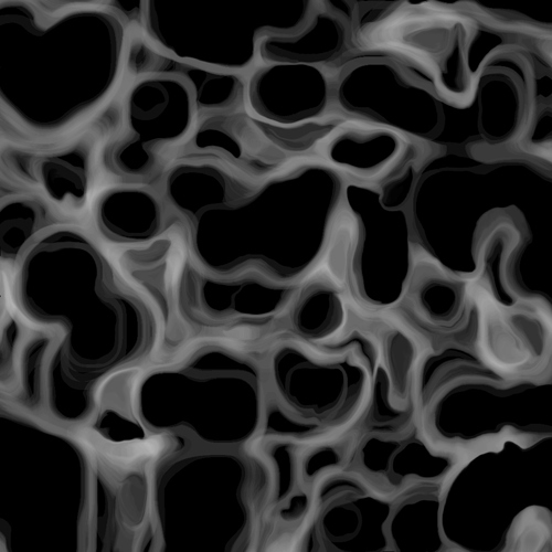
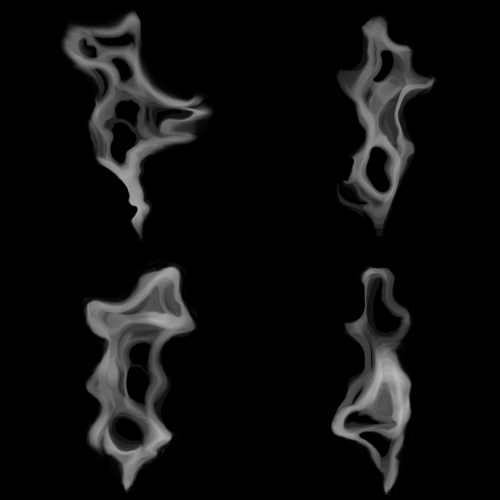
I’ve been working on a wispy smoke effect recently (think cigarette/cigar smoke). I started off by creating the texture in photoshop…it looks handpainted but it’s not! I just fiddled around with different filters and settings and then laid bits out to create a texture for a SubUV
Next, I made the material in UE4, heavily referencing this super handy tutorial by Russell: VFX Basics - Creating the scrolling texture with mask setup
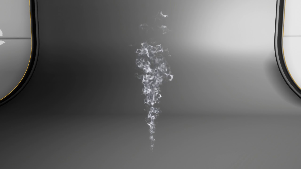
First pass is done, but as always I would love feedback, as the particle is not quite behaving how it should be!