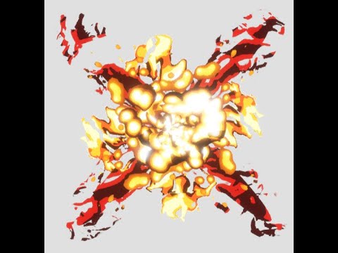
Here is the 2nd of the 2 hit-sparks that I have been working on for the past 2 months, this one has an explosion with explosive pillars coming out at the sides. I’m proud of this one, but I also want this to be the best it can be, any feedback would be greatly appreciated 

Here is a video of the hitspark in action, and also shows it in slow motion too: https://youtu.be/GaSWZ3WkrTY
2 Likes
This is overall looking really awesome!
It’s got some fantastic punchy timing to it, giving it some real satisfaction! I really like how you have the white flash, into the black flash, into the ramp down timing of the rest of the elements, it’s giving it great depth to the timing. I also like how you have different directions in the motion, with the cross pieces shooting straight out, it feels really cool.
I do think you could fade out the ending a little more, with the middle part fading to black and fading out in opacity, at the moment it kind of clips off at the end.
You also have a nice range of hues in there, from white through yellow to orange and red, which is giving a lot of depth to your colours as well.
The main way that I think this piece could be improved would be through the shapes. Right now overall the shapes are feeling a little noisy, with a high frequency of detail over all of the effect. The other ring that spins out at the end particularly has a lot of noisy shapes in it, and the high contrast between the black and white parts of that element mean you see the shapes very clearly.
I think if you reduced the frequency of the detail in one of the elements, or changed it so that one of them only showed a narrower value range (e.g. changing the outer ring so it was only orange/red, instead of the full range of white thru orange to black) it would help to define what are you primary and secondary elements of this effect.
Here’s a quick paintover illustrating what I mean. By reducing the contrast in the outer ring, there’s a clearer hierarchy of the elements. Additionally, I think it would be cool to get some fiery shapes into that ring element, and simplify the detail in that element. You can do this by using an erosion map with fiery detail drawn into it in stages
1 Like
Thank you so much for the feedback! I will make some time to revise my work while I work on other portfolio pieces. The fire ring and explosion core were made entirely with shaders and a few textures, so i’m not exactly sure how the erosion map will be implemented while maintaining the coloured outlines. Maybe if I changed the fire texture’s scale and not use 4 way panning it will create some clearer fiery shapes. I really appreciate the comments and will update this post once i’m done modifying the explosion.
1 Like
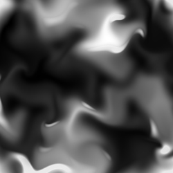
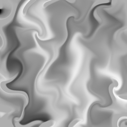
Hello! I finally got around to making a version 2 of this project, taking in the feedback you gave me! The main issue with my previous fire ring that made it so visually cluttered was that I used a lot of 4 way chaos nodes to try and make a complex shape. My original noise was also stringy and did not have distinguishable shapes. Heres a comparison of the 2 textures (left is new, right is old)
Another issue I had with my previous fire ring shader was that I tried to make the ring pan out by flooring the noisy texture and using maths to make a ring. I avoided having to do such thing this time by moving the fire effect to the back of the system which looks a lot cleaner and compliments the explosion rather than obscuring it.
TLDR I made a new and more simple fire shader using a new texture, and modified the timing and scale on my particle system. Again thank you so much for the feedback!
1 Like
![]()


