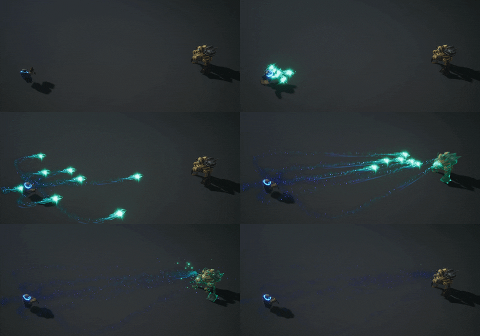
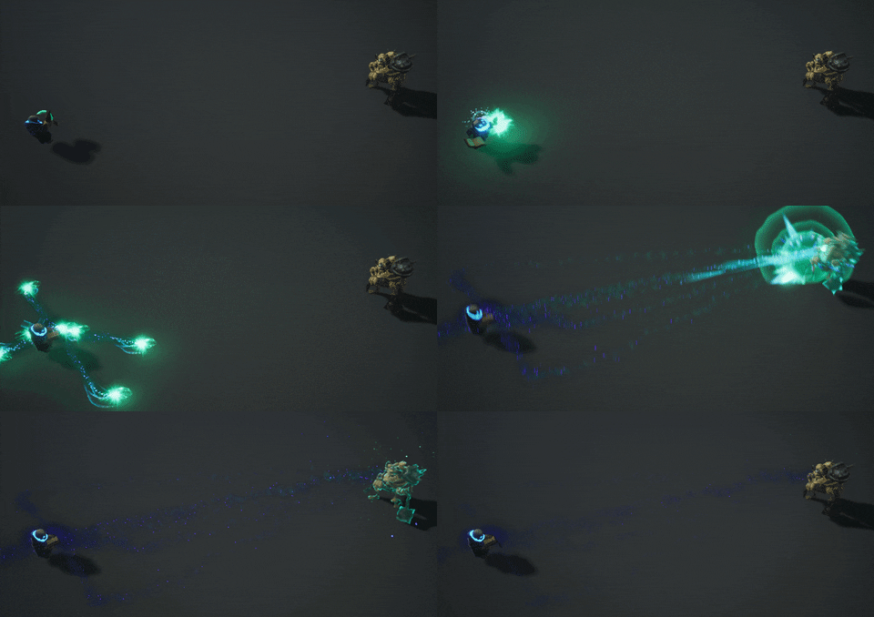
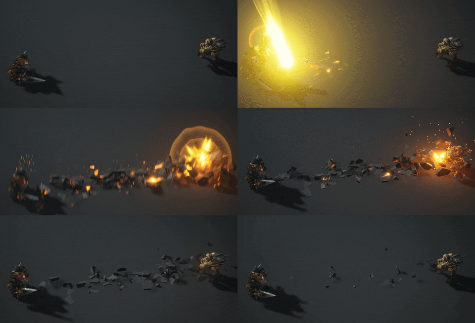
These are pretty pleasing to look at over and over.
Hey, Pamar! I’m not sure if someone suggested this yet, but having this start fast and slow down would look really awesome, I think!
Hey Thanks ! do you mean, initial burst should take longer in terms of appearance? or you mean animation weighting?
Oh sorry! I meant after the orb appears. Right now it’s going in a linear motion. If you had it start moving across the screen faster and end slower, that’d be cool. It’d also give the player enough reaction time to get out of the way as this effect looks like it’d deal massive damage ![]()
gotcha. Will give it a go. Thanks ![]() I got confused as bit I thought initially you’re talking about my latest gif which are loot drops but then realised you replied to my previous gif
I got confused as bit I thought initially you’re talking about my latest gif which are loot drops but then realised you replied to my previous gif ![]() Thanks!
Thanks!
Yeah, the reply thing is weird on the board sometimes. If you look in the top right of my reply, you can click on the little arrow next to my name to see what I was replying to ![]()
haha that’s exactly what I did after you mentioned ORB ![]() Thanks for the feedback I will try to add a bit more weighting on the animation to see if it will help the motion a bit. Once this is done I will tag you, hope you dont mind.
Thanks for the feedback I will try to add a bit more weighting on the animation to see if it will help the motion a bit. Once this is done I will tag you, hope you dont mind.
This is awesome. I can almost feel how much this effect hurts based on how slow it is! ![]()
thanks! I think at some point I will have to record video of it, as gifs are not the same quality of what I can see in the engine.
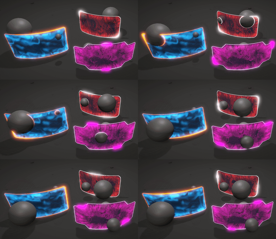
I’ve started working on shaders and trying to bring my barrier shader into unity with some additional functionality here are results, I plan to expand the shield mesh to more complicated meshes, curved ones and maybe some more sci fi looking barriers. Feedback appreciated.

great stuff! Some very cool exercises you have there
wow this is superb <3
This looks so awesome! I’m going to try making a shield effect like this next. When I get the time…
give it a go, I find it fun to make. Be Careful with the shaders I find it addictive ![]()
OK! I’ve started experimenting with different shapes and adding bit more variety by tweaking values in the shader and trying to achieve “nice” look with different textures
Great work man! And you didn’t even use the typical hexagon grid haha
The blue-orange one still my favourite, but I love the shape of the pink one.
Maybe the running lights in the silhouettes should be more subtle, like in the blue shield imo
Really cool Pawel!
Yeah that’s true, Thanks Ferran! I’m still experimenting with shapes and shader variables. Might as well change the colour of the running lighting around, from pink to white to match the colour of the frame/outline.
As I’m trying to transition fully to Niagara and I’m hoping to start using it in the production environment, I’ll be posting some of my work while I’m trying to get a better understanding of the system.


