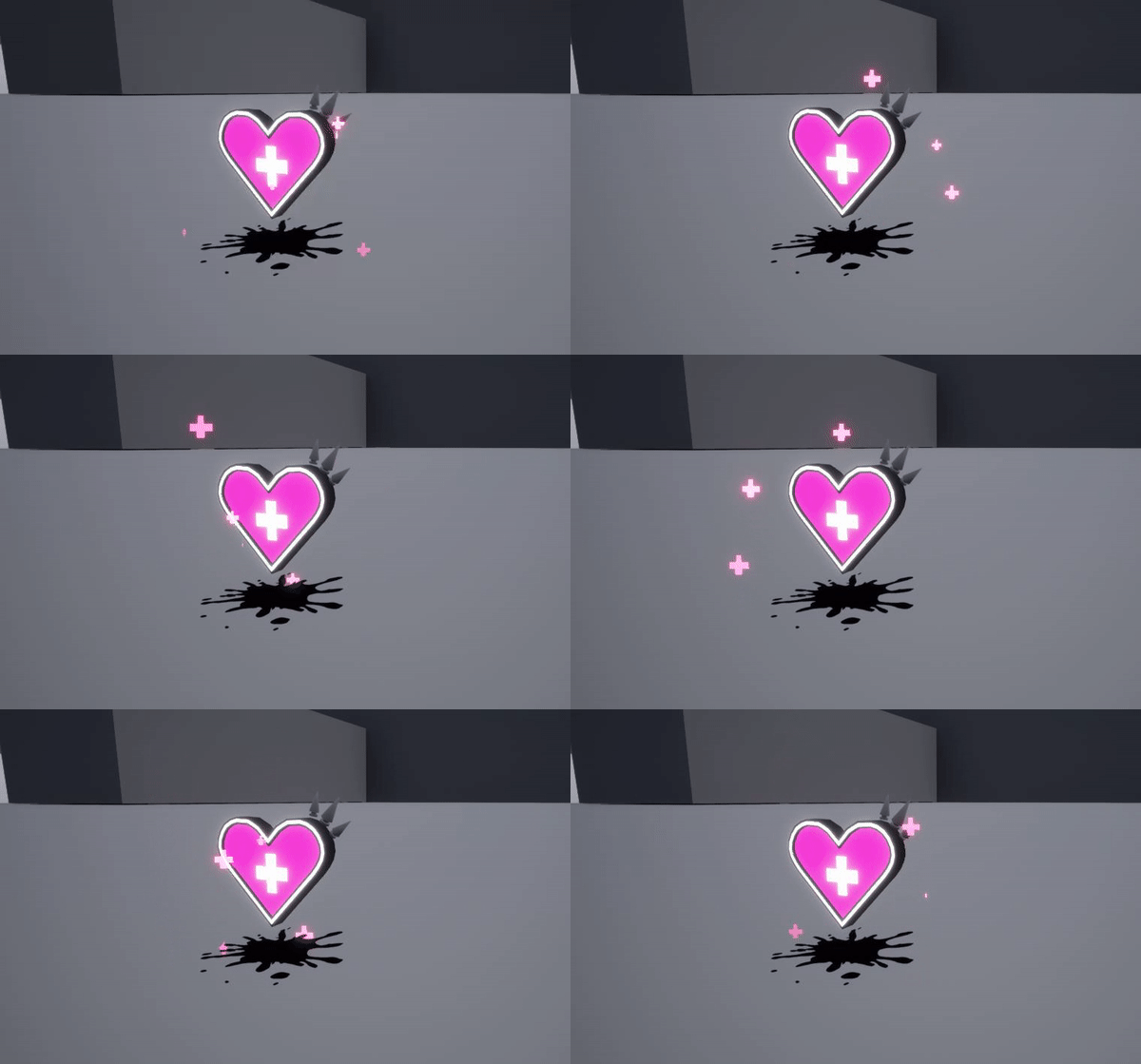
I am currently working on a health pick up for a game team I am helping.
Their theme is punk mixed with paint.

I would love some feedback!
I am having some difficulties keeping it edgy yet clear.
I am currently working on a health pick up for a game team I am helping.
Their theme is punk mixed with paint.

I would love some feedback!
I am having some difficulties keeping it edgy yet clear.
Hello,
I am having some difficulties keeping it edgy yet clear.
Are you talking about particles? That’s because they’re so small that the Temporal AA is decimating them.
You can try disabling temporarily to see if it works, but you’ll have to find other ways to fix this.
In the material settings, under Translucency, try enabling Responsive AA
You can also try changing the AA type to FXAA in the PostProcessVolume.
Regardless, I’d urge you to research this more and try a few things around.
On to the effect itself,
It’s cute, I like it!
The up and down motion on the pickup is a bit slow for my taste. Try adding some personality? Make it twist, spin, squash, stretch! Make it zoom around, anything to help it be more appealing.
The splash below looks out of place with the entire thing. Why is it there? Where are the particles coming from? Why are they pink but they’re seemingly coming from a black splat on the ground?
I’d try to think of ways to unify your elements together.
You can also try adding a single dynamic light to the pickup and do some shaderwork on it so perhaps the it slowly pulses?
Break the mold, try something new.
Thank you so much for all the feedback! I will def work on it! The paint over looks so awesome, gets me really pumped to work on this ![]()
Looks really fun as is! I think the crosses could be larger, but it’s hard to tell with no scale reference. Some really simple things you could do are a cone of light at the bottom or a beam of light in the center. Make the heart bounce up and down more and/or spin maybe? Add stuff to grab the players attention.