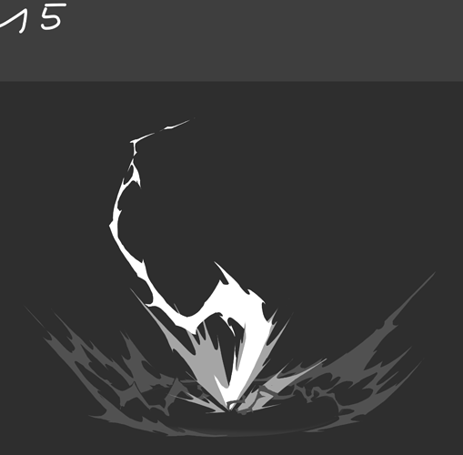
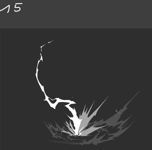
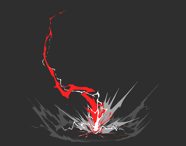
I always forget about posterize ![]()
Oh god, Simon you are on fire <3
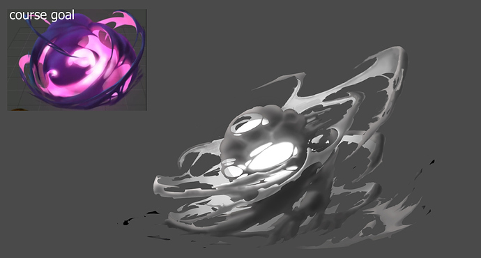
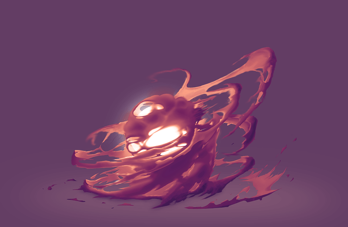
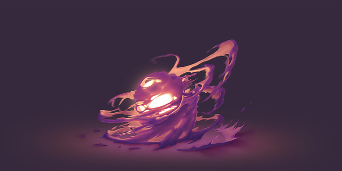
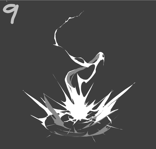
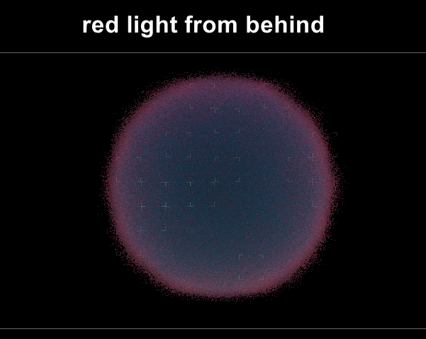
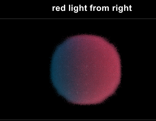
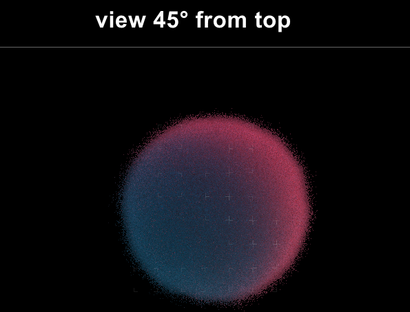
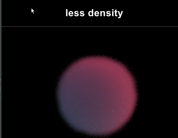
Small sub surface scattering test. I’ve started painting stuff like this but it might be wrong.

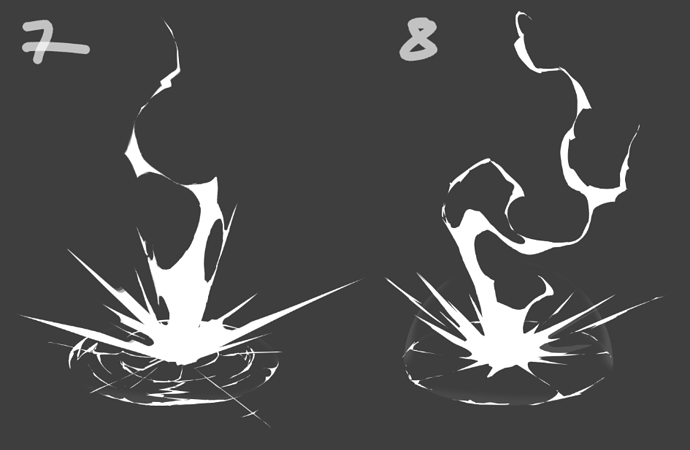
Quick check with Houdini. I think it’s clear now, that the smoke should only get brighter where it’s “thinner” and keeps being dark at the back (at least if the smoke fills a volume and is not “hollow”).
Beautiful! Would love to see that in motion ![]()
thank you! i guess my 3d version will be way simpler ![]()
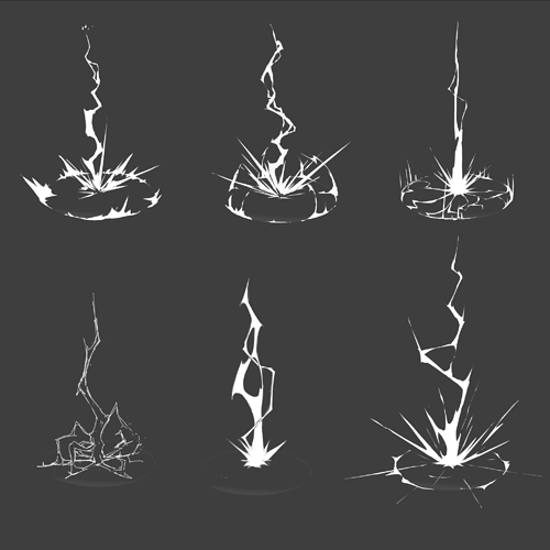
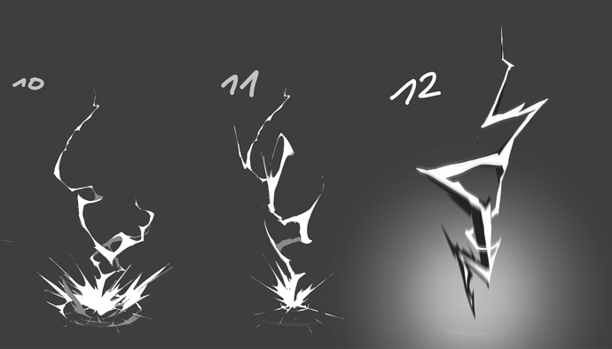
some new shapes. not sure what direction to take. 10/11 are almost a bit too smoky for me. 12 is not as interesting but resembles lightning better for me. hm…
As usual - good job) Love your dedication to the subject) There’s an awesome artist Adam Philips , i used to take his fx course long time ago ( BiteyCastle - BCAFX Course ) and there was a section relating lightings…some of the good tricks were :
- Chromatic abberations ( like a spectral aura ) on the sides of the lighting : it kinda adds a bit of volume to it
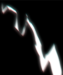
- Mass transitions : if effect lasts more then 1 frame, you may want to control it by adding a moving highlight , so that the viewer’s eye could track some kind of motion…kind of)
Screen capture - 13d63fb76598deb340008f50854a1b32 - Gyazo
wow, thank you for the tips! i’ll check this fx course! <3 (but i can’t find the free portion of the course, maybe it’s a bit hidden in the menus?)
Hm…you have to go to “FX Course” and then register there (https://bitey.com/dashboard/) once you’re done you’ll see those…or am i missing smth.Sorry, maybe i’ve forgotten smth…i actually found it back in 2013 or smth. , maybe it’s different nowadays.
Some good refs : https://youtu.be/C1HrcNgTDe4
for getting an account you have to pay first as far as i see it. you can ask for a remboursement of the money after the first month but i think that’s not cool ![]()
rough sketch. this time a bit less straight but also not too “smoky”. also i tried adding more different values.
The secondary lightning arc / strike is a very nice detail ![]()
![]()
Is the color intended to be the primary color of the effect or just for separating the layers in this preview?
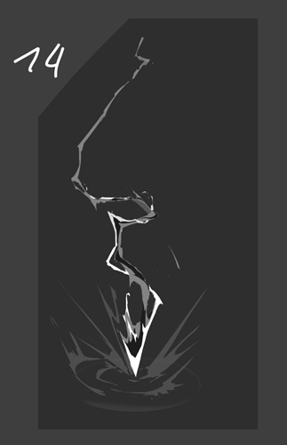
In image 12 and 14 I really like the contrast the dark parts introduced as well. In isolation like this I believe it enhances the effect nicely, maybe you could bring that back in?. However I see how too many brightness levels might make the effect harder to read if the effect would be placed in a scene with 20 other things going on.
