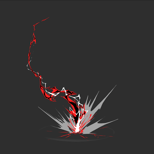
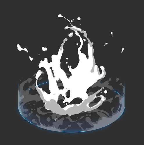
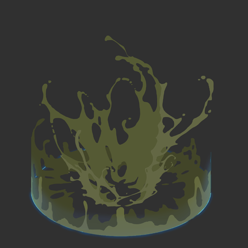
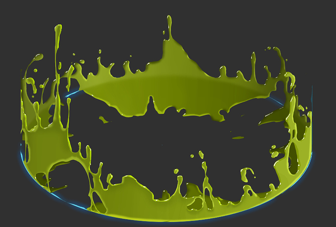
cleaned shapes + first black shapes added
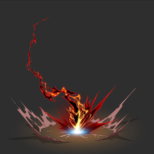
first tests with color. decided to make the outer ring dust because it was taken to much attention away from the lightning/impact.
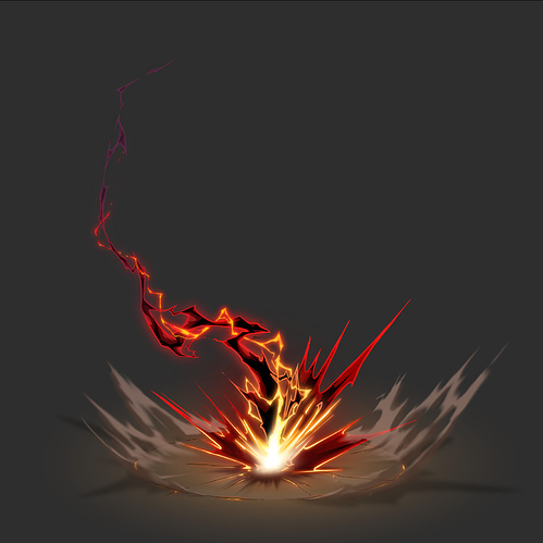
Really like how that bloom orange looks! And also how the shading in and around the grayish smoke makes it feel much more 3D.
Working for Marvel now eh? ![]()
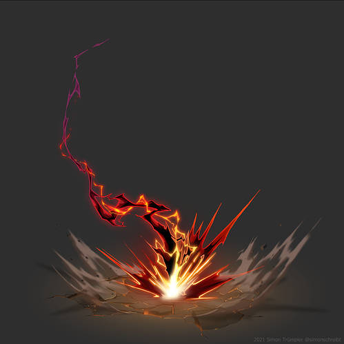
i’m calling it done! ![]()
- added small debris, reworked ground impact, raised the brightness of the upper lightning
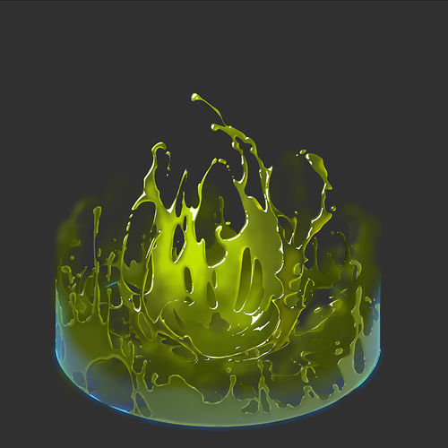
Started with the first rough idea for the AOE slime. I thought about putting a magical shield to the bottom to add a nice blue tint and explain why the liquid is doesn’t like to go further. A bit like my “shielded explosion” but this time within cylinder instead of a sphere.
New version: my idea:
- a slime puddle appears
- out of this puddle raises a slime blob
- the blob explodes and pushes the puddle in nova shape toward the shield
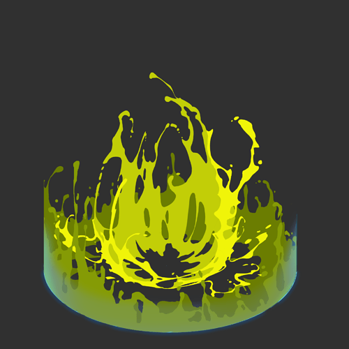
- refined slime-Nova shapes (added some more holes to take away a bit of the mass)
- also did first shading test
So hot so hot, simon
wow ive been following these as you post them in the dcord so its really awesome to see them all compiled together like this! Lovely work dude!
Gloopy! love it dude. ![]()
hey simon love your work and this thread
may i suggest fudging the gradient to account for simultaneous contrast? perhaps by using
- height based shadowing – to add depth for the eye and illusion of self-shadow
- top facing normals / top texture ability to diffuse light – illusion of subsurface for translucency
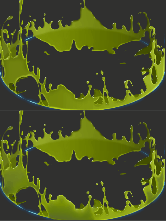
Hi, thank you for taking the time to write feedback and even do an overpaint! ![]()
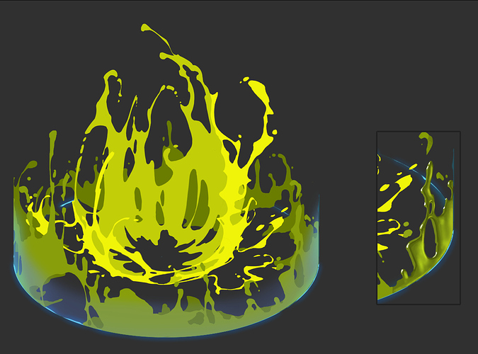
I also thought about a height based shadow but I’m careful to not have it appear too solid/opaque. What I noticed for example: Slime is usually brighter where it is thinner and I imagine those areas, which are in shadow in your painting, stay a bit brighter (see image), but I’ll play around with that!
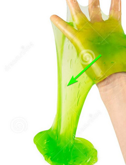
top facing normals / top texture ability to diffuse light – illusion of subsurface for translucency
I’m not sure if I understand the second point.
Thanks for your feedback!
My interpretation was wrong, i had made contextual illusions for liquid soap on the scale of a bath tub getting hit by an anvil; The suggestions are inapplicable relative to gelatinous material.
pretty much ignore anything I suggested.
this Slime has characteristics of foam, trapped air bubbles become an overwhelming light scatter property contextual to
- White background – no longer occluded as it thins out.
- relative foaming* - significantly scatters light as the bubbles can’t quickly escape while material thins
- (wont even go into the reflectance complexity as it has a lot to do with our eye/perceptions inability to perceive linear brightness)
(*this is similar to stretching plastic and how it brightens as the molecular cohesion turns a smooth surface into a coarse skin)
It’s a much more sophisticated material to reproduce in various contexts, sizes, lighting and background from a technical light logic/PBR standpoint; the density/stretching of trapped micro-bubbles and air pockets dramatically overtakes translucency.
@Torbach thanks for the additional feedback! <3
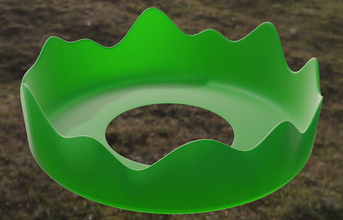
Inmediate update: did a small blender rendering to check where we see diffuse, translucency and spec color.
