My first and broadest bit of feedback that applies to all your effects are your colors. I can’t tell what the rules are for the blue and the yellow.
- Your first effect your character uses yellow magic that transitions to blue that builds up to a giant yellow sword that slams into the ground with a yellow shockwave that then spawns a continuous blue effect.
- Your second effect, your character has a yellow charge up, and a blue dragon spawns above him and looks like he’s breathing down yellow energy on him.
- The next bit his shield turns blue and emits blue energy that turns yellow.
- Prayer magic effect starts with objects that are both blue and yellow, launch up into the air with blue trails, and then land to make a blue prism effect that I can’t tell is damaging or protective.
Before making any non-realistic effect, think about what the rules are for the effects. Is this effect helpful or hurtful? What colors are you going to pick to convey that? Are those colors good representative choices? What kinds of shapes are you going to use? Are these elements consistent throughout all of your effects? I also noticed some outlines appear before the effects fire off. If these are something that a player will be using to determine the area of the effect (like in MOBAs) then I would recommend using a color that doesn’t match your effects (so a player doesn’t get confused if it’s part of the effect and it doesn’t get lost IN the effect itself). I would also get rid of the noise in the texture and give it a contrasting element so that it’s visible no matter what the texture is underneath it. Kinda like the 'ol “White text, black outline” thing.
That out of the way, lets get down to each effect.
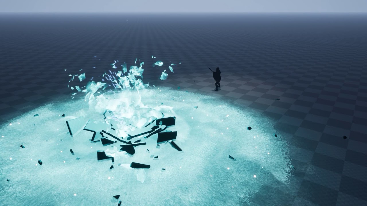
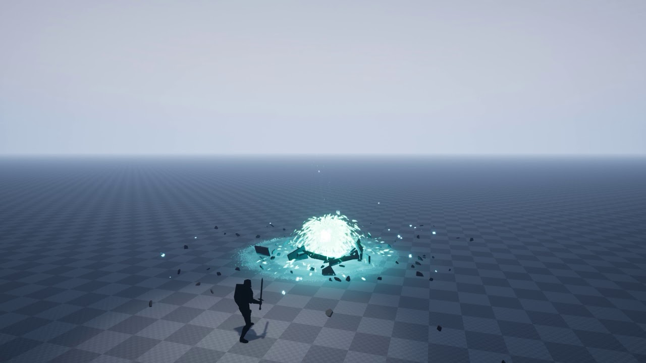
First one I like the concept for summoning the giant sword and your buildup to it slamming in the ground is good. The particles coming from the player’s sword and the energy on the ground moving towards the center build nice anticipation. Try and gradually work your giant sword up to that bright emissive it has right before it slams into the ground, the “pop” into that hot color is really noticeable. Maybe pull the sword up vertically just a tad right before it slams down; again helping with that anticipation. I can notice a seam in your texture on the left side. I’m not sure if you’re using a mesh to pan the texture or some UV tricks, but just double check to see if your texture tiles or if your mesh UVs are properly set. The debris is a really nice touch, and I like the shockwave’s material and quick lifetime. I think it’s great you transition into the second half of the effect with a quick twist of the sword, it gives it a lot more character! I’m still a bit confused with the blue color and how it ties in, but over all part two fits well with the first sword part. The textures all feel like they belong together, you have nice layering with all the different elements and it really gets that fountain feel across nicely. The waves dispersing from hot in the center to cooler and darker at the edges, as well as slowing down is great, and the lingering waves and little glow dots is a good final touch.
The second effect I like the energy waves at his feet and the buildup around him, it definitely feels like he is charging something up and has good layering of different shapes and elements. Back to the color stuff I mentioned above for the dragon, his (I’m guessing) breath attack and the character blocking it. I like the little bits and pieces bouncing of the player’s barrier the the energy forming the cool V-shaped shield at the end. The noticeable transition of the energy at his feet going towards him for the barrier, to away from him for the second half of the effect is a really good visual transition to offense. The color transition in the outward spheres from blue to yellow seems smooth. I think you might be able to get the sphere sizes to transition a little better from small to large, but I like the erode out at the end of their life.
Third effect I agree with @Rachel_Day that it’s your strongest piece. The sequence of the spell shapes appearing in the U-shaped formation, the mix of colors and interesting shapes, the secondary particles that play and linger when they spawn, the shapes rotating and pointing to the player, their slow secondary rotation after spawn, all of this is excellent! The color connection between their cores and the particles left behind when they launch up really ties and connects those elements and colors together like I was talking about in the first paragraph. There is now a relation between the yellow and blue, with yellow being the dominant color in the initial part of the effect while still tying together with the blue, and the blue trails helping convey that the color has a larger part to play than just an aesthetic choice for the core. I don’t think the spell triangle needs to “shoot” out from the character to it’s final position, I think you can have those initial triangles and symbol just fade in at that location and then do it’s rotation/lock on bit. Once again, awesome element transition from the yellow shapes it started with, to leaving behind the blue cores on the ground in a triangle shape. Maybe you could add some yellow particles on each impact so they feel like they are breaking and leaving the cores behind, instead of just really quickly fading out? I’d like to see that initial pyramid shape build from the base up to the peak, but I like the burst of the hot outer shell and how that material erodes away. Maybe have that outer shell linger just a bit longer and dissolve out just a bit slower. I like the triangle shapes spawning from the bottom to help give the pyramid structure, but I think if you keep those, have them go farther up the pyramid, if not all the way up to the top as they fade out. Lastly on that effect, don’t cut your reel so short on that note! I want to see some residual particles and ground scaring! I think how you left off the blue portion of the sword impact was the perfect duration and amount of lingering elements, I want to see that with your last effect!
Great stuff so far, you have some really good elements and demonstration of animation concepts in here. If you can get all that into each effect you’ll have a killer reel in no time! 

