Personal Progress FX - Chris Nordgren

The timing is so satisfying :slight_smile: Fun to watch!

@Sirhaian makes me happy to be there! :tada:

@difra I wouldnā€™t mind answering questions or anything. I might do a breakdown for portfolio purposes, but that might be in a while, I just need to shape up my portfolio so its in a level I feel justified :slight_smile:

@Ohadgfx For the bombs its a material hooked up into a animator component which is called on through a simple script! I animated the bomb inside Unity.

@Keyserito Thanks! I feel quite confident in these types of effects after reading all these comments. I need to start doing more non-impact things to challenge myself.

@ShannonBerke Thanks! More stuff incoming!

I wished I would finished up the look on the ā€œisometricā€-effects. I think they are in a state that they can be shown, but I would want them in another environment, something that is gonna happen later.

Currently Iā€™ve setup to do a match-3 mockup with effects, its a type of job I know I could a do a nice version of. I am gonna push out some art and effects about it for the coming days because of circumstances.

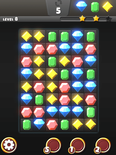
Here is a work-in-progress match 3 effect.

More UI, environments and more effects and powerups will be focused!

(occasional freelance jobs might also fall in here)

7 Likes

Love it all & that match 3 is fantastic!

@alex.underhill thanks! need to get back to match 3 asap. Been busy with non fx related things lately

Iā€™ve made some more sparks for Black Future, the particles spawn the same direction currently, engine issue that is gonna be fixed later. There can be more improvements done here but Iā€™ll take it into the next effect :slight_smile:

2 Likes

Oh my god ā€¦ loved all of them ā€¦ amazing timing, colors and style

@iNoob Thank you! more of that coming! :slight_smile:
But not right now:

I decided to approach to make a UI for the gem fx part. I knew it was gonna be hard. I know I can do a lot better when regarding to art direction.

I think working with UI is great and I could easily see myself working with UI that is interactive, but I mostly want to focus on the FX parts and play to my strengths for these pieces. I will probably have a minimized UI just for portfolio purposes.

I will be starting a new thread for the VFX sketch(Official VFX Sketch #2: Portal / Wisp - #6 by Elyaradine), but I will also post here because I intended to do it in similar style and it will possibly be part of the upcoming reel.

Iā€™ve been juggling daytime work, freelance work and this portfolio making, lot on my plate but I am sure I will make it :slight_smile:

1 Like

I would suggest to play with a different hue, or more ā€œhappyā€ colors for your UI. since the center is very colorful but the surrounds are mostly black/autumn brown-goldā€¦ over all I like it ^^

I appreciete the feedback @Ohadgfx. I think I will play it quite grey and non interfering because of the FX for these pieces thou :slight_smile:

Iā€™ve joined the VFX sketch-thing. Check out the thread here: Chris Nordgren: Sketch #2 WIP Wisp/Portal - #3 by ChrisNordgren

Here is the latest image:

(Imgur)

2 Likes

Just update on the healing effect. I donā€™t wanna go to overkill, its more of a minor nature heal.

Probably might take a little inspiration from Alexander Savchenko reel, I really like his buff effects.

10 Likes

For the gem board, Iā€™d recommending not having it so bright and saturated normally. By toning it down some, it gives you a bit more value and saturation range to play with for your effects when you want to be drawing focus to specific gems.

Yes I totally agree. I will look into not blooming the gems to much. Thank you for pointing it out

Here is some new exploadable objects:

24 Likes

Very nice ! What is your approach on the missiles path finding? The AI looks really neat and nicely randomized, I would love to check a breakdown or short tutorial on it ^^

Cheers,

The initial locator has randomized rotation values and pushes the rigidbody missile with AddForce.

The projectile uses
GameObject.Find(target)
transform.LookAt(target)

Adding force onto the missile speed against target, which also gets multiplied through time to add speed.

I hope this makes sense!

I might do a breakdown later on once I get the pieces up on a better portfolio-reel state :slight_smile:

5 Likes

wow. ā€¦ just wow ā€¦ look at those colors and impacts <3 loved it

1 Like

Nice way of thinking, I didnā€™t realize the cube rotate until you wrote it. Its now making sense , cool simple approach. Well done bro!

ey thanks @iNoob and @Ohadgfx

I got a bit inspired by @veer and his thread about sword attacks (WIP - Sword Slash Attack :) - #3 by veer)

So I went and made a simple one also, gonna see what I can conjure up later on

12 Likes

More experiments with the slash effects

8 Likes

I finally got around and made a reel for the latest effects I made

I am starting to get so much material I am not sure what I should include. I thought I wanted to use Ayablaze footage( http://i.imgur.com/fM2VMKV.gif). Because its much more of a collaborate effort. Iā€™ve excluded the gems, for now. I want to have more effects and possibly stronger UI elements.

Please if you have any feedback, comments or thoughts I am more than happy to hear them.

8 Likes

The slash effect is sooo pretty! This catches my eye and I canā€™t stop looking at it though:

maybe just fade it out before it gets to that point if it canā€™t be resolved.

Youā€™re stuff has a style of its own, I really dig it :slight_smile:

Youā€™re work is fantastic, as others have said your timing and use of colours is great. How you represent such clear shapes in such a small amount of timeā€¦ beautiful.

Iā€™ll likely be trying to recreate some of your effects here to get better at these aspects myself, assuming thatā€™s all good. Iā€™d love to know more about your process.

Keep up the excellent work friend :slight_smile: