Heya,
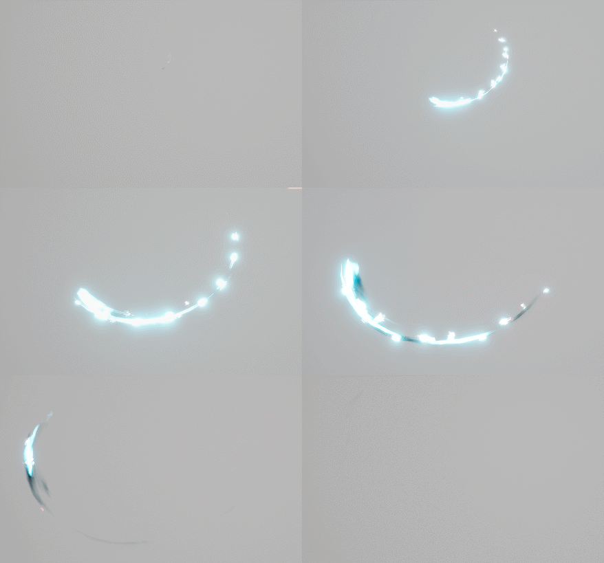
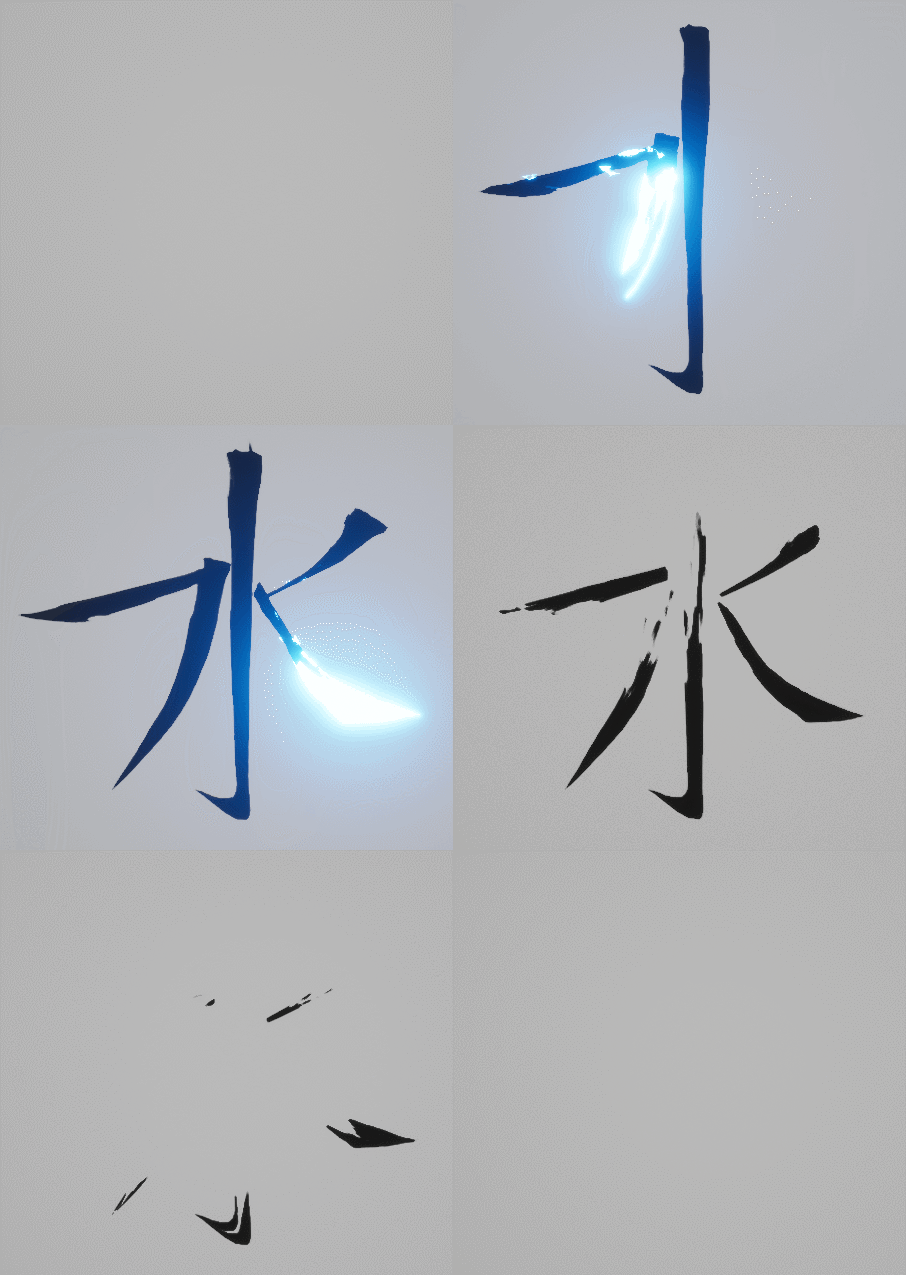
Trying to create some fun and interesting variations.
Latest gif:
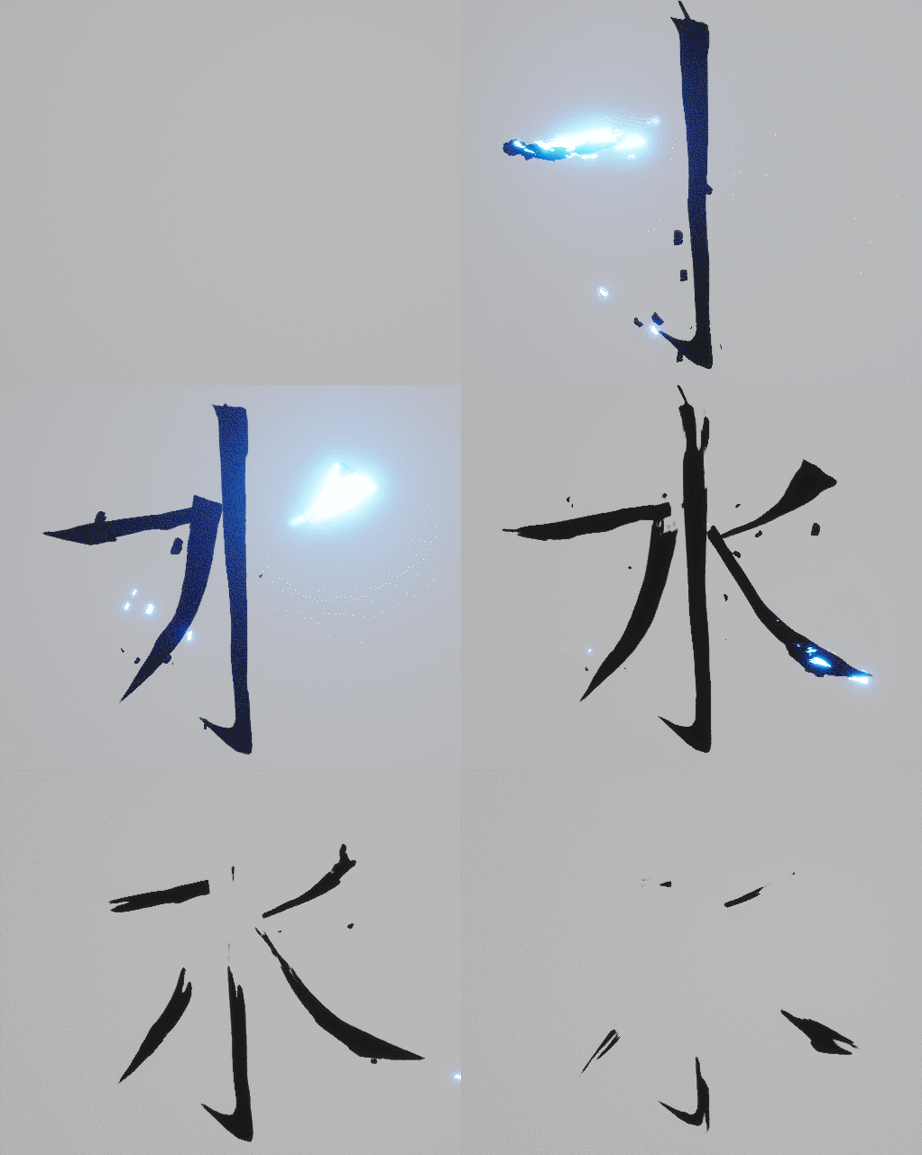
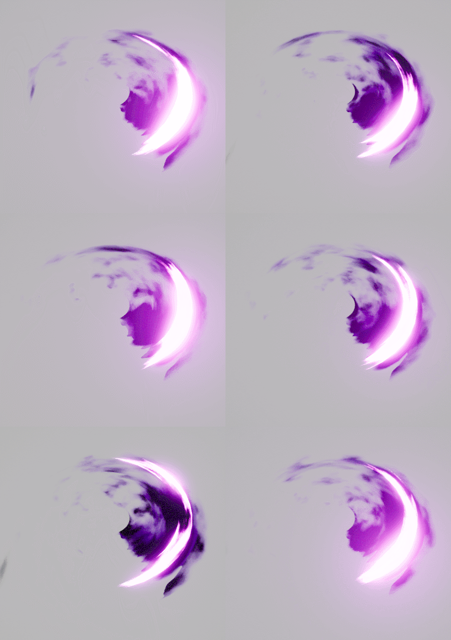
Quick itterations on the silhouettes above.
If you like me wonder what it looks like if you stack them
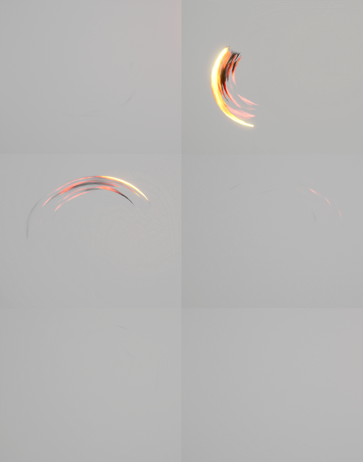
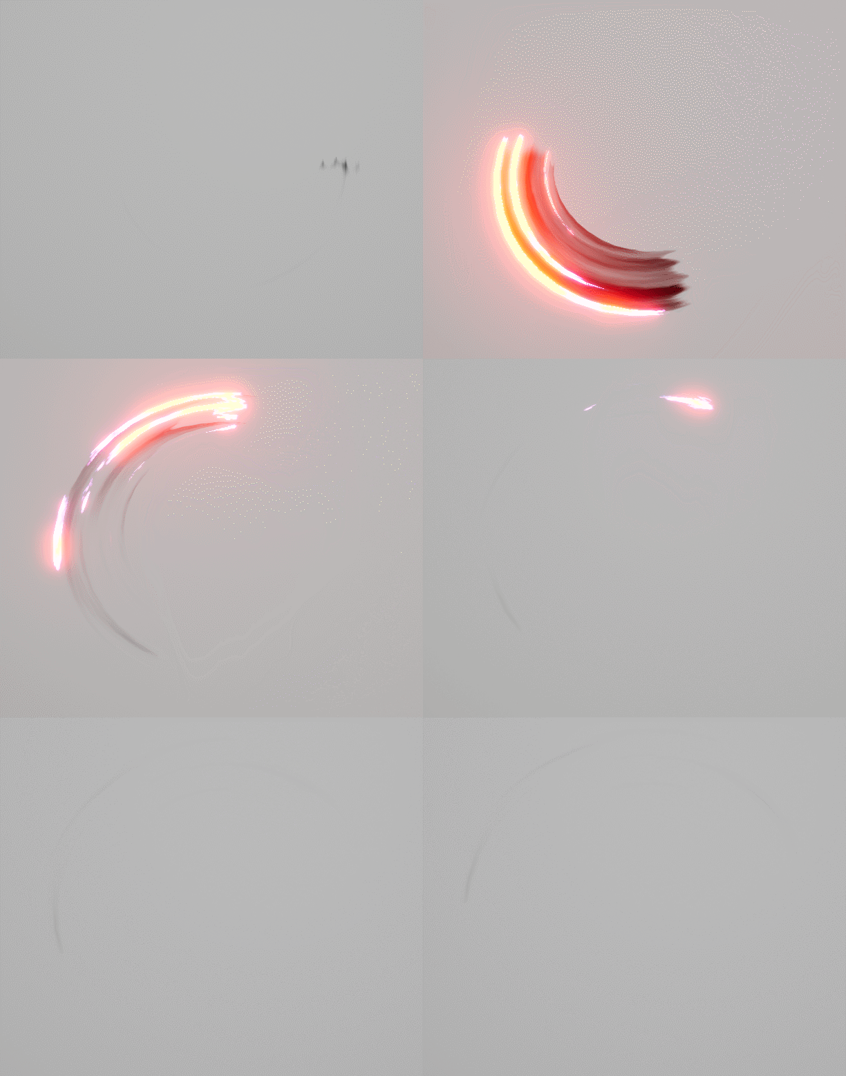
And one with fire, for the fun
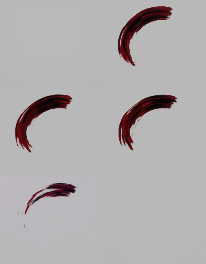
i dig the painterlly feel with that red slash, makes me think of some b/w graphic comic animated with touches of color reserved for emphasis
Very small update, more incoming soon ish
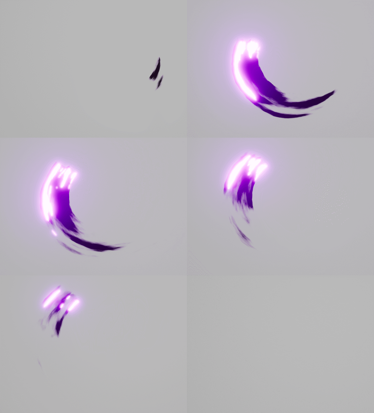
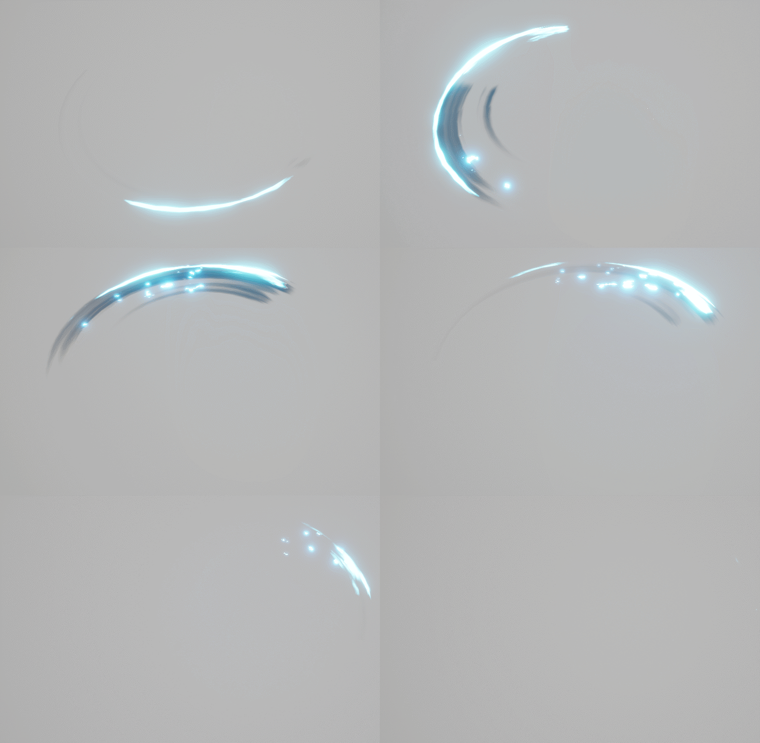
Two more variations :
Hey, very nice effect !
Could you detail how your masks are working in your shader ? I would also like to see a gif with the wireframe : i’m not sure how you made your uvs !
Also, is the bloom adding a lot to your effect ? I mean, would it be cool enought without ?
This looks great! Really nice work.
@Torbach Very similar in style, but with a painting animation, tought it could be cool ![]()
UV layout and textures look like this.
The shader just multiplies the scrolling stretched noise with one of the masks,
Then colour and opacity are just lerps using the generated gradient mask.
Bloom is adding quite a lot in this specific instance, but there are ways to achieve very similar looks without using unreals build in bloom.
How do you get the movement in these?
Like one nice swing like in the Painted example (last one), where it slows down at the end.
I get the general idea of a sword slash, but the motion for it, is still buggin me.
My approach uses layers of motion to make it interesting.
I hope that helps ![]()
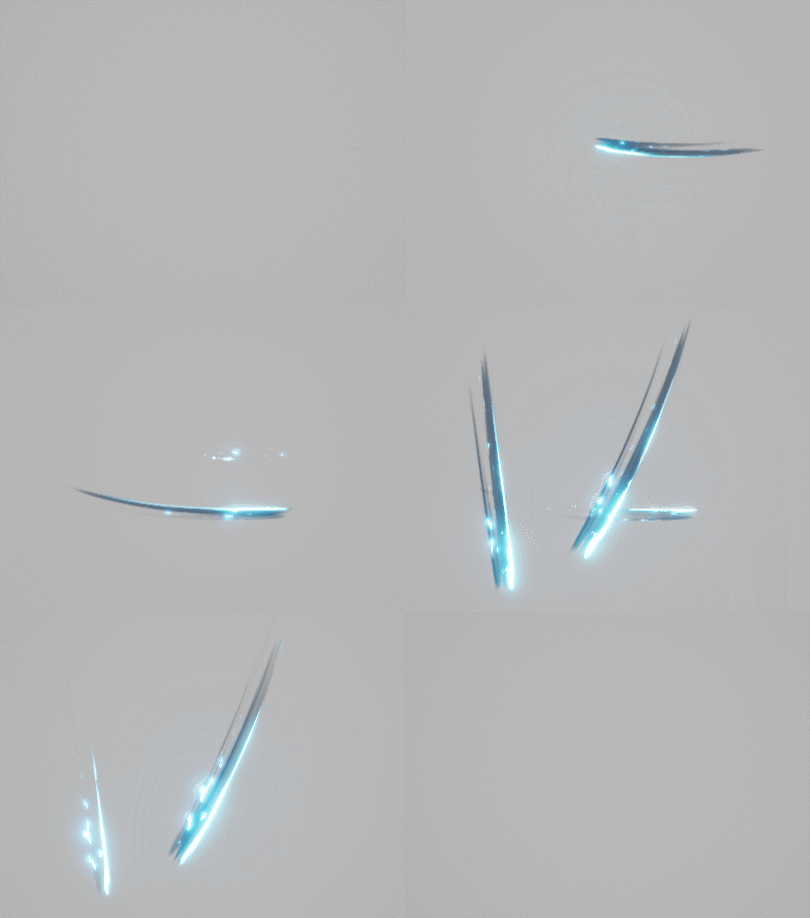
Progress is slow, but heres something to look at
These are really beautiful and inspiring!
