Thank you, I’m happy you like it! To be honest at first I wasn’t sure if they are good enough to share ![]()
Taurus - VFX for a 2D Illustration
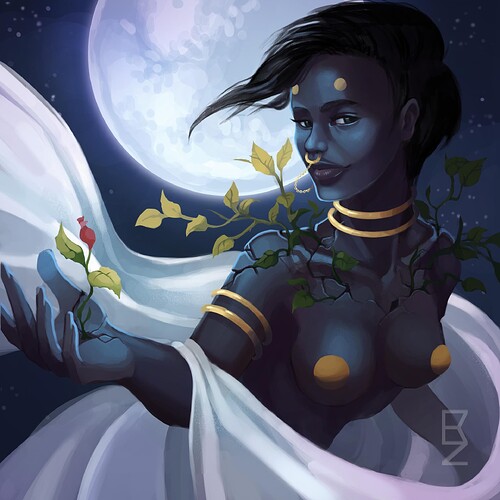
It’s time to reveal my new artwork upgrade - say hi to Taurus!
Taurus animated version (for uncensored version click here)
.
Taurus original illustration (for uncensored version click here)
The illustration was done by Verena Demel (instagram, portfolio). Everything else was done by me, mostly in Unity.
Here are some insights into the project:
I tried out a rather unconventional workflow by projecting the illustration onto a human 3D model with the same pose in Maya to be able to animate the body. In Maya I used a camera with perspective first, but I couldn’t get the same exact camera settings in Unity, so I had to use a orthographic camera setup and therefore I not only posed but distorted the 3D model to compensate the missing perspective distortion. And I had to do this step twice, because I didn’t deactivate the Segment Scale Compensate attribute of the joints in my first go what led to unwanted distortions in Unity ![]()
I got the illustration from Verena as a well organized (or kinda organized) PSD and I exported as many separate layers as I needed and imported them as sprites in Unity. So except for the body and the effects everything consists of sprites.
http://imgur.com/dFNQgoT
For the moving hair, the veil and leaves on the shoulders I used a refraction shader with a mask, as I already did in my last artwork upgrade. For the veil I also used a cloth simulation, because it needed to sit in the crook of the arm while the arm is moving. The plants effects were made with particles using Unity’s new trail module and several sub emitters with one using the new light module - I used these two modules for the first time and it’s impressive what you can achieve with them! For the tendril trail particles I enabled world collision, used geometric colliders for the hand and the arm and two wind zones to attract the particles to the palm.
http://imgur.com/CHG5EkS
The Unity scene isn’t optimized because the performance wasn’t important for the sole purpose of this artwork upgrade.
Finishing this project took way longer than expected. It was fun to upgrade Taurus and I learned a lot …but I think I’ll go for smaller VFX projects from now on ![]() I know about tools like Spine for 2D animation (and I probably going to try it next time) but I wanted to see how far I can get with my approach.
I know about tools like Spine for 2D animation (and I probably going to try it next time) but I wanted to see how far I can get with my approach.
I’d really appreciate your feedback!
Oh and I didn’t find out anything about the content guidelines here on RTVFX, so I hope the degree of nudity in this post is alright.
Wow, it’s been 1696 days since I last posted something in here ![]() But I’m finally coming back from being a lurker to actively taking part in this community
But I’m finally coming back from being a lurker to actively taking part in this community ![]() I’ll post a VFX round-up of my previous long term project Weaving Tides eventually, but today I want to show you this ↓
I’ll post a VFX round-up of my previous long term project Weaving Tides eventually, but today I want to show you this ↓
Beam VFX Study
My newest portfolio piece - so happy about how it turned out! ![]()
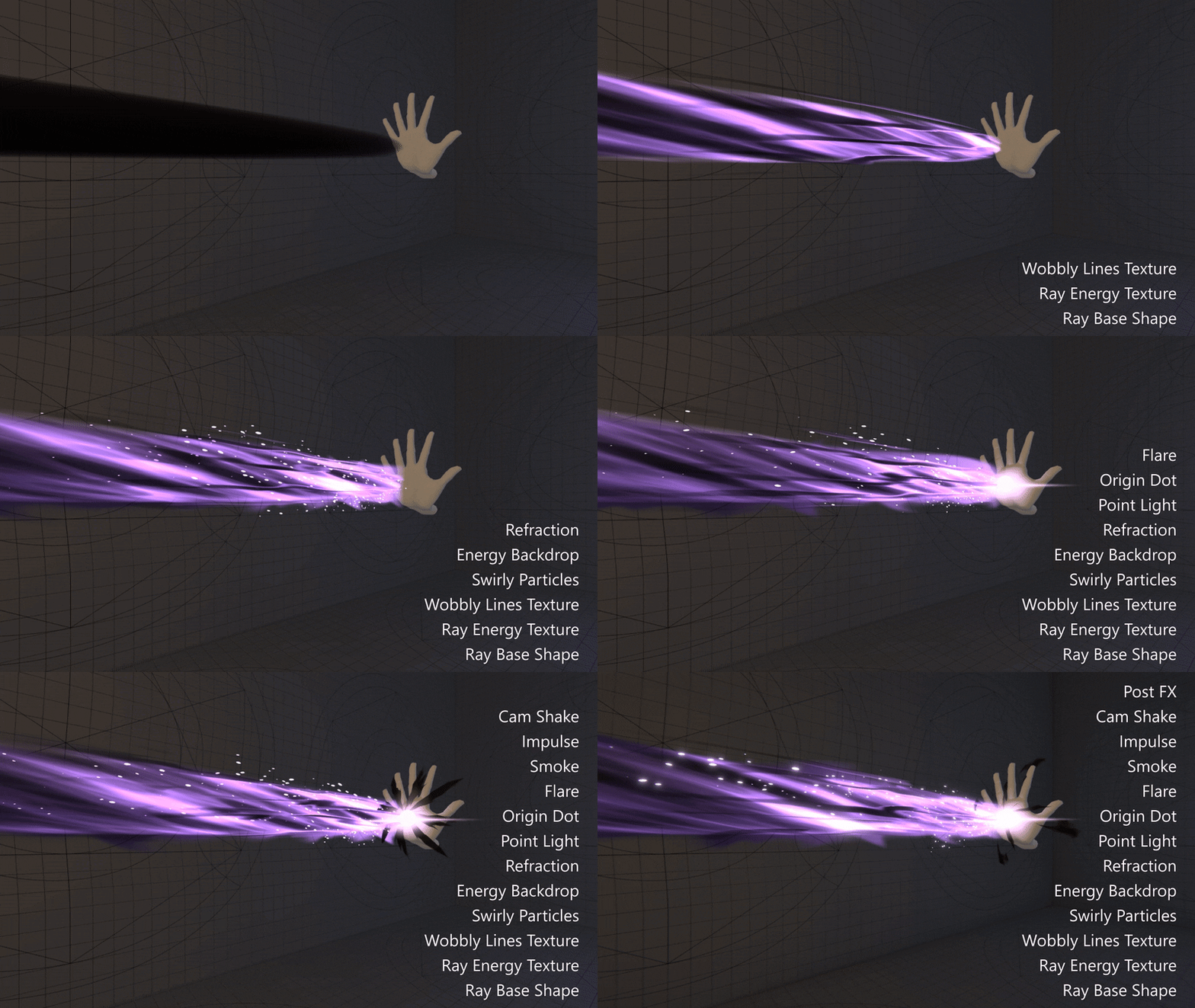
My goal was to create three beam VFX in quick succession which increase in their power level and use different technical approaches.
I created this short clip over the course of a week. Inspirations were a laser tutorial from Gabriel Aguiar and a void projectile piece from Matias Mahler.
After finishing the beam VFX I named them “Guiding Bolt”, “Lightning Bolt” and “Disintegrate” just to have something catchy for Twitter ![]()
For this piece I also created my new VFX test chamber environment, just to make things a little more interesting. Animating the hand was a lot of fun too ![]()
![]()
![]() (← yes, I animated this last pose too, I didn’t decide what VFX I will use it for yet).
(← yes, I animated this last pose too, I didn’t decide what VFX I will use it for yet).
I’m thinking about doing a ray of fire and a water beam next, before I move on to the next thing. ![]()
![]()
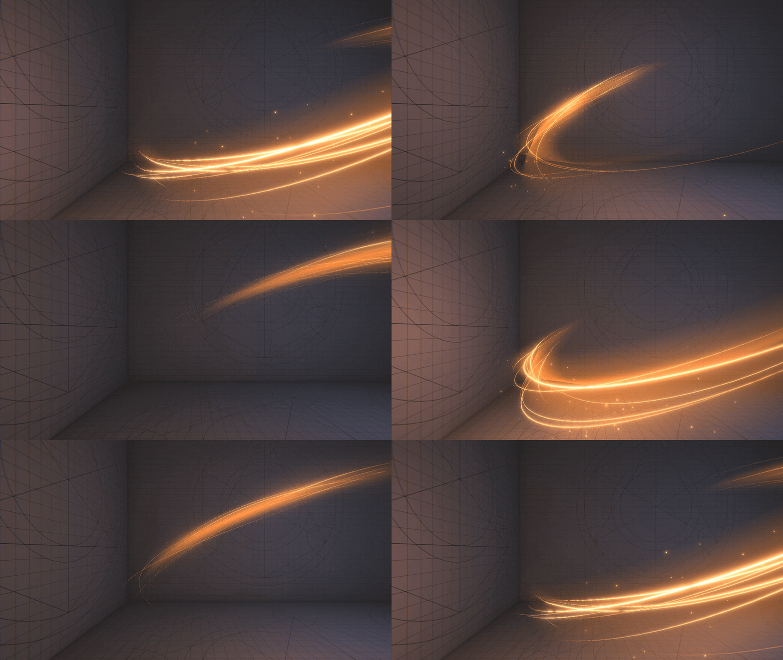
A relaxing light swoosh sketch from last night ![]()
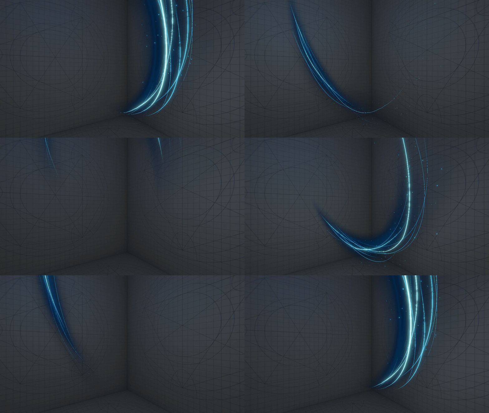
Mostly a pretty simple effect. I did some color explorations and stumbled across this ghostly look, which I think is really neat:
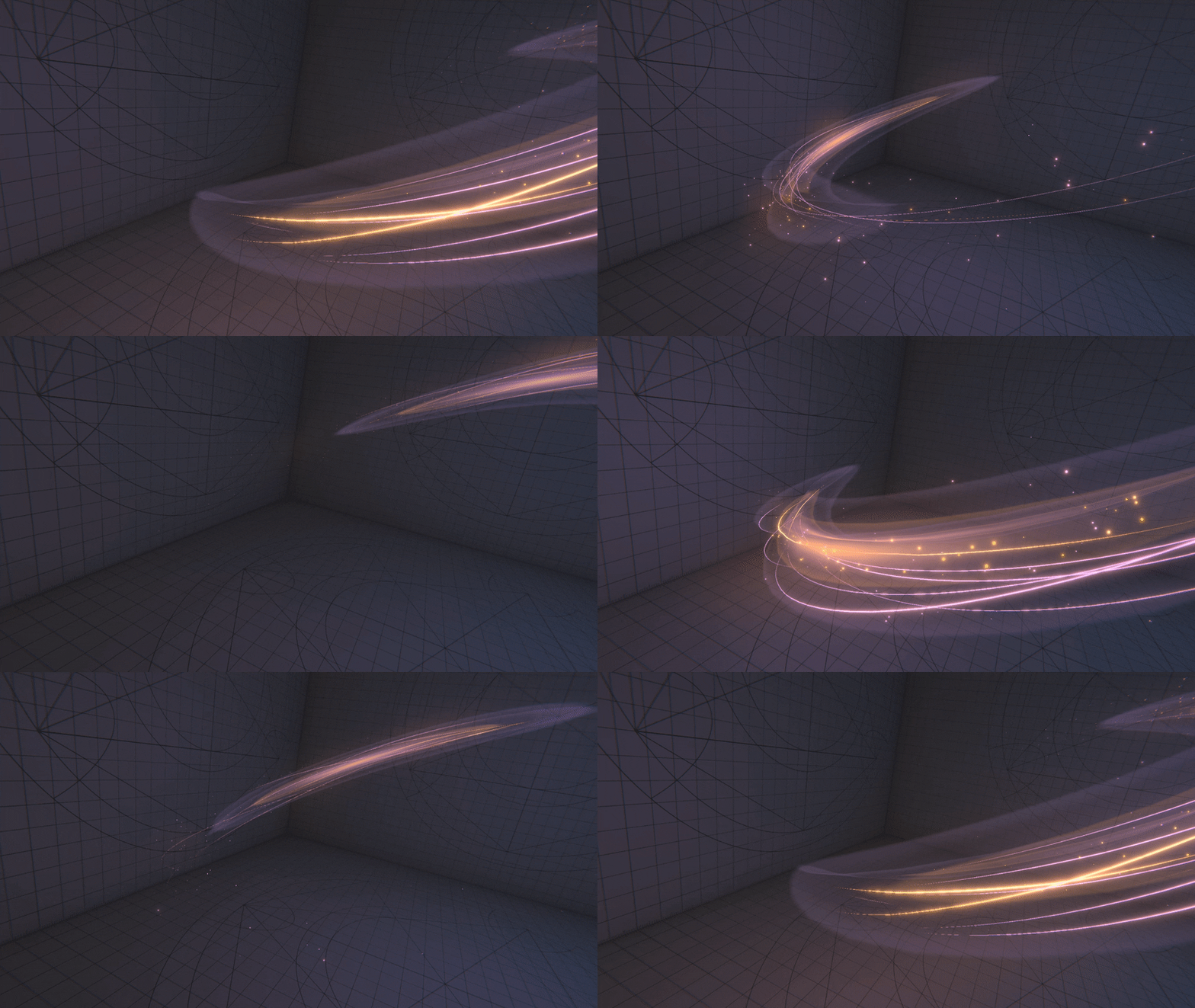
Very nice! I especially like the middle one. I saw the post talking about best practices for soft trails, but wasn’t clear which approach you ended up going with for this effect.
Thank you Nick, happy you like it!
Ah, sorry that it wasn’t very clear, I’ll quickly edit my post - thx for pointing it out.
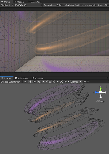
I used the approach with just simple cones that are intersection each other. For the middle one I even used 4 cones (not very sophisticated, but it looks nice ![]() ). Here is what they look like if I put them next to each other:
). Here is what they look like if I put them next to each other:
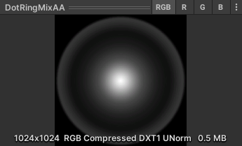
And here’s the texture I used for the middle one, which gives it the ghostly look:
I loved the second and the third one <3 <3
How did you do the thin white lines? Are those simple Trails or they are also projected on the cones?
I spotted the artifact/hard edge on the first one, but didn’t see any on the second and third. Did you use a different technique on those last 2 or maybe it’s not as noticeable as in the first one due to its POV?
Thank you! ![]()
Yes, the white lines are just simple particle trails with a emissive material in combination with a bloom post effect.
And yeah, the technical setup for all three versions is identical, so the hard edge is not as noticeable, also because of the white lines.
Working on an ice spell and really happy how it’s coming along.
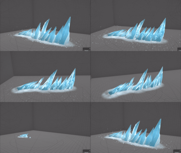
Next steps:
- frost effects on the ground
- snowflakes along shards directions
- steam eminating from shards (not sure yet which approach might be best for this
 )
) - smaller shards alongside the path
- more shard mesh variations
- maybe improve shards shader (It’s an experimental setup that uses object space view dir for texture offset. Currently has no refraction, so it looks a bit like plastic.)
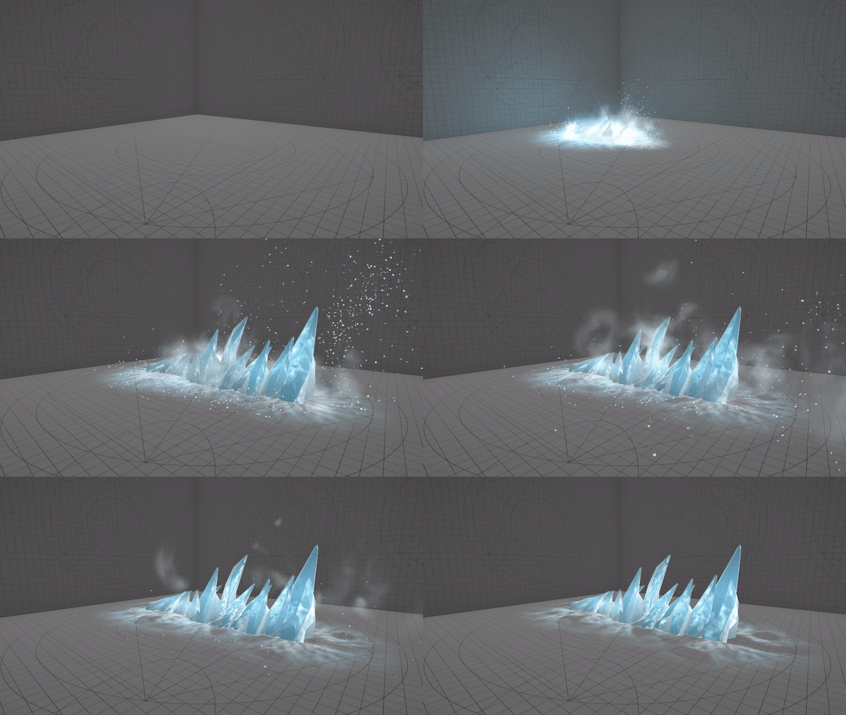
Progress update on the ice spell:
Further things I’d like to improve:
- custom texture for dissolve of frost effect on the ground
- maybe smaller shards alongside the path or thick fog around the shards
- maybe a light ray on shard spawn instead of light flares
- maybe make shards glow for half a second after spawn
I think I’m almost done with the ice spell! I’d love to hear your feedback and suggestions on what I could still improve ![]()
My notes on this state:
- I’ll probably animate the subtle voronoi noise pattern on the ice decals on the ground to match the look of the animated texture on the shards a bit more.
- I temporarily disabled the point light and the flash, maybe it’s better without them? They added this explosive feeling, but at the same time it looks like the shards are teleported here instead of emerging from the ground.
 Maybe I give it just a soft glow on spawn instead of something flashy.
 - Maybe a refraction when the shards spawn would be a good way of giving it more oomph without obscuring it.
- The “ice roots” could look nicer. I didn’t want to create a custom model - it’s just the top of a sphere with a noise vertex offset. Here’s a cool reference from the anime Magi, maybe something similar could be achieved with a root-like model and then make it grow in thickness via vertex offset? Not sure how the “spreading” of the roots could be animated (inside a particle system)
 I love versatile approaches, so I’m a bit against using a blendshape.
 - I might look into volumetric textures and test if it looks better than my current setup.
- I’m happy with my steam/fog, but it would be cool if the steam would follow the shape of the shards like at the end of this piece from CGwell. I imagine I this would only be possible with a fluid simulation baked into a flipbook?
- I might add a short summoning effect before the shards emerge which would act as an anticipation for the actual effect.
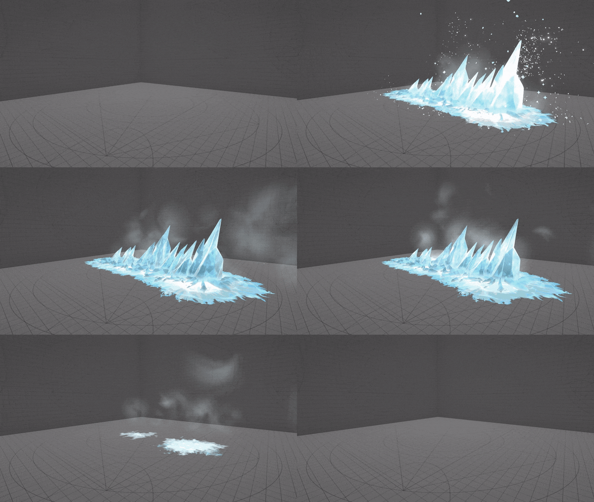
Okay, I’m done! (or so I thought)
I won’t make any more changes, but your feedback would still be very appreciated! From my last notes I only finished the first bullet piont, 'cause I didn’t want to invest too much time in this piece.
Instead I invested some time in my new “Intro UI”, which I’ll use for each of my finished works from here on out ![]()
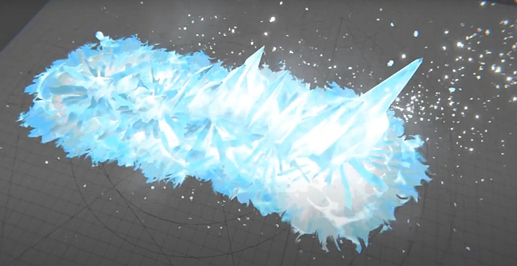
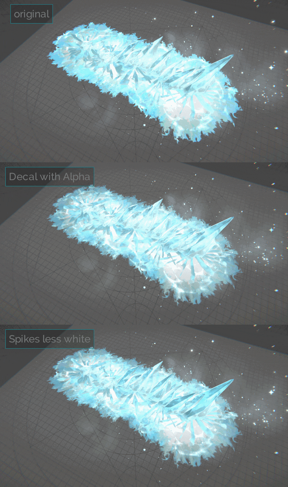
Hey! If there’s one thing I think that from top down you lose the great spike shapes. You could increase the contrast between the spikes and the ground. Lowering alpha and color intensity for the ground could do it.
Anyway, you’re killing it, great work! ![]()
Thanks, man!! Right, very good point, I totally missed that.
I quickly tried it, I think I would need to do something with the spikes as well, maybe a shader function which increases the color intensity of the spikes by camera angle would work nice.
the effect is cool as hell
You could increase the contrast between the spikes and the ground
I see that. The difference between spires from mountain is lost because the ice is delicious, but also busy with refraction
thoughts for delineation is 2 components to break up the shader with gradation, possible just ramps
- snow separates ground from effect
- Ice separates spires from snow
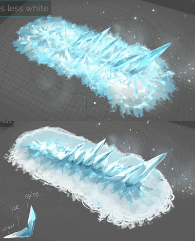
Wow, yes, that would indeed make it much more readable! Thank you very much!! I was probably clinging too much to one of my main references, where ground and spikes look the same.
Here’s a quick incorporation of your feedback. ![]() It would probably need a better texture for the snow decal and a few more tweaks on the spikes though.
It would probably need a better texture for the snow decal and a few more tweaks on the spikes though.
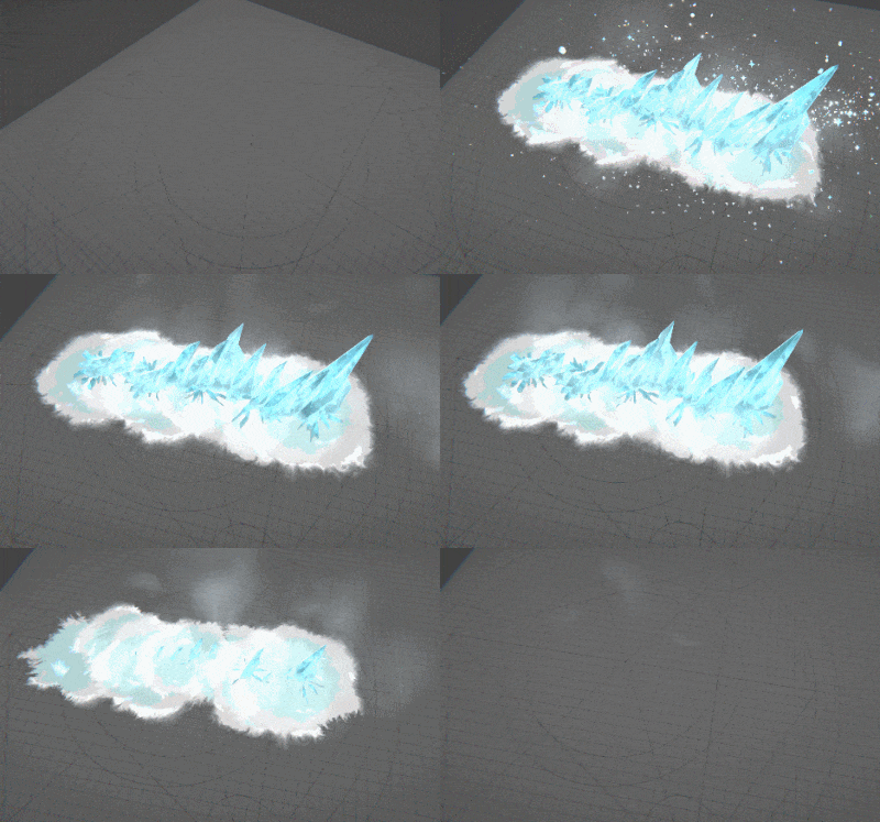
I think you just made me love it more… really working, the contrast and that softer rendering of the snow mounds is phenomenal!

