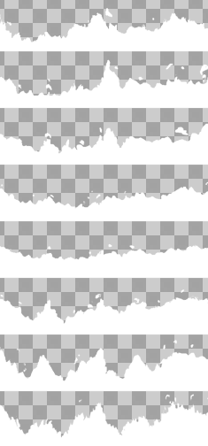
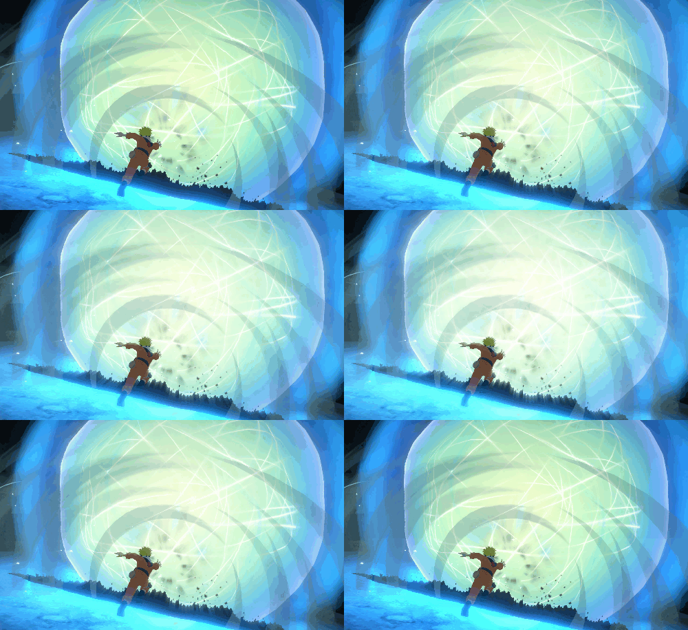
So as many of you might know, I just love the naruto fighting game vfx and I tend to watch at least one compilation of it once every 1-2 weeks.
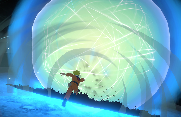
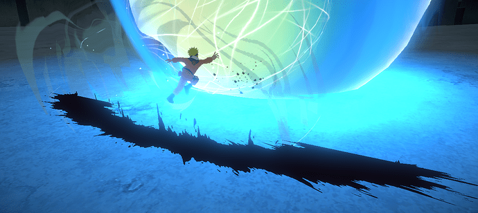
By now I think I have a firm understanding of most of the mesh and shader-work going into them but one really baffles me, the ground shatter effect seen here:
( use “.” and “,” to skip a frame/previous frame )
I am not talking about the sphere, or the small rocks flying, but the floor shatter effect.
While in most cases when they use an effect like this, often the effect behind it is so bright they get away with a simplified version, but this particular one does something extra.
From what I can tell:
-
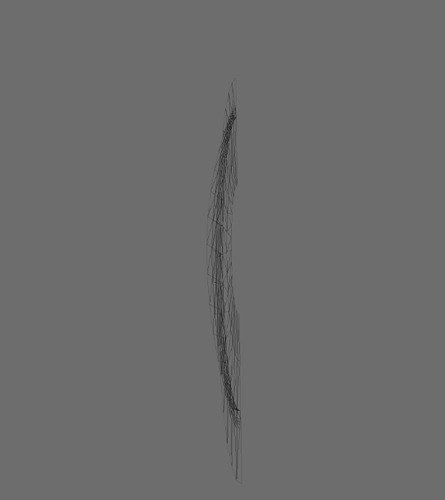
Vertical (cylindrical) mesh bend around the radius of the sphere.
-
No actual rock meshes (would be too expensive in this case)
-
You can definitely see it panning/tiling outwards around 1/4th of the left side of the effect.
about here: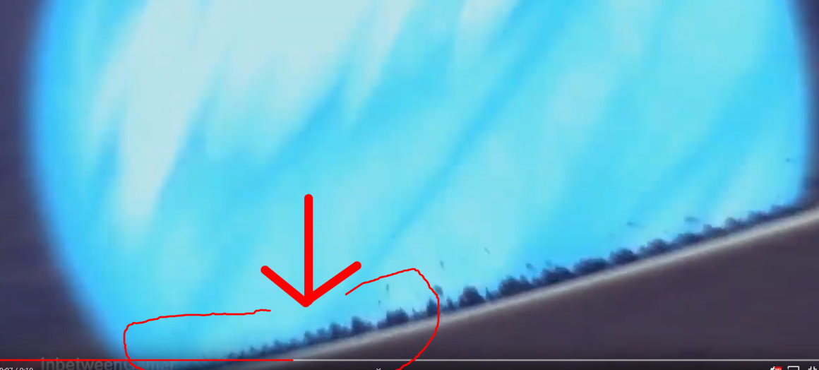
-
going trough a horizontal tiling flipbook or mask. (though with some clever uv-distortion one could fake this)
now where I am confused on what they are doing.
If you pay close attention on the left, but most noticeable on the right side they are faking(?) highlights on the rocks, and potentially fake(?) some of the light rays going trough them inside the texture.
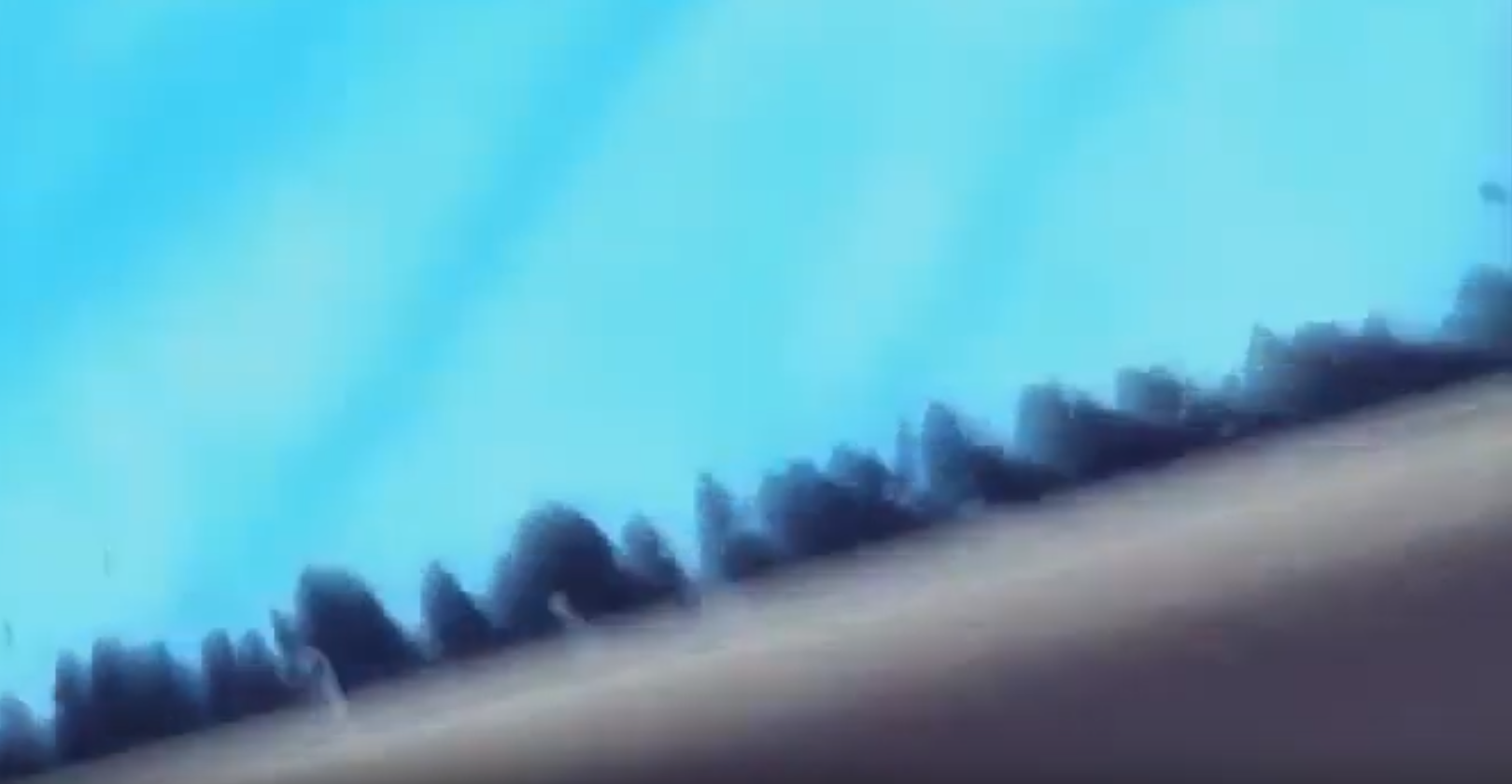
While it could be done trough post processing/light rays I expect both to be too expensive a thing to use for this (kind of) game, especially the light rays.
So I am wondering how they are faking this inside the texture (or actually, how they are doing this in general), making it look like the light is coming from the right angle.
Since the texture is clearly panning (or at least, I am experiencing it as panning) I dont think its just one horizontally tiling texture. it could be that its flipped and blended around the location I pointed out.
And the details of light drawn into the flipbook depending on how far away a rock is from “the center”.
but it would still result in a somewhat expensive flipbook.
Things I tried:
- Slight offset in the cylinder-ring mesh in a 2nd uv and blending between both uv’s to fake it.
- slight bump-offset and blending. which gives somewhat okay results but feels off.
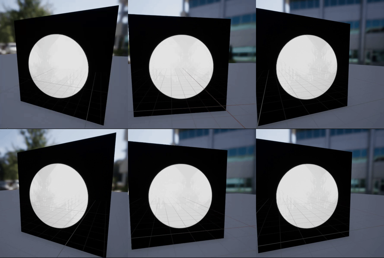
(would need some iteration to mask out the opposite side)
Things I considered:
- POM, but would be too expensive.(?)
- Normal map (or other math) that depending on angle the polygons are on shows highlights.
But, perhaps I am overthinking it by looking at this for way too long by now.
The cheapest way to recreate it would be to neglect the highlights but since I sunk my teeth into trying to find out how they did it and how they kept it as cheap/performant as possible…
Id really like to find out.
Thoughts? advice? ideas?

