Thanks @Gimil for the model with animation!![]()
Damn that’s cool !!!
beautiful!
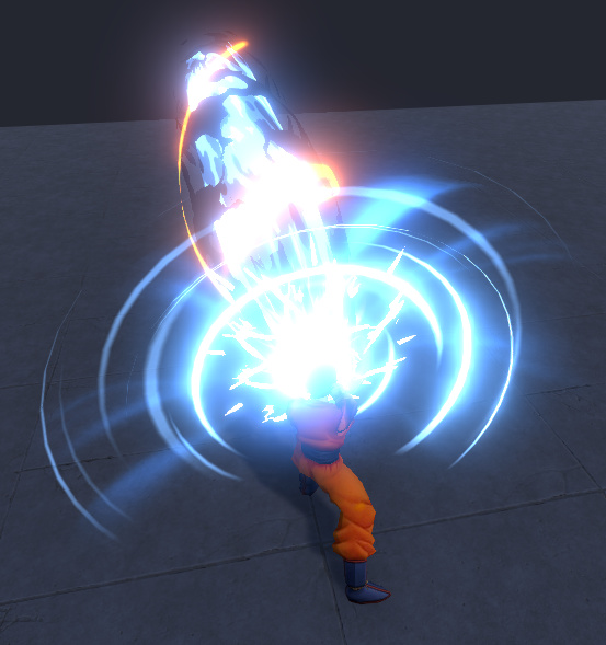
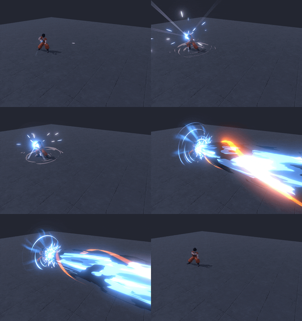
The yellow spiraling shape adds some powerful energy-containing rythm to the stream.
So much great work in this thread! Nice job!
I had to make a similar effect to your most recent mega-laser-beam fairly recently (although not stylized), I love how clean and controlled you’ve presented it - Have you given any consideration to how this effect looks from other angles (eg. When being hit by it) or is this effect only intended to be viewed from this top down MOBA style perspective? If this is just a personal practice effect maybe that would be an interesting challenge to consider ![]()
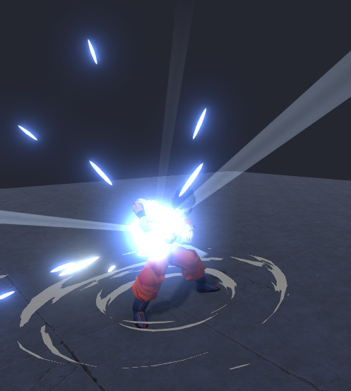
If you’re looking for feedback - I really like the grounding provided by the dust effect at the characters feet during charge up, an effect this strong is really sold on how grounded it is and you’re doing a nice job of reinforcing the blow-back against the character but I think it would also benefit from implementing a similar dust effect along the ground under the beam? Anything that helps tie your effects into the world will really help add that extra level of fidelity!
I made this effect at the request of subscribers and I will make a tutorial soon.


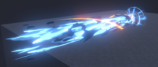
How it looks without bloom:
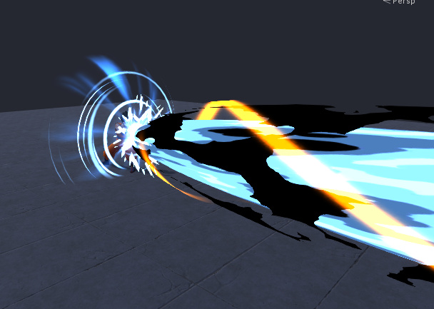
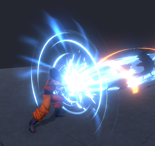
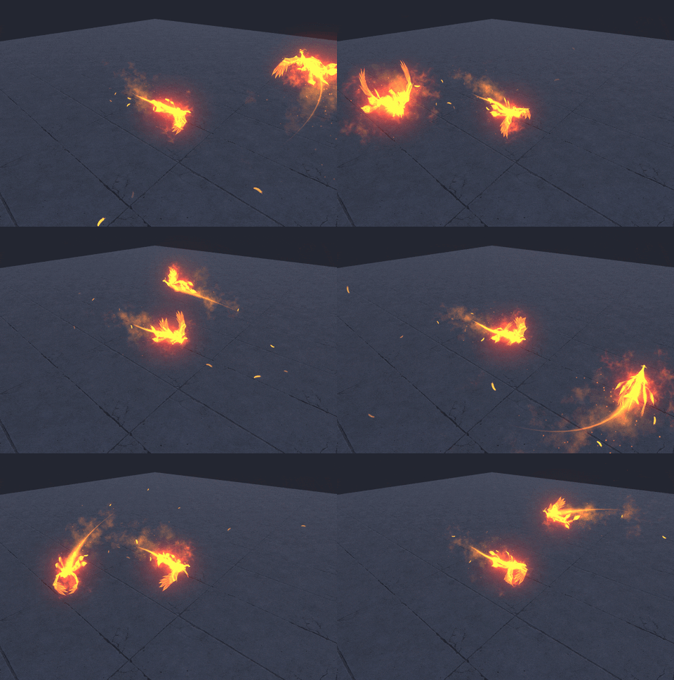
This phoenix was made using imn nam tutorial and then deleted https://www.youtube.com/watch?v=koXPzx_sHS8
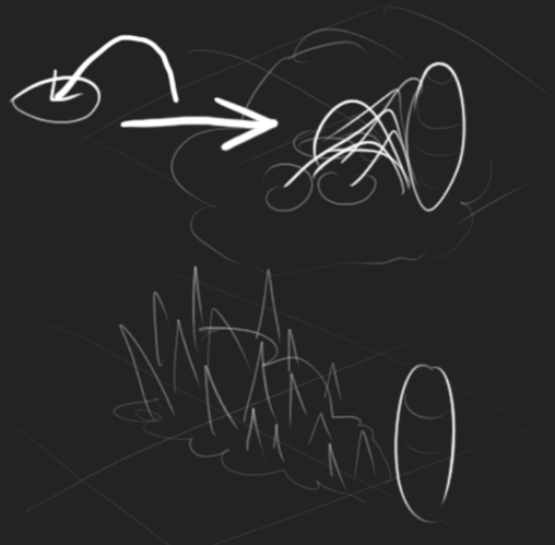
I drew it for myself before bedtime so as not to forget. The idea was like that:
But doing through different variants, I came to this:
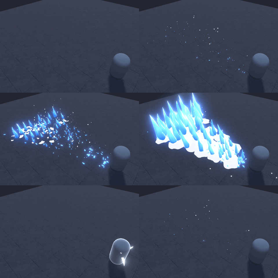
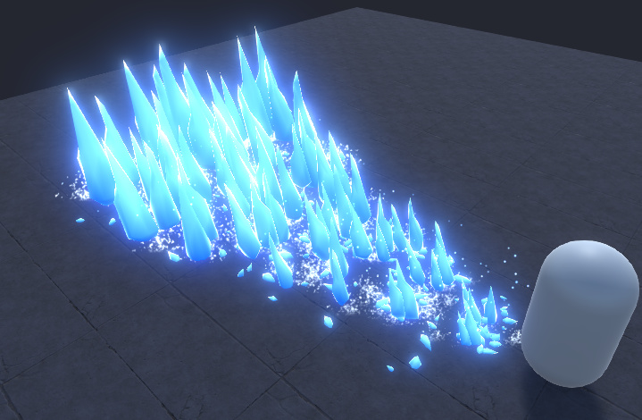
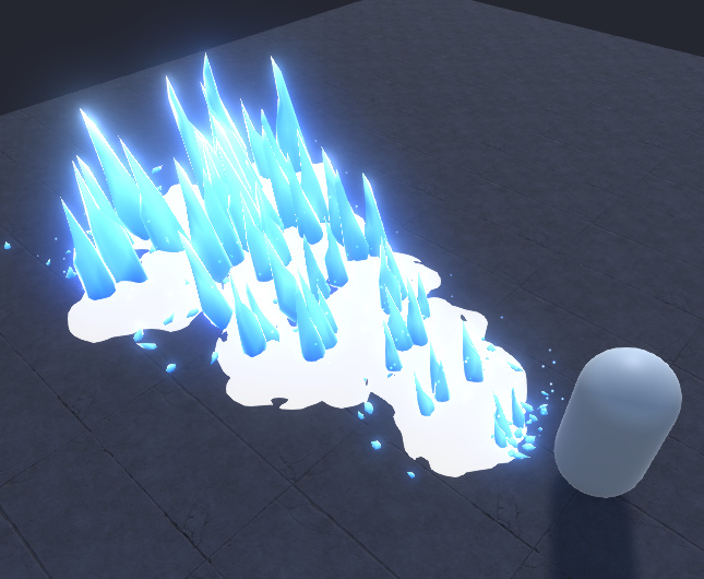
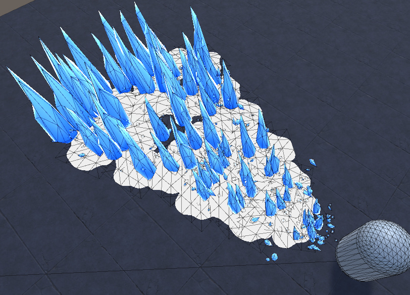
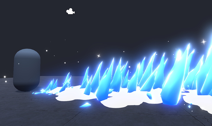
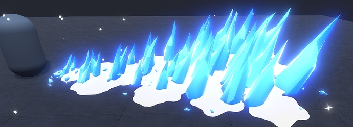
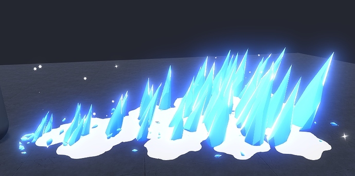
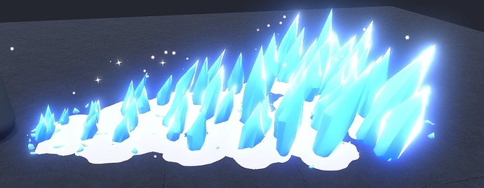
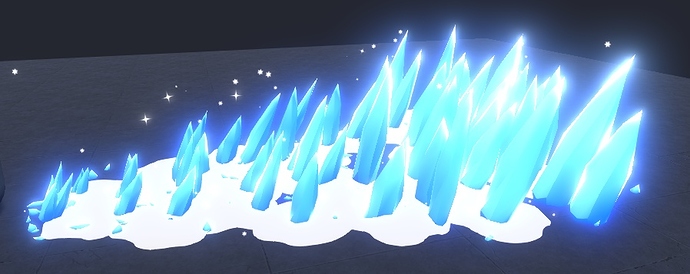
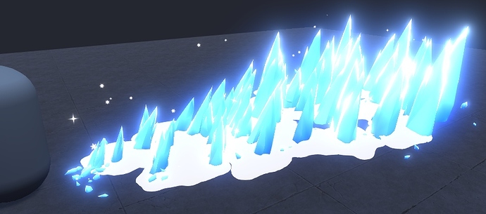
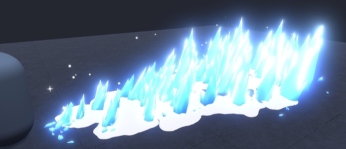
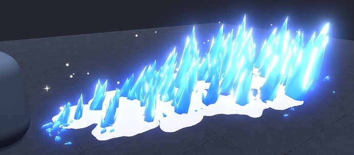
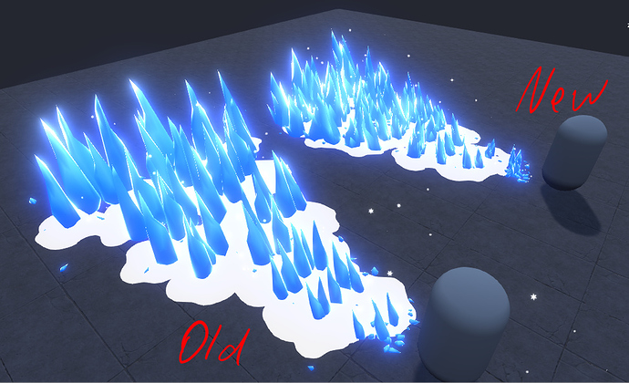
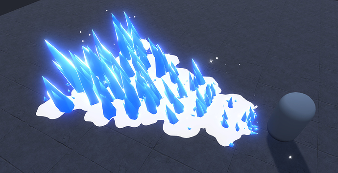
Snow is not flat.
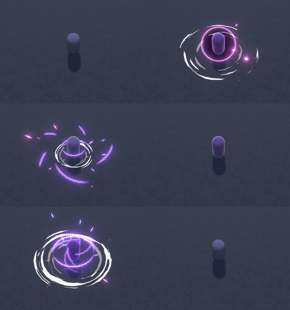
I love the motion of the slashes, but I dont really get the feeling of “healing”. Maybe reduce the speed of the slashes that emit from the character, making it more elegant.
Yet it seems to me that quick slashes are better. I wonder what others will say.
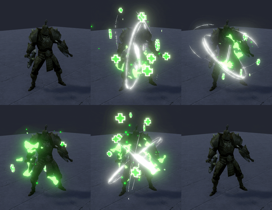
P.S. Oh no no no… I put a quick slash in the new version of the effect and it looks awful.
If the plus signs wouldn’t be there and you wouldn’t say it’s a healing effect I would say it’s more like some demonic spell cutting me to pieces. ![]() I think some more subtle, less sharp shapes would be better. Also maybe the colors have too much value. Everything is too bright. But maybe that’s just me.
I think some more subtle, less sharp shapes would be better. Also maybe the colors have too much value. Everything is too bright. But maybe that’s just me.
Looks sick!!!
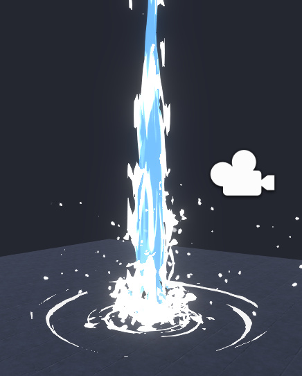
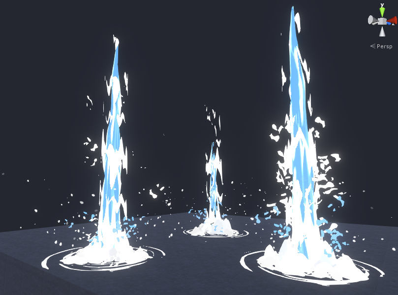
How do you get this clean zelda the windwaker ish water look?
Hi, what mean sick? Illness?
Experience comes with practice. I made a tutorial a year and a half ago: https://www.youtube.com/watch?v=OU9Ti6VDfmk The effect in this tutorial is not perfect, because I created it in a hurry, there are a lot of mistakes, and the effect itself is not very optimized.
Later, I redid this effect and laid it out on the patreon. There are no errors here, only 1 texture is used and 1 shader for everything. But still not suitable for the phone, I used a lot of polygons: https://www.youtube.com/watch?v=7p8semGmrnk
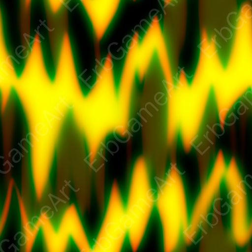
Now I have done everything much easier, water splashes on ground is a simple mesh that rises up. For this, the size is increased from 0 to 1 and back. Water is just a cylinder and a cone. For this effect, I use the same shader as for the rest, only I had to write another shader for the main water effect. It was very difficult to create a suitable texture for the water:
And I didn’t want to make this effect look like in Zelda. Just wanted to make it toon.
I’d guess masked material and solid colors w/ strong contrast in the texture for clean lines, or maybe some kind of clamp in the material
