Forgot to put the thumbnail in this first post:
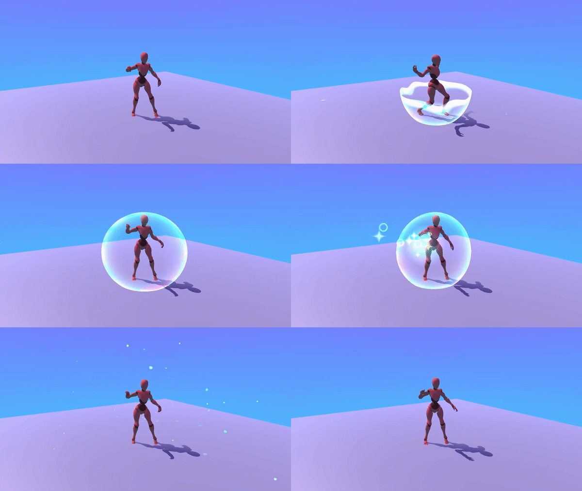
And the final result:
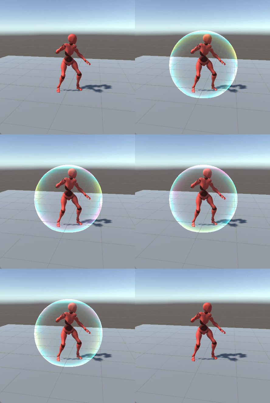
Hi! This is our first time doing the challenge and we want to make a shield with a soap bubble look that reacts to impacts and has an in-out animation as well ![]()
![]()
Refs:
Forgot to put the thumbnail in this first post:

And the final result:

Hi! This is our first time doing the challenge and we want to make a shield with a soap bubble look that reacts to impacts and has an in-out animation as well ![]()
![]()
Refs:
So far we got a dissolve effect that would probably be used for the in animation (for the out anim we plan to make the bubble explode but so far it’s used for both) and some moving noise turned into colors with gradient mapping acting on a Fresnel and on the dissolve effect edge.
Next step is probably adding some vertex distortion to the sphere so it looks more “bubbly” and make it distort the image behind a little bit as well.
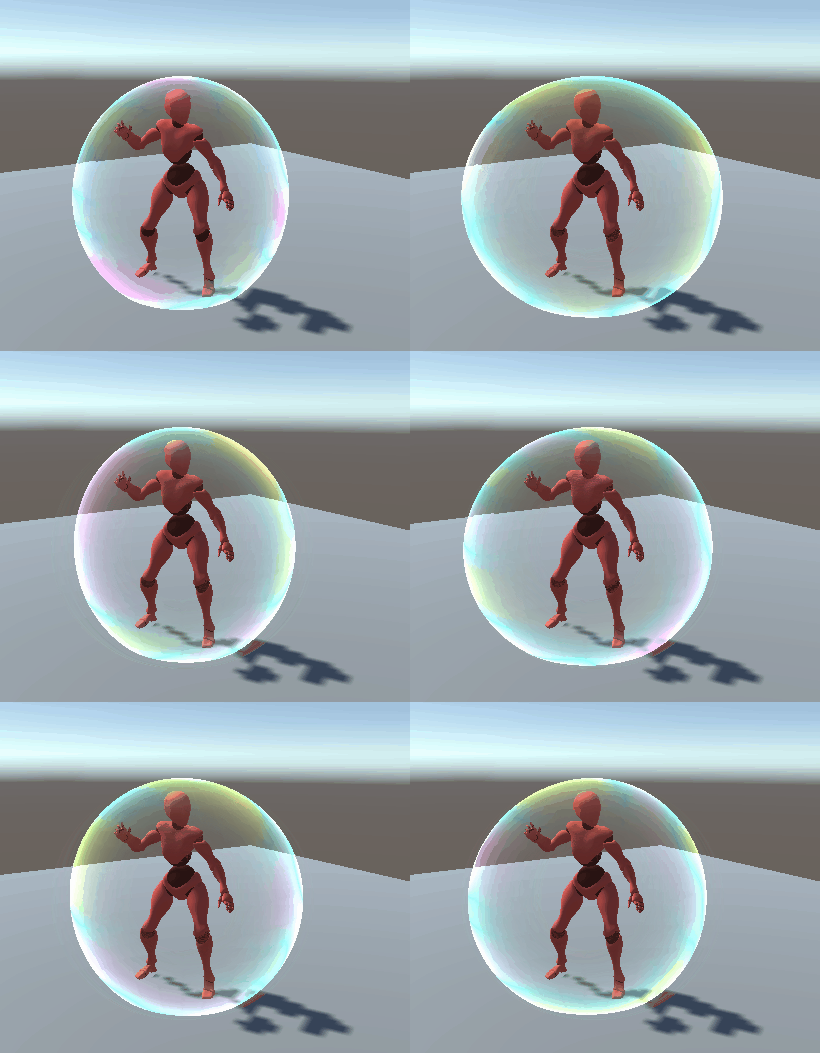
Some vertex movement added to the bubble sphere and some distortion as well (it’s very subtle right now, maybe we need to turn it up a little)
Hiii, its looking great! I can’t make out the colours bcs of the colour banding on the gif, coudl you post a static pic? I’m curious!
Also, I dunno if you looked at some iridescent shader magic, but I’d totally recommend checking those out
I’m pretty sure think the gif messes up the colours so you might not need any of that, but sending it just in case!
Hi! Thank you for the resources, i took a quick look and it looks interesting so i’ll check it when i have time.
This is not done like that though, it’s just a moving noise used as input for the “time” in a Sample gradient node and multiplied by the Fresnel. So it doesn’t react to light, we though it wasn’t neccessary for this case but we might rethink it if we have the time. The gif quality is indeed not the best anyway, here you have a static pic:
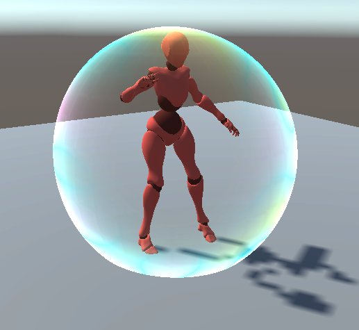
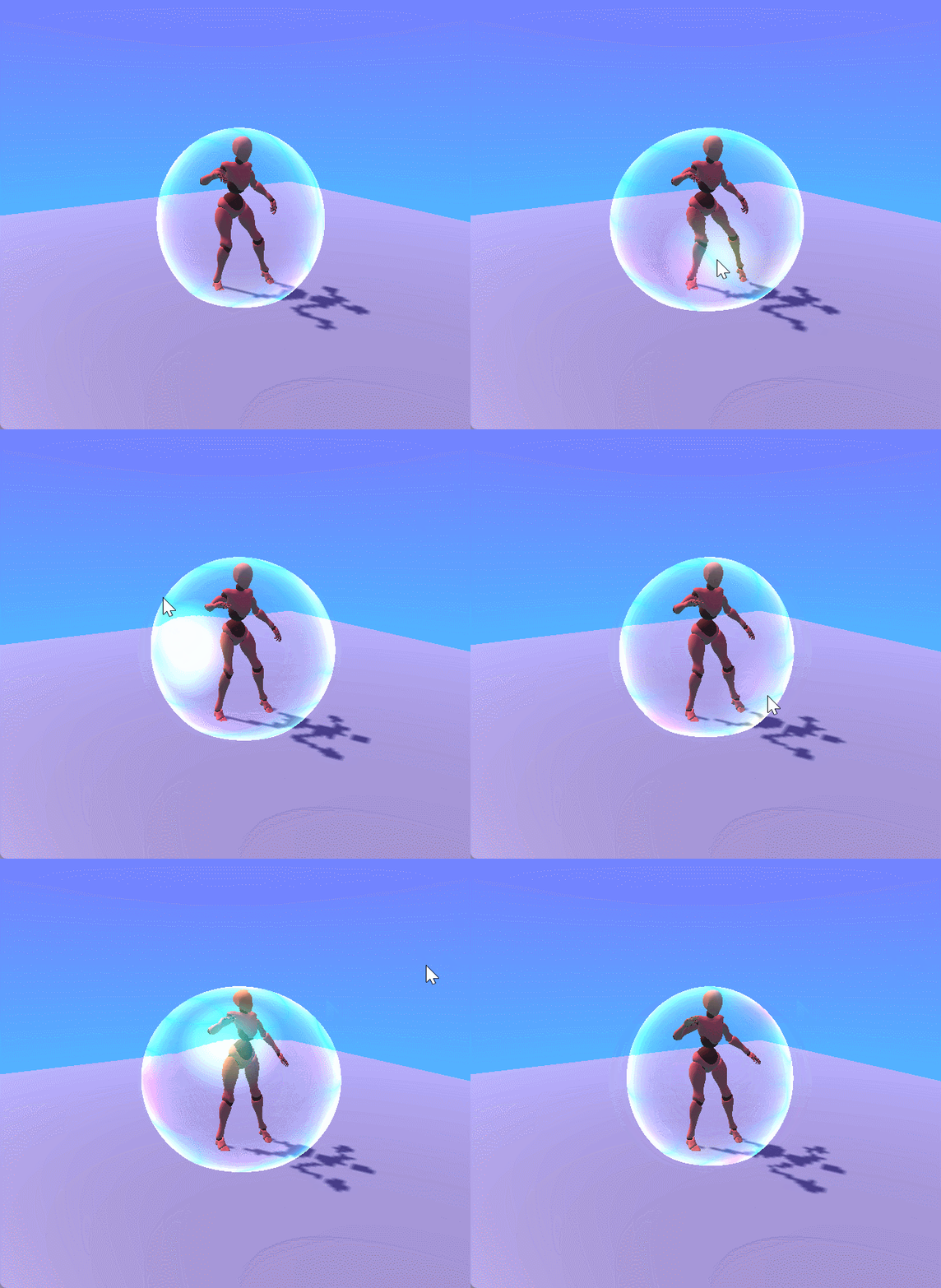
Now it reacts to impacts! It might be too exagerated, we’ll see it when it’s finished. Next thing will probably be adding some little bubbles in idle and making the big one “explode” to remove the shield. Oh, and fixing the character’s shadow.
(Skybox was also changed cause the default is so ugly)
