VFX Portfolio (WIP) - Augustus Allen [2016]

Hey Folks, I recently started getting into VFX and it’s pretty awesome. I welcome harsh C&C as it’ll help me improve drastically (as I’ve learned). Any cool tips & tricks would be awesome as well! Yeeee

https://www.youtube.com/watch?v=Mq71yrd5Eqc&feature=youtu.be

I’m now reaching the end of my project and I’d like to know if it’s at the quality it needs to be for an entry level artist. It’s inspired by some awesome VFX portfolios and game’s I’ve played. I’m aiming for the Blizzard VFX position (in-game) on WoW. That said, I thought I’d include some original stuff on top of the usual stuff, so not everything is WoW related but some can be applied to Blizzard in general.

So far it’s been trial and error with some help from friends. Alongside the notion of “Cool idea > Refine, refine, refine.”

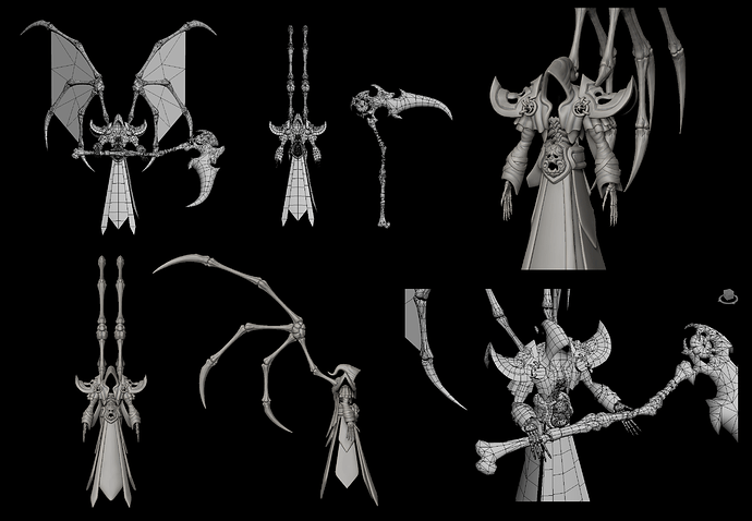
I’m currently adding the final effect, “The reaper” to the end of my reel. There’s a transition from the “fake credits” (Time - 2:17) to the final mini-cinematic (not included yet). Definitely inspired by Darksider’s Reaper Form haha. The idea is pretty simple so I thought I’d share:

[Cinematic Concept]
Paper Doll (Teri) looks around > Smoke forms beneath sphere > Teri becomes afraid and jumps, turning into paper airplane > hands erupt from ground, ensnaring sphere > Reaper rises from the smoke (awkward/distorted top-view angle) >

Reaper slowly tilts back (front camera view) > Reapers hands waver, magically lifting sphere into air (hands release grasp) > “Soul” is drained from sphere as its suspended > Reaper cocks back and swiftly slices sphere (cutting viewers screen in half and transitioning to real credits)

And that’s about it. Nothing insane but should be visually interesting. A nice finishing touch to a simple reel.

Is there anything you’d consider weak or uninteresting? Or perhaps I need more stuff? I’m open to suggestions. Thanks.
4 Likes

Cool man. Can you possibly upload your VFX reel to YouTube or Vimeo? That’ll make it a lot easier to view :wink:

Aye, certainly. It’s gonna take a while though (1 hr), since its pretty hefty file for some reason.

I’ll update the first post once it’s complete.

Oh wow! Vimeo’s compression guidelines are a pretty good guide for getting that file size down. Also if you have it, Adobe Media Encoder is godsend ^^

Okay I finally updated it. Jeez, it took an hour to upload on Youtube and Vimeo couldn’t even handle it. Uploading to Youtube always takes forever lol.

Nice dude, you’ve got some really solid work! I would say instead of thinking of adding more, I would think of taking away some pieces. At least for me, I really like short and sweet reels where all the pieces are amazing rather than a longer reel where some things that don’t shine as nicely as others. I’ve got a bit more time tomorrow to take a better look and give you more in-depth feedback :slight_smile:

Looking forward to your final piece as well! That reaper is gona look sweet! ^^

1 Like

Awesome. I look forwards to what you’ve got to say! Haha.

Ya, It was getting pretty lengthy, but I really wanted to hammer it in and give alot of variety. Coming from a place of 3D Prop, it’s hard to stand-out so that mentality carried over. Some say “short and sweet, done very well” will do, while others say “make alot of really cool effects.”

Ye, I can’t wait to get it done, it’s been bakin’ for a while. It’s gonna take a while though, its pretty time consuming towards the end.

It’s too long! You could cut it down to less than half without losing much.

It’s all in the same angle and style so it gives off the feeling of being 2d effects for a mobile game. If you are aiming for WoW, why not show some effects off in an environment or with a character casting it?

Effect by effect:
Shield thing looks cool. Strong opening but it’s a bit boring when it just fades away.
Same with second shield.
The eye of sauron lacks some connection between the ground and the eye. Maybe lose this one.
The bubbles, I don’t get this one. Timing is a bit wonky and it’s quite unclear. Maybe drop this.
The red eyes lack definition and don’t have much interesting stuff going on. Drop it.
The skull is cool! Well defined start, activation and an interesting removal. Nice.
The ship is interesting, but the timing seems weird. Perhaps sync the disintegration particles with the shader a bit more. The smoke moves in the opposite direction of the rest of the effect. I don’t get it.
The heart is cool!
The projectiles all lacks punch. They seem to have token impacts instead of what you’d expect to happen if for example an ice spike smashed into a target. I’d polish up one or two and drop the rest.
The 8bit heart combined with full res spears look weird. It pops off a bit.
The cleaver, wings and doll are really cool.
The skulls hitting is interesting but not your best. (The reel should only be the very best stuff)
The pinata and cursing skull are cool, but remind me a lot of something I’d see in a King game. That’s fine, but is that the look you are going for?
The lightningstrike impact is too noisy. The textures look stylized, but the impact looks like you paniced and just spawned a lot of them and hoped for the best. Keep it simple and the effect could work.

And that’s about how long I made it I’m afraid. It just feels too long and samey with the static camera.

1 Like

Awesome Reel! If it’s WoW you’re after, make sure to chat with @Sai and @SarahCarmody.

Better to hear than too short! Haha Okay, I’ll start trimming the fat and refine the best.

I kept the camera at 1 angle because it demonstrated the effects the best (quick and snappy). As for a character casting it w/ an environment, I had originally done that here, but it was far more time consuming and I couldn’t get as much done. I decided to save the fanciness for the finishing blow haha.

https://www.youtube.com/watch?v=kxaxM8Lv0-Y

I’m gonna just do a burn/dissolve for the shields like the skull. Add some fire sparks and smoke perhaps.

The bubbles was a reference to Vlad’s skill in League of Legends. I’ll drop that.

Ya, the UFO is a bit strange and I can adjust the timing better. I don’t get what you mean by “opposite direction” for the smoke. Perhaps I need to make the smoke spin while it’s pushing out radially? Can be dropped if it lacks energy.

I made the projectiles a certain speed so they can be seen better. I can totally make them fast as hell but it’d be hard for the eyes to register. I’ll create a separation between the speeds (slightly faster/slower) for better impact. I’ll cut out the “Lux sphere” thing since its slow.

For the “undertale” spear stuff, it’s super low-poly and I was going for a pix-elated effect. Perhaps I can resolve it by making the heart HD or something. That way there’s less disconnect.

For the pinata and skull, I was going for a “Wildstar” and “Stylized Pinata” look. I guess it’s like a King game? If it’s uninteresting or weak, I can always remove it. The idea here is to stand-out with variety/techniques.

Ya, the lightning is pretty noisy, especially the spinning lightning triangle. I wanted to display alot of electro-static energy and make it have impact. I’ll reduce down the noise so there’s more clarity.

What would you recommend I do for the static camera angle? It was intended for viewing ease as seen here: https://www.youtube.com/watch?v=VYl4MGI2geg&index=23&list=PLGL1ywscbgeTCvVLoNgS5ux6PTyXFwBYS

Based on what I’ve seen from WoW, alot of stuff is seen from a distance and typically from above when fighting. Wouldn’t different camera angles foreshorten the effect, especially if I only showed it once and quickly?

Alrighty, thanks for the input so far! I’ll get at it with those changes!

Thanks man! Love your tutorials, they helped alot! The radial guide is an awesome trick I use it on 90% of my effects haha.

Okay, I’ll be sure to give them a ping.

Here’s a small update. I cut out stuff that was recommended. A piece I’d consider weak (but that I like) is the pop-tart nuke thing. Mainly because the frame-rate dips whenever I record it I may have to remove it altogether. It’s got nice colors and its strange. I was thinking about doing a “nyan cat nuke” with the screen cracking or something. Now its just a flying poptart.

I’d also consider the “Rift jump” to be weak, since I’m unsure of it’s quality. It looks neat but is it good? Perhaps the “Googly-eye rock” as well? Or maybe the rock rift & healing (+) spell because their too simple? Would you cut out anymore or is it fine? After things have been refined/removed I’ll start working on the Reaper part.

https://www.youtube.com/watch?v=YxgIs8-g9GU&feature=youtu.be

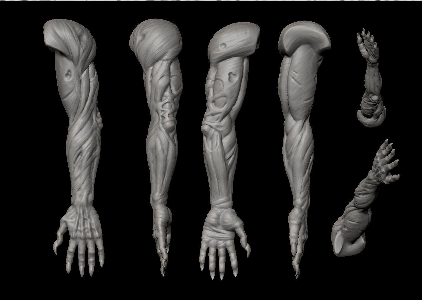
I also worked on that arm. It was horrible before, I’m glad people pointed things out. I’ll be sculpting on that while working on the Reaper animation. The arm will be mostly inside the ground, bending to restrain the sphere.

I’d still say you could reduce your reel down at least 30-45 seconds more, down to 1:30/1:45. I have a short attention span and anything over 2 minutes is pushing it for me honestly. I know it’s hard to pick and choose but it really helps to have fewer really solid pieces IMO.

These are my favorite pieces:

heart/arrow 0:22 (one of most favorite)
bloody axe 0:37
vodoo 0:42 (one of most favorite)
butterflies 1:11
health 1:37
rainbow beams 1:46
trinity force 1:51 (although needs shine when trinity comes together)
first Ice hit 0:26
skull 0:14

least favorite:

rainbow box 1:19
heart arrow 0:35
wings 0:40
pinata 0:52
lightning 1:16

Are you looking for feedback on changing the pieces that exist or just taking them out/leaving them? I would recommend taking a few pieces and just push a bit more polish into them. Some like the alien one are so close but could use just a small amount of extra polish. For example I’m seeing a lot of trails that are very plain, and don’t have a mult or any design to them. Also it seems like the smoke in some places is all very much the same as the one at 0:26 emitting in a ring (green). A little more definition to some interesting shapes instead of basic clouds could help it.

Anyhow, best of luck man!

Hey, thanks for the specifics! I’ll remove the suggested ones and tweak whats needed. Ya I have to remember that hiring is going through millions of reels and can lose interest pretty fast.

Ya, the trails need more work. I’m gonna go for something like this Shannon McSheehan - LoL FX + Knowledge Share - #6 by ShannonBerke for some trails. I really love that effect.

Cool idea on the trinity! I’ll add an emissive pulse (kinda like heart).

Yes, I agree with you on the UFO. It’s definitely lacking in the smoke area. I’m having a hard time figuring out how the smoke should look (whether its more full or empty), since it’ll be duplicated/rotated/etc multiple times.

I’ll apply the necessary changes to get it to that industry quality haha. Thanks for the input!

Okay, I dropped the weaker pieces and updated some. Added a trail effect to 3 of the VFX.The frame-rate dropped on the ones with trails (ShaderForge mixed with Trail Renderer).

Also, it seems that I can’t get the trail renderer to stay on top of the bone/mesh and it’s set a few steps back. It looks like its trailing from an empty space, but things are moving so fast it’s not as noticeable. Not sure why it works in some areas (ice spike & ufo) but not in others (horde shield’s axe).

Should I drop the snowball (0:27), wildstar skull (0:41), laser (0:43), rock rift (1:13), healing [ + ] (1:11), or golden healing (1:17) to reduce the video length further? Or is it fine as it is? I’m open to further reduction haha.

https://www.youtube.com/watch?v=Zdbt1KP8vE8&feature=youtu.be

1 Like

hey man great visuals, but I have only one problem, I’m not an expert but I could easily find many times the textures being trimmed (I guess because they reach the quad boarders), or they go through the ground… I cant tell because the colors and angle makes it impossible to get the right perspective.

1 Like

Hey, thanks! Ya I agree with you, good eye.

There’s a feature called soft-particle in Unity but it doesn’t seem to work for me. I’ve cranked up the values (max 1-3) in hopes that it would blend the hard edges with the ground. The particles still cut into the ground pretty harshly.

For some particles I’ve used Shuriken’s 3D Rotation feature to tilt the texture towards the camera. That only works on certain pieces and looks funny on others such as smoke since it squashes it a little. It does resolve clipping though.

However, I just noticed that by slightly changing the pivot (Z-axis), the smoke is above the ground (no squash/no clip). Looks like this is the solution!

Thanks for the input man! I’ll correct that right away! Haha.

1 Like

That’s the solution if you are making the effect for a fixed camera. That’s what I meant by it looking like it was mobilespecific. In that world, the Zoffset hack is acceptable. In a game where you can move the camera, it is not.

Gotcha. I’ll keep that in mind for future projects.

For demo purposes would it be okay? The soft-particle doesn’t work for me so I’m unclear on a solution. For now, I’ll keep it as it is.

Alright, here’s the latest iteration. I removed the ground clipping. Tweaked some VFX.

Is there anything else you’d reccomend me fixing/changing/removing? If not, I’ll continue working on my Reaper VFX. Thanks!

https://www.youtube.com/watch?v=XovflzSuJcw&feature=youtu.be

1 Like