Mursi's Sketchbook : Random Galio fan art

Hello everyone here’s my first post on the forum :smiley:.
So lemme introduce myself, my name is Yohan I’m a french junior vfx artist and I’m currently working for Gameloft in Vietnam as an intern. I’ve been lurking around for quite some times now and I guess there’s a moment I had to leave the shadows ^^

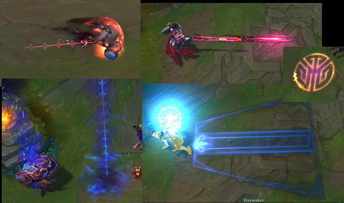
For few weeks now I’ve been working on a fan art of a Mecha Kingdom Poppy skin for League.

Short preview.
VFX_MKPoppy56 !
:arrow_down_small:Here’s a video with the full set
MKPoppyVFX

In order : Q, W, Passive proc, E, R, Basic attack, Critical attack.

Feedback are more than welcome.

PS : I’d like to thanks Beardilocks who already helped my a lot with his feedback <3

3 Likes

Hey! Here’s some value adjustments I made yesterday.
VFX_MKPoppy59
I’ve made the background color of the shield darker to add more contrast to it. (here’s a screen the gif one looks a bit weird with the compression)
VFX_MKPoppy01
I also made the meshes from her ultimate opaque (I might change them or their texture they feel too much like hextech Poppy for now)
VFX_MKPoppy02
Next I’ll probably polish a few things and do the not charged R.
I’ll post some updates later today or tomorrow :smiley:

2 Likes

Hi Mursi!

Nice to see you over here from Twitter :slight_smile: Your Poppy has really come along.

Overall she’s looking really great! You’ve done an awesome job of adapting Poppy to fit the Mecha Kingdoms thematic. You’ve found a great balance between the asian shapes and the sci-fi shapes.

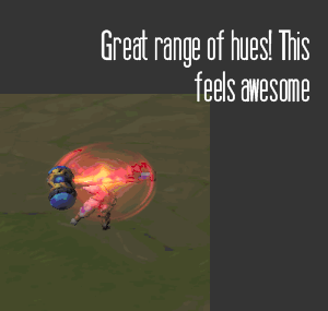
You’ve also done a great job of adding visual depth by getting a range of different colours and values in there. I particularly like the update you did to the Ult cast windup.
image

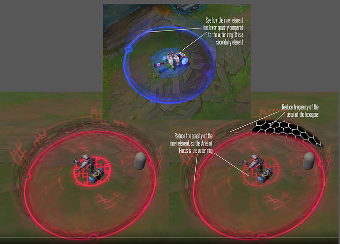
For the W area, I would suggest a few things to help this effect. You should try to define what is your primary Area of Focus element, and what is your secondary element. (you can read more here about areas of focus: Anatomy of a League of Legends missile - Part 1 - Creating Areas of Focus - #3 by Qq781217732 )

You should reduce the opacity of the central circle, so that it is a secondary element. The primary element should be the ring on the ground, as this is the area important for gameplay.

I also think that you should reduce the frequency of the hexagons on the wall. The decal on the ground has a great balance of detail and clarity. At the moment, the high amount of detail on the wall is drawing attention from the decal on the ground.

For the E, I really like the value hierarchy you have, with the bright values at the front, and the dark values behind, it helps to show the direction she is dashing!

However, I think the trail texture reminds me too much of Hextech (though this may just be personal preference, as I have made hextech skins before XD )

I think if you could design a new trail with shapes more inspired by the existing VFX in the skinline, it could match the thematic better.

For the ultimate, I think you could increase the strength of this spell, by adding some soft glows to the pillars, making them feel like they’re glowing with energy. Additionally, at the moment, they have a very even value across the entire column. If you made the top brighter and the bottom darker it would help to define what your area of focus is. It would also allow you to add saturation: most of your other effects feel red, whilst this one feels a little bit pink.

Overall you’ve done an awesome job, great work!
3 Likes

Hey, first HUGE thanks again for all those juicy and interesting knowledge.

So I reduced the middle shape opacity and increased the size of the hexagons while also reducing a bit their opacity.
VFX_MKPoppy61

For the E trail I quickly tried something new, still need to fix some things.
VFX_MKPoppy62
I’ll work on the R and the few things left later.
Much love and have a great day :smiley:

1 Like

Awesome changes! They look great. Good work on that E trail as well, that fits really well within the thematic :smiley:

1 Like

Sooooo I’ve had a bit of time to add some glow, gradient and made the pillars more reddish.

VFX_MKPoppy65

Video Update of the full kit

2 Likes

Hello, I’ve been away for some times but I’m back with another League fan art. This time I want to try to add the concept phase to the process.
So I’m doing a skin for Mordekaiser and the theme is Storm Lord.

Here’s the passive (the one below is in-game default skin), the goal is a small storm around him kind of like Kennen’s ultimate but with wind and weather elements:


And here’s the ultimate, sending the target straight to the eye of the storm :
VFX_TLMordekaiser05

It’s still WIP so feedback are more than welcome. :smiley:
Have a great day.

3 Likes

Hey, here’s some random experiments I made over the week-end.
So first I tried to do the 6 way lightmap shader in unity based on this thread by @NateLane


Then I wanted to reproduce the fire shader in Rime based on @simonschreibt 's incredible talk. Got it to work more or less, I still need to polish few stuff.
VFX_Fire02
Have a great day. :smiley:

Hey there, I had some free time today so I’ve worked on this effect, it’s a bullet that applies a fire status to the target, it’s based on what I’m learning from the VFX Apprentice course. Animated GIF - Find & Share on GIPHY
VFX_Bullet08
Ain’t entirely sure where I’m going with it but I like it, I’ll do some polish tomorrow.
Have a great day :smiley:

Hey hope you’re having a great day, here’s the final version of the effect I started yesterday, I learned a lot especially on the texture painting part.

https://www.artstation.com/artwork/3dlV5B
Have a good day :smiley:

3 Likes

Hello there, today I worked on a fan art of Legends of Runeterra, I got inspired by SrRafles’s Bard level up.
So I wanted to do a Taric level up animation.
Here’s the current state:

Summary

taricmini01

What I want to keep working on :

  • I’m not currently convinced by the transition into the crystal, I think I’ll try something more like : The card “morphs” into the crystal.
  • I want to add some of the shiny shader that passes on top of the card once it’s leveled up and some other stuffs.
  • Polish a bit the background.

It’s an interesting exercise for sure, feedback are welcome if you have any :smiley:
Have a great day.

4 Likes

Gif not showing on phone I’ll check it later on computer

That’s curious I didn’t had the issue on my phone on the forum, tho I had it on twitter :thinking: :thinking:

Now i can see it… Looks good…

1 Like

Looking cool so far, though - nice work! :+1:

The card transition to a crystal might be helped by an edge trace or other pass to highlight the hard-edged crystalline nature of it. It mainly reads towards the end, with the color flashes on the faces as the crystal rotates - a shader or lighting effect that helps the surface stand out from the background as a solid object might be a nice addition.

1 Like

@cghow Thanks, means a lot <3

@ryvanc Thanks a lot, I’m still not entirely sure on how I’ll do it for now so your feedback and suggestion is more than welcome :smiley:

Hey, I had a bit of time to work on it today.
So I added, the gem shader thing to the card, I polished a bit the mount Targon vfx, I added some gem shard burst at the end.

For the topic mini

LoRTaric

What I want to modify :

  • Fix and make the first card into gem transition smoother.
  • Make the end burst more punchy and rewarding.
  • Change the texture when he lvl up (I’m probably gonna need to find a fanart of him).
  • Polish the gem shader has suggested by @ryvanc.

Have a great day and thanks for passing by :smiley:

1 Like

Hey there.
So I think I’m done with it, I’m happy with the current result, was a really cool exercise.
Here’s how it ended up looking :

Youtube link :
https://youtu.be/4sSQqcljh5k

Shaders

The gem shader :


The card shader :

I’d like to thanks the Beyond-FX team for the short video they made giving some insight on the Shen level up and SrRafles’s Bard level up and breakdown for the inspiration. Also thanks to @ShannonBerke for the insight on how Taric gems are made in League.

The leveled up Taric is a fanart made by Yeorin.
The board, card, splash art, mount Targon are Riot properties.

1 Like

Hoyo, hope you’re doing fine.
Today I wanted to give a try to Diablo 3’s shader, so here’s what I came up with :


Shader


Have a great day. :smiley:

2 Likes

Hey there, hope you’re all fine.
So as you might have seen on Twitter I’ve started a new small project, doing some fanart vfx for a Spirit Blossom Sett.


(the skin concept is from @marcoshichima on Twitter)

So I started by roughly sketching the shapes I wanted. :
VFX_WConcept

Then I made a quick rough that I posted on Twitter and I got some good feedback from @Beardilocks and SrRafles :
VFX_W01

Feedback where mostly on the inner shapes so I polished that by adding more thickness variation and removed the symmetry on the middle leaves. I also added some scorch on the ground.
VFX_W02

And so here’s the current latest version of it, I still need to polish the dust texture, add Sett model and animation so I can do his hand trail, and some other random polishes.
VFX_W05

Have a great day :smiley:

1 Like