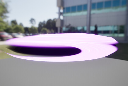
anyone know how i would go around making an effect like this? (from Lost Ark’s Souleater)
Thanks!
anyone know how i would go around making an effect like this? (from Lost Ark’s Souleater)
Thanks!
What part of the effect? Just the ending “swipe” itself?
just the slash, without all the particles and stuff.
atm im trying to follow
^this tutorial, translating it to niagara and changing all the parameters to fit something similar to the effect in lost ark
but it just doesnt look quite right
stuff like
thanks for the reply!
About the overlapping, it occurs because the system struggles to calculate the sort order based on depth. To address this, you could try setting the sort order manually. By default, they are set to ‘0’. To change this, navigate to the render settings of the emitter, scroll all the way down to ‘Sort Order Hint’, and adjust the value. Setting it to ‘1’ will place it above, and ‘-1’ will place it below. This can help avoid conflicts due to overlapping.”
like for example

a black portion to go across the middle of my mesh, but this just looks weird, (black mesh higher sort order than purple one)
That’s odd. If you take a Sphere mesh with white additive material size 1.0 and another Sphere mesh with black translucent material size 0.8 in the same position this should be the possible scenarios with the sorts:
both 0: you will see the black sphere within the white one.
Black sphere sort 1, white sphere sort 0: same result as above
Black sphere sort 0, white sphere sort 1: only see the white sphere and cannot see the black sphere inside.
As per your screenshot, I would recommend checking the additive material to see if it is completely covering your mesh, otherwise, there will be empty spaces that would make anything inside visible.
yep it seemed like my sort order was off, thanks!
in the mean time after fixing it i mocked up something, would be great to have feedback on how to make this nicer