General Website Feedback

Wanted to share some inital thoughts on the site! It’s super awesome and I’m really excited to participate. There’s just a couple things that I’d like to suggest that were either confusing or could be features for the future ^^

-A “Personal Work and Demo Reels” section for people to post in would be amazing, and is by far my #1 thing I’d love to see. Just a place for people like me to post my personal work and get feedback on.

-

-

-This new topic window has a slight bug where it won’t “abandon” if I’m switching categories, just noticed now ^^

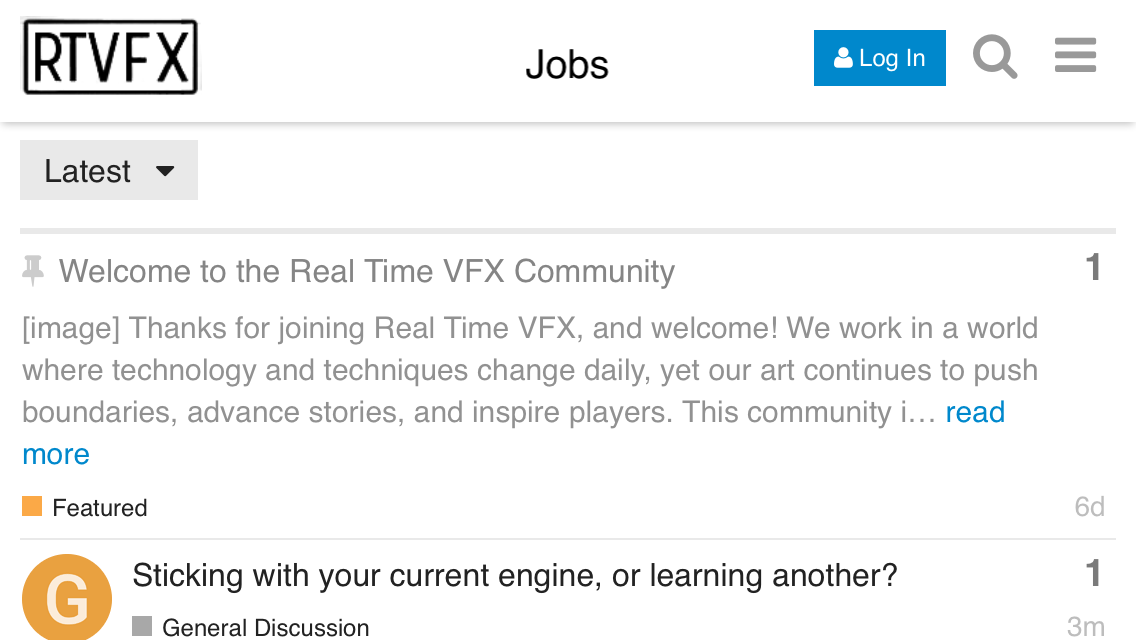
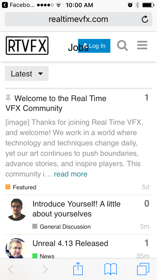
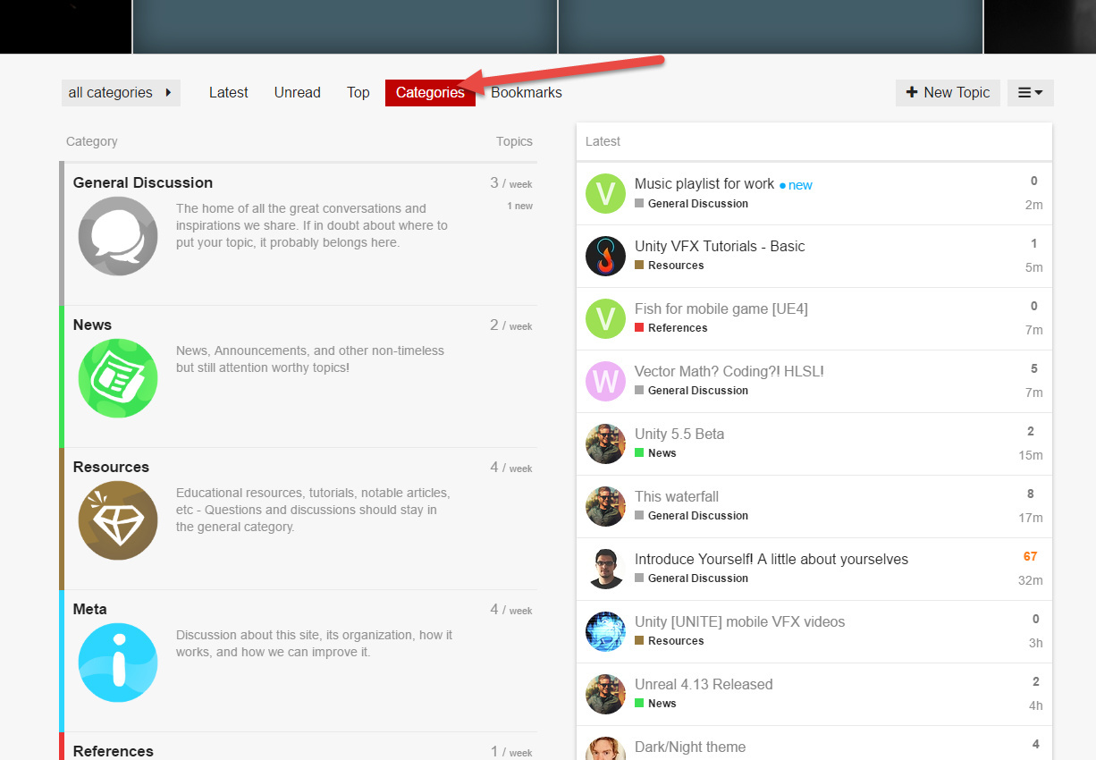
-Would love a page that had all the categories layed out with their descriptions of what is to be posted in each. The front page feels a little overwhelming with the latest posts, which likely are not relevant to most people coming here in search of something specific.

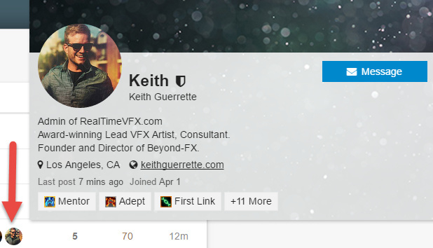
-I love the achievements. Amazing. Could some of them, or other pieces of info be displayed by each persons name? Company, their level of participation, how many posts, how long they’ve been a member etc.

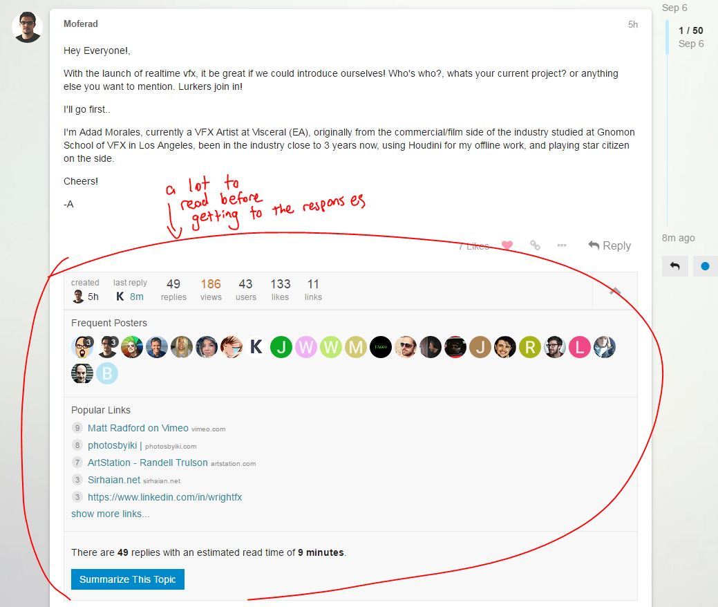
-LOVE the image embedding into posts. So EZ!

Again, looking at the website as a whole I’m super excited to see where it is already! Can’t wait to see it grow! Rad work guys ^^

1 Like

Found a bug :smiley: The jobs text gets sorted oddly on mobile (iPhone 5s). It’s fine in horizontal mode, but gets in the way vertically. Could be the browser, but I don’t know for sure since I just use Safari on my phone.

Edit: Same thing on my iPad (first gen retina…I think iPad 4?). Vertical scrunches things up too much, but horizontal is fine.

Edit edit: <3 :wink:

1 Like

Bah, you’re still always breaking things… We’re doing a few special care things for “Jobs” at the moment. I’ll dig in. Thanks!

Thanks for the awesome feedback @PetrieTheWild - sorry for the slow response too, it’s been a crazy day.

Reading this left me thinking “Duh… why haven’t I made a category for that yet?” Shall we call it WIPs & Critiques? @Keyserito Think you can crank out another beautiful icon for it?

Re: The Summary. You’re absolutely right, that’s a lot of stuff… We’d never crossed such a large topic before, so I’ll have to look into what’s going on there. Interestingly, there’s an up arrow to collapse the entire thing, so I’ll figure out how to make that collapsed by default.

This is actually intentional, and may take some getting used to. The hope is that you’ll be able to navigate the site without ever running the risk of losing your beautiful post that you’ve spent hours turning into a masterpiece. You’ll notice that all of the settings for your post (category, title, tags, content), can be changed from within this window, so it doesn’t really matter where you navigate.

There actually is a handy page that provides that view - I’ve been debating making it default, but it’s one of those things that people love or hate. I also haven’t found a way to allow you as the user to choose a default (I’ll look harder at it).

There’s a ton of customization that we can add to badges, and to name cards. We haven’t spent a ton of time digging through them yet, but I agree, there’s a lot of room for improvement here.

Some of the badges, and bio, etc are visible on the name card when you select someone’s thumbnail - here’s mine currently:

You can check out more about your profile by click on your own thumbnail in the upper right, or just going here:
www.realtimevfx.com/my/summary

It’s one of my favorite parts too - you can even just paste images into the text window! There are a few things it doesn’t handle super well (facebook posts for example…) but it’s always being improved, and it’s far better than most tools I’ve used.

1 Like

I checked out what this is doing, and i think it’s actually a pretty neat. In the event that a topic has more than 50 replies, it tries to give you a summarized view of all the content within them: Who replied (so you can find them faster) and all of the included links (that you might be going back to search for. In this particular post (http://realtimevfx.com/t/introduce-yourself-a-little-about-yourselves/167/), it’s a little unfortunate because the purpose of the thread is to be a mega topic, as opposed to a discussion.

It’s also worth mentioning that the system bookmarks where you left off on the discussion, so when you return, it’ll go straight to where you left off, and you need only to scroll down from that point to read all that is new.

1 Like

Just sent Keith the icon for WIPs and Feedback so he can implement it.

2 Likes

Awesome! Thanks guys :slight_smile: