I’ve seen a lot of people posting their work here in a single thread, so I wanna make a thread for feedback and discussions for my pieces too. Hopefully this ends up being at least a bit interesting or helpful somehow and I don’t just word vomit and then waste everyone’s time lol.
Here’s my 1st piece that I recently finished.
https://youtu.be/wEi0Go6fZnI
(how do I embed YT vid?)
For the most part of the particles, I used Riot’s A Storm is Brewing Dev log as inspiration to help make the effect, but I tried for a more lightning focus/less windy version of it. The log was very insightful.
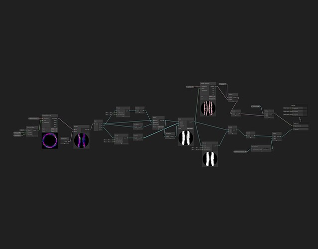
The part that took the most time is the circle on the ground
The entirety of the ground circle from the build up to the dissipation is in that shader, because I thought that’s how they did it. (But when I was looking at the thread over and over again I found that they might have split it into two parts? Is there a down side to putting it all in one?)
For the cloud, I really want something that resemble the rolling storm clouds like in movies with sea faring bits. Where there’s a storm incoming and the sky suddenly turns dark and you see clouds come in.
I personally really like the result I’ve achieved, although it might be taking away focus from the ground. My shader ended up being a lil bit whacky too.
Originally, I wanted to make fake lighting on a plane from a height map, so I can have the light on the clouds move, or have clouds reflects lights from the lightning and the glow inside adjacent clouds. So I painted my texture that way. Then I feel that the former doesn’t really make sense in this context and the latter wouldn’t really look good, So I ended up blending the height map with the UV gradients and posterize it to give it some stylized fake lighting.
I’ve also come to realize I have no idea how to rate/judge my graphs. Is this problematic at all? Would it be a way better option if I just repaint the texture? I welcome any feedback on either graphs.
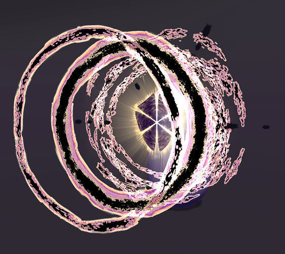
Because I did this to the initial clouds, I also use the weird height map blending on the swirly parts of my effect, for a consistent look. But they are meshes instead of camera facing planes, so I could only blend them with the UV gradient from specific direction.
After some feedback, I tried a mesh cloud version too
https://youtu.be/Nv6I-CFrGrk
I took some inspiration from Mim's Sketchbook - #12 by mim & Mim's Sketchbook - #13 by mim
but, well, Idk how I feel about it? I think I lacked a clear vision for it when I was making it so it seems kinda wishy-washy?
It was really fun to make the mesh wobble tho.
Here are some of the texture I used for this piece.
The 1st row are for the ground circle, I tried to do the same they did in the dev log. Left is the glows and the erosion. Right is the color map.
The 2nd row are the clouds’ textures, left is for the 2D cloud and the right is for the mesh cloud.
They both have a channel as an initial base/cutout mask, a channel as the “height map”, a channel for the inner glow the clouds do, and a channel as alpha/erosion. I also use the inner glow to on the right to distort the mesh cloud and blend it with 1-fresnel for the overall inner glow.
The last row are the swirl and the main lightning bolt.
The swirl is very similar to the clouds, but it doesn’t have a channel for glowing.
The lightning it split into RGB and alpha erosion. I used the RGB split to make the growth of the bolt slightly uneven by blending with the UV gradient.