Hey,
this is my first post (I am quite a lurker) here. I am teaching myself unreal and vfx in my free time and decided to take part in hopes it’ll keep me going.
I wanted to start earlier but got sick, will see how far I can get with the time I have left.
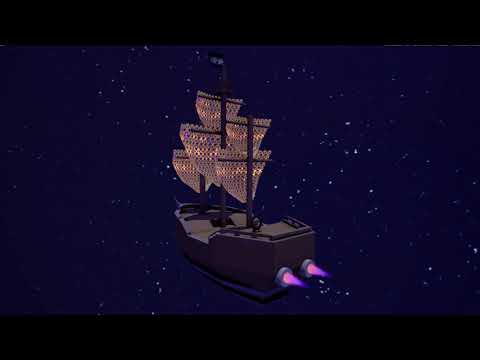
My inspiration is the space boat from the movie Treasure Planet (https://youtu.be/5alUZ5XUF1o).
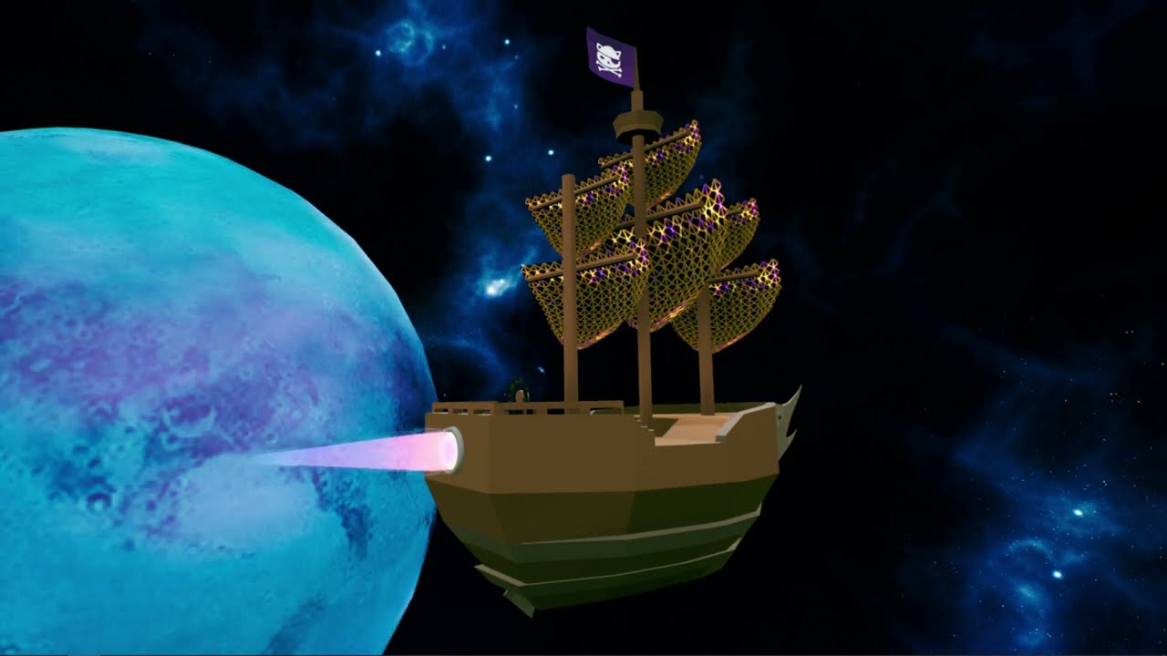
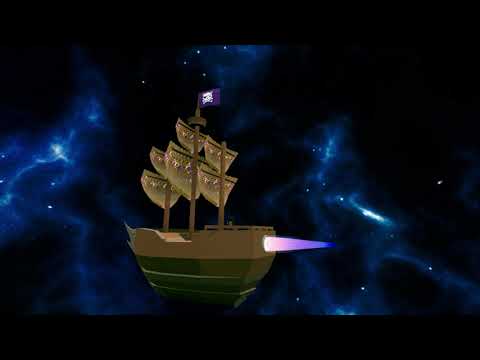
Final:
Not from me:
Mesh from Pirate Ship Cat - Download Free 3D model by N e e K i r i (@uno_leternita) [2c5b5c1] - Sketchfab
(I changed the sails, the materials and removed the cannons)
Planet texture from Planet Mars Texture Maps
Space texture for the skybox from Spacescape – Alex Peterson
2 Likes
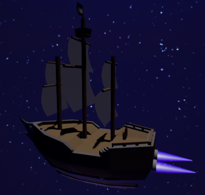
I started by grabbing a free mesh from sketchfab and experimenting with different looks for the engine vfx. Didn’t get far, hopefully I get some more stuff done over easter.

2 Likes
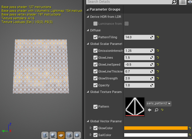
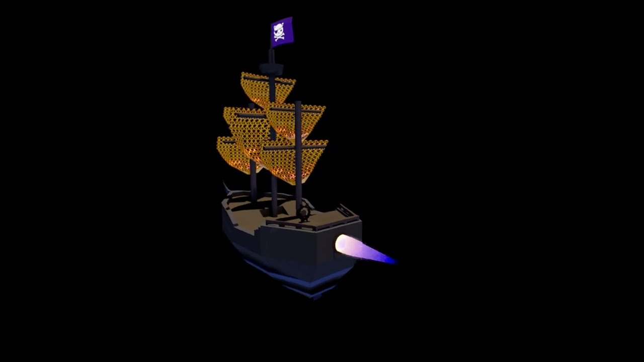
I create new meshes for the sails and did some shape research for the pattern.
Material for the sails is pretty straightforward, scrolling a gradient with some noise over the pattern to get the wavy glow.
To accomodate the “evil” theme, I decided on a color scheme of orange to purple.
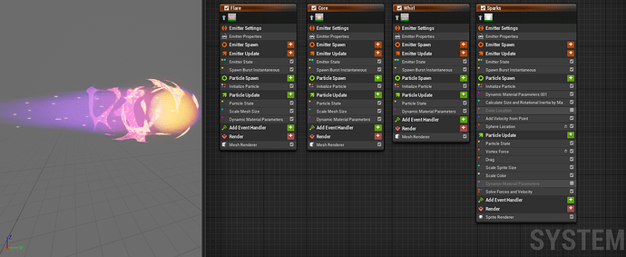
So today I worked on the rocket engine material, added a gradient curve and then created a niagara system. Very basic so far, I hope to make it a bit cooler before easter is over.
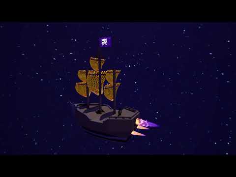
I also added a gradient curve to the glow of the sails to make it more interesting and fit the color scheme of the rockets.
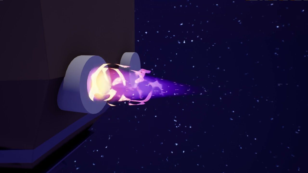
My first space rocket engine thing!
I wanted some swirls around it to make it look more active and chaotic, hopefully giving it a more … evil… vibe (I think it fits the Cartoon Disney Villain vibe).
The swirl is - like the rocket - a mesh with a scrolling material. Both are purely noise based and of course I added my beloved gradient curve for the color.
I also added sparks to the effect:
I am open to any feedback, tipps or tricks! :3
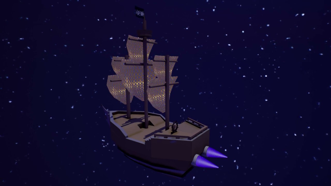
Decided on 3 engines in a triangle-esk shape, also fixed the pirate flag and added a glow to it. Our enemies WILL see us coming!
2 Likes
I decided to play around with my whirl effect and ended up with this result. I think it looks better?
Also tried some new colours, more purple, less warm and yellow.
2 Likes
I wasn’t planning on doing much this weekend but then I added some heat and space box and a planet so I could see the heat distortion better.
I used Planet Mars Texture Maps for the planet texture and Spacescape – Alex Peterson for the space texture.
Overall I tried a lot of new things and mostly learnd that I got a long way to go. Next time I wanna try sketching and iterating more.
2 Likes
