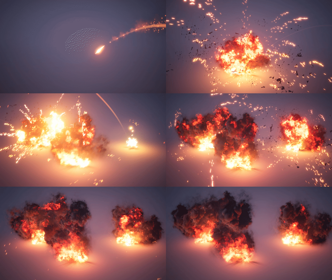
Cheers everyone for the comments and critiques during this sketch! I had a blast and learned alot!
Everything below here are WIPs.
I just created a couple of explosions before this event so I figured why not show them here.
My first explosion I ever created was of course from Partikel’s course, but hopefully I’ve moved past that now  I would love some feedback!
https://vimeo.com/284680483
16 Likes
Really nice work! The only thing that stuck out to me was as the smoke dissipates the shapes become quite sharp, in my mind I imagine they would be a little softer. Other then that it’s great. 
Hehe, yeah I was about to say. The smoke has a very Battlefield Bad Company vibe to it due to how it dissipates. It’s a great start!
Thank you for the comment!
I’ll work on reducing this - like when they become almost like solitary particles at the end
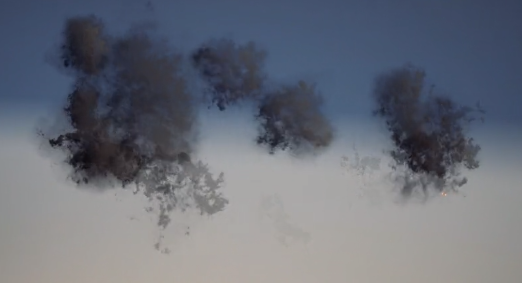
Thanks! I always thought they looked pretty good in BF:BC at the time… I’ll have to upgrade my particles to have a Battlefield 4 vibe now instead 
Here’s the second version.
https://vimeo.com/284930254
Made the smoke softer and less lumpy. Added more lingering flames at the bottom and a scorch mark aswell. I find the explosion a bit boring though after looking at it so much… Any tips on making it more interesting? 
4 Likes
Much better, but the smoke alpha is still very flat. The lingering smoke has very obvious edges by the end.
1 Like
Lovely explosions! It looks like the smoke particles erode as they grow older as well as fade out if that makes sense
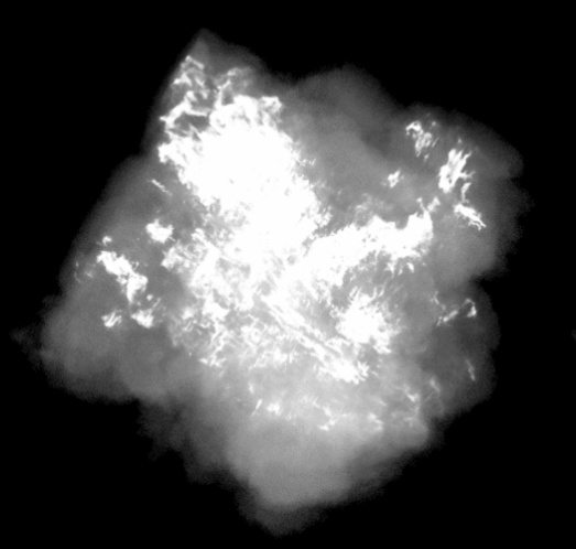
I think this happens when the erosion hits a wall of solid color in the alpha and can’t make it “shrink” anymore. Here’s a frame in the alpha where it really shows.

It’s difficult to balance since it looks good when the particles are at full opacity but when they fade they get really sharp around the edges. I might have to go back to my pyro shader to fix this so that it ramps more uniformly between 0-1.
2 Likes
Thank you! Yes, you are correct. The particles get eroded down to the white blob in the middle of the alpha and then get multiplied down so that they can fade out completely. Yeah, probably should fix that alpha 
Just a quick question if that’s ok? Did you use Houdini or another piece of software to create the smoke puffs?
Well I think the issue is the shapes the texture erodes into are far more “fiery” than they are “smokey” If you had your texture erode into softer, swirling, smoke shapes it would probably look more natural than eroding into jagged, angular, fire shapes.
Hey, here’s a third attempt.
https://vimeo.com/285163891
There’s only slight changes in this one. I made so that the texture have a way softer alpha. Hopefully this helps with the jagged edges @Partikel and @TheVman was talking about.
I also tried switching out the regular particle sprite for the explosion to a quad with edited vertex normals for some soft shading (Company of Heroes style). Like this:
I did this with UE4’s mesh emitter, don’t think there’s a way of doing it otherwise… Maybe someone knows? Doing this, however, game me some sorting issues which can be seen at around 00:04 in the video. It’s very annoying.
I used Houdini for this 
3 Likes
I really like the new additions! Can’t really see anything out of place 
Nicely done! The smoke looks much better.
Next I’d start looking at secondary effects. Smoldering smoke at the ground that stays for a really long time. Glowing bits in the decal and so on. It’s up to the ref you are using, but it’s a nice looking effect already 
1 Like
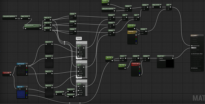
After seeing the awesome post by @Mederic I thought I wanted to try it for myself because those were some nice smoke puffs! I’m pretty much using his shader straight up so props to him! Here’s some results:
Here’s the shader:
I had no idea there was an Atmospheric Light node before reading the post by
@NateLane, thanks for showing it!
I’m not quite happy with how the generated front or back map looked, so for this one I cheated and rendered out separate light maps for those directions just to try the functionality. I don’t have any pyro information, so it’s just a puff of smoke so far. I think the shading looks better than any normal map based shading I’ve used before.
All this made me realize I really need to brush up on the old linear algebra and vector math and how powerful it can be 
I’ll try to incorporate this into my explosion next.
6 Likes
Beautiful work! Very clean results too! 
Agreed, that backlighting is tricky. I think there’s opportunity to have some really cool SSS show through the thinner parts, giving a bit more of that silver lining. Looking forward to see where you take this!
1 Like
If you’re using the ramps for albedo and emission colours like us, then you’re only using 6 channels. Which means with very little changes you could turn the mask2 texture (ramp key + alpha) that was compressed into the same format as the light map texture (mask1), and you’d get 2 extra channels. So you could pack 6 light maps, + color key + alpha into. 2 textures. While that would use more memory, you’d keep the texture fetch to the same count and won’t have to fake the front back maps.
1 Like
I managed to implement this into my explosions with point light support. Feedback appreciated 
https://vimeo.com/286364487
@Mederic I ended up doing what you suggested with the channels. Thanks for the tip and thanks alot for showing this technique on the forum!
Here’s a bonus smoke/fire pillar to demonstrate aswell.
20 Likes
holy moley, this is looking great!
1 Like
![]() I would love some feedback!
I would love some feedback!