Hello everyone!
My name is Audrey Lucas and my goal is to expand my knowledge and skills in VFX. I currently work at a small start-up company as a character animator and effects artist. I’ve only known how to animate effects traditionally, but lately I’ve been learning Unity and its amazing particle effects tools! It’s quite fun and I would like to get better at it!
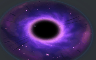
That being said, here’s a black hole effect I did.
https://audreyslucas.deviantart.com/art/Black-Hole-Explosion-711245631
I’ve already gotten feedback from @Sirhaian and @Keyserito, which I will quote below! However, I would like more so that I can make this the best it could possible be! Thanks guys! (And sorry for this post being so big… >_<;)
Kevin’s Feedback
First of all, I like your colors! I think they can still be improved but that’s a very good start.
Now, let’s talk a bit about your timing. For now, it’s all very linear. The black hole appears, get bigger then closes. You can spice that up a lot by modifying the way it grows and closes. I made an effect that can maybe give you a better idea for the timing here: Kevin Leroy: Sketch #2 WIP Portal (That stuff is definitely way too much for a game like league, but that’s just to give you an idea".
Basically, the idea is that your timing “curve” for now is almost a straight line. It never accelerates and it never slows down. To make your effect more interesting, it is good to add accelerations. For example, you could make the spawn of the effect a bit more powerful, by making the center grow faster at first, then slow it down. Something that always helps me out when making effects, and it might sound funny at first, is to make the sounds with my mouth. If you were to “imitate” your effect, what sound would you make? A slow “pshhhhh…” or a big “Pshiuuww!”? Well it’s not as effective when writing it down, but you get the idea.
So, faster at first, then slow it down while the AOE charges. Then, maybe as the AOE is gets ready to close down, make it go bigger and bigger, then a super rapid close down? It’d go like “pshiuuuu! pzzzzzz… PSHIU-POW!”. Once again, writing doesn’t do justice to it, but bear with me. x)
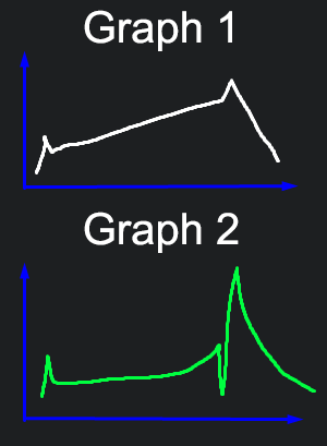
If I were to show your effect’s curve right now, here’s what it would be in Graph 1:
And here’s a curve in Graph 2 I think could make it more interesting.
So those curves aren’t necessarily the brightness or scale. It’s more about the overall intensity of the effect. The first spike would be your spawn, the long line would be the charge, then an abrupt down and up for contrast for the explosion, and then the lingering of the explosion.
Also, think of your effect as one single element. It’s one spell, cast by the same guy, from the same school of magic, with the same power. Right now, your explosion seems very disconnected from your AOE. The intensity/contrast that your AOE colors give you are not in the explosion anymore, which feels a little sad, because the explosion is supposed to be the apex of your effect. It’s the thing that deals damage and/or applies the CC. Think of it as the one thing that needs to make your players go “WOW, pretty~!”.
Jason’s Feedback
I can see the tricks you’re using. You need to find ways to integrate each element (particle emitter) into a cohesive visual, which will make the whole effect believable. Here’s a few examples:
The gathering black streaks on the disk are a missed opportunity. They blend in nicely with the portal texture, but have abnormally crisp edges, ruining the illusion. Also, they are straight, so they only indicate a slight amount of inward motion. Some more varied shapes, with slightly fuzzy areas will make the portal feel like its energy is being sucked in.
Similarly, the hot pink edge of the portal looks fine as a static image, but being such a great eye-drawing focal point, it’s plainly a still texture. Think of ways to add life to that region of color: distortion, pink gathering bits, wisps, shimmers, etc.
There’s a ring/nova shape that bursts up at the climax. It’s clearly a flat card. Maybe use a partial taurus mesh with a scrolling texture instead. This would offer a subtle billowing motion, making the ring rise up out of the collapsed portal.
No major concerns with the puffs. Just more polish.
Take the time to carefully study each element in isolation to pick out what you do and don’t like about it, and imagine what specific things could improve it: texture tweaks? Motion timing? Scale timing? Color over life? Variation? etc.
Hope that helps!

