Hey everyone. My name is Ben and I have been working on a VFX sequence as part of my Masterpiece project at uni. It is primarily a VFX sequence but I have integrated some Motion Design into the piece. The idea is to imagine what the university inside could look like around 2044. Rather than plastering effects in, I have been told by my tutors to keep thinking about purpose and ensure that my piece remains dynamic throughout and not just a case of repeating effects too much. Otherwise, it would be great to gain some feedback on my piece (positive, negative, add in, take out, alter, etc.) as the only feedback I haven’t yet been able to receive is industry feedback. (There are quite a lot of hidden effects in but that is mostly masking things to get rid of them and add stuff on top or just simply get rid of it). I believe that is all. Thank you! https://youtu.be/4I3h3QMBOWs
I’m not acctualy sure what I’m looking at,
Is this footage of an AR setup?
Are the special elements composited on top and pre rendered?
Is it premade footage which is being tracked and overlayed in real time?
Is the whole thing interactable? Can you walk through it?
That said, I do like the designs on the back wall of the first shot, but why is it there?
And why only there? Does this futuristic school only have money for one motion designed wall?
The rest of it is just plain bricks.
The left wall has led boards with 1 board giving really vague information about the weather, but the other boards
are just ads. It’s still a school, so I would think they would give clear information (Weather, Lessons, Extra cirricular activities etc,…) Not ads?
Second shot is cool, but what is its purpose? Why are there animated walls with flowers? And again, why only there?
Some of the shots feature work of other studens, which is something we would do in a normal art campus, so that makes sense, and to use the improved technology to present it differently, is not too far fetched.
I’d say, overall, it looks cool and fun ![]()
Thank you for the feedback first and foremost. Also, apologies for the lack of context on the footage - probably would have helped deliver better feedback.
You could describe it as AR but it wasn’t necessarily the intention. What I’ve done is go around a building at the university filming particular areas and imagining what it could look like futuristically. The elements are composited on top in post and are made to animate as I have moved the camera. So it’s almost prerendered effects that are responding to the footage. The posters and one or two other elements are animated on as the camera gets closer.
I was at first going to animate things on all walls but due to a lot of the walls being plain bricks as you say, I chose not to animate on the bricks because I felt it would look odd and jarring whereas on a painted wall, it looks smoother and better so I chose to animate all the painted walls to make it like the paint was the projection screen. Hence the motion design wall in the background on the first clip, second clip, fourth clip and sixth clip.
The led board on the first clip was an idea from my tutor whereby it’s giving information about the time and a calender. I can see what you mean about it being vague though. As far as timetables and related information goes, I have left that to the board on the last clip as you may have seen.
The photo frames in each of the shots are work from the journalism courses fom what I heard and I did have other intentions for the boards but I had to slightly alter my ideas here and there as the project went on and in the end, my idea was to feature mostly student work on the boards and the other few were basically information boards such as the time and calender in at the beginning and the mapping system at the end.
Hopefully, that helps put the sequence into more perspective for you. Thanks again for the comments though! ![]()
Nice!
I have some perhaps more nitpicking feedback. Also beware it’s just a train of thought!
- 0.01 - Some things are comped with motion blur & the white text/black box stuff seems to not fit with this. The slightly imperfect elements (blurred) work well. The “Boot Sequence” is the strongest element here, the imperfections sell it, and the colors match the footage.
- 0.04 - Particularly the Aston Martin & FLARE sign seem to lose tracking a little.
- 0.04 - the FLARE sign & in general - never go pure white (or pure black). For the whites, consider adding a monitor or some other tone.
- 0.04 - Stupid thought with that multi coloured wall; would love to see a blue screen of death pop up on that for some humour. But it may very well not be the impression you want to set!
- 0.07 - Seems to track a little off
- 0.10 - I like this concept - the info board. Maybe some type of apple-style blurring of the background behind it might be nice, however that’s very much a current trend, and not necessarily a 2044 trend
- 0.14 - I feel like I wanted to see the front edge of the truck getting clipped inside the frame; I realise it’s meant to be a hologram/AR but it might be nice & a little more technologically grounded, if it acted more like a sheet that tracked each individual viewer’s head. So what you’re seeing is still a flat surface, with head tracking. I can definitely see that technology happening by 2044.
- 0.23 - the text on the notice seems to float off the surface. If this is intentional, maybe add some digital overlay to it, or some sort of QR markers on each edge, to really try and sell that it’s an overlay, and not just a print out comped on the door? Or maybe it’s a mini digital display.
- 0.23 - Conceptually, what about this changing language whilst you view it? Might be nice, and could help reinforce that it’s technology.
- 0.30 - It feels slightly like the screen the student is viewing, tracks deeper than the wall surface. It might be an optical illusion though so don’t read too much in to that. Just feels the parallax on the screen is stronger than the wall.
- 0.30 - I really hope emojis are dead by 2044. Nothing to do with this piece, just a personal opinion.
- 0.40 - I hope Jpegs are a distant memory in 2044. See above.
In general, I think there’s a couple of easy wins.
For digital displays that are in the world, consider making them read more like a digital display.

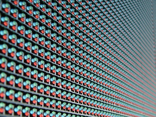
Consider that they are still a surface & not pure bright. What has worked well for me previously, is tiling an RGB pattern like above, at high frequencies. I did this on B:AK for the in world jumbotrons. What you end up getting is a nice patterned effect that helps sell that they are displays, and also you get a nice moire effect (which is up to your direction, if you think it’s nice)
Also consider that these surfaces would still have reflections, whether they are matte glass or shiny.
Finally, some sort of refresh rate effect on digi displays works well ![]()
Those two features should really drive home the idea that these are digital displays (if they are) and make it look less like a comped element & more like a physical reality.
Conceptually, it feels like there’s a few ideas going on at once and I’m not sure which ones to focus in on. For example, some parts feel like AR being filmed, and other parts are in-world, digital tech displays. It may be nice to focus in on one of those ideas, have them a common theme, and create a nice, consistent visual language across all the elements.
FWIW What I would focus on, if I was to pick, would be the 2 forms of displays you see in 0:14. A hovering UI Overlay that reads as an AR moment, and the digital, in world display of the war rig. Any other posters/signage in the vid, I would make conform to this standard and style. For example in the next shot, the Staircase B sign, wheelchair and important notice, I would expect to all be the same as the AR moment I described (the school info) and so they’d follow the same visual language/branding. They’d have the same outline, background, colour scheme, and the same consistent glow around them if desired (i see the wheelchair glows, which is effective, but the others dont)
In fact I’d say the effect on the wheelchair is fairly strong. Love the chromatic aberration on this as we look at it closer. If this could just look like pixels a little more, that would be killer. It’d be great to see the other elements resemble this.
Cliff notes:
- Drill down to just a couple of core ideas, brands & styles and make everything fit to the style.
- Never use pure black & white
- The school info displays are some of the stronger pieces & with a small push could be even better
& in the near future I look forward to seeing some of these ideas realised!
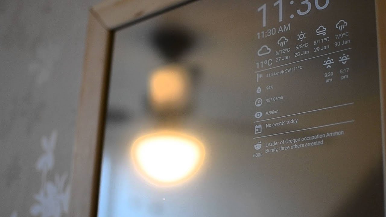
Magic mirrors feel like a first step to some of these
https://www.google.co.uk/search?q=magic+mirror+raspberry+pi&rlz=1C1CHBF_en-GBGB703GB703&espv=2&source=lnms&tbm=isch&sa=X&ved=0ahUKEwiY0-r7nNvSAhUICcAKHQUxCbwQ_AUIBigB&biw=1850&bih=1014
Wow, that is some amazing feedback. Thank you for all the comments! I’m happy that you’ve been nit picky as well because it’ll help boost the project in the end. Even the small and intricate details can be improved upon so thanks again.
Looking at the feedback you have posted, I know about the motion blur and the text, I took it off the text so that you could read it a bit better - this was also feedback from a fellow student that mentioned about removing the motion blur but I’ll have another look at it and try and make it work with some form of blurring so it blends with the rest of the image better.
I’ll take another look at the tracking on the Aston Martin because I haven’t noticed any bad tracking on that one, I know about the Flare advert though - I’ll go over the tracking data for it and fix it. I know what you mean as far as the colours go on the video. If I can replace it with something more fitting colour-wise, I probably will.
I love the idea of a blue screen of death for humour and may add that in as an optional extra now that I think about it but for the purpose of the assignment, I think I may just keep it as an optional extra… I’ll see about it.
At 0:07 seconds, if you’re referring to the wallpaper, I’m glad you noticed that because I didn’t. I’ve just noticed it and will have to fix that.
For the info board at 10 seconds, it does actually have some blurring on as well as a greyscale animated background that all comes together to make the sign work. I’ll look into adding some more blur to see if it works better or not.
You make an interesting point about the War Rig design. It’s given me an idea to try out to see if it looks any better. I agree though, it’s definitely something I can see being available come that time.
I like the idea of adding QR markers on each edge. The text is supposed to be in a small amount of 3d space and I have pushed it back a few times due to feedback from many people seeing it coming off the page here and there because of the angle of the camera. I do also love the idea of the language changing whilst viewing it.
At 30 seconds, I think I see what you’re talking about but it’s definitely not deeper than the wall. I have created several nulls within the scene so I can see where different points are in 3d space. In this case, the monitors to the wall and using the Top view in After Effects, I’ve moving the layers relative to the objects in the scene so the monitor effects are where the monitors are at in the scene and the wallpaper effects are where the wallpaper is in the scene. As far as the emoji goes, fair enough on personal opinion. It is part of the video in the wallpaper so there’s nothing I can do about it beyond changing the clip, which I am not likely to do to be honest.
Hmm… Thinking about the Jpeg, I could make up a new image file extension name considering it is the future. Potentially, new extensions could take over in the future.
For the rest of the feedback, looking at the digital displays and the RGB pattern idea, I will definitely give this a shot because the keyboard especially needs fixing. It looks right to me but I want something more to it to help sell that it’s a touch sensitive keyboard glowing on the table and the RGB pattern sounds like a promising idea.
Thanks again for your feedback. I’ll go over my work and see what kind of improvements I can make to it based off of the information you’ve suggested. ![]()