[WIP] [HELP] Athena Thrust - How to strengthen the motion?

Latest
StGNeural1-256_03

Previous
StGNeural1-256_02

Version 1
Zoomed out: Screen capture - ffc03def496624574ed4cfafa34cb29f - Gyazo
Zoomed in: Screen capture - aafd7029f894b2166da7e836e6b565e5 - Gyazo

So I’m pretty happy with the overall structure, but want to push the intensity and also make it feel dense. I Want it to feel heavier while being fast :sweat_smile:

Besides that, at the moment I think it’s too clean and encompassed at it’s own “space”. I want it to bleed out a little more, to get a little bit more messy and intense.

All feedback is appreciated. Be it colors, timing, balance…anything! :heart:
Also, if you have ideas on how to make it cooler, drop it here :star_struck:

In advance, thanks for helping me grow!

Update:
StGNeural1-256_02

1 Like

You can actually strengthen the motion by making some of the trail go the opposite direction, this gives a sense of wind-up.
I found some old examples in a twitter list I made:

and the slomo:

You can clearly see the bones coming out of the floor.
Yet at full speed the effect looks like its coming from the sky, hitting the floor.

Additionally, a --with lack of a better term-- force ring could also help:

2 Likes

Hey Sig, sorry for the low quality images, I don’t have my tablet to do proper paintovers in Photoshop for these, so hopefully they are legible and make sense.

I think the biggest thing that will help your thrust effect feel powerful is starting your core shape sooner in the animation. Even watching the gif play back at 0.5 speed, in only briefly flashes. You could probably start it earlier than where I marked in the screen shot, and then build into it more with size and color over life


.
.
My next bit of feedback is have that core shape move forward more over its life, and then slow it down with some Drag or reduce its velocity over life near the end. Think of like a car skidding to a stop over a short distance.

.
.
My last bit of feedback is just echoing @Luos_83 ‘s about having some sparks move the opposite direction of the thrust. If you give that a try, I’d recommend moving the sparks’ start location more forward, so they have room to move backwards, but still stay in roughly the same area they are playing now. I tried to mark out where I thought the center of their spawn location was, and a recommendation of how far up to move it.

Lastly, the hot yellow/gold sparks feel a bit too spread out and start to make the effect feel noisy. I’d suggest either: reduce the number spawned, vary the size or split the emitter into two so you can have more of them be smaller in scale, or group them more tightly around the shaft of the spear. I marked out a guess at how much tighter the group might be to look a bit better
.
.
.
I also think adding some glow in front of the spear will help sell the power of it more too. It doesn’t need to completely cover it, but some yellowy additive sprite over the top of it would help tie everything together.

.
.
.
For these types of effects, Drag (or scaling velocity down really fast) will be your biggest asset, in my opinion. You’ve got a great start to this effect!

2 Likes

Love me some force ring/ air shockwaves :sparkling_heart:

2 Likes

Here’s an example of a thrust attack I worked on for War in Darksiders: Genesis. Keep in mind, the effect is traveling really far in this because that was the distance of the hitbox for the attack. It’s hard tell, but I’m slowing the core “blade” down from 100% velocity to 0% over something like 0.8 - 1.0 of the particle’s lifetime as I’m fading it out and scaling it down a bit.

(Video might still be processing)

3 Likes

@Luos_83 @Travis Oh my, thank you so much! These are all great ideas.

And what and interesting thing…who would have thought that moving it to opposite direction could strenghten the motion?! Well, I didn’t!
I’ll be messing with it later tonight.

As for letting the core shape live for a longer time, I kinda thought that too last night when I made the gifs.
Right now it’s so fast…Unity can’t even render the last frame of the flipbook (the third, where the core is really small). Sometimes not even the second frame shows up. Plus, since it lives for a so short time, it can barely move through space.
Yet, in comparison to the other entry, living for less time made it “sharper”.

Anyway, I’ll be making some changes taking all that in mind.
Again, many thanks!

1 Like

Update!
StGNeural1-256_03

The guys over Rumble Arena liked it, but still gotta do some tweaks.
I went crazy and made it bleed way too much through her back. It’s too long and, gameplay wise, this will look confusing.

Also, they want the “head” to be a bit thinner.

As for going further away, I can’t due to the hitbox.

I also added some sparks angled differently, which are going backwards instead of forward.

Feedback and ideas are always wanted!

2 Likes

It’s getting great!

Maybe you could add some kind of “charge” effect, taking advantage of the first longer anticipation part of the character animation. Adding some dust in the ground could also help, as well as the rings mentioned by both Luos and Travis.

The Paladin in Lost Ark has some nice stabs you could look at for reference, the game has awesome VFX.

(video of all the Paladin skills witha timestampt to similar to yours)

There’s also a spear user in the game, but I don’t know their attacks, so I’ll just leave it here in case it can help you:

(btw you can go frame by frame in youtube with < and > while paused, I just recently discovered it and I’m abusing it :rofl: )

1 Like

You can slow down or speed up the play speed with Shift+, and Shift+. respectively too.
The frame by frame hotkeys have been a life saver :+1:

2 Likes

Update!
Athena Thrust

@atcolombini I’ll take a look later tonight, I’m almost falling asleep on my chair haha. Indeed Lost Ark VFX are amazing. I completely forgot to check that out, thank you! :star_struck:

Yeah, a charge-up would be very much welcome along with Athena preparing for the attack, right?
I plan on doing exactly that! Just don’t know when…I keep coming back to this Thrust effect for adjusting stuff here and there. I’m beginning to ask myself if this is the right way to go about learning. I mean, it’s such a small effect, yet I’m hitting about 2 weeks of work poured on it :open_mouth:
Maybe I should set deadlines and do the best I can on that time, and that’s it.
Sometimes I feel like polishing it so it shines as a portfolio piece, and sometimes I just feel like I should “print” more effects so each character gets to have effects for their moveset.

When do you call it done? Maybe when it serves the purpose? Maybe when the client says they like it? Maybe it’s not done, but the time for loading it into the game has come?

This is something I’ve been thinking on the past days. Maybe I should start another post xD
What do you guys and girls think about it?

And yeah, I discovered < and > quite recently, those are the keys I use the most now hahahaha.

@Travis Ohh I didn’t know these! Will come in handy for sure :smiley:

3 Likes

Hey Sig, this is looking awesome! I’m sure it looks even better not compressed down to a gif too. I think you’ve really nailed the “feel” in your latest update, it really blends well with the character animation timing!

My last bits of feedback for things I think could use a few small final tweaks are for two things:

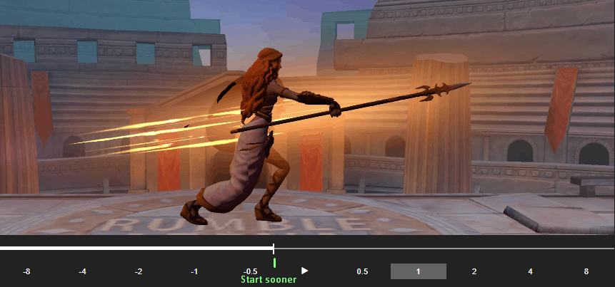
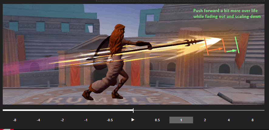
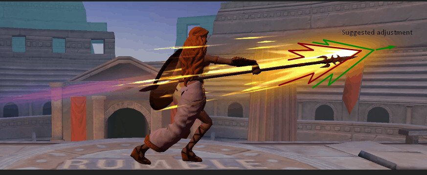
I think moving the main “core” of the effect, the hot white/yellow jagged arrow, could be moved forward just a bit, so the hot white center of it stays just a bit in front of the spear’s tip. This will help not only blend it a bit better with the spear, but will give a good contrast background for the spear tip as well, making it more easily readable by players.


.
.
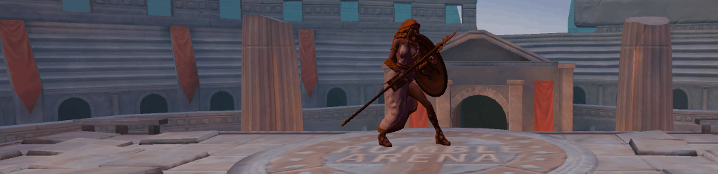
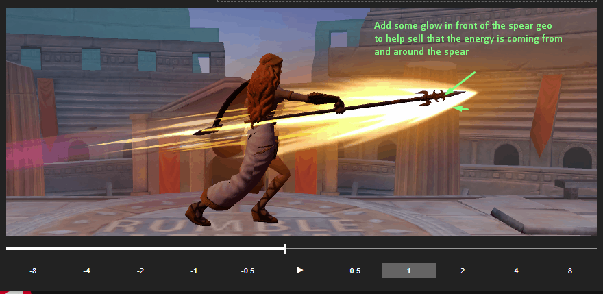
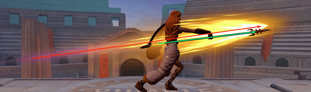
And the second bit, I’d just suggest aligning the angle of the whole effect a small amount to line up with the spear’s angle. In the first screenshot, the orange arrow is the angle it’s currently at, and the green arrow shows the angle that the spear prop stays visually on the screen the longest.

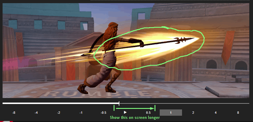
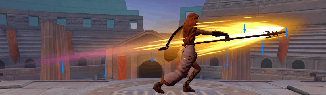
Just scrubbing through your latest gif, it looks like all you might need to do is just move the whole effect down a bit on Z. I know it lines up with the spear at the end, but going back to my previous mention of contrast between bright, light effect, and darker spear prop, when the effect is at its largest you get the most contrast between the two and the angle difference stands out more.


So a player (or Lead looking over this effect) is more likely to notice that in the large visual beat of the effect far more than it not lining up at the end when its scaled down and fading out. But in general that will depend on the given animation and how long the effect lingers.
.
.
All in all, like I mentioned, these suggestions are very small polish bits. Overall this version of your effect is great as it is. I really like the colors and shapes, your timing and overall “feel” is much better and blends well with the animation, and your residual supporting elements are good as well!

You were wondering when to call it done. Over the few years I’ve been doing effects, and especially when I was working on a game with a mountain of things to do and not enough time to do them, I learned there’s a point in most effects where they are “good enough”. If I had to put it on a scale from Basic Blockout (10% “done”) > Polished/Demo Reel (100% “done”) I would say “good enough” is around 70% “done”. The big question I started to ask myself when working on a production with a hard deadline that shifted my perspective and was kind of an Ah-Ha moment was: Will the average player playing this game and seeing this effect think it’s cool? This is dependent on a lot of different factors, but you start to get a better feel for it over time. You may not be completely happy with an effect’s level of polish, or the director or lead might not be either, you feel like you could do a little more but maybe it’s not immediately apparent what still needs work. But when a regular non-vfx artist gamer plays the game and sees your effect they will think “Wow, that was cool!” or at the very least it won’t stand out as unfinished to them.

Don’t get me wrong, you always want to strive to do your best work on every effect you make! But there will be times in production when you just can’t (or shouldn’t) put more time into something and have to move on, and knowing when something is at that “good enough” stage will save you unnecessary time noodling on things. Does an effect stand out from the others in the game? Do the colors not match, is the timing way off, is the shape language or overall style too different from the rest? Does it correctly convey the gameplay information that it needs to? Stepping away from an effect at the “good enough” stage can also give you better perspective for what needs improving when you come back to it too.
.
.
.
TL;DR: When I watched your latest update for this effect, the first thought that came to my mind was “Wow, this is looking great!” so I think it’s at a very successful spot! :slightly_smiling_face:
Watching it play for the 10th time, in a vacuum with no pressure from time or combat or gameplay, scrubbing through the gif frame-by-frame, was the only factor where I found little things to point out. So take my above feedback about the effect with a grain of salt, as they were all very small things that didn’t immediately stand out :+1:

2 Likes

Heey! I’m pretty happy with that too! :star_struck:
Had to do a lot of scrubbing for getting the time right :hot_face:

Yeah, I think it would be better too. Sadly I think it’s already encompassing the hitbox limits…if I make it go more to the right, it might lead to some confusions. I’ll have to check the hitbox to make sure (I confess I super want to move it a little bit further :sweat_smile:). If I could, I would also make it start earlier too (more to the left) so the main core has more distance to cover over it’s life, as I did in one of the updates (the one I went kinda crazy, hahaha). The thing is, if I make it spawn more to the left, it gets a little bit tricky to get the main core sync it’s location and speed with the spear tip while the attack is “activating” (spear starts to go forward > fully extended). I end up making the effect reach the final destination before the spear, or the spear reaches it first. Right now it’s not perfectly synced, but will do…for now :yum:

By the way, I did not state it earlier, but the effect will be rendered in front of the spear, so it will cover the spear. But we will only sort things once it’s in the game.

As for angle and lowering the whole effect…
Omg, how did I not see that :rofl:
I was just scrubbing the gif just now and I think it has to do with some issues on the 3 frame animation of the main core. I think they are misaligned.

===//===

I had similar thoughts on the past days, but the scale and specially asking the question about how the average will perceive the effect…yeah, I can see it shifting my perspective too xD.
But yeah, both are a kinda abstract, and it’s something I’ll get a feel over time.
To add on that, I think weighing things also helps. Like, in this game in particular, most of the characters do not have any effects on them. So, what is more important for the game as a whole? Athena having a 100% super ultra pew pew swoosh polished effect for one of her attacks VS all of the characters having, say, a 70% done effect? I think the latter impacts the game quality as whole.

Man this is soooo common. I look at the thing and I know it’s not really what I want, yet I don’t know how to pin point what are the missing elements to make it look what I want. Then, when I revisit the effect, sometimes it suddenly pops in my mind “ok, I gotta add this, remove that, adjust this” - things that were not obvious before.
Maybe making actual concepts would help :thinking:

This sums really well with the question about how the average player perceives the effect.

Yeah, and if we think of it, the potential for making something better is infinite if the time is also infinite, which is not the case. Plus, the effect is only of any use if you ever put it into the game or you finally record and put it into your reel/portfolio. Also, there is always the possibility for coming back to it in the future.
So the real thing really is getting the feel of the scale you mentioned and correctly asking the question about how the average player will perceive the effect. Not having that in mind will lead to noodling unnecessary things.

As I said on a previous post, I’ve been thinking about that on the past days and your comment got me thinking the whole past day. I think I’m slowly progressing into seeing this matter with more clarity…so ultra big thanks for typing it down, man! :hugs:

1 Like

@Travis By the way, have a look on all the versions of the effect. I’m curious to know how would you rate them on that scale and what version was already the “Good Enough” version.

Version 1 - Zoomed In.
I was using a different animation at that time. I know it is not aligned and is hugely mistimed, but what about the effect itself?

Version 1 - Zoomed Out

Version 2 - Zoomed In

Version 2 - Zoomed Out

I think V2 this was already “ok” but wouldn’t really stand out, plus it needed some tweaks on timing and all.

Version 3
StGNeural1-256_02
V3 would be the Good Enough for me, it was when it got me “wowing” over it a little bit. The previous versions I was like…“uhh, meeh” :rofl:

Version 4 - that’s the gif of the last update.
Athena Thrust

1 Like

I still think v4 is the best out of all of them. Imo the overall composition, colors, shape and timing all feel really good. Without knowing any information about your prompt or project, constraints, design needs etc. or having any other vfx from the project to compare it to, it didn’t seem unfinished in any way, and feels on par with similar effects I’ve seen from other games.

To me, v3 feels unfinished (about 50% compared to v4)

1 Like

Really nice to see how it progressed! I agree with Travis, v4 is the best one and some solid improvements were made!

Just wanted to add my two cents here, it was mentioned before, but I really think that some anticipation from FX side could help pull all this together very nicely. The character does a sort of “step back” in the animation, which is a great window for anticipation FX. For example, some fresnel on the weapon mesh, increasing in intensity, and then “release” that intensity with a quick “flare-up” on the spear (or the tip of the spear, might be better). (see this, just an idea) Not every effect can be built with anticipation, but in this case it could be, so it would be a lost opportunity not to use that extra ~0.5s before the actual strike to sell the strength of that effect more. You could even have a little “glint” / specular effect before the strike, you know, anime-style. Although the scene is quite free of any specular, so maybe it wouldn’t work so well. In any case, many opportunities to pull off some cool anticipation FX here!

2 Likes

Hi! Thanks for the feedback and ideas, it’s always aprecciated! :smiling_face_with_three_hearts:

I am indeed working on an anticipation for it. This is the first draft:
AthenaHeavyForward

My intention was to have it attached in her hand, but this is something I still didn’t go into on how to get set. The way it is now can give you a rough idea though.
I’ll also experiment attaching it on the spear blade instead of her hand.

As for the glow and the glint, these are great ideas. I thought of the glow, but a glint didn’t occur to me! I can foresee it would fit really well too.
I didn’t try it already because, again, I still didn’t go into how to attach things to other Prefabs or Objects in Unity.

@Badfish (over RTVFX Discord) said it would make more sense if it shrinked, so it has a feeling of energy being gathered.

I think I’ll go down this way, but still want a convey the idea of energy getting unstable, as if the energy is gathered, but it’s too much energy for that space, so it starts to get unstable, it starts wanting to spread out, to be freed!

@Travis Check it out! I tried to fix most of what you pointed out. Though I can’t really move the effect more to the right because of the hitboxes :frowning_face:
The misaligninment was due to some of the animation frames not being perfeclty centered + effect angle and height.

By the way, I went on rescaling the textures and arranging it in texture atlas, so I could end up with fewer materials. In that process I kinda broke the effect hehe :sweat_smile:
I had to retweak some stuff and didn’t end up with the exactly same effect as in v4.

AthenaAttack1
This is a new effect I was working on. I used some of the elements I used on the other one (the stronger one). I’m probably grounding myself somewhere around these colors and elements as her “theme”, so I can have consistency in all her effects.

Yet I’m really open to ideas since I’m not quite sure if I’ll indeed stick with this.
For Athena, I wanted a light color palette, but didn’t end up with a holy/angelical feeling. Because, well, she is a fighter and her movements are not really gracious but sharp. Yet I don’t want to end up with a ferocious feel. I want something on the middle ground, something brute, but with some delicacy and elegance on it.

Does it make any sense? :rofl:

Thanks everyone, this community is awesome :heart:

1 Like

For Athena, I wanted a light color palette, but didn’t end up with a holy/angelical feeling. Because, well, she is a fighter and her movements are not really gracious but sharp. Yet I don’t want to end up with a ferocious feel. I want something on the middle ground, something brute, but with some delicacy and elegance on it.

Maybe you could try to implement some sort of “ghosting” effect for the spear. As in, in the key poses, you spawn another spear mesh right on top of the spear’s current position, and then slowly fade it out? Just something that popped into my head when you said “angelical”. Something more spirit-like, something that kinda “defuses” the quick, hurtful, spikey feeling of all these attacks. You could even spawn a couple of them “along the way”, tracing her movements with such a ghosting effect that softens her movements. Also, for an angelical feeling, the color palette might have too much (and too heavily saturated) orange. I feel like these heavily saturated yellow-orange-red gradients usually go into more of that “ferocious” feeling.

Oh my, I just read your reply and realized I could’ve incorrectly expressed my intentions. I went on reading my message and spotted my mistake here:

I skipped a “want to” between “didn’t” and “end”. What I actually wanted to mean is I didn’t want to end up with something too holy or angelical, because she is a fighter and her movements are not gracious, but sharp and strong movements. Yet, I want something leaning on “light” vibes, but don’t wanna get too extreme on that in order to end up with something holy/angelical. Buuut I want some elegance and delicacy on it. Hence something on middle ground :rofl:
The little sparkles I use as residual elements are elements I added mainly to help me soften the effect vibe, for example.

So sorry for the confusion!

Yet those ideas will serve a lot once I start working on Cupid. I got curious about how it would look like and maybe I end up using in Athena if it fits her well :slight_smile:

1 Like