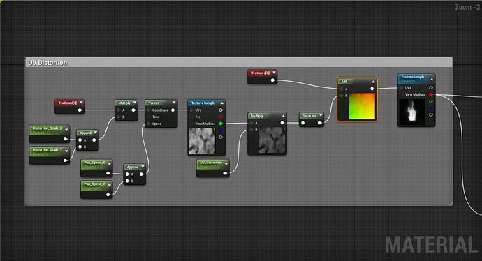
No worries, another person asked about the technique as well. Gradient maps are super useful and really easy to implement tool, as seen above.
Basically gradient maps can be thought of as Look Up Tables that checks each RGB value in a 256 x 32 image, in this case a color range from black to magenta and finally to a sickly green, and remap the color value of their own color range, in this case from black to white, to match the new color scheme. That sounds like a lot, I know.


In this example, we have the black values look at the new gradient map and ask what color they should be, in this instance, a very dark purple. Half way through we have the gray values check and find that they should be magenta, and similarly, the white values should be green.
The reason, and benefit, of using the 256 x 32 dimension for our gradient maps is that we can stack multiple maps of different color schemes on top of one another into one mega gradient map, allowing us to save on space and still sustain those powers of 2 that computers love so much.
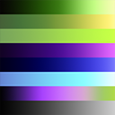
For the Warlock Spell, I made this guy, which includes 8 different maps in a 256 x 256 image.

These are really easy to make in photoshop, and a few google searches should get you what you’re looking for.
What makes it way more useful is when you use this logic on a texture.
Using the smoke example, we have a slight alteration from Luos’s implementation found here
Particle Gradient Mapping - #2 by NateLane
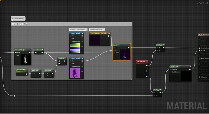
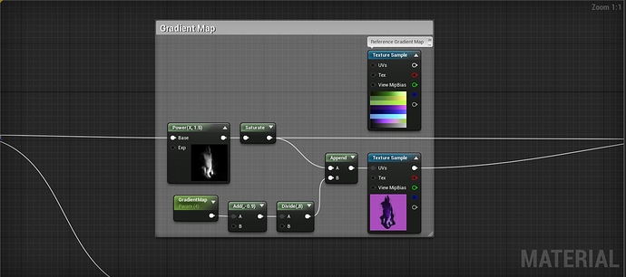
Starting from the left, we take our grayscale version of our smoke texture and saturate it, which basically normallizes the RGB values, or set them to range from 0 to 1. The green node called “Gradient Map” from the screenshot is a parameter I set so that I can easily swap out which gradient map I want to to use at that moment.
In this instance want our smoke to be dark on the edges and light pink at the center, so we look at the Warlock Gradient Map and see the 4th row down, the one that goes from dark purple to light purple.

Starting from the top, a value of 1.0 would give us the black to green color scheme, while a value of 2.0 would give me the off green to bright yellow color scheme. We input 4.0, remapping the texture we give to now take on the purple color scheme.
The floating “Reference Gradient Map” node in the screenshot is literally just there to show me the order of maps, and is intentionally not plugged into anything. And that’s it!
TLDR; Gradient maps let you change the color scheme of a black and white texture. Copy that unreal code and apply it to a grayscale image. This stuff is way easier to get by doing than explaining in text form. 
Again, this post is great if you’re wanting to see much smarter and more qualified people discuss them Particle Gradient Mapping - #2 by NateLane
