Hey Guys, here’s an Earth elemental spell that I made using PopcornFX.
C&C Please
Version 3:
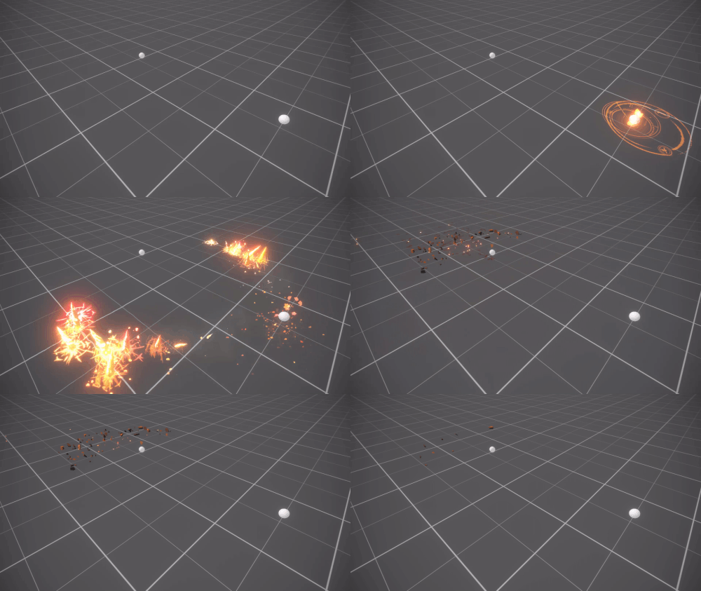
Version 2 :
Alright, here it is, a small update that took into consideration most of the criticism
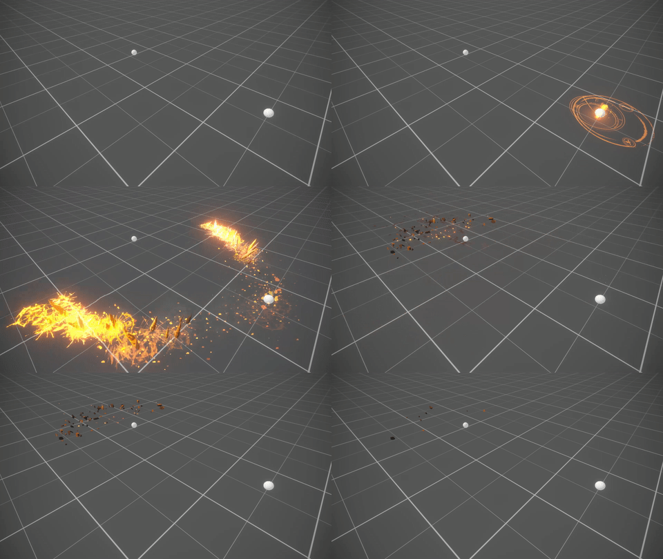
Version 1 :
Hey Guys, here’s an Earth elemental spell that I made using PopcornFX.
C&C Please
Version 3:

Version 2 :
Alright, here it is, a small update that took into consideration most of the criticism

Version 1 :
i really like the look of the attack, but i feel like your timing could be a little better. Most of the attacks in LoL are click, release, hit from what I have seen.
the initial startup is around 6 seconds, trim that to maybe 2-3 then release…impact on the target! followed by a quick fade. It will definitely give this effect much more of punch!
Hey Five,
Could you tell me a little bit about what the effect is? What is it’s purpose? Is it magic? Is it molten rock? ect. ect.
Firstly I agree that the animation could be faster. I say that having never played this type of game. Seems like it takes too long to get to the target.
I like the rotating bits you have at the very beginning. I’m not sure it’s necessary for them to go completely away. It might be worth lowering their opacity so you get a second layer of read beneath the ground sigil.
The ground sigil is awesome but it might be cool to break it up into three rings that animate in seperately and rotate with different direction and speed. This on top of the spinning bits will create a very compelling point of origin.
The sphere has a nice glow on it but I don’t really see that reflected in the ground. It’s losing some of it’s presence since my brain expects there to be light cast from it. I realize this is probably in an editor and you may not have a ground plane. You can install a soft radial gradient below the sphere which will not only fake cast light but marry the other elements you have going. You could even have it increase in intensity before the spikes burst through!
I love the particles coming from the ground sigil. It almost looks like they’re only emitting from the opaque areas of the texture?
The penetration decals could use some brightness when they first appear. I like that they fade out but you might want to try some alpha erosion as it’ll trick the brain into thinking the ground is sealing back up.
The spikes are super cool! Haha I didn’t see those coming! I would try making them super bright to match the penetration cracks when they first come in and have them cool down like molten rock.
It’s a great effect! Thanks for sharing!
gl hf!
Yance
Nice work! Those spikes feel very dangerous! I like the design of the circular hologram thing in the beginning, it feels very sci-fi/techy! I also like how the spikes fall back into the ground at the end. It’s a nice subtle effect that helps make it more believable.
The biggest thing that sticks out (no pun intended) to me is the timing difference in the ground effect itself and the final hit. It feels a bit disconnected from the rest of the effect.
Also I’m seeing a lot of yellow/gold and red of the same saturation and value everywhere. Think about where you want to draw the eye of somebody if this were in-game. Bringing attention to where head of the effect is can help communicate gameplay.
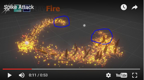
^ Right now you can see how the entire effect is drawing that same amount of attention. Try to play that to give it more variation and a front focal point.
Anyhow, I really dig this effect thus far! Keep up the awesome work man!
i’m going to make another version, where the FX is faster, since this one was intended to magic earth elemental spell effect as a cinematic (like a fatality in Mortal combat )
@Yance i highly appreciate the organised list of feedback,
@Lee, @PetrieTheWild thank you for the C&C !
Alright, here it is, a small update that took into consideration most of the criticism

Thanks again for your feedback guys @PetrieTheWild, @Yance, @Lee
Huge improvement from the initial version! I think there’s some room for polish if you want to specifically target the Riot style:
The level of detail you have in the gathering rings at the beginning is perfect for this camera distance. The small bits of fire, sparks, rock, and crack frequency get pretty busy, though. Try finding ways to simplify the particle count, textures, and shapes of these emitters.
The color palette is very “samey” across all the emitters. Maybe expand your palette to include touches of red and even pink, which could be used in the “burn-off” transitions of the magic and flame elements. Giving some variety in hue range to the different groups will help sell that they’re all made of slightly different materials, and thus enhance the overall believability. Also, a slightly wider color range will make the ability feel more magical almost instantly.
Lastly, though I feel this is a huge step in the right direction, there’s still some room to apply Petrie’s suggestion about creating a clear, bright, leading edge of threat. Actually, it’s fine to have the trail of the missiles fade off much more slowly, just leave them subtle, dark, and not prominent. Then you can really punch up the leading edge, maybe with some kind of burst emitter, punching light and energy up from the ground, just at the leading edge. That could transition nicely to a similar group that lands a satisfying POW on the hit effect, which is currently missing.
Keep it up! This last 10% is always the trickiest part of production.
original post edited with v3
I like the overall idea but I have some suggestions that might improve the effect:
The “magic circles” that you spawn on the rightmost sphere around 00:01 in v03 seems a little out of place, they fade without visually transfering their energy to the the rest of the effect. You might want to try a masked fade that moves outwards towards the left and right positions where the effect contiues (the spikes shooting out of the ground).
The final spike feels a little underwheming, the is a lot of stuff moving towards that point, but the spike doesn’t look like it is connected to the previous spikes and I think that it is too small.
Maybe speed up the tempo of the spawning of the spikes shooting out of the ground so that they spawner with longer delays at first and then lower the delay so that you get accelerating “wave” feeling towards the target.
Heyo 5919 (is that how I should address you? :O)
You’ve come a long way from your first iteration, nice job!! I believe you can push it even further! I don’t know the limitations of Popcorn FX as I’ve never worked in it. Technical limitations aside here are a few things I’d suggest thinking about when making Riot Style FX.
Aside from what my feedback is, I’d like to hear from you what your thought on the current state is and what you would do to improve it. ![]()
Reference!
This area is incredibly helpful if your goal is to match an existing style. Pulling from FX that already have similar color palette, or shapes will help set a solid foundation for what you are aiming for. It also helps to show your knowledge of the source material. League already has various earth elemental FX. I gathered a few examples from League based on your description and ability so far.
Shapes
Shapes inform intent. What is this abilities intent? Are the shards super sharp and pointy as if to piece their victim? Are they haphazardly erupting through the ground via some force or are they being pulled towards a direction?
From what I can tell from this ability so far they are two missiles zooming towards a target. I would love to feel the impending doom and damage these will do similar to Braum R.
Color Pallet
The color pallet should speak to the thematic of the ability. Is it rock’s answering a magical call like Taliyah? Is it volcanic shards piecing through the ground like Braum? Typical of all abilities in League the most dangerous, gameplay relevant information is where the most saturation and contrast will be. Bloodmoon Kalista’s Q (top right) for instance. The most contrast and saturation let you know exactly where you don’t want to be as an enemy! This fades off with the lifetime of the ability.
I hope these points are helpful even outside of this project. Can’t wait to see your next version!!
@Cubik I agree with what you say about the final Spike, and I guess I should exaggerate what the way the spikes evolve. I also have an idea about the magic circles that you spoke of.
@ShannonBerke I appreciate the feedback with the pictures / references (<3) and descriptions !
About the current state of the effect, it’s 90% done but the 10% that needs to be finished will make a huge impact on the look and feel of the effect, it still lacks that final POW!.
I’ll change the Final Spike add some effect to give that final blow move, also make the spikes zooming to the player appear more dangerous (size, intensity that is increased)
If there is one thing that seems constant in Riot and other hand-painted style games, they lean away from bloom, and if they do, it’s usually a sprite and not using the engine bloom. I’ve seen a few people try and recreate Riot and Blizz stuff, and their textures and materials are always very hot and blown out. This style stresses readability, and when it comes to effects, try and stay away from tiny and noisy detail as much as possible. Realistic fire has hot whites in it, but stylized effects need to read as fire, so you get a lot more of oranges, deep reds and burnt browns to help contrast whith yellows and brighter oranges.
When I was trying out hand painted effects I found a good helper was to set my material to masked and have the color run through the base color and not the emissive. That way it wouldn’t allow me to blow the texture out with bloom and I could start looking at just my textures in the effect.
Agreed with @Travis: Try not to use Bloom at all. None of League effects use it, and it makes the effects a lot less readable, especially if you explode your values. I used to use Bloom waaaaaaaaaaaaay too much when I first started making effects, and that was a really bad idea. Bloom should only be used as a last resort, to add a little extra to one effect that might look a bit underwhelming, and should never (?) be used when developing one.
Also, as explained and illustrated by @ShannonBerke, try to add (a lot) more contrast to your effect, especially at the tip of the projectiles. If you compare the gradients, you’ll see that yours are a lot brighter than most effects.
About the timing, try to add some anticipation to both the cast and the impact. One thing I usually do is (very) quickly reducing the size of my glow or shape sprites, then adding an empty frame, right before the explosion/impact, where I exaggerate everything for one frame, then make everything fade out or disappear. Adding that little anticipation helps the player know when it will hit exactly and can be the difference between a good or a failed flash. ![]()
I also recommend trying out simpler shapes and motion. Your effect looks a bit too noisy. And if you really want to replicate League style, I recommend to use a similar camera. I am not sure about the exact values, but I believe it is a 45 or 55 degrees top-down camera. Correct me if I’m wrong. ![]() It will help you a lot to actually have the right view from the game.
It will help you a lot to actually have the right view from the game.
Also, and this is just me, I believe it might be better to make League effects (or other similar-looking effects) using more traditional methods than Popcorn FX. I am not versed in it, but if I remember correctly, it is pretty code-based, and I think you’ll have better results and faster if you were animating it by hand. ![]()