I’m doing my internship as a VFX artist for a race cart game, all the VFX will be project from beamers onto the physical world where players will be racing on. In this post i will be sharing most of my VFX for feedback and for other people to use as inspiration like i am doing with other peoples posts  . Any feedback on my VFX will be greatly appreciated so feel free to do so.

1 Like
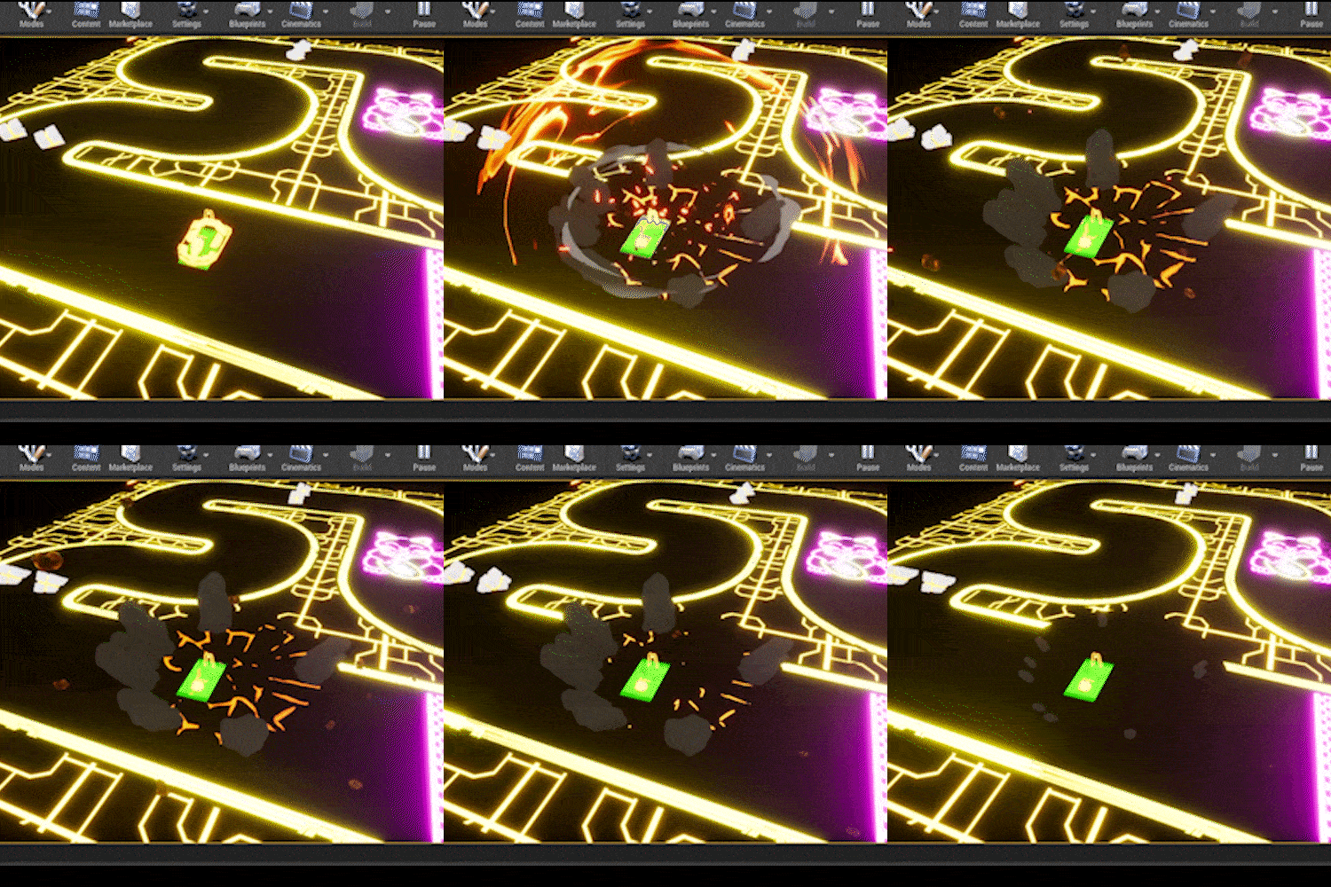
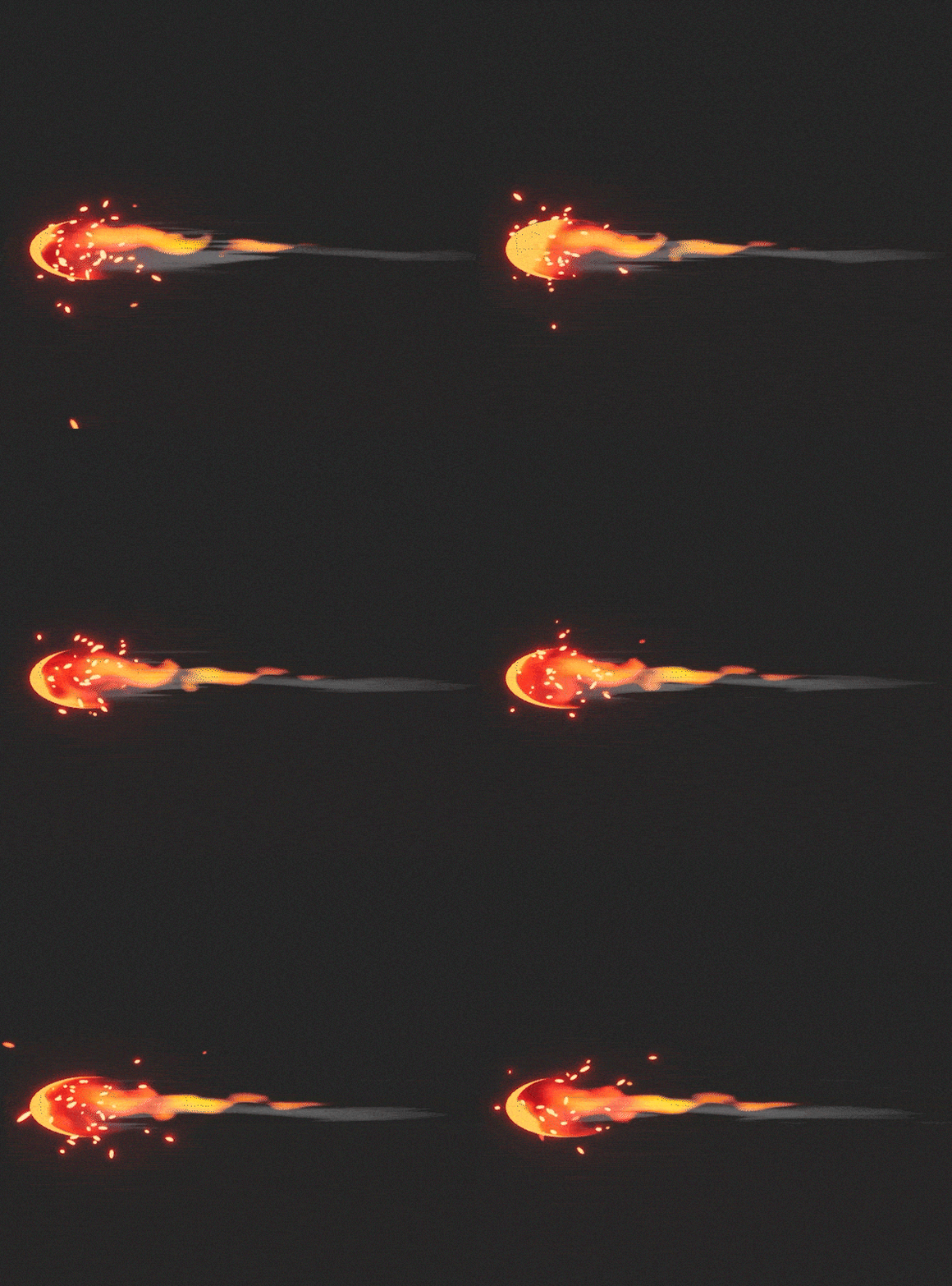
The projectile for this explosion

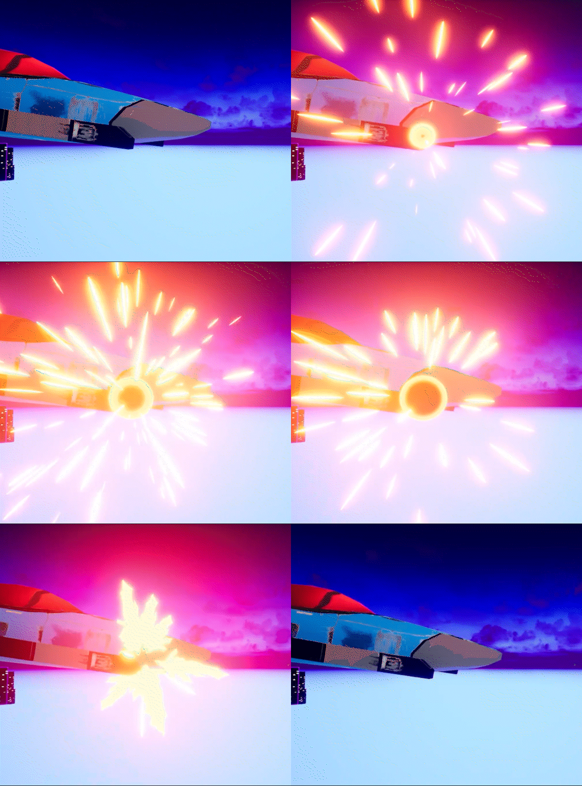
The flash FX for the spaceship that shoots this projectile onto the racetrack. Any feedback on the shape or readability and how to improve or change this can always be said in the comments 

The crescent could use some movement, vibration to give a sense of power.
The flame is good. I like it but would want a few more frames in the animation as I get a little snake wiggle from it.
The wind, for me, wants to condense like a triangle at the back. It also needs to have some color in the front from the flames light bleeding onto it.
The sparks, have too much turbulence, at least in this gif, when they move forwards. They should only move backwards. They need to scale over life. You only have color over life… or alpha over life. Move the color from white, yellow, orange red.
I’d add a front distortion “re-entering the atmosphere” leading additional crescent in front.
Flash. Too much distortion, but maybe that plays well in game. If you look at just the glow/bloom its the same on every element. It should start softer and smaller then grow over time. If you don’t get easy unreal bloom then I make a second additive bloom particle so I can control bloom very specifically. Your brightness values feel like all 1 value, everything is set to +10, lol. If you save 5 frames from this and say how distinct is the color between frames? not much? How can you fix that?
Look at how the main fx enters frame, kinda fat right out the gate. I want to see 3 frames of an individual particle over time and each of those frames are unique. First frame, middle frame, last frame. What you have now is each frame is only a different scale.
The one frame of “muzzle flash” looks like you got an asset from a fx pack and used just this texture that no one would notice! Well we noticed. it doesn’t match the other fx. Try to make one from scratch even if its annoying.
Lastly the glowing crack shatter from the first gif. It should instantly crack then the glow dies down. Your crack grows over time then dies down. Instantly all the way cracked, the heat then dissipates.
The grey blobs that shoot up remind me of earth bending. If that is smoke, then we might want to talk about that. Too many notes to write.
The circular explosion/shockwave is good, as far as texture and shape, but the animation is too linear. Smooth that curve/ease it out and it will feel more of a pop/bang.
Thank you for all this feedback David  , I appreciate that a lot. I will put this all into account and change my VFX where needed.
The grey bobs are rocks that shoot up from the ground. But I’m not sure how to give it a good texture since the level is made with pretty much no light and i do not have any say over the change of that
You can bake the lighting into the rocks. In the emissive you have the lighting. I’d do a soft ground up lighting. If you bake an AO you can all use that to help show the shapes of the rocks by figure out if that added or the inverted AO helps.
![]() . Any feedback on my VFX will be greatly appreciated so feel free to do so.
. Any feedback on my VFX will be greatly appreciated so feel free to do so.