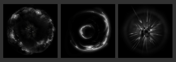
my current sketch

here is latest sketch (8th iteration)
Blaster Master
Blaster Master
It’s basic Unity, Shuriken systems - here’s some breakdown of the textures I painted

going for hybrid 2D look, soft with graphic elements
no meshes just billboards, medium amount of overdraw
the cartoonier shape using set seed
Updated the timing and then added the secondary micro blasts you see at the end; I’m pretty happy with it, I thought about residual smoke but it distracted from the clean feel imo
adding color, some texture to the middle,
![]()
also asymmetry like in the original
changed some sorting too on the black ring being above the magenta ring,
added 1 more outer shockwave to try to give it more power
 along with
I decided to get rid of the double pop on the main blast, found it distracting, adjusted some colors colder, and added some hot coal like gibs; placing gif on top post too
Im out of ideas on polishing, at this point I feel stuck
how about a shrinking or growing contrast frame with a white card/bloom effect for 1 frame
just a suggestion. I am sure you get the point. Also you could some heat debris with outwards movement and smoke arms to underline the volume of the effect.
yah I can give it a shot, maybe punctuating the blast and adding some trails. thanks VinceWee
[quote=“VinceWee, post:7, topic:3121”]
white card/bloom effect for 1 frame
[/quote] okay i’m taking a cue from LoZ when Link gets hurt they palette shift white , black, blue, normal
also adding smoke trail texture to give some tendrils,

hope it’s not overworked
yes timing is getting more punchy now even tho I am sure you can even push it more with a sharp shape. Good job !![]()