无纹理,无材质确实是个好主意哈哈!
我最近在重新学习基础构成,而这个方法刚好可以用来实践。
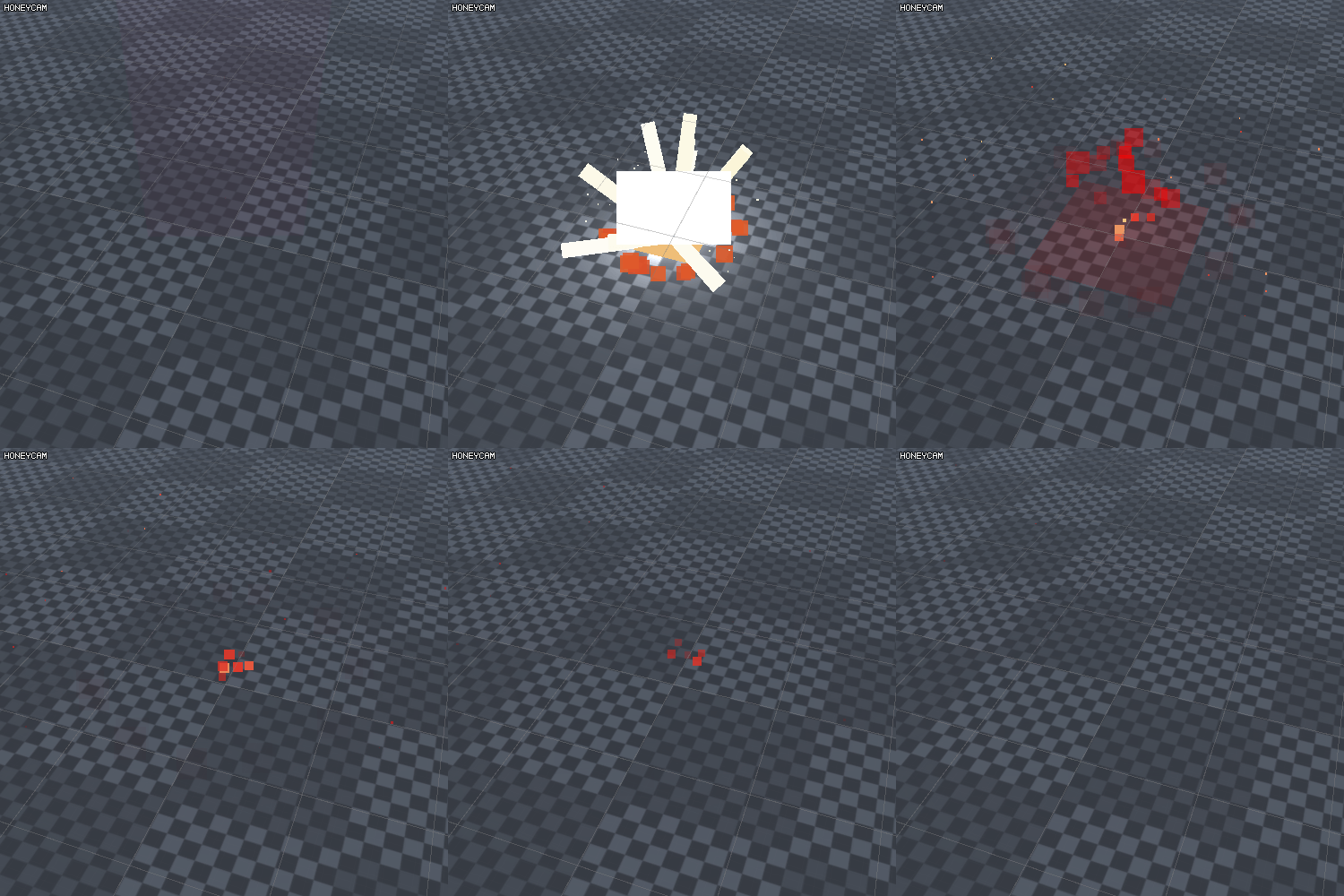
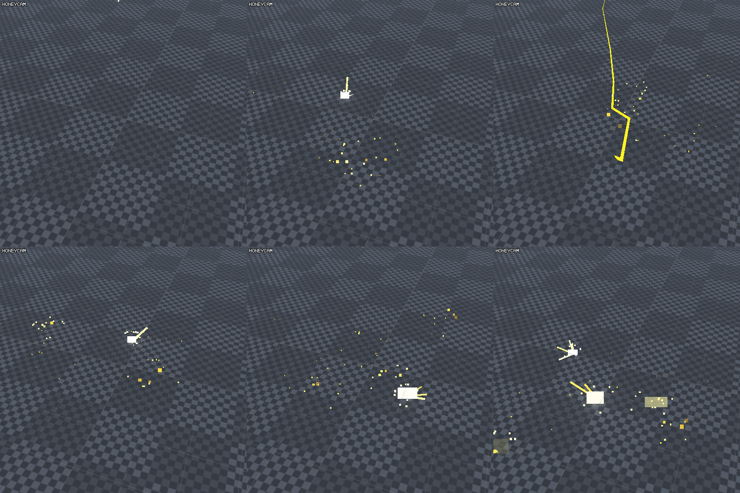
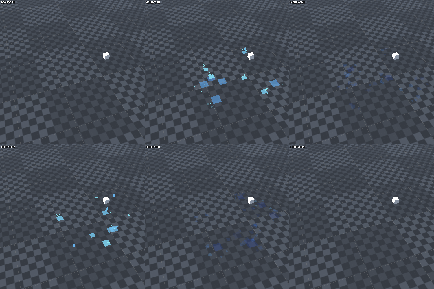
像素化的特效的好处在于“化繁为简”,可以让我大部分的注意力可以集中在:外轮廓,主次关系,动态,基本色彩。
![]()


无纹理,无材质确实是个好主意哈哈!
我最近在重新学习基础构成,而这个方法刚好可以用来实践。
像素化的特效的好处在于“化繁为简”,可以让我大部分的注意力可以集中在:外轮廓,主次关系,动态,基本色彩。
![]()
Just a google translate for us westerners.
No texture, no material is really a good idea haha!
I have recently re-learned the basics, and this method is just enough to be used.
The benefit of pixelated effects is that “simplification is simple”, so that most of my attention can be focused on: outer contours, primary and secondary relationships, dynamics, basic colors.
thank you ![]()
and thank you,google ![]()
Basically, he/she is the only one who understands the purpose of this challenge or the initial intention of the person who created the challenge: Making an effect, but removing the textures, so that you can focus on timing, shapes and hopefully the correct translation of “outer contours, primary and secondary relationships, dynamics, basic colors”.
I don’t think he’s the only one though, haha.
But yes, the idea is definitely right ![]()
![]() 哇 这个有意思耶 膜拜大佬
哇 这个有意思耶 膜拜大佬