i’m a gamedeveloper student from munich and want to focus on visuall effects. So i made these following three stylized effects and it would be awesome to get some feedback to improve. All of the effects are not finished yet, so every feedback is helpful for me.
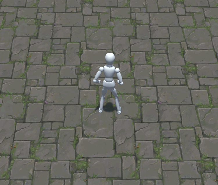
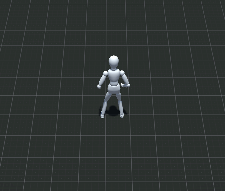
keep working on it ! =) Especially the shield is going good ways imo. Plus when you show effects, kill the floor texture and use a simple gradient ( maximum a grid texture). viel erfolg weiterhin
I disagree. If the game takes place on a textureless plane, sure go for it. If not it’s pointless. Always show effects in the context they will be used. It’s irrelevant how they look in a vacuum.
And what is being showcased against a contrived background? If an effect is made to blend well with a certain color palette what good is it to show it off against something else? Sure it’s easy to spot errors that only show up in that scenario but what’s the point of that?
I’d say it lacks a little bit of build up to anticipate the FX. They just pop up like that besides the 1rst one, but again, it disappears quite abruptly.
For the 2nd effect, it looks like this is just a texture facing the camera (or am i wrong ?), you should try to use a mesh instead. No fade out as well so you should play with the Size Over Lifetime module to make it shrink (for example).
Other than that, it’s really not bad to begin with. Just practice and the rest should come naturally.
Thank you Fenix! I started to use your feedback to improve the Shield effect.
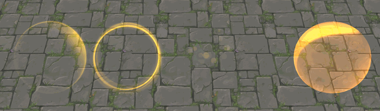
First to answer your question: I use both. Its a sphere mesh with a subtle scrolling texture. And i use a base texture and a kind of a ring texture growing over time.
So are you trying to say that its looking to flat?
Here’s my secound iteration with a dissolving effect and a visual timer (shine on the top right):
Same effect with different background:
What i did miss to say: Im aiming to do MOBA effects (League of Legends, Heroes of the Storm…) So the effects sould be optimized to fit in these fast paced games.