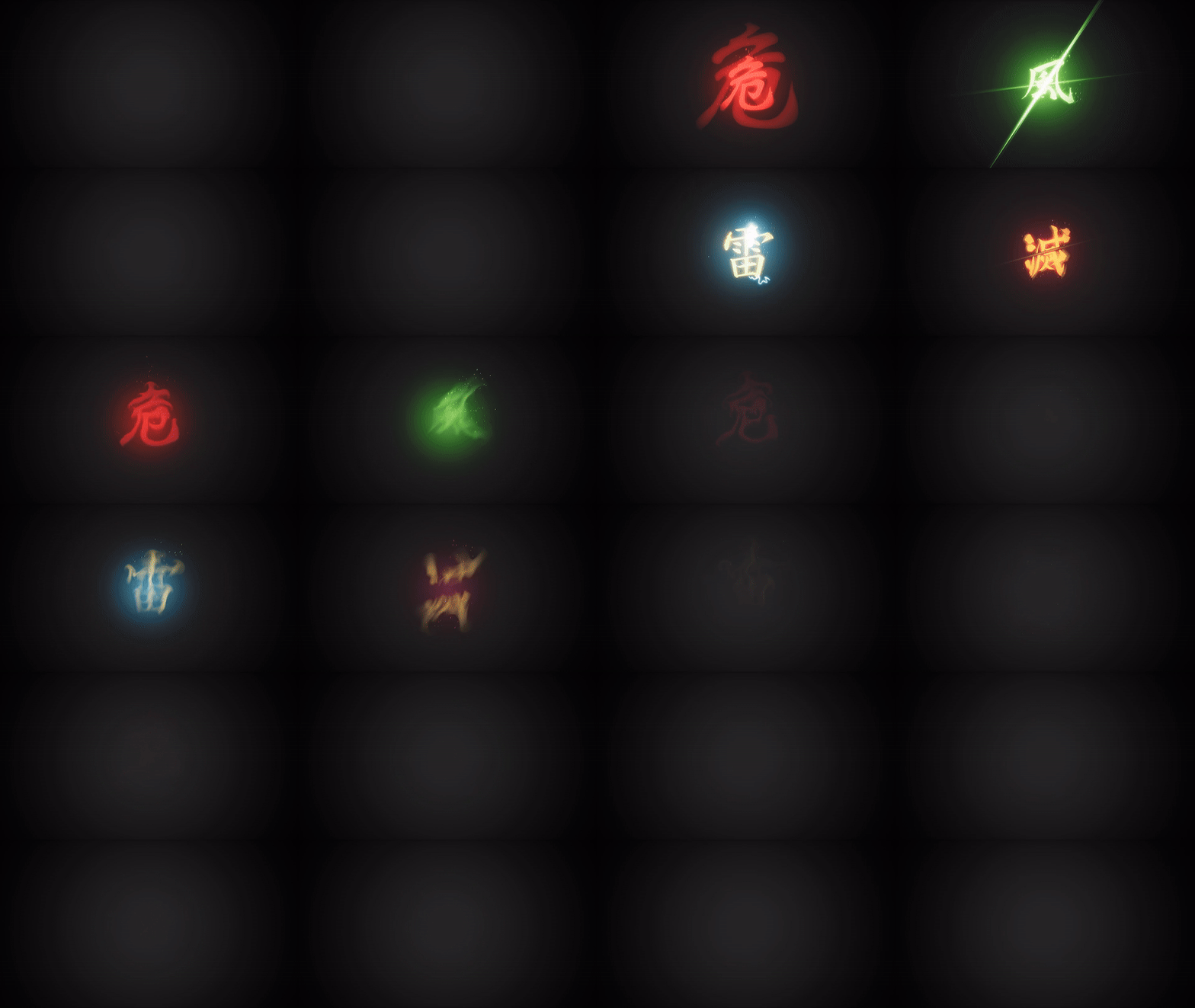
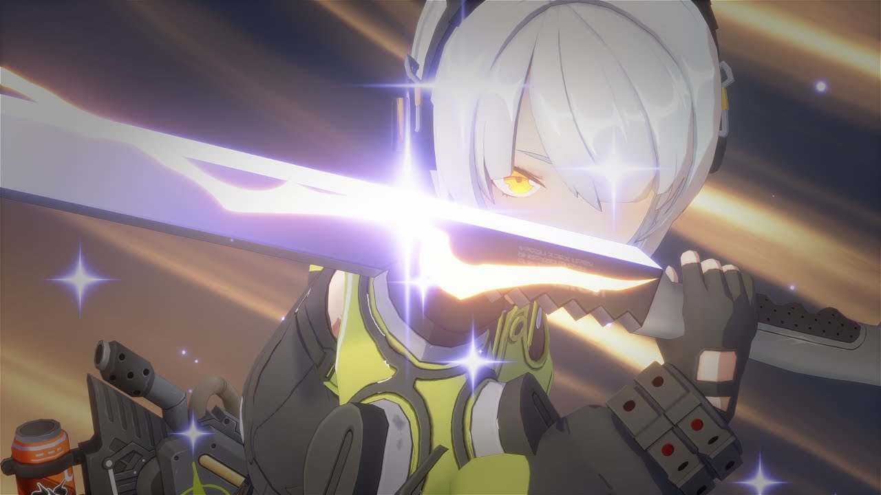
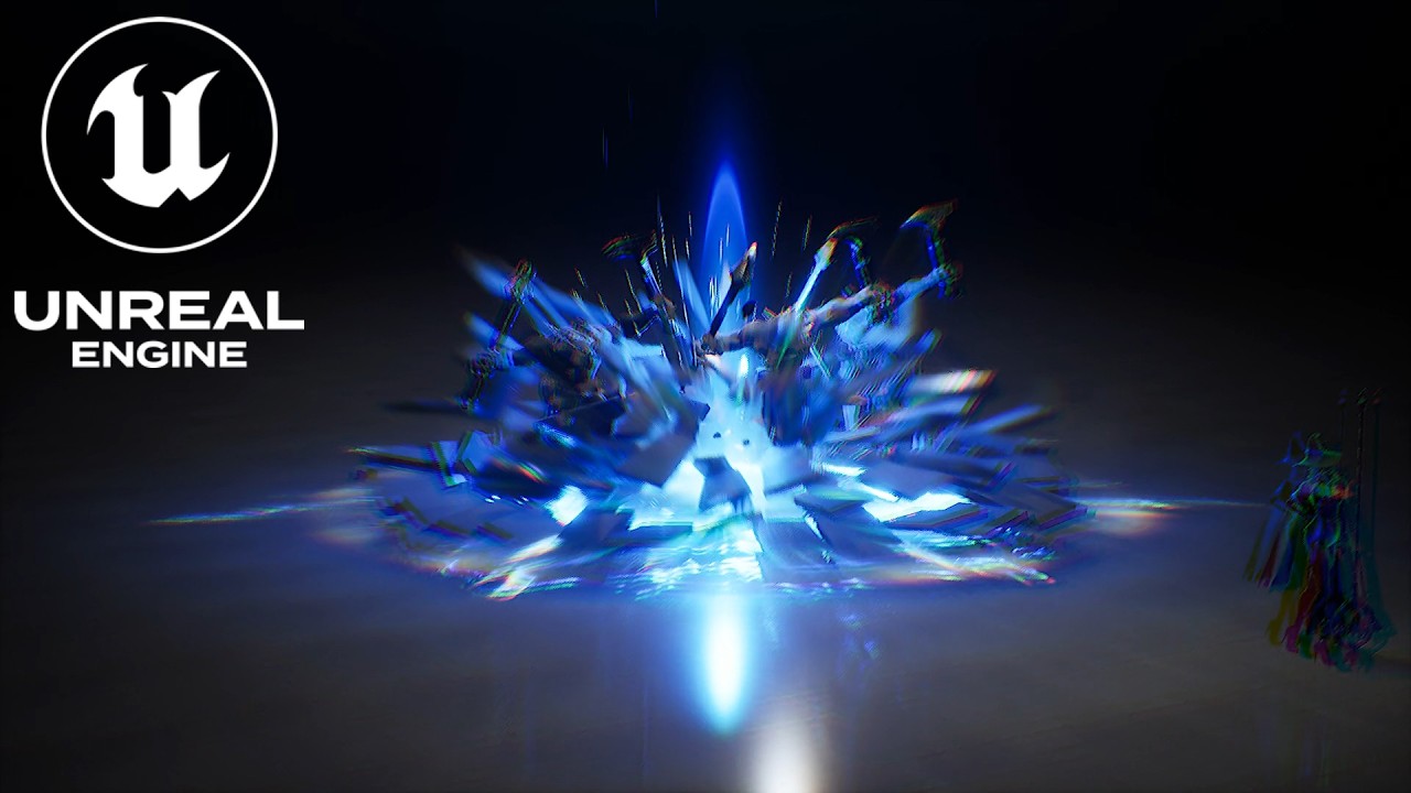
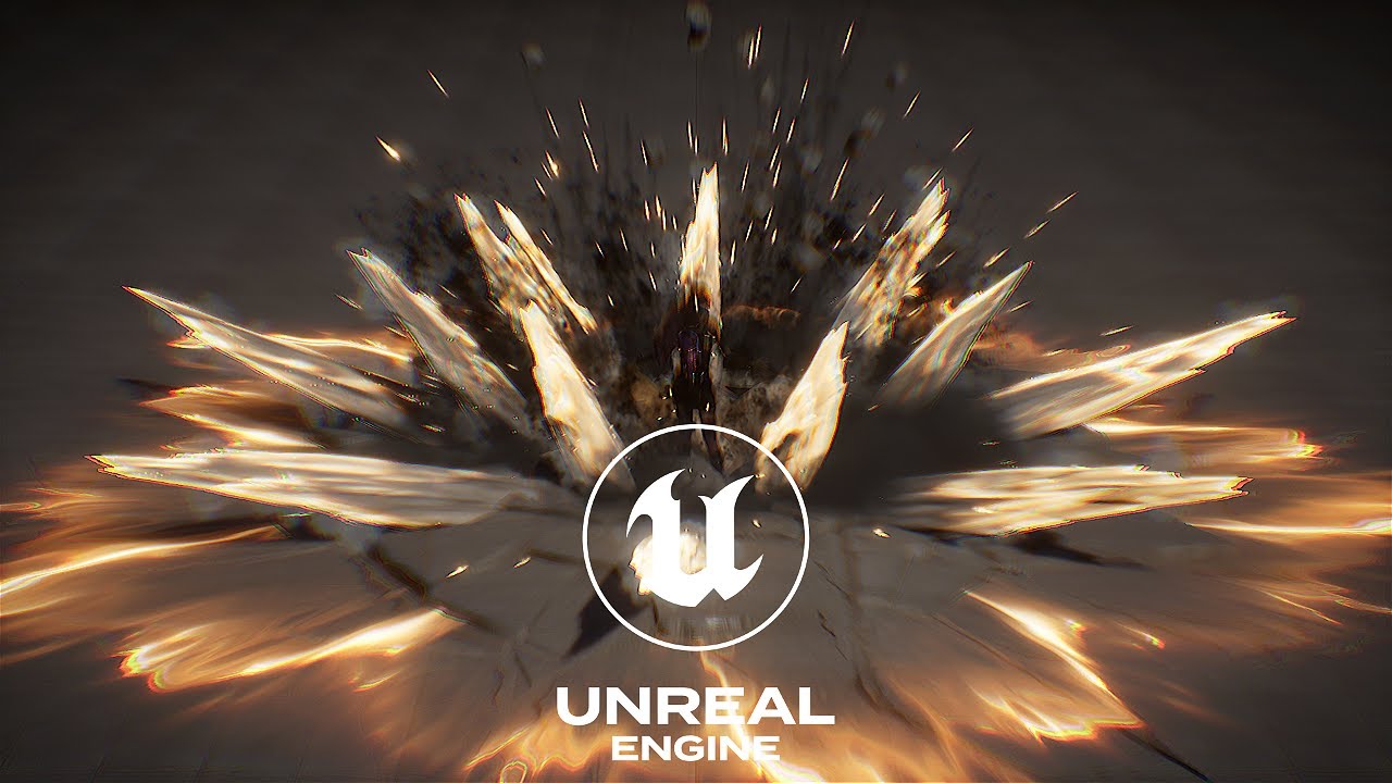
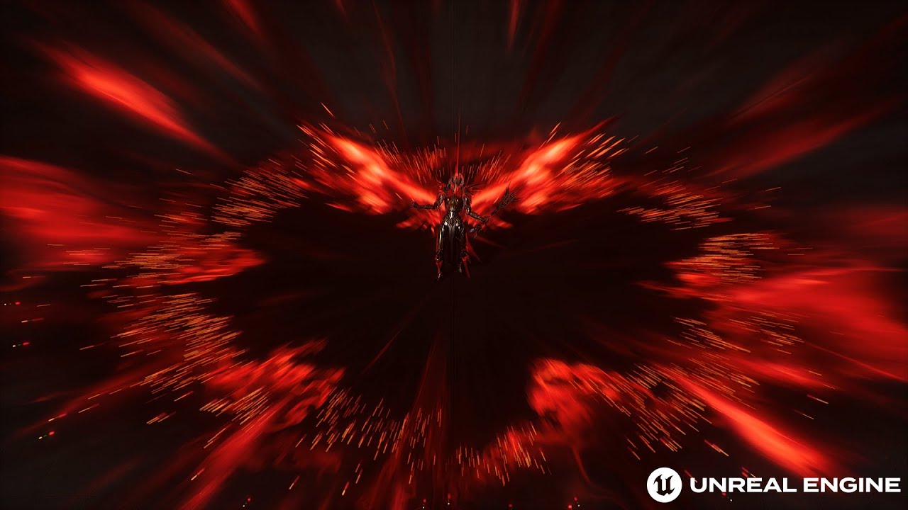
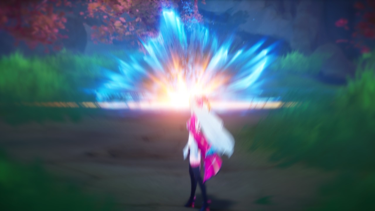
Thank you for the feedback! I was very proud of the result of the final slashes, but I agree that it could be made more interesting. What would you suggest adding to enhance the final slashes?
Your first slash is very interesting, with noise, distortion. It’s a pleasure to watch.
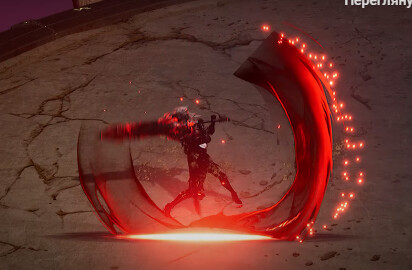
But you AOE slashes is only 1 color on black background. Maybe it can be better if you make the center of the screen a little bit transparent to see the scene.
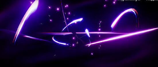
Now I’m talking like a gamer, not a VFX artist.
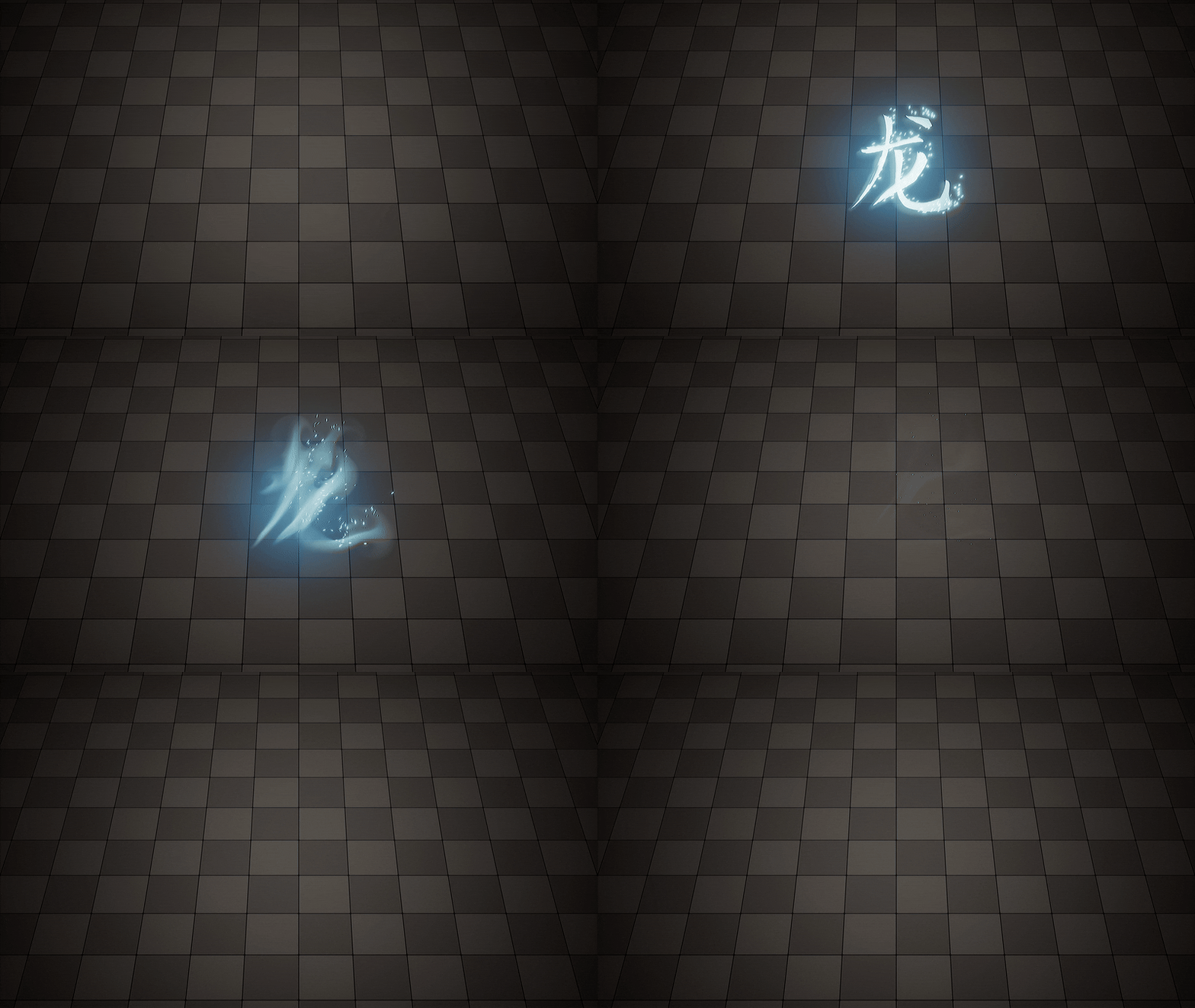
Looks satisfying! Is it a simulation that uses the symbol to drive the initial shape?
Yes! I used FluidNinja plugin to create the fluid simulation. The simulation itself was driven by the density input as a texture. After everything looked cool, I baked the whole sequence into a flipbook.
How did you go about blending the Letter into smoke?
I used two separate layers. The first layer is the letter itself. I just added some UV distortion and a dissolve technique using a dissolve mask. The second layer is the baked fluid simulation sequence. The rest is all about adjusting the timing to achieve perfect dissipation. I will create a breakdown here soon
looking forward to the breakdown!
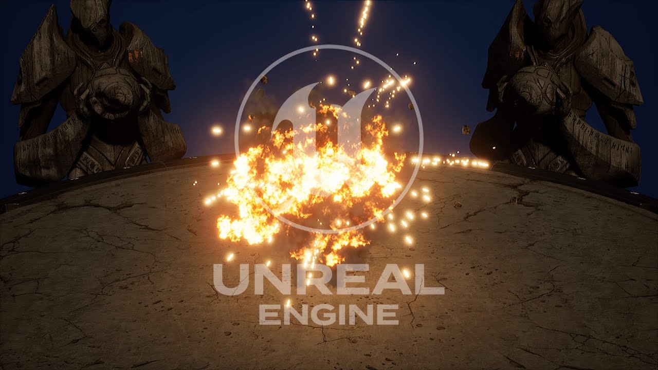
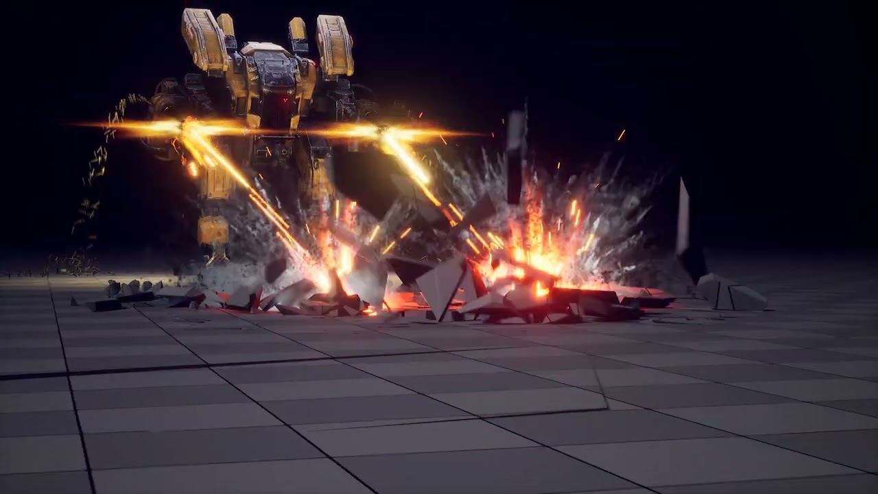
This is very clean! I love the camera work and the overall effect. The only thing that I think would be nice to see is some type of dissipation after the target bag is destroyed. There’s sparks, lightning, and an initial shockwave on impact, but I think lingering dust particles would sell the effect and create some overlap.
