Sketchbook Torbach

yes! much better.
lacuni_fire_13
still going to noodle those textures a bit, but that’s it
image

quick update, I could polish the texture for hours frankly however all the motion and shader multiply means it’s not exactly necessary for sketching

lacuniFire_09
here ill share 256 versions for others to play with if they want to give this one a shot.
lacuni_textures

2 Likes

good job!
i was also very impressed by the d3 effect. it’s astonishing how good it looks.

That’s very Diablo 3 lol. Or I guess the updated modern version is Lost Ark. Well done.

I repurposed Lacuni to due a witchdoctor like frog-blood soup but trying to feel older like Diablo 2 sprite work.

My goals for the past few days was to keep with Julian Loves GDC talk, take something relatable and tap into lizard brain references to sell mood - so I went through a few ideas

Intoxication-Drunk popping bubbles in the air seemed the strongest allegorically
image

TBF I attempted to do the ‘Frankenstein monster’ and relate to stitches or fleshy bits but the motion relates more to worms/snakes… not a bad feel, just wasn’t what I was going for

so I left them in
lacuniToxin_02

Tonight goal was to figure out a simple way to dissolve polar shader
and make some D2R auras
d2rAuras
Conviction and Holy Freeze

— i’m certain there is an easier way imo it took a lot of nodes to figure out something that worked.

shader I settled on and some various textures I was testing

now for edit/update using some variation, added a smoothstep into the mix with Lerp to remap outcomes + some new textures sketched for the ideas
image

  • Cracked ice for the Holy Freeze
  • Fire and Firebird for Fanaticism
  • Bolts +electrical gold for holy Lightning
  • Defiance with castle fortified texture
  • Conviction flaring piercing arches
2 Likes

For tonight I’ve always wanted to do a waterfall attack similar to Pokemon Go
waterfall_pogo_ref
I love it, however I want to work on making it softer rather than the more purist traditional water mass
sorta like the other game versions
waterfall_ref_01

I sketched this up yesterday as a waterfall strike downward,
waterfall_pogo_00 waterfall_pogo_01
im not sure if I like the steam cloud in the sky or hate it and leave the emphasis purely around the strike but I think ill add and touch up more tonight.

1 Like

I think the cloud could potentially make people confuse the effect for rain (as opposed to a waterfall). Regardless: I believe that the timing between the three elements (i.e. cloud, downpour, and splash) in that particular effect could be improved.

Hope to see more.

1 Like

First think that came to my mind was “maybe grab your previous waterfall and make it go wild?!” hahahaha. Joking apart, I believe it would be cool!

so here is my current waterfall strike
waterfall_pogo_04
the textures are pretty plain and made the line smore bold for the waterfall due to scale
waterfalltext

not what i was originally inspired to do, but I might, …maybe add a setup. Some build up ball of water that becomes the attack
waterfall_ball
… maybe.

2 Likes

I love the water pillar, but the splash isn’t really catching my eye.

I prefer this splash here. Bolder, contrasty and foamy

The circular shape going upwards…hmmm what is it? Is it meant to be water or just fitting the theme?

1 Like

i’m conflicted; sorta dabbling with this one – I’m considering working the emphasis. I am curious how far I can push that, I forgot to add an emissive mult :DOH! ill do that . maybe tomorrow with more time
edit did it anyway cause why not, and love it! i touched up some timing white should lead your eye into the shockwave and darkened the waterfall at the top
waterfall_pogo_03

The hemisphere is for a shockwave, conceit is an impression of a cannon ball hit. I made it because I had fun illustrating the spikes and wanted to adapt it to a sphere.

in order to do a ‘good’ job i would want to map a lot of this to geo, finesse erosion for dimensional/motion of texture on changing surfaces… i dont have maya at home and I get anxious about opening up blender >.< i dont want the stress lol. I should buy maya … expensive! but worth it maybe

5 Likes

Power slashing
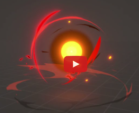
Sig’s post Most common / Bread & Butter Shaders and Materials "techniques"? - #26 by Sig for the red slashes seen in the yt vid
image

  • I wanted to tackle how to make rudimentary slashes without 2D flipbook or post-process
  • would be the basis for a more elaborate technique I’d like to get to eventually

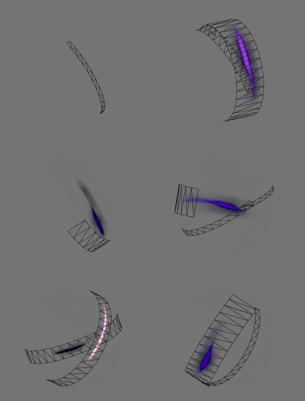
As particle mesh so it can revolve around geo - results
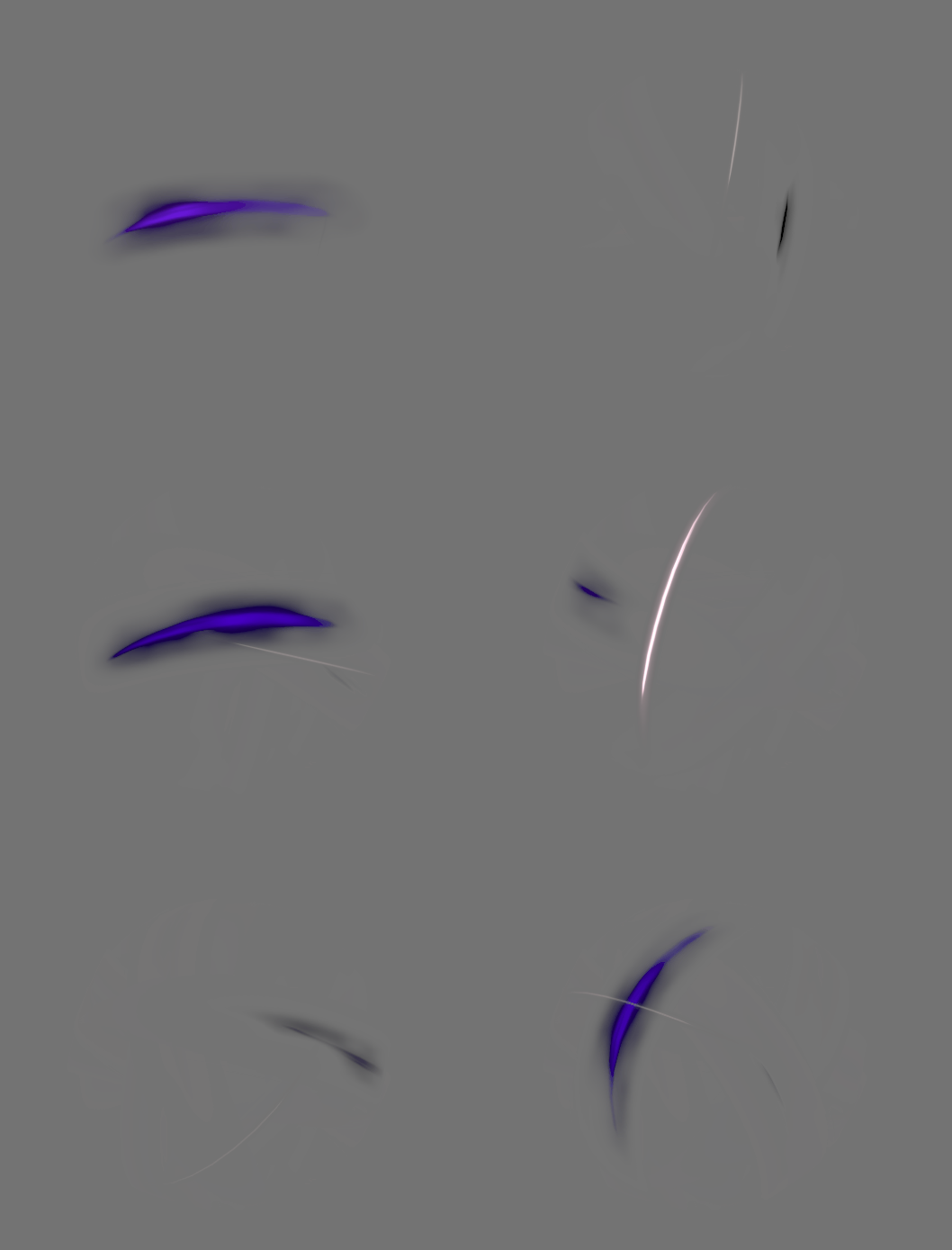
slash_dissolve_01

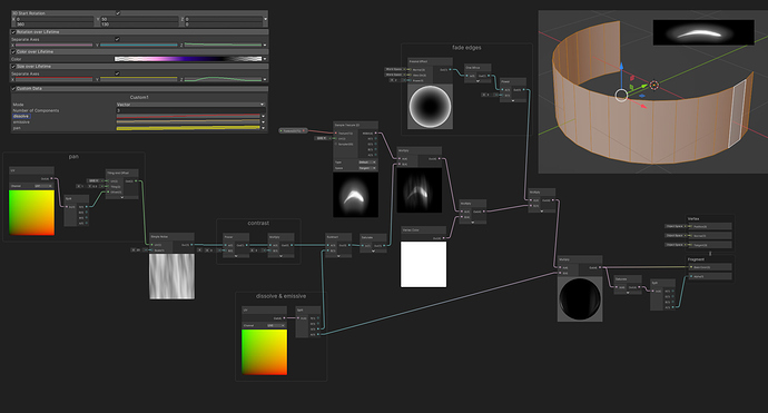
HD breakdown image

Wireframe
slash_dissolve_02

switching to Subtraction with more contrast we can dissolves harsher than multiplicative fade
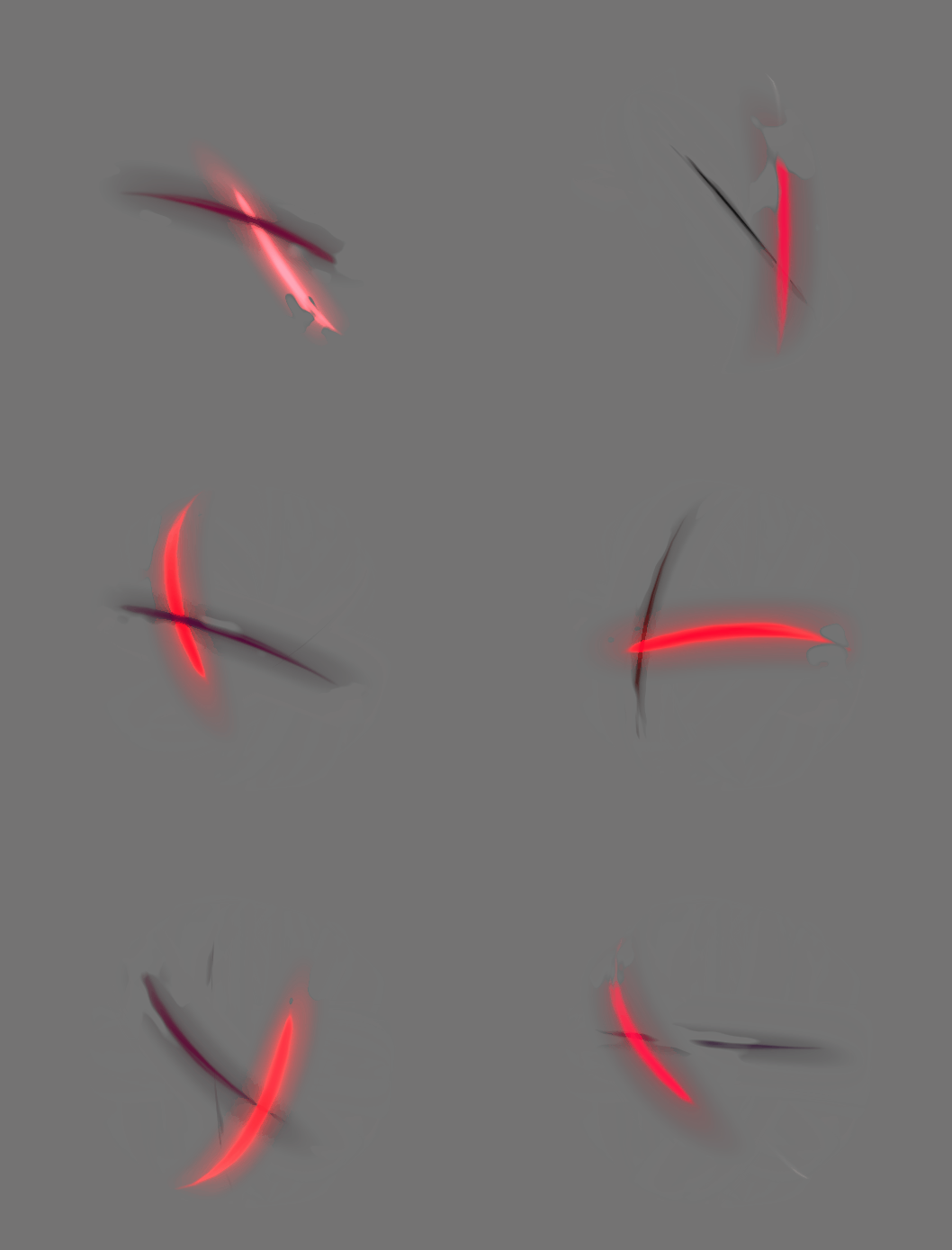
slash_dissolve_03

10 Likes

distinguishing slashes in context; I like them both but harder shape & dissolve is my favorite style now.

4 Likes

:star_struck: Awesome results! :star_struck:

Yeah, the ones simply fading out are cool too, but the hard edge dissolve really is something else in my opinion. I love it!

My favorite one is the red, followed by the purple one (the one below it)


Also liked the blue because of the colors of it - really liked the purple/blue mix <3

Did you notice the “bubbly” look you got on the purple one below the red? Really cool!
I feel the green one could end up giving a really cool nature/healing vibe if you added some delicacy to it

I’m really glad the stuff I brought in - even though I didn’t make it - sparked some cool experiments!

Hellow! Long time no see!

I’m finally back to my Orb thingie and I instantly remembered you posted some cool stuff.

At the moment I’m trying to convey something similar as what you’re doing with those smoky shapes being sucked in/out.


I painted a bunch of stuff but none of them are looking nice in the engine. Would you mind showing the textures you used?

they’re all derivations of the slash and 3 extras (one of which is certainly just ‘Dot_pin’ to be the glow)
image

  1. dusty
  2. glow
  3. soft_ring
    image

here are some split away from the group
orbsetc

1 Like

Many thanks, Torbach! Both for showing the texture and for showing them at work alone :star_struck:

I’ll try painting some tomorrow. I think now I know why mine weren’t working.

By the way, do you hand paint it? How do you usually go for painting this kind of texture?
I was doing the following, more or less:
Paint it horizontally, straight, then Polar Coordinates it and see how it’s looking. Then I use Smudge and Eraser to get it to a more desirable shape + use maximum or minimum to get nice white spots, along with Blurs.

PS: If you know any good tutorials on handpainted textures or textures in general, don’t hesitate on dropping it!

by hand, I work indirect and i don’t have any sophisticated tricks, nothing that would be of mention to actual concept artists that demonstrate interesting technique.

largely i’m pixel pushing adding, erasing and smudging is 90% of my work

1 Like

Here is a nice video playlist of texture drawing techniques, it’s in korean but you can follow along without audio as well.

I use Krita and the tools are a bit different but most of the time is mostly the same stuff but I find tiling is easier there too.

And this one, which is not on the list but was the one I wanted to share.

(Also, sorry Torbach for the intrusion in your sketchbook)

2 Likes