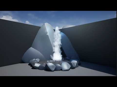
Challenge #2 for me! I’ve got a rough version of my waterfall so far, and I expect to refine it further, but I thought I would share my progress. If you have any feedback on how to make my VFX look more like my reference, please let me know!
Progress:
Reference:
1 Like
Hello GuySCool!
If the gifs or videos are larger, we tend to use webhosts like youtube, imgur or giphy and then just post the direct link (it should auto embed the content).
Looking forward to see your sketch from a few different angles to better judge it. The splashes on the bottom don’t sell me yet, but the top looks nice.
Hope this helps 
1 Like
Hello,
It looks a bit sharp, I don’t think it’s a bad idea to use sharp shapes but maybe you could also add a kind of mist to cover your effect. That would help to don’t see to much through your effect at the same time. Water collision looks a bit weird in my opinion and we don’t even see this in the reference with the opacity and the mist.
Other idea : have you tried using some longer shapes with velocity direction ? Shapes looks thiner and longer in your ref.
You can disagreed with some ideas but I hope that will help 
Thank you for this feedback! I would totally add to it but this month has gotten busy. Whenever I get back to it, I’ll check these ideas out.
Yeah I totally see what you mean. I wanted to have some collision to it could bounce off of rocks but ultimately I think it was a bad idea because it made it pretty broken up.

