Simon Trümpler - VFX Sketchbook

image

I did a small study in blender. Just to answer some questions. I don’t know if any of my assumptions are correct - feel free to add you own thoughts. If you want to try around, here is the file: https://nx12131.your-storageshare.de/s/ATZpibr7qK9g79y

Note: This is rendering noise, NOT bubbles :smiley:
image

Questions I had:
(1) Why is it dark here?
(2) Why is it bright here?
(3) Why is there a dark rim?
(4) Why is it VERY bright here?

Observation #1 - Specular Reflections (regarding Question 4)
On of the brightest parts of our slime interior is actually a blurred version of the inner spec reflection.

  1. Spec Reflection on the outer side of the sphere. Light comes from behind the camera. It’s an area light (to get a bigger source size and parallel light rays)

  2. Spec Reflection of our light but this time on the INSIDE of our sphere!

image

Here I rotate the sphere. Interesting: Even though my light rays are parallel, the (green) reflection on the inside of the sphere is bigger. Maybe the rays get bent light though a magnifiying glass?
https://imgur.com/qKIpWgF.gif

Here i rotate the sphere a bit and it is super interesting how the inner reflection deforms depending on the viewing angle (white spec spot is in front, green spec point is behind):
https://imgur.com/EtEPWHB.gif

Observation #2 - Roughness (regarding Question 4)
Here you see how the reflections change when I change the roughness of the material. It affects heavily both spec spots: the outer AND of course als the inner. This is one part of the big nice area we saw in the slime before.
https://imgur.com/xFuVUgc.gif

Here I’m the same but with the transmission roughness. This should basically add diffusion within the sphere, making the lights bounce around a lot (note: as the roughness of the material itself doesn’t change, in this example the outer reflection stays sharp - the inner too, but before the light rays can reach the back side, they are already scattered around - at least that’s my guess).
https://imgur.com/GK7Hlix.gif

Also interesting: When the diffusion is very big, you get a dark border. It seems that not much light can exit the sphere and then hit the camera when it exits near the border.
https://imgur.com/jN5z3Fd.gif

Observation #3 - Inverted Reflection (regarding Question 1)
Here is the answer, why my slime was darker in the upper side of the sphere. The transmission turns the world upside down (because it refracts the incoming light). So it’s natural, that it’s brighter in the lower area (if the sky is bright) and darker in the upper area (when the ground is dark):
image

And here you can see how the impression changes when the reflection gets blurred:
https://imgur.com/jMhJh8B.gif

Observation #4 - Weird Dark Rims
Interesting: Here we see the scene without any light except a grey HDRI - so, gray light from everywhere. And still: sometimes we see very dark rims. Not sure why…because the same light comes from all directions.

https://imgur.com/EDHuZFX.gif

Observation #4 - Index of Reflection
IOR changes drastically how the inner reflections look. I had 1.75 as value, not sure why. Might be too high. Water is 1.33.

https://imgur.com/5xWk3CK.gif

Observation #5 - Inner Reflection
Brighter spots can also appear in locations where you’d not expect them. Here for example I think I see inner reflections. First the light enters the bubble (1), gets reflected at the back (2) and then continues to bounce around.
image

With a but transmissive roughness (light scattering) it looks like this:
image

7 Likes

New Studies:

slime_05a

image

9 Likes

I don’t think your observation #3 is correct. Looks more like it’s not a reflection but a refraction of the world behind the sphere. It’s the strong lens effect that turns the world upside down. A reflection wouldn’t be upside down, it would look exactly the same as in a mirror ball.

Good list of observations otherwise, really interesting how well Blender does at simulating what essentially is a complicated combination of light reflections and refractions.

1 Like

Oh, yes of course, you are totally right. I’ll correct that in my text. Thanks for the hint!

Here is my new interation. I think I’ll leave it like that and continue the course now :slight_smile:

5 Likes

small update. torak (from booms & blasts discord) took the time and made an overdraw and based on that, i adjusted my drawing a bit. now there’s a clearer hierarchy and not the same detail everywhere :slight_smile:

slime_07a

By the way, to define the volume for this slime iteration, i did a small sketch beforehand on how it would look with opaque diffuse material. i found it easier to imagine the forms this way and then used it as a base to think “how would the light would react within theses volumes?”:

By the way #2, this was my ref sheet:

9 Likes

Started with the first (VERY ROUGH) drafts for the bigger concepts. I found the cloud shape a bit boring and symmetric so I tried one version (2) with an assymetric cloud shape. I’m not sure yet in which direction to go.

4 Likes
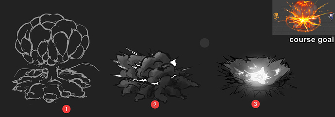
My idea for the next iteration: An explosion happened (building up a nice cloud of smoke) and THEN another explosion happens inside, pushing the already existing smoke away and ripping it appart.

(1) Looks a bit too organic (more like meat getting ripped) and noisy.
(2) Looks not too interesting and is a bit too equal everywhere. Need more variation and I don’t want too loose too much of the billowy smoke forms on the top.

2 Likes

Next version. I didn’t pay too much attention to smoke shapes - I tried to just focus on the idea (of an explosion within an explosioN) and if the shapes transport this. What do you think?

3 Likes

This time i tried to adjust the 2nd explosion so that it points more upward than sideward and ripping holes into the upper cloud. I think it tells the story of the 2nd inner explosion a bit better now:

Also, I’m trying to get rid of to symmetrical shapes:

image

6 Likes

New iteration:

6 Likes

Small update: added shading to the lower parts:

11 Likes

Looks good man, but the shading looks a bit weird to me , i mean you’ve got the brightest spot under the
vertical cloud but it’s shaded as if the main light comes from the upper-left) And i also found out that the structure of those vertically-aligned smoke pieces is much more complex then overlaying smaller on top of bigger ones…like there’s got to be a twisting / swirling motion or smth…which is probably the hardest thing to animate :slight_smile:

@RandomStroke thank you! yes i reworked the lighting a bit, wasn’t finished with doing the lighting.

new version :slight_smile:

tested a bit with colors but it doesn’t work well. i’m open for tips if you have some :slight_smile:

1 Like

Another iteration. I focused on making the core more intense and I think I like it more like now…with that intense white glow.

4 Likes

Lovely glow!) As far as i’ve studies explosions , it seems like those big clouds of smoke and dust come from the fireball which comes after the flash…so it starts with a flash ( ignition ) - shockwave-fireball ( that has to move upward because it’s hot ) and then come pieces that burn down, get colder, turn to smoke and got sucked by the underlying flow. I’m a total noob at it actually…still can’t get my head around this dynamics in real time…but it’s kinda what i’m talking about
image
Anyways, good job, keep it up:)

3 Likes

Thank you! I Love the motion blur version! I’ll try to add some blur to my final result as well <3

Yes, your observation is perfectly correct. If you look at the first post related my explosion you’ll see the course goal (Simon Trümpler - VFX Sketchbook - #140 by simonschreibt). And I had exactly the same questions popping into my head - usually you see either the inital blast OR the big mushroom cloud:

So, my idea was, to imagine a 2nd explosions which disrupts the one which happens just 3s before. But it’s very hard to translate this idea into an image :frowning:

Just wanted to share this with you guys. I found two anime explosions which tell the story I had in mind for my explosion as well: An explosion within another one :smiley:

https://imgur.com/pLJdCF3.gif

https://imgur.com/aKAhkZZ.gif

Small inbetween state:

9 Likes
  • added some “inner fire” at the top of the cloud
  • tried a different color palette (based on photo)

16 Likes
  • tried different inner glow as the one from yesterday looked a bit like smoke shaded from top with a red light source but i wanted to communicate inner fire

6 Likes
  • used the “posterize” filter to reduce the colors of the reference to get a good feel how the shapes work
  • reduced opacity for my “inner fire” and added glow/blur for a softer impression

Todo

  • inner smoke wall (more detail)
  • ground(shadow?)
  • lower light on top part
7 Likes