Hey everyone, I’ve been thinking of starting a Sketchbook here to keep track of my progress and to recieve some feedback to better improve. Until now I’ve been reluctant (and a bit afraid) of putting myself out there, but @simonschreibt encouraged me, and I do think it’s time and that I will benefit from it, so hello world!
To start easy here’s a flame shader that I made based on a talk Simon did a couple years ago about the fire from Rime.
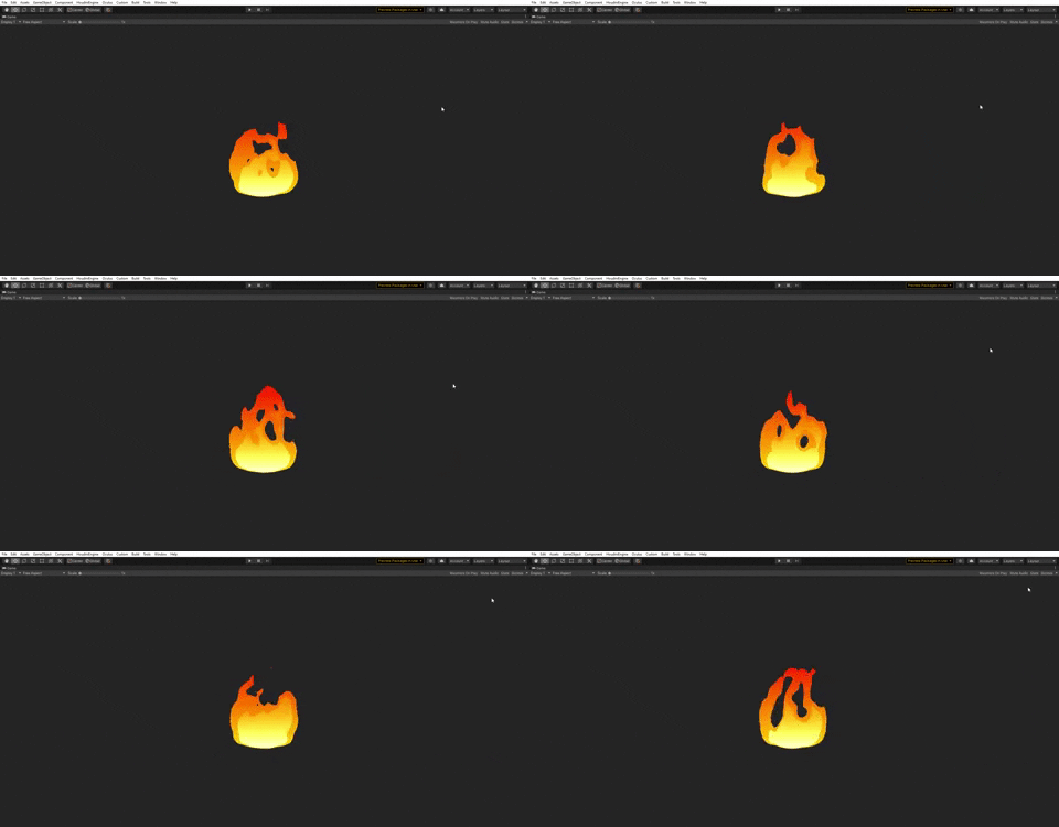
I’m happy with the result, but for some reason there seems to be a line in the left side even tho I’ve changed the alpha multiple times. Maybe I’m missing something.
Anyhow, I hope I can post some more cool stuff from now on.
Welcome, it’s awesome that you started your sketchbook! I love your little flame, well done! I really like that you did not just use simple colors but also added a gradient on top of everything.
But I don’t see the line you mentioned. Maybe it’s not visible in this GIF?
By the way…normally the forum uses the first image as thumbnail but in your case it does not. I don’t know why, but I think having a thumbnail helps a great deal to make people open the thread…we need to find out, why here the forum is not taking the image…but when it will, I’d recommend not to include so much space around your flame. You can use for example ScreenToGif or ShareX to capture the flame and in the case of ScreenToGif you can crop the image afterward. Or, if you don’t feel like installing a new software, you can even do it online with ezgif. I did it for you:
I started my next effect - the wisp effect from VFX Apprentice. For this one I made my own concept and I’m challenging myself to make my own shaders in Unity.
It’s a bit too simple, but I lack proper drawing/painting skills. Nonetheless I really like the result, it helps me layout my idea. I intent to make the effect with more details tho.
Next up, and the thing I’m most proud of myself - I finally started to make my own “master shader” and I’m really happy! I made a small part of the effect with it:
It was really cool to make a master shader with all the parameters costumizable so I can use it for (almost) all the effects. As you can see in the gif I made it so I can enable an option that makes the top part dissolve first, that way the skull can later emerge from it.
Simple but great result. Leaving it here, may be of some help to someone starting
With all this I also learned two things: finally understood how costum vertex work so I can change the curve of the dissolve and distortion over lifetime with more precision. And that in order for the depth fade to work both shaders (effect and floor) need to have the zwrite on to be able to write depth. Now that I think about it makes sense.
I will be adding new stuff I learn along the way to the shader, hopefully someday I’ll have my own great shader to make some quick effects with a great look
well done, super good start! i like that you made your own design with the poison style.
I’m looking forward to see how you feel about the master material later. Personally I lose track of them after a while when they get too complex and adding new stuff often breaks old stuff for me. So I tend to get away from one super-material but I would love to hear your experience later on.
Oh man time flies. I finally finished the effect! Took a bit longer than I expected and didn’t post much of the process because I had some big pc problems
Meanwhile it’s all fixed and… here it is: