worked so hard on this! i’d appreciate any feedbacks. (sound on)
Artstation

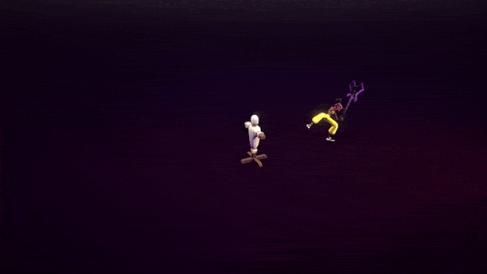
Nice! An interesting style of work… but ![]() the 180-degree flip of the camera really catches my eye, to be honest, it took me a while to realize that this is the same effect. I think if you keep the general direction of the camera without flipping it 180 degrees. this will improve perception.
the 180-degree flip of the camera really catches my eye, to be honest, it took me a while to realize that this is the same effect. I think if you keep the general direction of the camera without flipping it 180 degrees. this will improve perception.
thanks for the feedback! the purpose of the camera flip is to add a cinematic vibe to the effect
You can get the cinematic look without crossing the line by keeping the character on the right side in the close-up.
Actual effect looks pretty amazing, and if you fix the camera it will be clear if the impact lands as well as the rest of it.
thank you for bringing it to my attention, I didn’t know that rule
We do a lot of similar effects in our current project and this punk-ish style is really difficult to pull off if you ask me. So first of all congrats, this looks pretty great.
The 180° flip is distracting at a level where I have to pause and scrub only until that point to look at the effects because the flip breaks my ability to watch them continously.
One of the “rules” we established and only really rarely break is “No soft gradients”. You can replace those with two tone / screen tone dots / hatching patterns and that will give an even more cartoony vibe.
I love the colors of the weapon slash (that just looks perfect).
The two hit flares are a bit much for my taste (or just too similar) but then there is none on the third hit, you try experimenting with increasing their size or similar to emphasize that increasing hit strength.
The circles on the guitar after the cut look a bit cheap to me and maybe a bit too random, what are you trying to show here? power going inwards or power going outwards, are they rotating or are they redrawn every frame?
The exact moment before the hit when the guitar is charged up to the max is my favorite because there I can not decipher the individual elements anymore. Before I often still see “oh there is a quad here”
The frame by frame smoke trails at the end in the light shafts don’t work, they don’t travel as they should, I can see they are only scrolling upwards? Maybe try a bit of UV distortion on those, or maybe could use more variety too.
Keeping the outlines of differently sized shapes somewhat consistent could be good too. The circles on the floor vs the circles on the head of the dummy puppet in particular.
The black and white inverted impact frames are a great idea, but the execution could be improved. It’s odd that during the 180 cut its a different post process effect than after? The impact effect that is truly black and white detects the brightest parts of the image and applies a threshold? Consider animating more materials during these frames to really direct the shapes (maybe even add some additional speed lines that are only drawn in those frames) because currently we loose the character silhouette in those frames and that’s not ideal.
There is something broken here, why do these look so noisy?
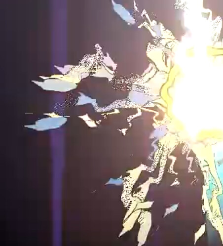
I’m certainly more critical here with your work than with mine usually. Your timing looks solid btw and again this looks super nice and it isn’t easy, the style demands super busy effects and that is soooo much work.
I’d argue if you do a lot of these they would be fine to carry an entire game but there is a bit room for improvement ![]() .
.
punk-ish style is really difficult to pull off if you ask me.
Hey! Yes, I agree that this is a hard style and I experienced it in the first hand ![]()
The 180° flip is distracting at a level where I have to pause and scrub only until that point to look at the effects because the flip breaks my ability to watch them continously.
as I said in the previous replies, I didn’t know the 180 rule so I will pay more attention to it.
One of the “rules” we established and only really rarely break is “No soft gradients”
I tried to not use gradients as much as I can but you are right about the hatching patterns, it would be a good fit.
I love the colors of the weapon slash (that just looks perfect).
Thanks! Tried a lot of variations for that ![]()
The two hit flares are a bit much for my taste (or just too similar)
Actually, I just resized the same slash/hit effect for all slashes.
The circles on the guitar after the cut look a bit cheap to me and maybe a bit too random, what are you trying to show here? power going inwards or power going outwards
The circles are meant to emphasize the audio shock wave going inwards for power up.
when the guitar is charged up to the max is my favorite because there I can not decipher the individual elements anymore. Before I often still see “oh there is a quad here”
I agree about the obvious shapes, they lack some variety.
Keeping the outlines of differently sized shapes somewhat consistent could be good too.
I didn’t quite get the outlines part, I used the same texture on both of the effects. But they are just textures, not a shader magic, maybe that is what you are trying to say?
The black and white inverted impact frames are a great idea, but the execution could be improved. It’s odd that during the 180 cut its a different post process effect than after?
Actually, in the game engine there is only one impact frame. I added the one during 180 cut while editing the video that is why they are different. I felt a bit lazy to add that in the engine and record again lol ![]()
(maybe even add some additional speed lines that are only drawn in those frames)
Speed lines are great idea!
There is something broken here, why do these look so noisy?
I think the noisy look is because of the little distortion value that I forgot the change.
Overall, thanks and appreciate for taking your time to write a great and long feedback!
I am a newcomer to the VFX field and feedbacks like this helping me a lot!