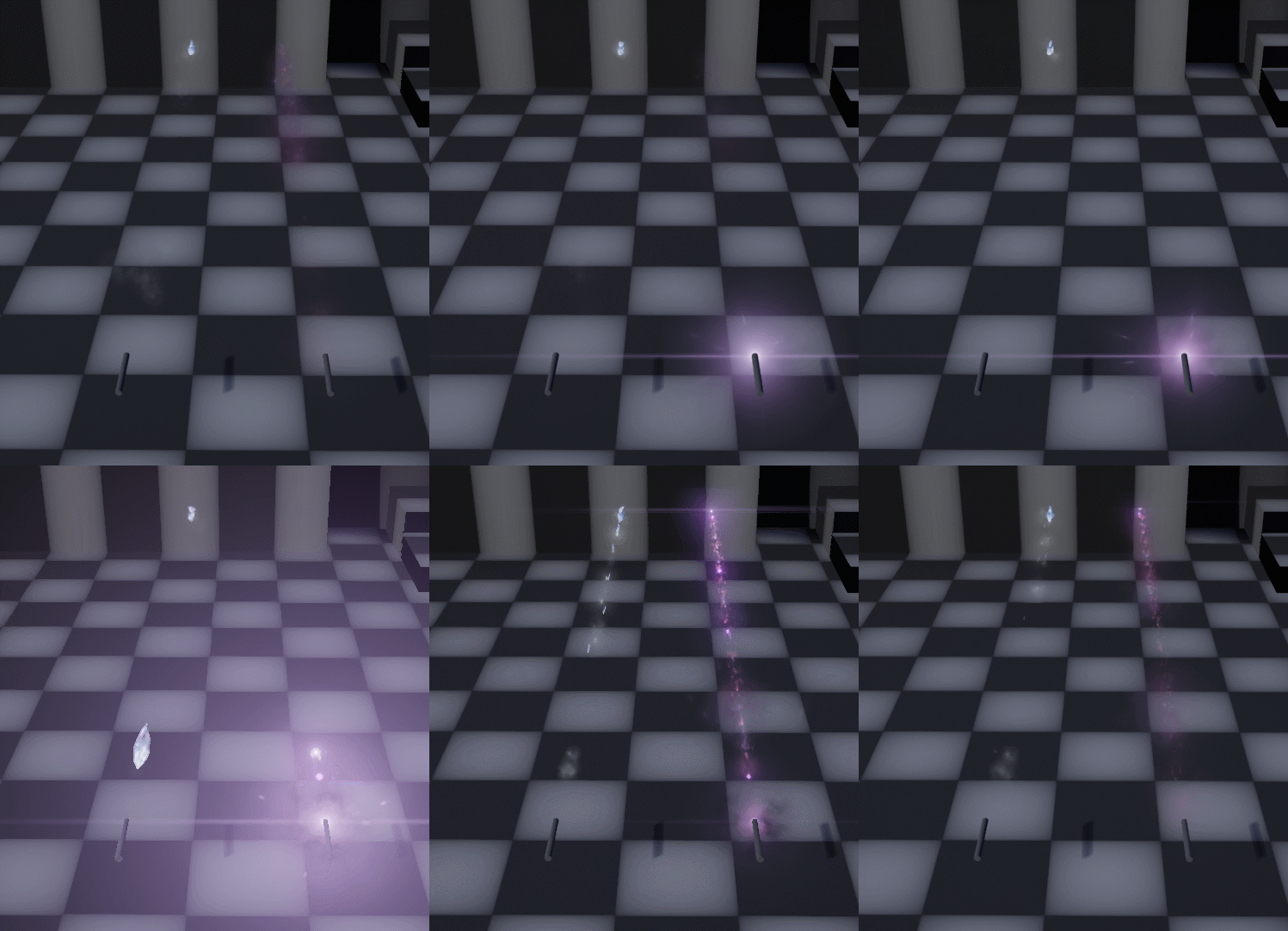
Bird and anim look cool, I am sure your moddeling is fine. It must be my birdspotting skills, but also that angle… tough call! looking closer now it’s more of an eagle actually ![]()
Regarding anim: eventually at the start the bird doing a strong stroke with his wings as part of the release might be something ![]() and then gliding everly after… might get lost with a strong release effect and not worth it though…
and then gliding everly after… might get lost with a strong release effect and not worth it though…
Gif got a bit to big to still call reasonable, so it’s a video this time… sorry ![]()
Oh, also, here’s how I test framerate impact ![]()
Are you trying to blind me with that bloom? ![]()
Btw, did you also -like me- thought about creating procedural spline paths for the -probably- swooshies?
*ps: Liked for good taste of music ![]()
Yup I am trying to blind you with the bloom, if you can’t see the effect, you can’t see how bad it is right! ![]()
and Yeah!, procedural “swooshies” are so much better then having to go into max or maya! ![]()
Can’t stop looking everyday into your sketchbook and just think “Oh, another wow!” ![]()
I want a close-up from the phoenix ![]()
Haha, you’re gona be disapointed. As I said, I’m not that good at moddeling, so it doesn’t really look like a phoenix ![]() If figured with all the bloom and stuff I might potentialy get away with it though.
If figured with all the bloom and stuff I might potentialy get away with it though.
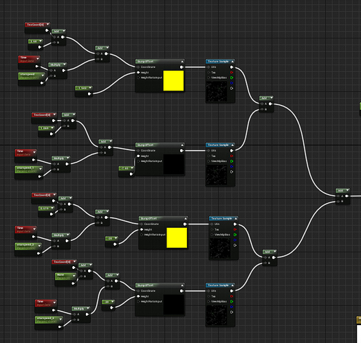
I’d love to know how you achieved the starfield material! It doesn’t look like ordinary bump offset to me.
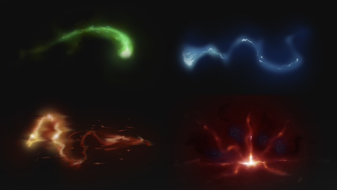
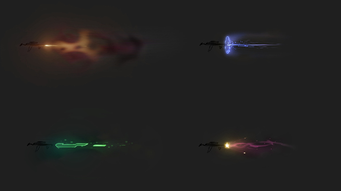
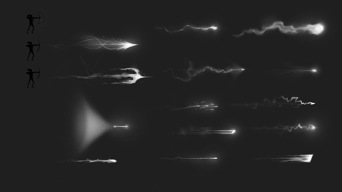
As promised, more concepts.
I’m really struggling with colours here, I’m doing super magicy stuff, so I’d want to get some nice glowy elements, but I’m struggling to make it look like that.
this looks super cool, I love the movement from the first 4 concepts ]
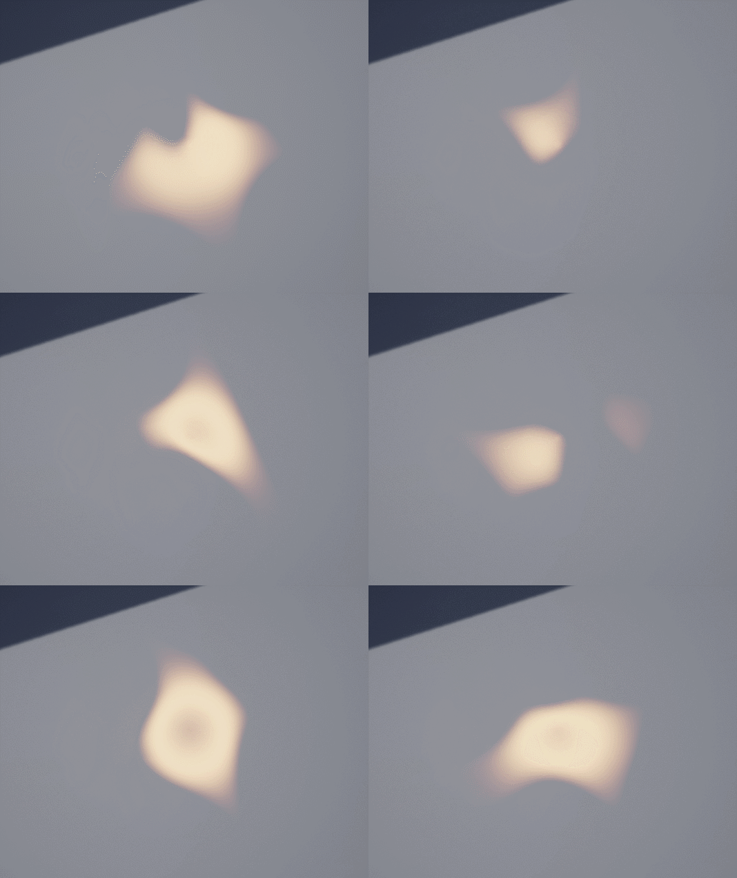
I’m not sure if I’ll end up joining the sketch with this so I might as well just post it here until I decided.
This is a result based only on the sample result of the one circle texture.
It’s essentialy a super light weight simplified naive particle simulation on a grid of particles cutting into eachother.
Oh, and yeah, It kinda sucks, doesn’t it ![]()
This is absolutely stunning! Well done!
Bit late to the battle but the anticipation / buildup on your phoenix feels too powerful to me.
It feels like it is the actual attack / hit, not the building up it.
Also not really functional in gameplay situation if it’s going to cover the whole gameplay area.
It definitely looks nice but should probably be toned down if you want to use it in gameplay situations as opposed to a stylistic exercise.
Hey,
Definitely not too late, I’m still working on this.
Yeah, This is very much an excersise in emulating this over the top asian mmo ultimate ability, not a third person action shooter as my footage would make you think ![]()
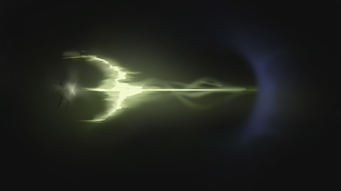
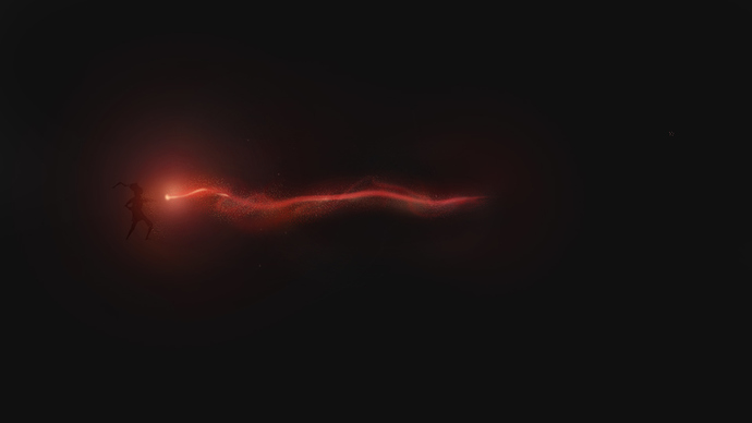
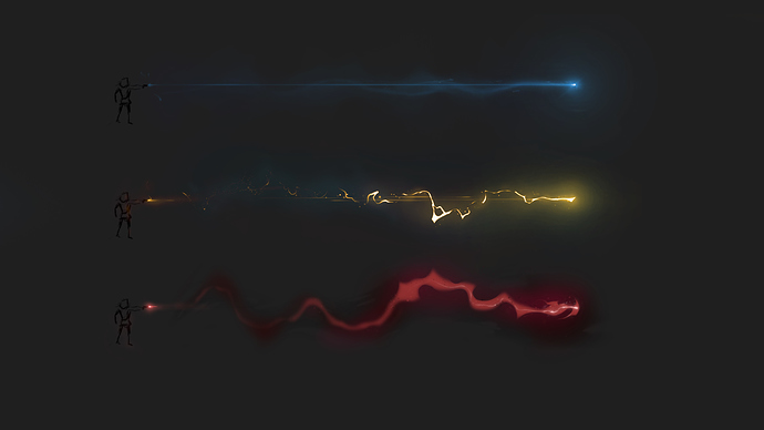
Just trying to go as far as possible with the trails, seeing how puffy and magicky I can make them feel without having too much overdraw.
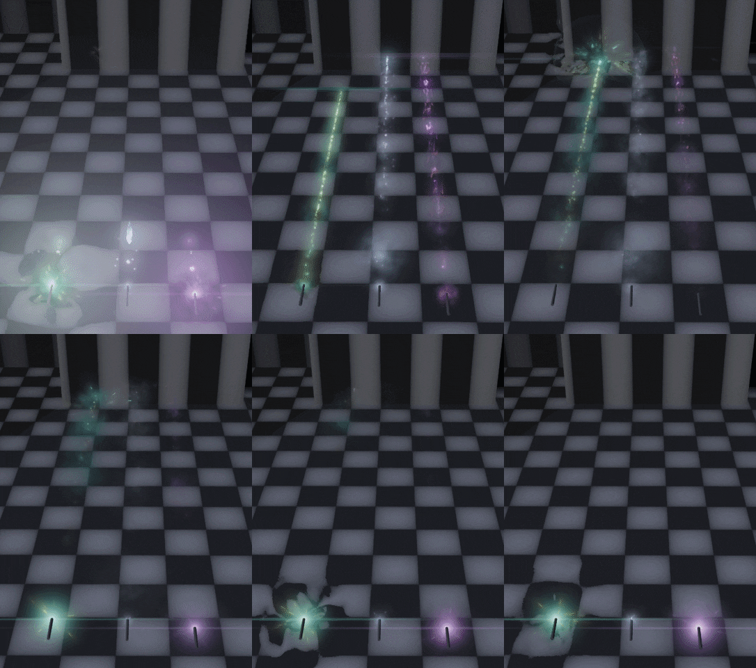
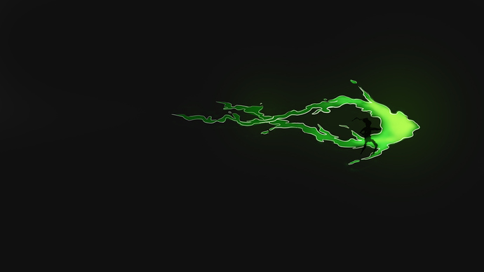
Beautiful! May i ask how you did the normal map / distortion on the green one? My guess is that you used 3 normal maps and used size over lifetime to make them smalled?
![[VFX] Phoenix Progress](https://img.youtube.com/vi/T-b2i_CfV9w/maxresdefault.jpg)

