Hi there!
Currently, I’m working on a translation and adaptation my article about making of VFX. I’ve done about half of it when recognized - oh, a lot of words… =)) That knowledge worked well many years when I mentioned it for junior artists, but that wasn’t a text. It was a dialog.
So, now I have to ask you guys. Would that big text (served beautiful pictures and sort of videos in future ![]() ) help or articles full of text doesn’t work anymore?
) help or articles full of text doesn’t work anymore?
And if you will say - “Yes”, the next questions is - What do you think about that article? Is it interesting or borring? Any suggestions improving that article are very helpful!
And sorry for my English!
Original article is here
Visual effects: theory and tips
About
Hi! My name is Alex. I’m a VFX artist with over ten years experience in the games industry. Working on AAA projects such as Skyforge, Allods Online, and other games gave me a lot of knowledge. Today I glad to share it and I hope you will found something new and helpful.
Intro
Visual effects artist similars to an alchemist. His mission is making gold. In any case, it will be a fake. But how much it will be believable depends only on artist skills. He must be a generalist experienced in various fields of art. If a task doesn’t fit into a common artist pipeline it means that task for a VFX artist. You should know as much as possible and not to fear uncommon ways done your work only if it gave a profit. In that article, I’ll try to describe some rules followed by VFX artists working on Skyforge in detail as well as some tricks, optimization and artists’ motivations.
Terms of Art and their influence on visual effects
In that paragraph, I want to talk about the theoretical side of a question. Visual effects lie at the intersection of Classical and Modern art. That gave the theory of Visual Effects Art a lot of rules and principles but it has own terms and technics. Further, I will describe most important of them used me every day. I won’t mention long basic conceptions. You can find these rules in books if you want. I offer to focus on how they affect visual.
Amount of visual
This is a value of visual appearing for a particular time. You can increase the amount of visual by increasing the size of the color spot, opacity, brightness, time of appearing or decreasing the speed of a spot. You can also compensate one for another, but each term gives you the unique profit. The more amount of visual we use, the more attention viewer gives. More important visual needs more amount of visual and vice-versa. It’s the biggest general factor for me.
Style
It makes your art unique and coherent, helps to recognize new using knowledge what viewer saw before. The major method is the inheritance of visual parts and dynamics. If you do that in the right way, you will save time reusing art elements.
Details
A style dictates a level of details. More details take more viewer’s attentions, so try to add them to important parts of an effect. Too many details will worsen your effect. If you add details into unimportant parts of your art you will make a viewer feel uncomfortable, because he will try to see the useless information.
Dynamics
It changes each part of your effect for a certain period of time. More dynamics add more details. Dynamics may use a rhythm to increase a level of details. Usually, we use dynamics for making emotion and mood of our effects. You can either emphasize that or make it minor. Do not think about dynamics as a motion only. It may change color, silhouette and whatever you want. Dynamics of big masses take more attention than changes into a silhouette.
Rhythm
Usually, it makes a viewer feel your effect better and comfortable, but it always adds more details. It may be a part of a gameplay in games such a Patapon or Guitar Hero.
Contrast
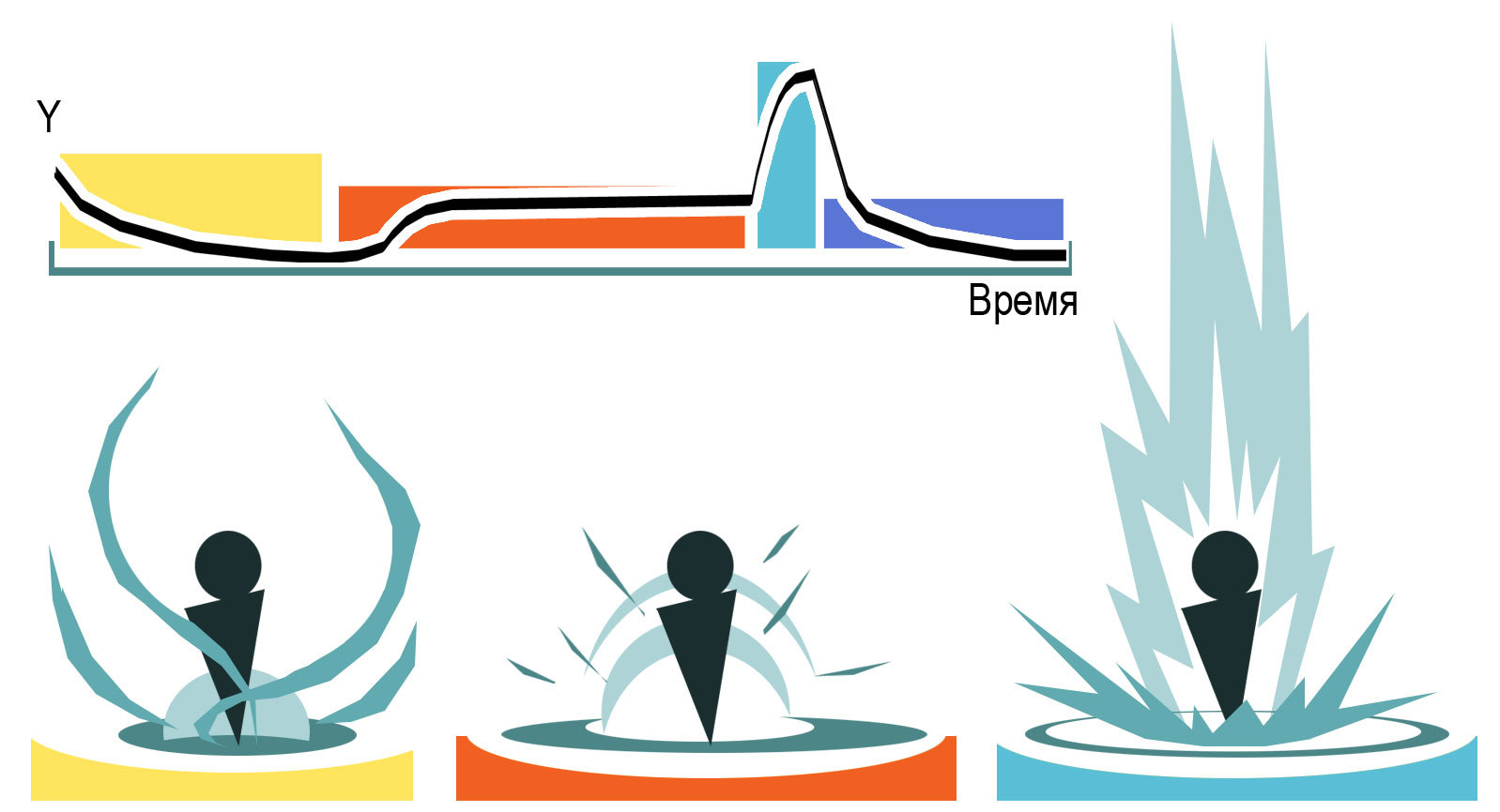
Contrast is a big change of something for a short time. Most often the biggest contrast is used as an accent of effect and shows viewer when a visual event completely happened. Contrast is a stimulus for a viewer and it takes his attention. If you use too many contrasts, it will irritate viewer and get him tired quickly. If you need a contrast, not necessary make always a big flash. Instead, you may change any part of an amount of visual for a short time. It may give a viewer near feeling. The biggest contrast of dynamics is statics. If your visual has continuous action and you need to make a big contrast, often a bad idea is trying to make a contrast of dynamics bigger. Instead, show a viewer a static shot (short pause, slow-mo, freeze or something else). After that, your contrast will have a greater impact on a viewer, than before. Of course, more contrast, more details, and contrasts may have a rhythm.
Art and Technical approaches
Game Mechanics — first!
We are humans and for our nature, the game is first and foremost set of rules, and then how it looks. So, that’s a rule: Game Mechanics — first! But art is an important factor too. It makes a game unique and attracts new gamers. It makes promo art and trailers more valuable in the market. It improves gamers’ desire to share and talk big about it. On the other hand, if VFX art is self-contained and detailed just for details, not for game needs, it starts necessarily dominating and disturbing gameplay. The best way would be here, made art correlating ideally to gameplay and not interfered with understanding what’s going on. But unfortunately, our world doesn’t have an ideal approach to make gameplay and all effects of a game become the best friends. It’s important to know it. VFX artist has to find a balance between them.
Effects and their Priorities in a Spell
The most important effect for gamers is a result of a spell. For example - hit fx. The second effect is a chain between caster and target. For example - a fireball. Next effect explains who was a caster. For example - a light splash at the cast moment. Next one shows preparing of a spell (fire magic moving around wizard hands) and less importance part is continuing effect for buffs/debuffs. For example - pieces of fire emitted from clothes.
Learning Curve
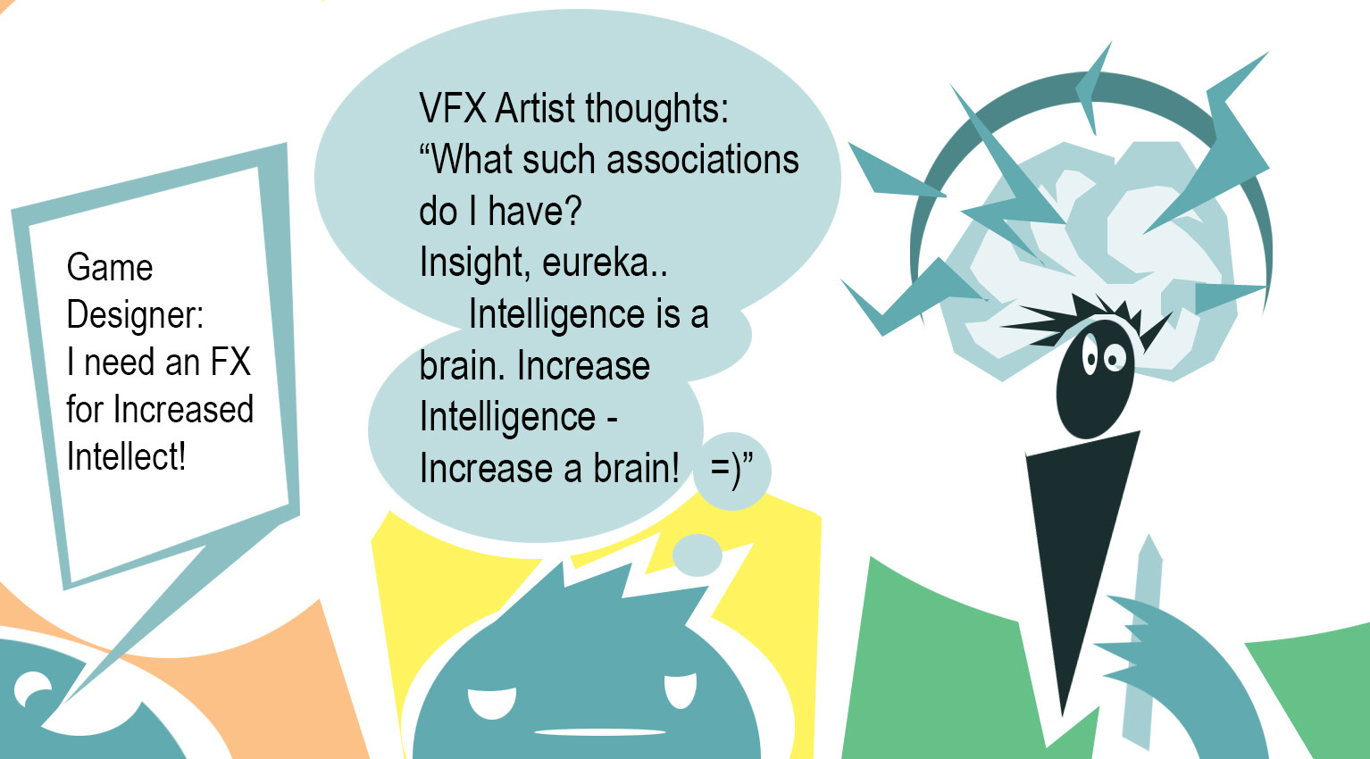
Your visual design should, ideally, be intuitively understandable at first sight. But it’s a difficult goal to attend in practice. Sometimes you have to show not so clear art. In that case, you hope that if a gamer read annotation once, he would know that is that and wouldn’t be confused next time. And the key word here is “sometimes”. That is the worst approach. Don’t listen to them who thinks that is normal. The best and obvious approach is to find the nearest visual association with a game mechanic.
VFX Kit
You can make a kit categorizing parts of effects for reusing them. For example, you may reuse part of effect containing texture, geometry, and dynamics in other spells the same hero. In the future, it may become a visiting card for that hero. That isn’t artistic but common approach. It lets us preserve the integrity of art and make VFX fast without a lot of unique textures, geometries, and shaders.
Color Coding
That is a part of Kit. It’s a widely known term for categorizing artistic elements. Color coding is the most important for a viewer to recognize new elements. Don’t be shine using that. The best way here is to make color code charts for all heroes and mechanic (classes) of your game. For example, in Allods Online for a paladin, we used three colors. The main is golden, additional color is red and for strong spells we used light azure color. It let us have not boring gamma and had acceptable distance between other colors.
Contrast
We measure contrast only relatively all current dynamics in the shot. If your visual line full of explosions, shooting, and other contrasts and you need to show something important, instead of showing the other one biggest big bada boom, you should reduce contrasts and give a rest for the shot for a short time. After that, your next effect will be more important for gamers because it won’t compete against other contrasts.
Not translated, just headings.
A progress of dynamic and color gradients.
Rithm and accords
Simplicity is a healthy of shot and gamers’ nerves
Prototyping
Real reference as a concept or basement of magic
Outcomming influence. Camera shaking. Light.
Destruction as negative, loss
Fast motion as aggresion
Templates of shapes and silhouettes
Templates of dynamics
Principle of overdoing
Gathering a good feedback
See your art after a while
Scrolling UV and types of wrapping
Distortion as the motion blur
Motion blur as the generalization
Noise UV as the detalisation
Virtual Offset instead of Soft Particles
Additive VS Alpha blending — pros and cons
Saving everythere
Optimization
Still, what can we save else?
Right culture and VFX artst’s motivations in team
Where we’re going next?
Conclusion
Common terms in game projects.
Useful resources
Books
Last articles
Big thanks for your time! I will be appresiated for any help and suggestions! It’s important to me to know your opinion!