Hi all.
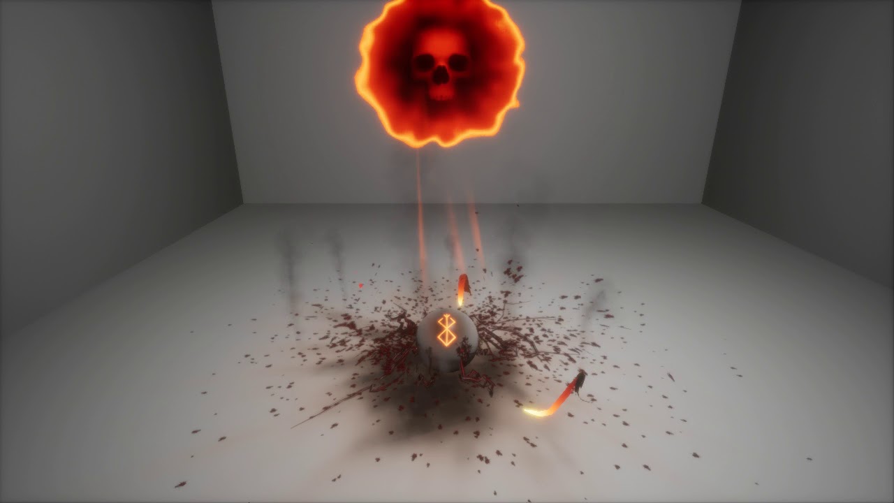
I’m submiting to you a part of the vfx. Some textures are placeholders.
I’ll integrate it soon to make some shader tests. The mark are not placed yet but i’m not forgetting the subjet of this sketch. ![]()
Feedback are always welcome! ![]()
Hi there! I present you a little update of the effect. There is some bugs, but i’ll fix it soon!
hope you enjoy!! ![]()
I think there’s some nice ideas going here, but here’s some personal feedback ![]()
-
Might be a bit visually crowded, cause you got the skull on the top doing stuff and then the worm like things hitting the sphere. I just don’t know where to look at that point

-
Generally some stuff don’t look connected. You got the big meteor crashing at first and then some residue coming, but they have nothing in common afterwards? Maybe have the residue fly away from the big blob at the beginning.
-
The fire coming out from the distorted circle doesn’t feel like the same style as everything else
Tech wise though really cool stuff, would love to see it more connected ![]()
Omg loved it … <3 … How did you achieve distortion on those splashes? Shader?
Holy jeez this is cool
Hi thanks for your constructive feedback ![]()
I have try improve it, by following some of your comment.
Next time i’ll spend much more time on the concept. ![]()
What did you use for the tails of the little meteor guys? They feel so fluid!
Hi! i’m glad you enjoy. ![]()
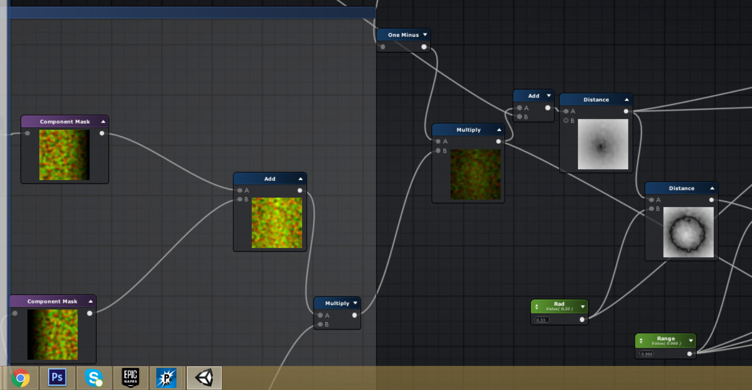
For the shader, I calculate the distance between (0.5.0.5) and texcoord with a slight offset on the coordinate.
Maybe it’ll be more explicit like this!! ![]()
To create this tail. In popcorn fx i create a ribbon placed around the main core over the life of the orb.
The fonction is this on popcorn fx :
Position =
rotate(scene.axisSide() x lerp(0,-0.12 , spawner.LifeRatio),scene.axisUp() ,spawner.LifeRatio x 2 x pi );
![]()
Here is the last update before deadline! i have finaly added the mark ! ![]()
@AntonDessov thanks again for your feedback. Hope it’s better now. ![]()
Really cool effect, I love the mood and colors you chose. Good job ![]()
berserk sacrifice mark ! Now the sphere can not find good sleep anymore ![]()
Awesome man, glad you took it by heart ![]() It’s really visually tighter now, could always be improved, but that’s every effect, right
It’s really visually tighter now, could always be improved, but that’s every effect, right ![]()
Love the progress on this and color variation! Great stuff ![]()
Having the portal for the skull be a perfect circle that’s distorted isn’t as interesting as some other shapes you might want to try. Also, the edge of the portal is more the subject of that effect than the skull inside it.
Very nice work, keep going if you have it in you.
Amazing,I like it. Can I see all your shaders?

