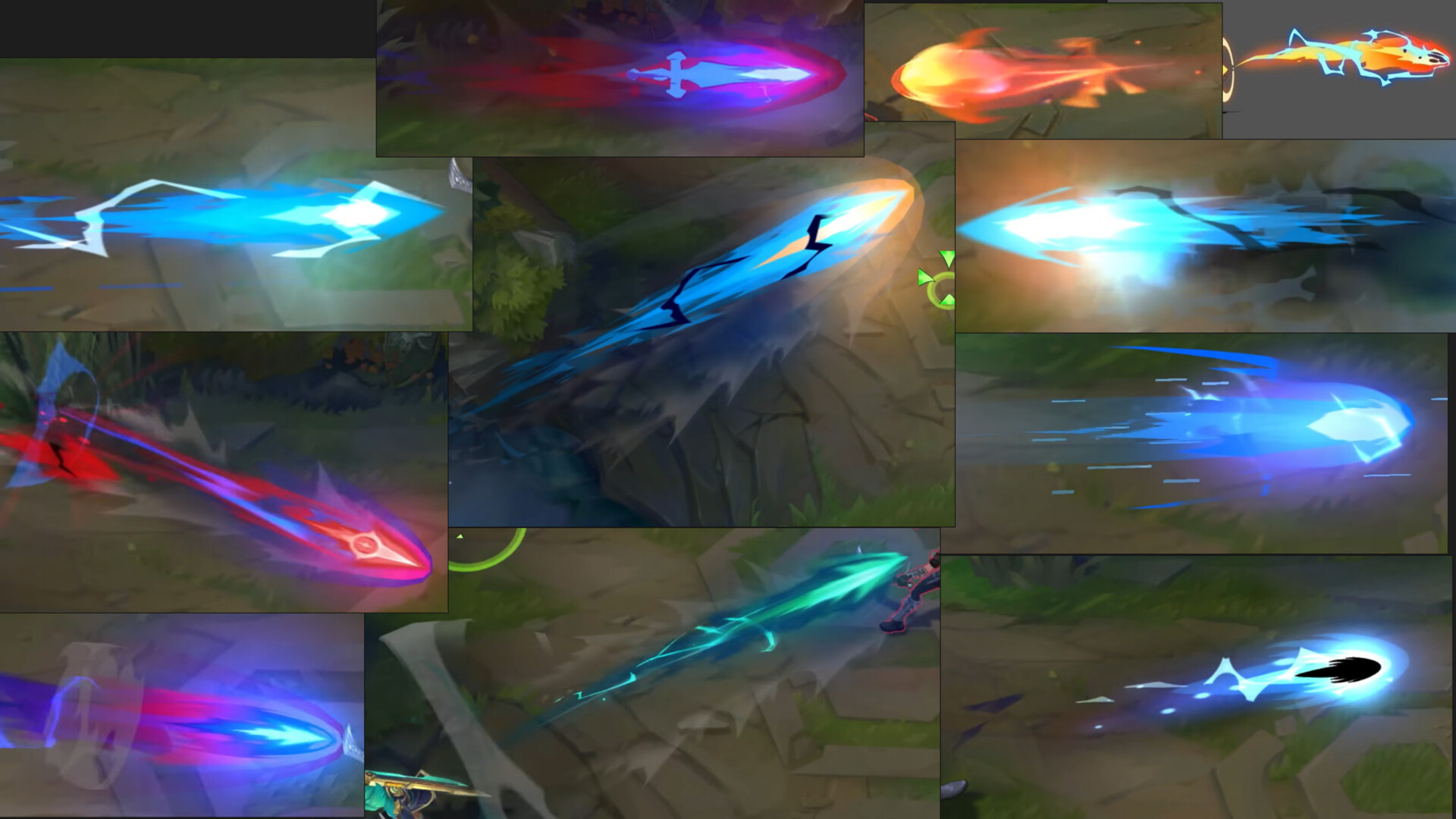
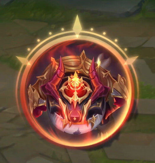
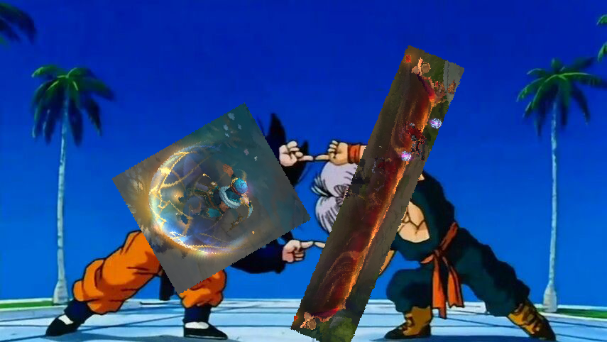
Seeing everyone’s work has been great inspiration. I’m starting this sketchbook to stay active and for future effects to try to share more of my progress
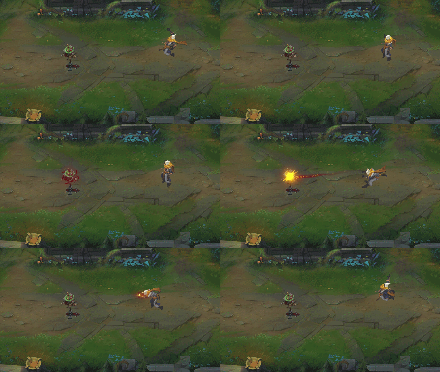
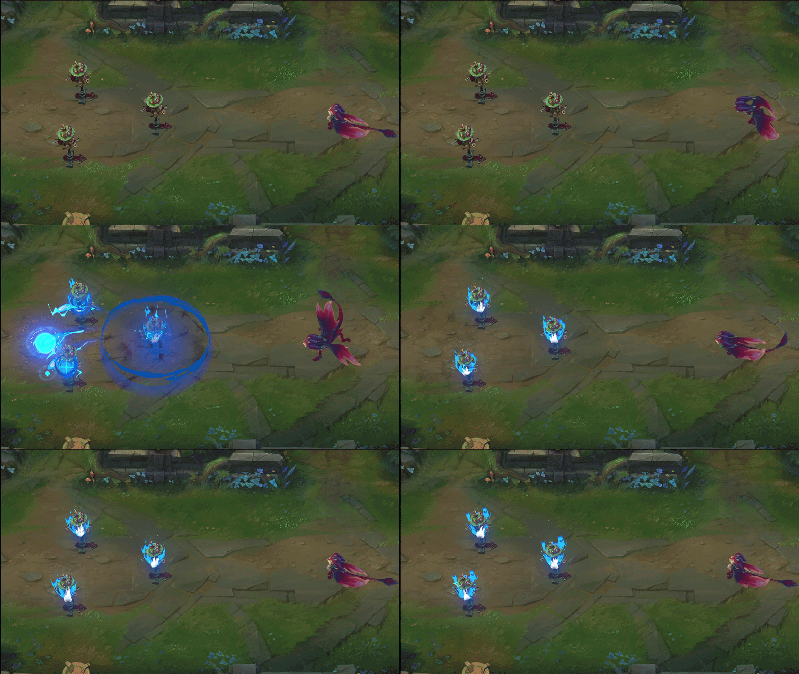

Seeing everyone’s work has been great inspiration. I’m starting this sketchbook to stay active and for future effects to try to share more of my progress
CAKE EFFECT?! Tasty!!
Really happy you got inspired  posting your own stuff helps so much with improving further and just getting to know others here!
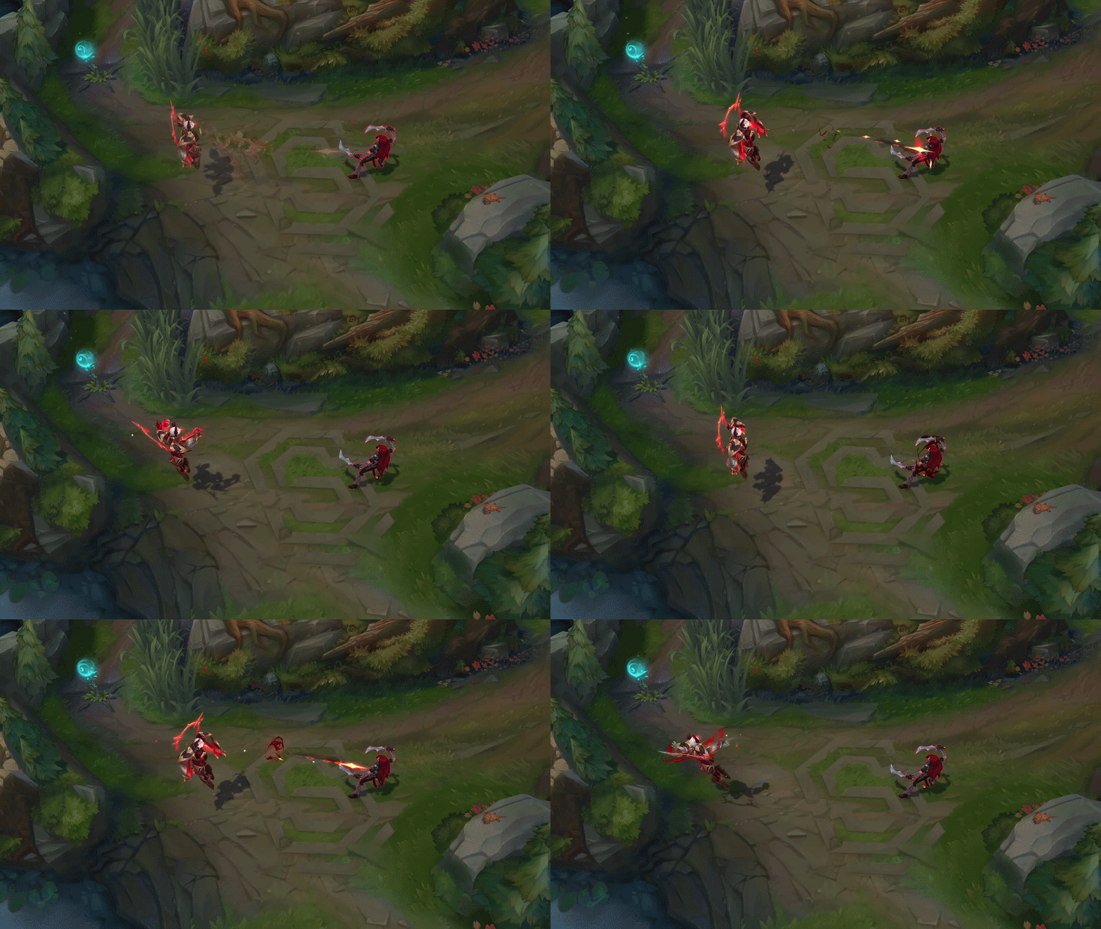
I finished my second portfolio piece! It’s fan art of Smolder’s Scorcher Breath ability from League of Legends, reimagined in the Battle Academia skinline.
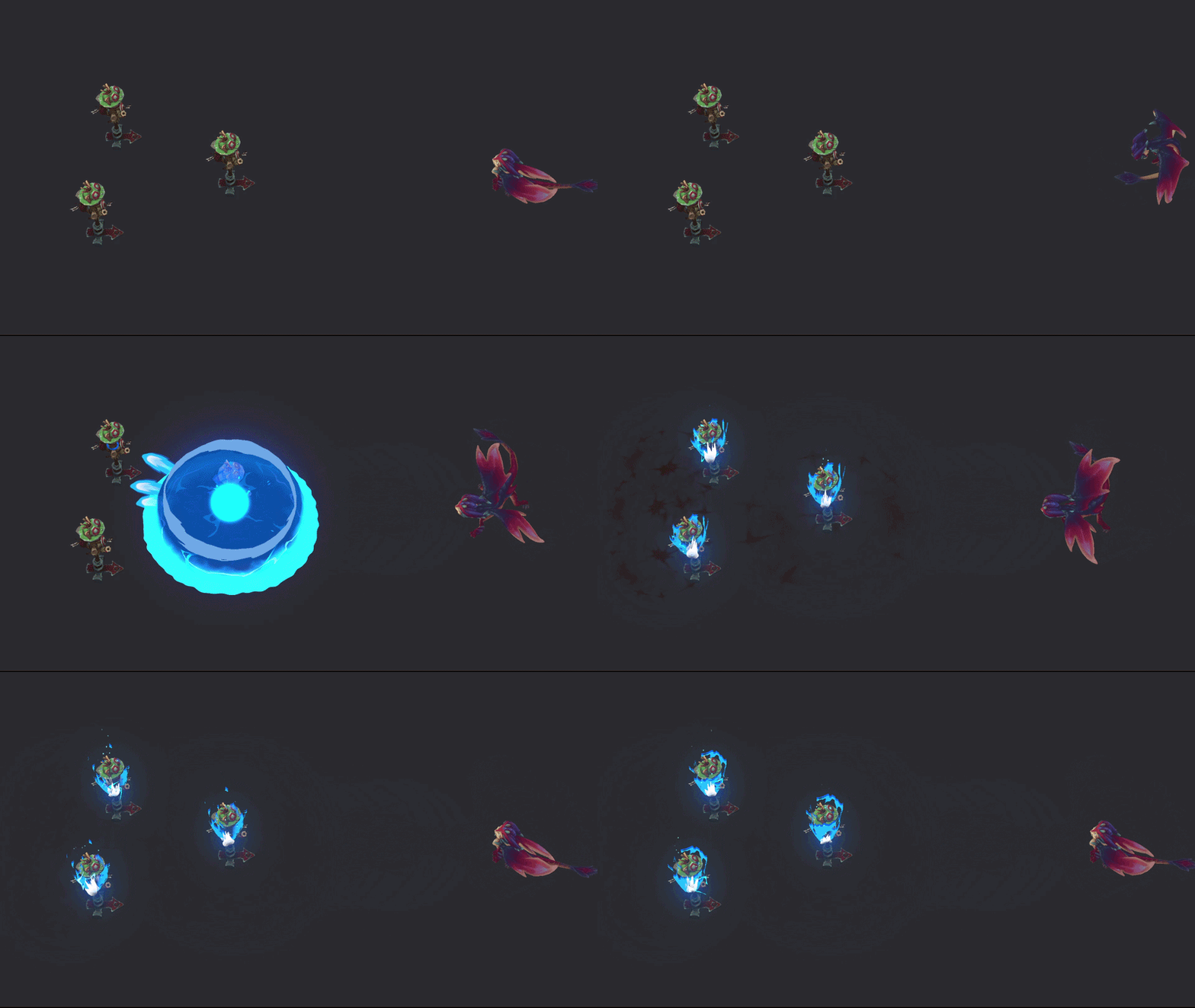
I just wanted to share some of the art direction decisions I worked through, and the revisions/changes I made when certain parts didn’t feel right to me.
Before
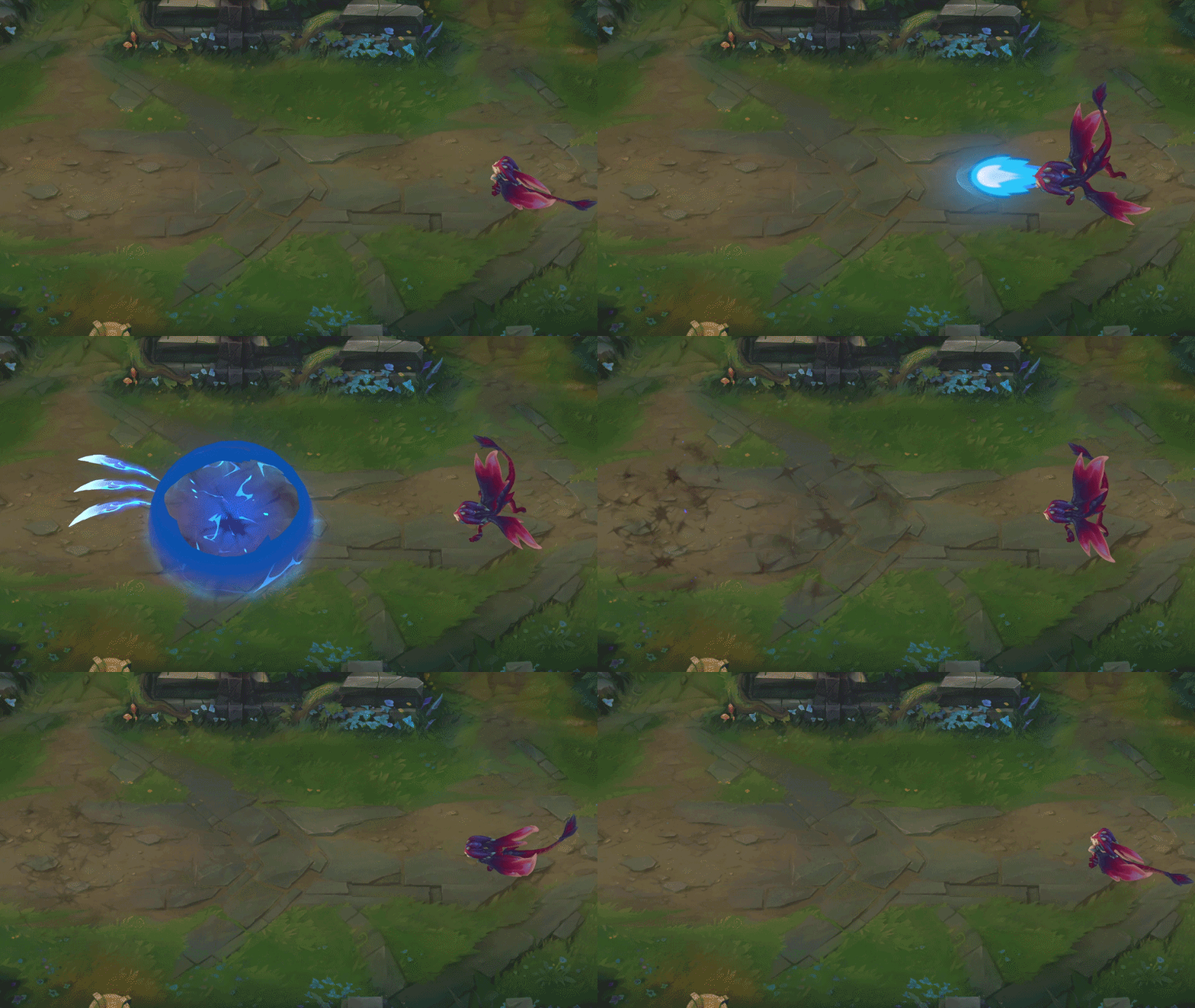
After
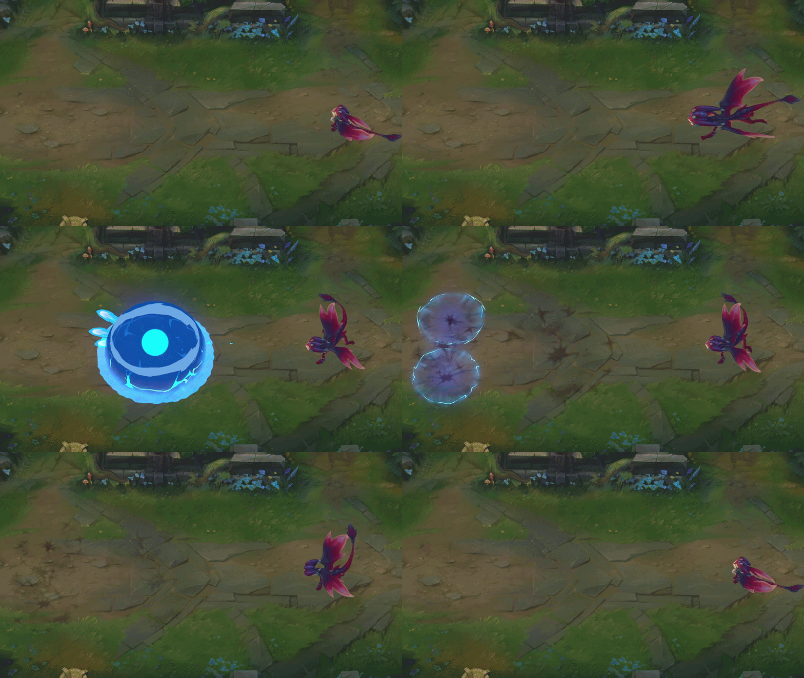
I thought my first attempt of my lightning bounces looked more like icicles, so I changed the head trails to be rounder and the little core explosions to be a circle rather than a spiky hit. And it also looks in line with the main explosion of the effect, not sure why I didn’t start with the circle to begin with 
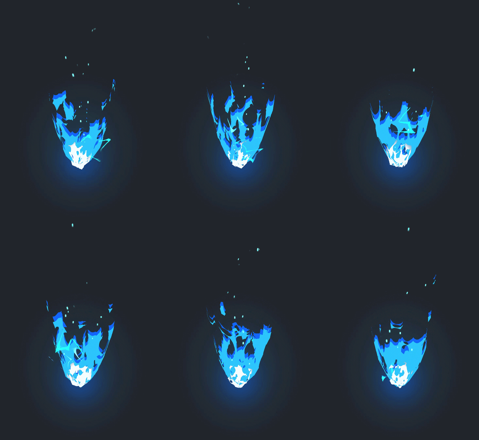

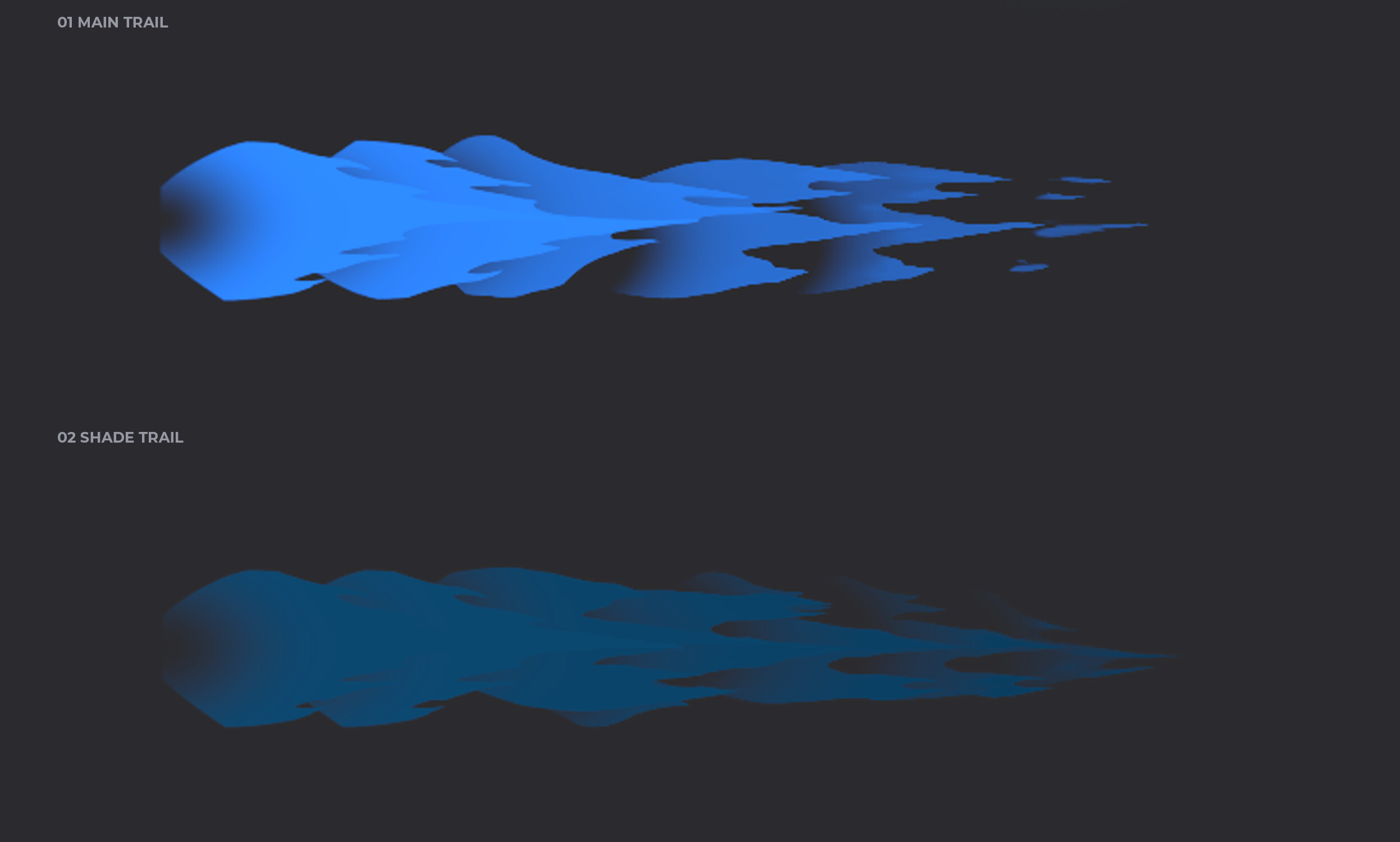
Even though I was satisfied with the first burn version on its own, I was still experimenting with the white core, and I found that reusing the sprite sheet I used for my projectile trail worked pretty well. Which made the overall effect feel more cohesive to me.
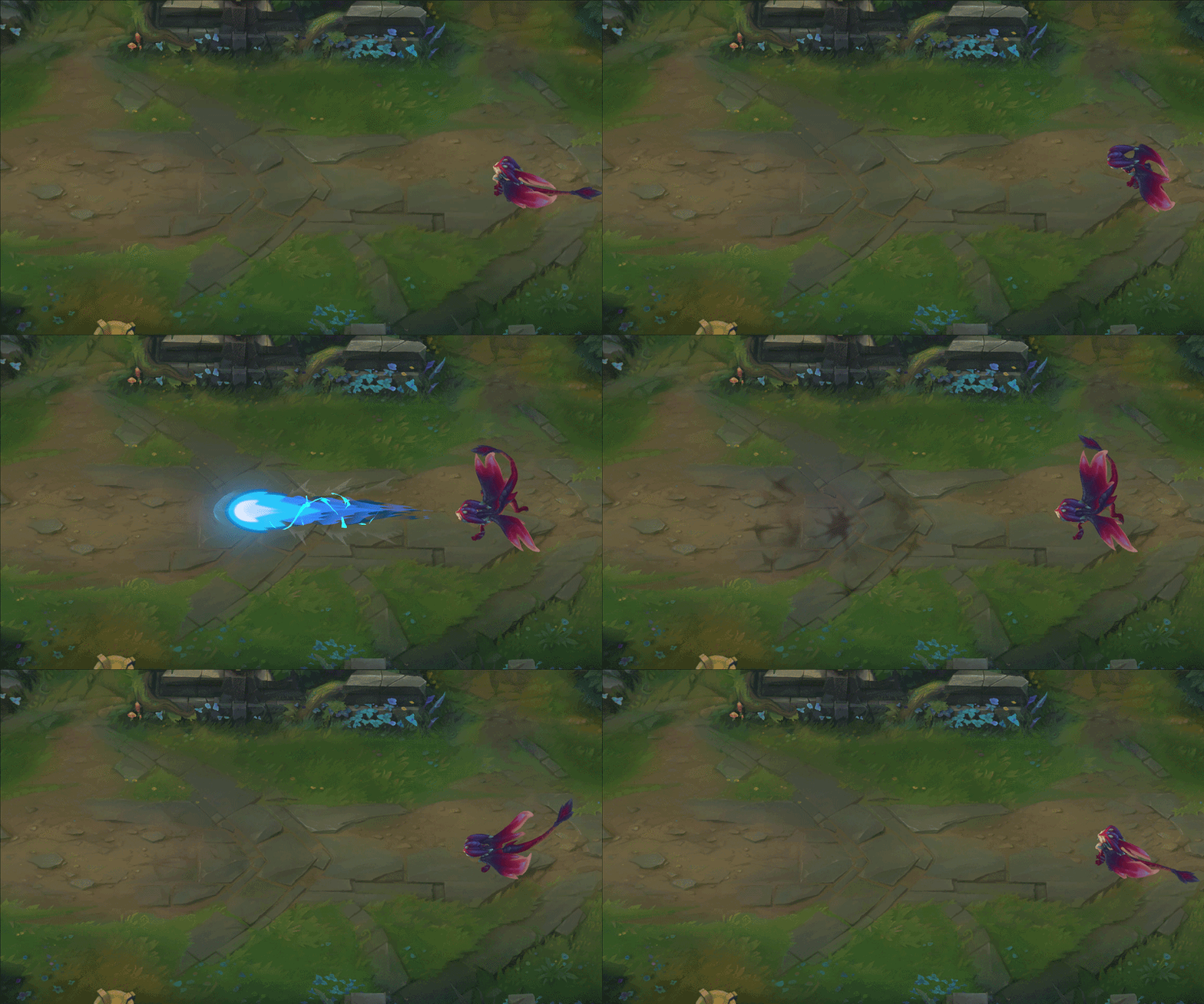
Without Dust
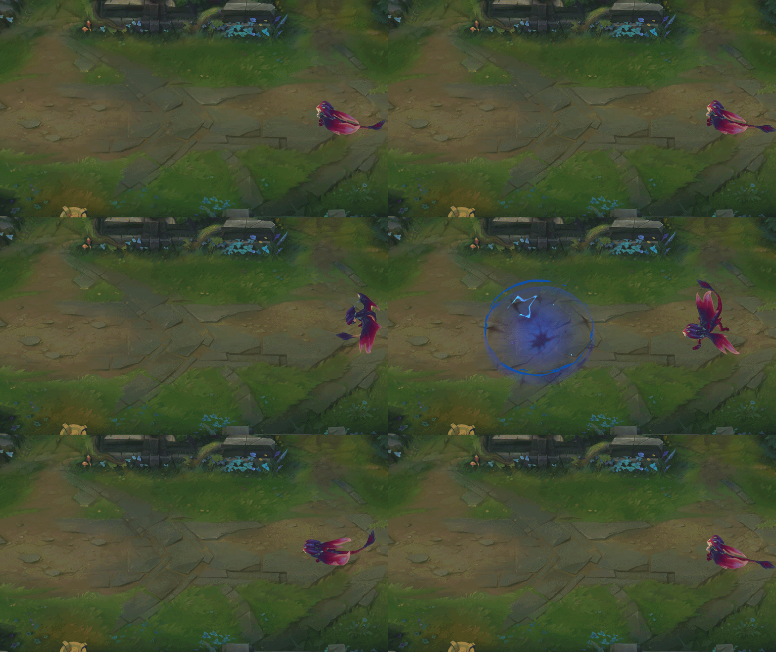
With Dust
Main Reference
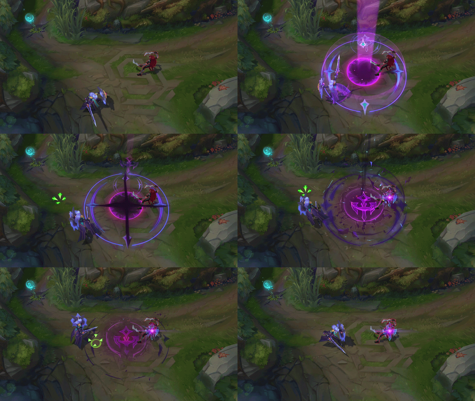
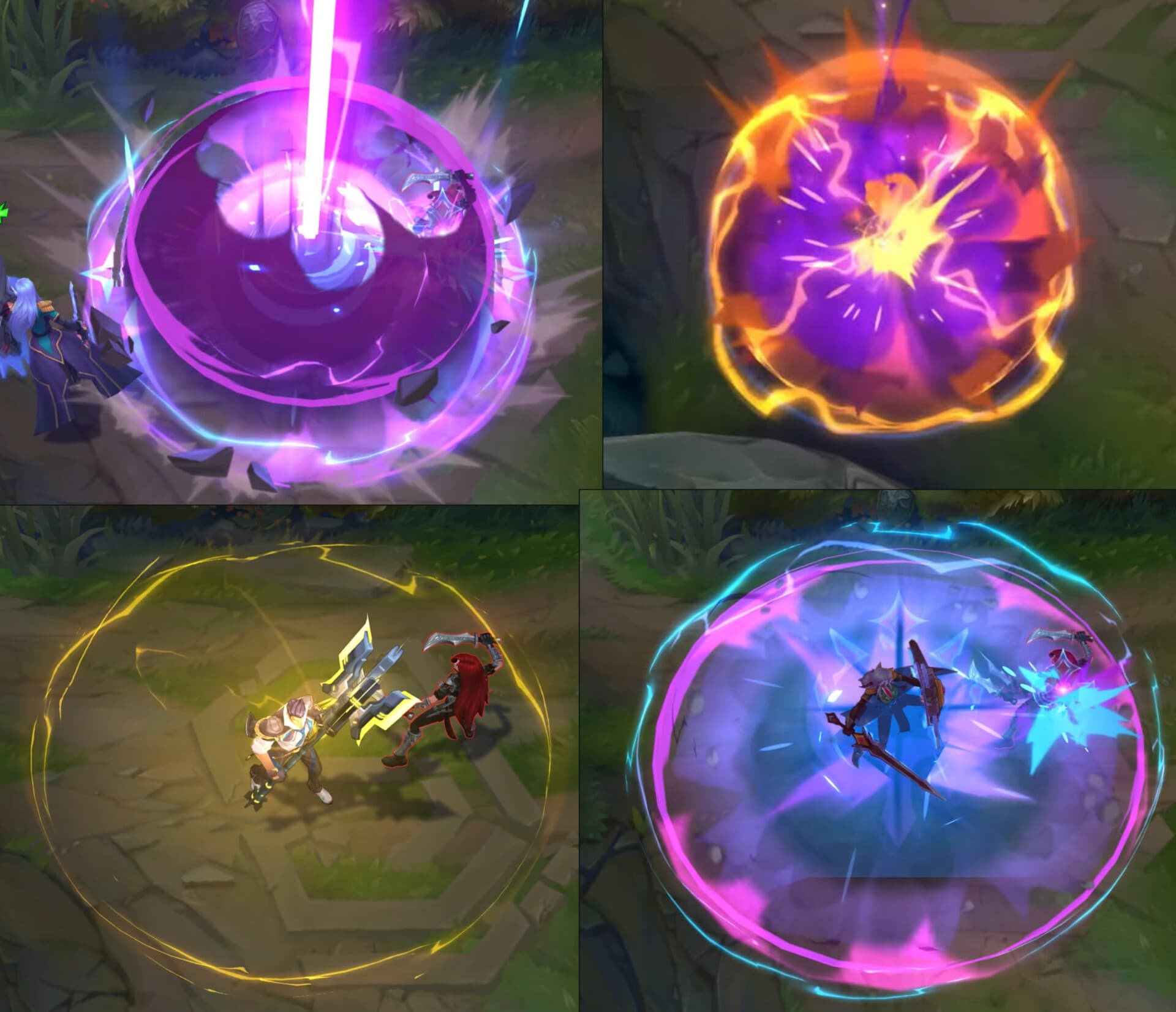
This one was the one I was unsure about when making the final decision. Ultimately, I decided not to include the dust shockwave in the final version. The main reason was better gameplay readability, the dust makes the circle of the AoE a little muddy and it’s clearer without it. (I’m not sure how much clearer though, I’ve been staring at this fx for so long I may be overstating the muddiness) Leona’s ultimate reads well though, even with the dust shockwave because her ult has the AoE indicator before the ability goes off, unlike Smolder’s Q ability.
The secondary reason was I thought it started to look too busy for not being an ultimate
Thanks for reading! I have more of a breakdown for all the elements I used in the effect on my artstation if you are interested
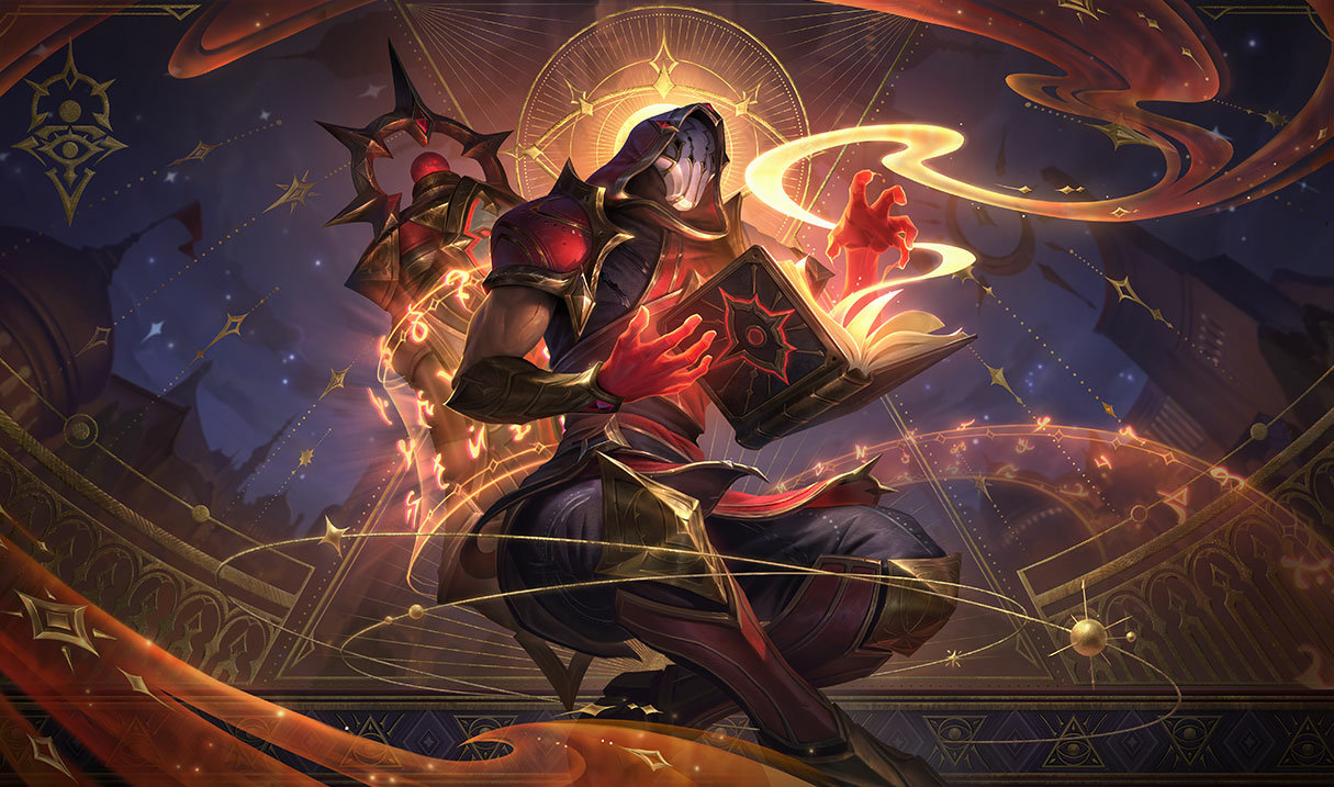
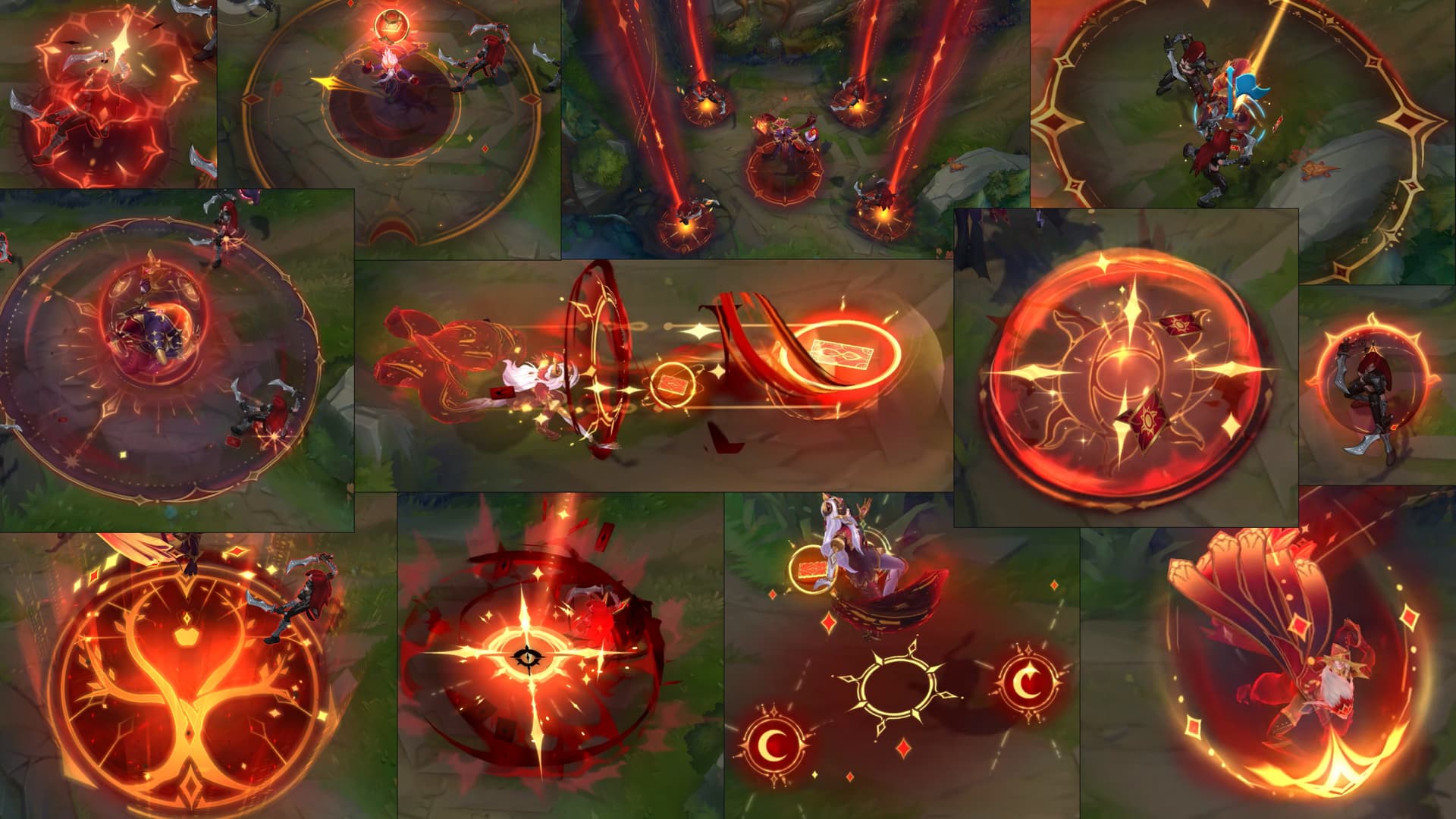
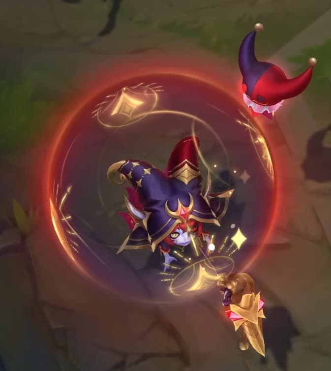
Wanted to share some WIP, instead of just finished work in my sketchbook. I’ve been working on Malzahar’s FX based on the Arcana skinline, and I wanted to challenge myself by creating all of his abilities. He has a range of fx that require different technical skills in making, so hopefully that would help expand my repertoire.
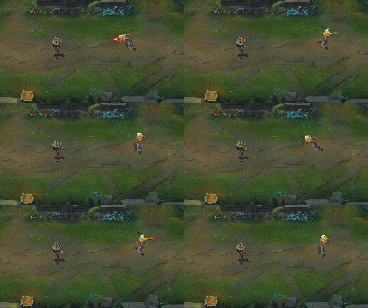
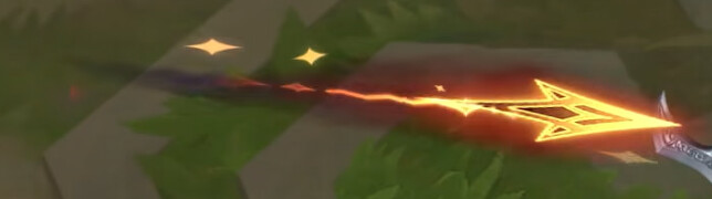
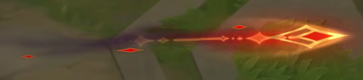
I didn’t check my references closely enough at first and ended up using too much purple in the trail. Which caused me some problems/confusion when I got to the hit FX. Making the swirl redder helped it fit the Arcana palette, but then it stopped feeling cohesive with the trail. Making it more purple solved that problem, but then it wasn’t Arcana color style.
I was also using Arcana Xerath’s auto attack as a color reference, which had me trying to make one color serve too many purposes.
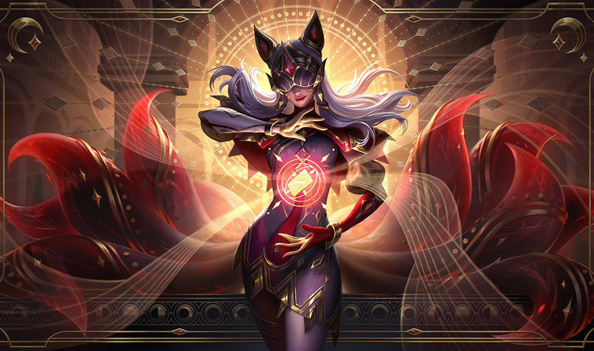
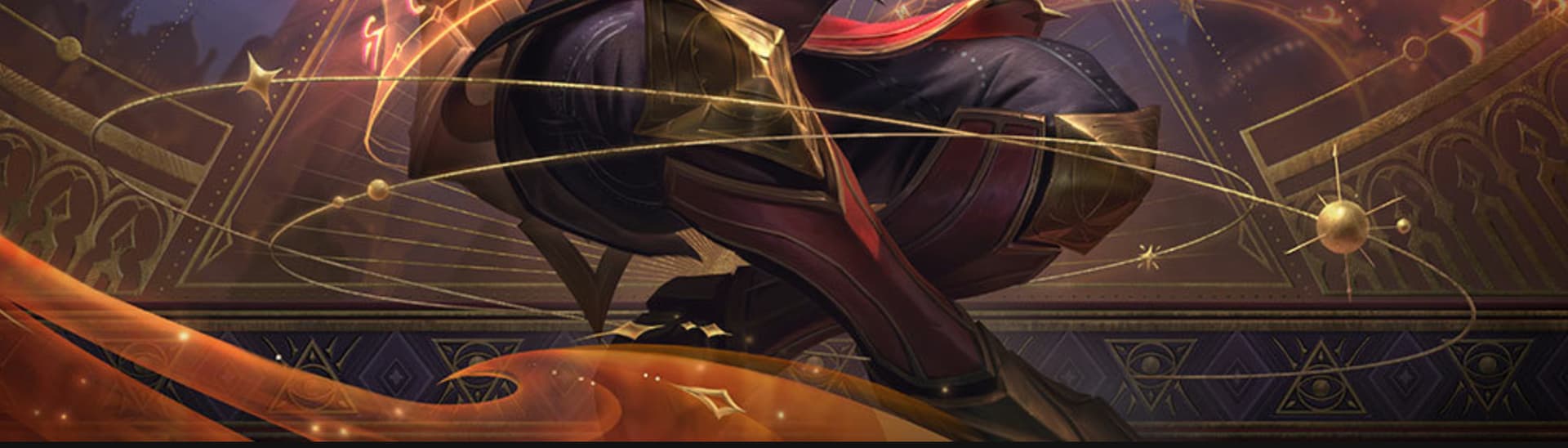
I finally noticed my mistake and made the purple more subtle in the trail. Once I got the color and timing in the hit FX to a point I was satisfied with, I tried to shape the swirl something like an orbital ring shape because it was in line with the celestial part of the Arcana theme, and then I noticed afterward that it’s actually in the Arcana Ryze splash art. 
This is the first time where I am satisfied with an fx, but then when I make it into a gif, I get dissatisfied with it. I know this format you lose some quality, but I feel my subtle color variation and the shape language gets lost more in the hit fx. But when I push those elements to be bigger, and flashier, the fx starts to feel overdone in Unreal especially for an auto attack.
I’m not sure whether that loss is mostly a consequence of the effect being small (less flashy), or if it’s exposing weaknesses in my shape language and color choices.
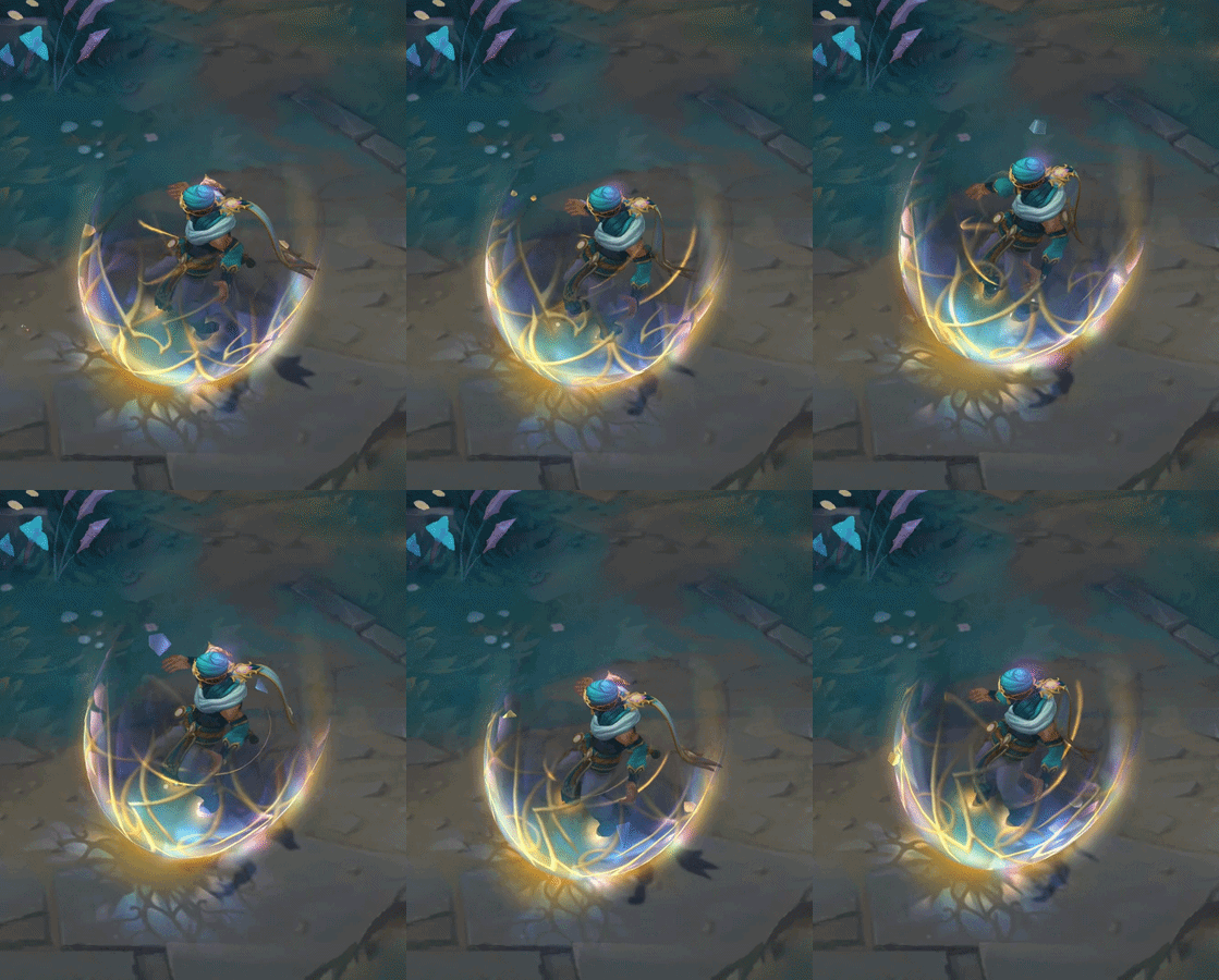
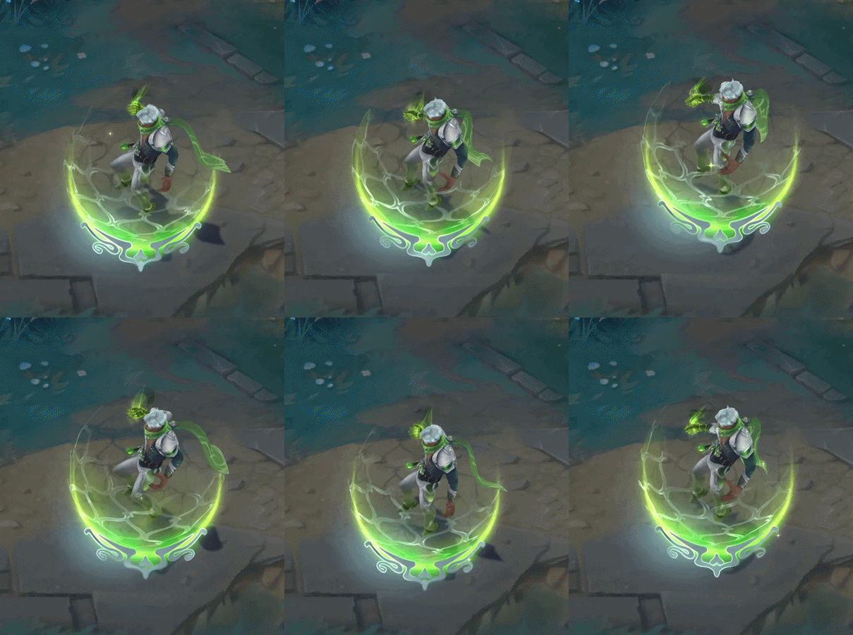
I’m using Fatebreaker (blue) and Debonair (green) as references for the shield, with Fatebreaker being the primary reference.
I wanted to see how shields have been approached in the Arcana style to get a better sense of which direction I wanted to go in. It gave me a better idea of the Arcana visual language, but none of them quite clicked with what I had in mind for Malzahar’s shield.
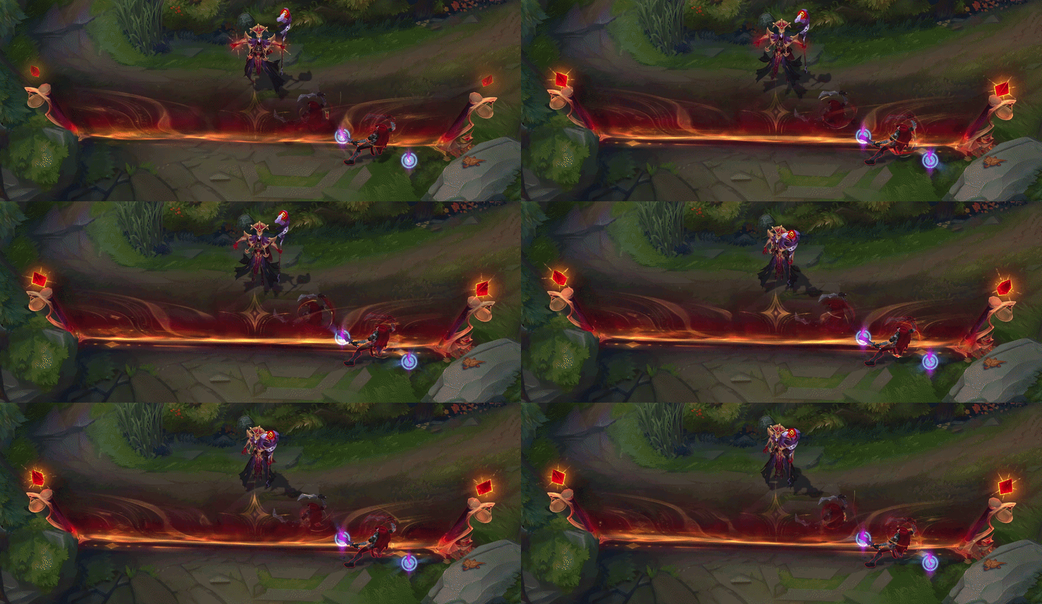
Arcana Karthus’s wall is the reference that really clicked for the direction I want to take the shield. Karthus’s wall has that dynamic, flowing motion that I want for its look. Also the great color gradient, having the orange gold base to deep red and dark purple. And the gold line shapes to accent the overall look.
The main idea is to use Fatebreaker Malzahar as the structural reference for the shield, while using Arcana Karthus’s wall as the primary reference for its art direction.