I think rich doesn’t necessarily mean you need to add a lot of elements. Instead I think it could be good to think how to polish this.
I’ll try and give some examples.
Right now the effect feels very monochrome green, it can be nice to add little hints of other colors, some dark cyan works well to add depth, and reds can give a feeling of lens chromatic aberration.
Bokeh elements also work well with this kind of effect
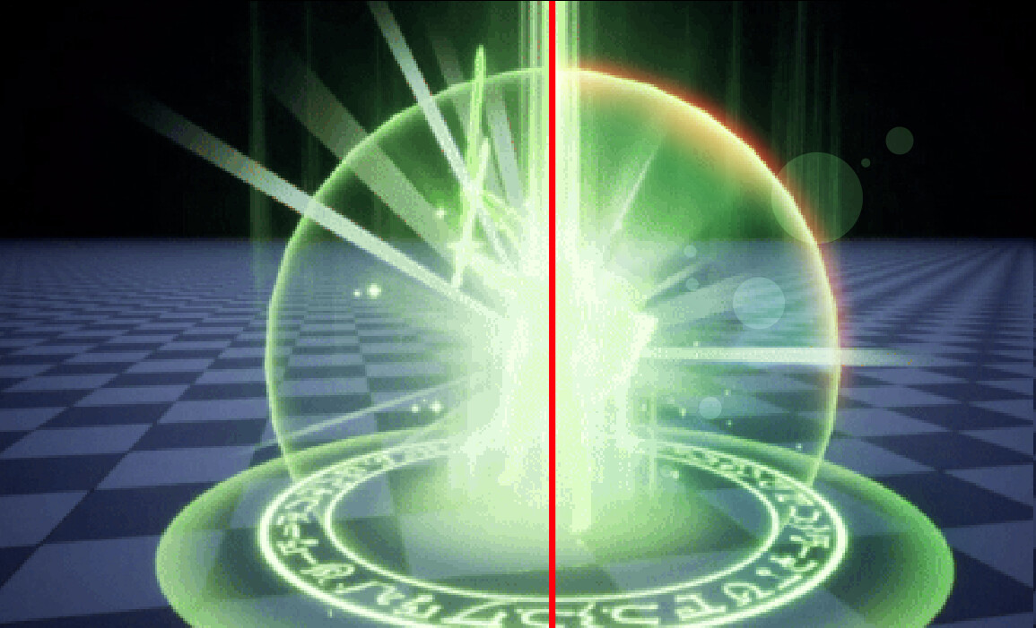
These elements are too thin and flimsy compared to the rest of the effects, try to add a bit of body and reduce the count.
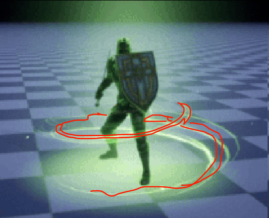
This sigil on the ground can feel more interesting, maybe have a few particles drift up, make it glow a bit in some spots, add a subtle inner ring, add some darker tones under it.