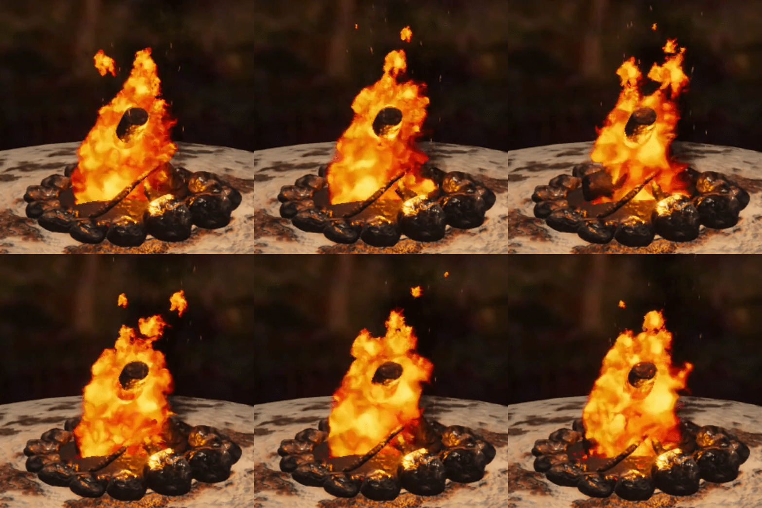
Its your every day noob back at it again with them effects, trying to do fire for the first time around. I know I’m really late on the whole campfire event thing, but, fire is important to learn. Smash me with those critiques and advice if you got them, I can handle it! I really wanna improve, so, thanks for taking the time to view! Hope to hear what you guys have to say soon!

Full video here (19 seconds)
3 Likes
hey dude! so to get right into it,
right now the fire looks ultra flat. I’m not texture expert, but it looks like the alpha youre probably using is mostly likely very white, there needs to be some varition in your fire texture. ( have the same issue)
Also the particles are just shrinking and not fading away like fire. That has to do with my first comment, as well as no alpha erosion ( I think, i’m not 100% on that)
looks like your sparks are just flying straight up as well, when and overall have the same life span, I’d randomize their motion and life span.
hope this helps  i’m trying to gett better too so i cant wait to see what you do
1 Like
Hey man, thanks for the critique, means a lot!
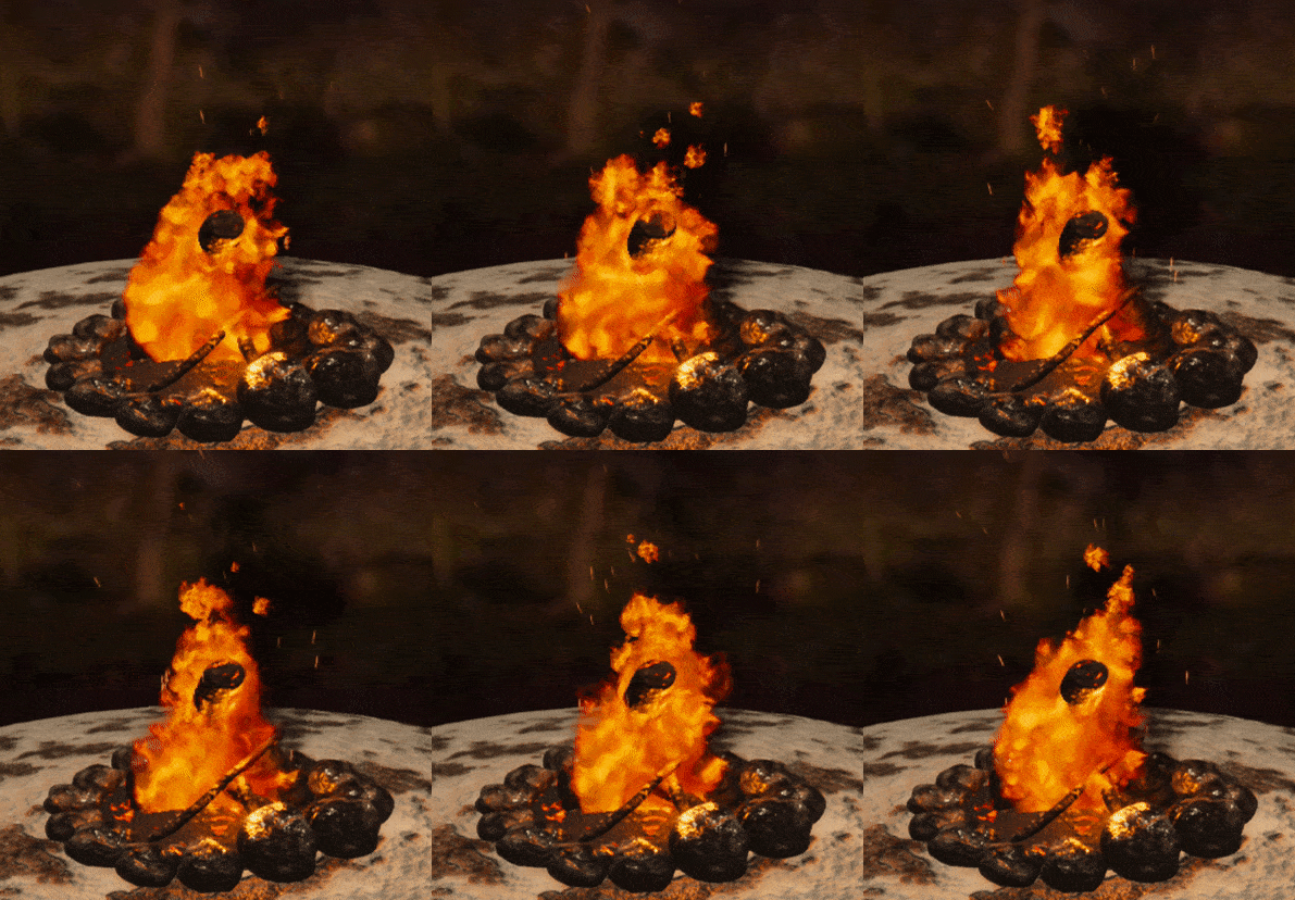
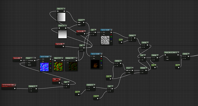
So I went through to adjust what you said, made the alpha a bit more intense and varied with more grey values rather than mostly white. Probably still need to get a better alpha, but I think its an improvement? I dunno, what do you think? I also adjusted the sparks a bit like you said. they changed direcitons before, but were kinda cropped from the video, but they still werent intense enough. So now they should look more like embers.

The main issue with the fading that you recommend is I cant…figure out how to get it to work. I know how to do it, but for some reason it just doesnt work. I believe it has something to do with the material, possible because the image I’m using for the fire has color in it? I’m not really sure. Usually in the 0 and 1 for the color over life it should be white in 0 and black in 1 for fading, right? I dunno. Do you know why by any chance?
Nevermind, solution found! Will post a update soon!
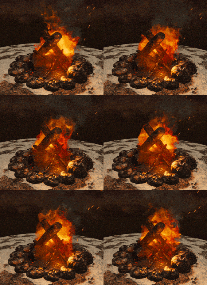
Huzzah, let there be FIIIIIIIRE!
Thank you for your help!

nice dude! I might also add, that to me there doesnt seem to be enough depth/contrast in the fire. LIke it looks like it came out of the ps2 era so far. But That might be due to quality of the gif? Otherwise, i’m really not sure what else you could do to make this better. If others chime in i’m sur ethey could give you some more advice, but as far as I"m concerned. This looks tight to me!
maybe put it in an environment and have it light some stuff up?
I’ll see what I can do there. Normally when I add more brightness/contrast to the current fire I have, it looks kinda blobby, so I may just need to create a better one that has more bright and dark values. Thanks for your help man.
