Hello! First sketch time, I can’t resist cute things ![]() So I hope this all set up correctly.
So I hope this all set up correctly.
LATEST:

REFERENCE:
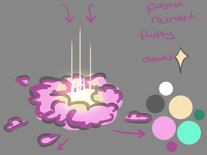
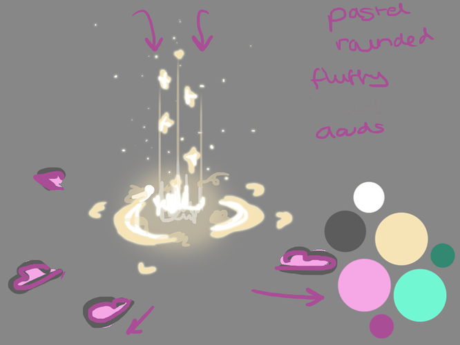
Slime Rancher, My Time at Portia - basic shapes and colours. I wanted to keep it quite simple for my first sketch, especially as I’d like to try something a bit toony, which I haven’t attempted before either.
I can’t think of cute without thinking of pusheen.
https://www.facebook.com/Pusheen/videos/802558196786049/
Elements I’ve noticed where pusheen gets that cute vibe; limited pastel colours, bold outlines, bouncing and pulsing animation.
So I started with a couple of concepts trying to stick to two colours. I picked three pastels to begin with but I don’t think it’ll need them all for simplicity.
WIPS
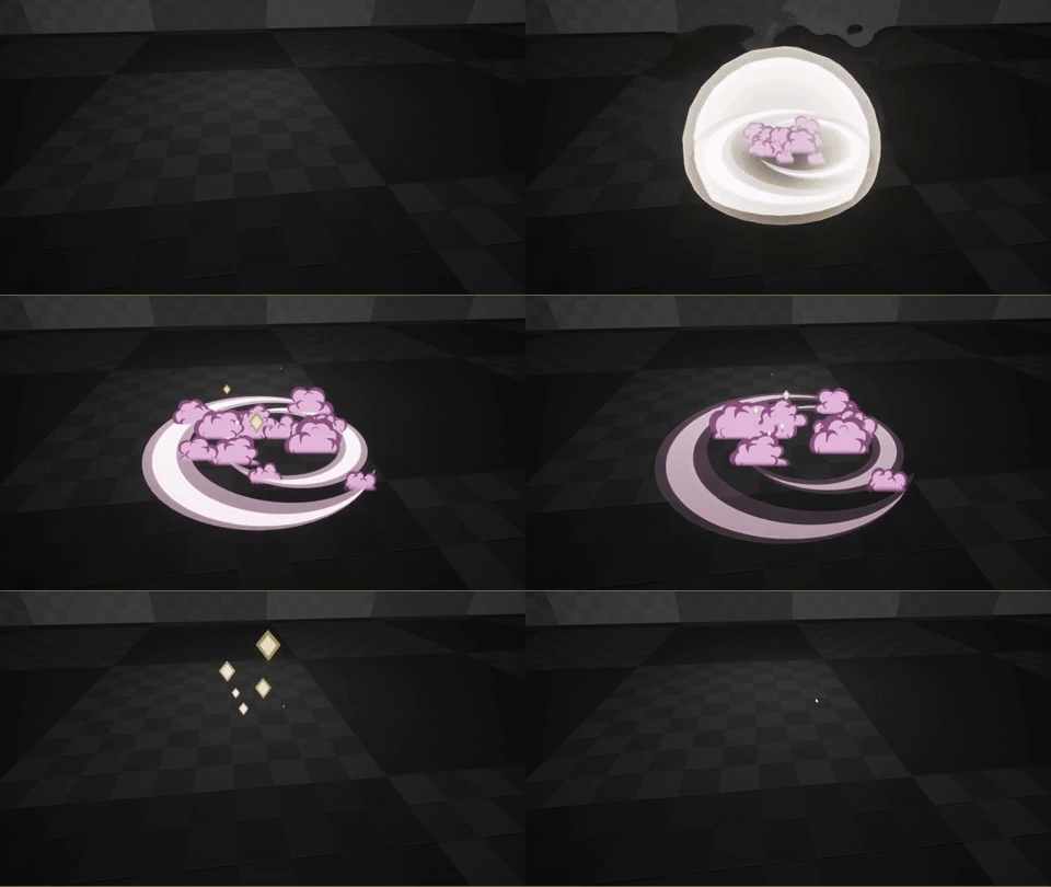
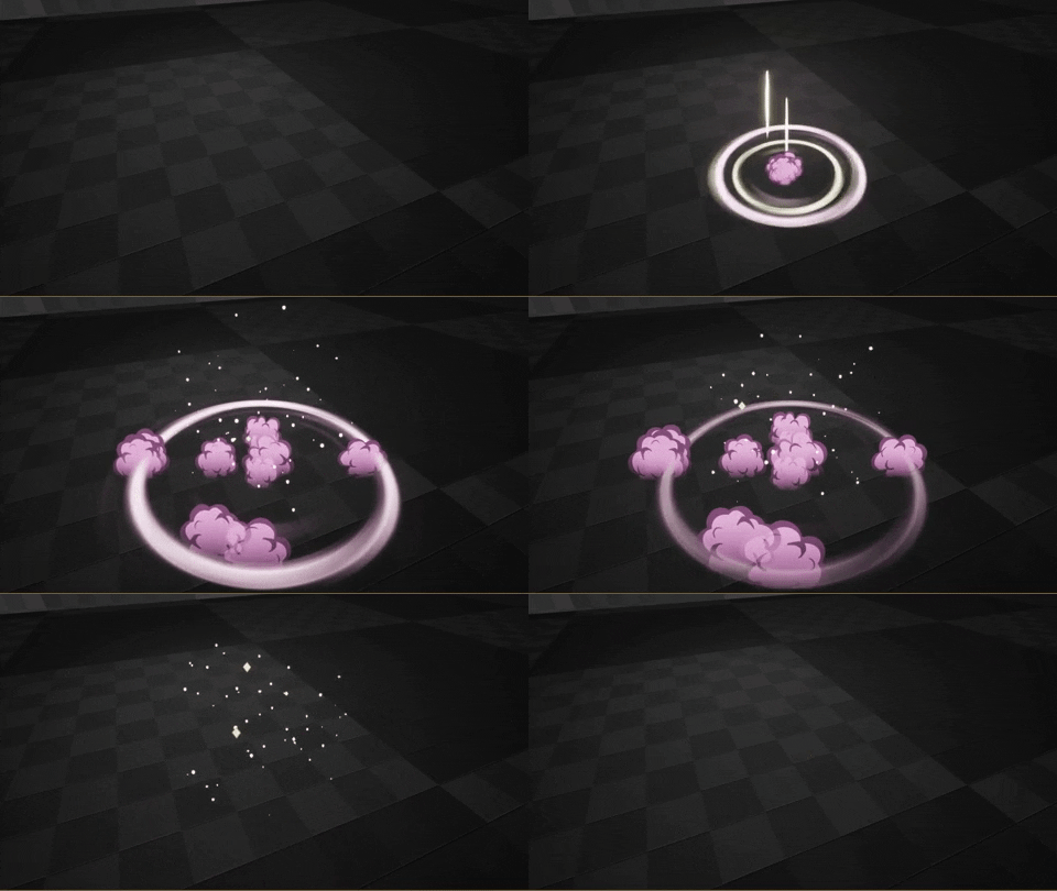
First I thought I’d tackle the clouds and I came across this https://youtu.be/waAW-rrhX4U?t=100, which had quite cute little cloud sprites that fit the simple shapes with an outline that I wanted to try. I thought I’d try a similar design for the sparkles later too. Originally I thought i’d have some animation on the clouds but I’m going to see if I can achieve ‘cute simplicity’ with really simplified elements and shapes.
Also rather than fading smoke and embers out as I normally might, I wanted to try to incorporate the bouncing and pulsing animations that I think give off the cuteness vibe to kind of pop them away ![]()
Video of all my WIPS so far:
Next improvements:
- Vector field on the small embers for more wooshing
- Bigger pop on the impact. Brighter like original concept
- Improve the ground ring texture and anticipation generally, not sure the lines really fit with the rest of the rounded shapes

Next Improvements:
- Try a vector field on the small embers for more wooshing
- Add another element to the anticipation but not too much

