This is my first time posting and doing concept for VFX stuff and i would love some feedback on how i could improve for next time! (i don’t know how to use this website )
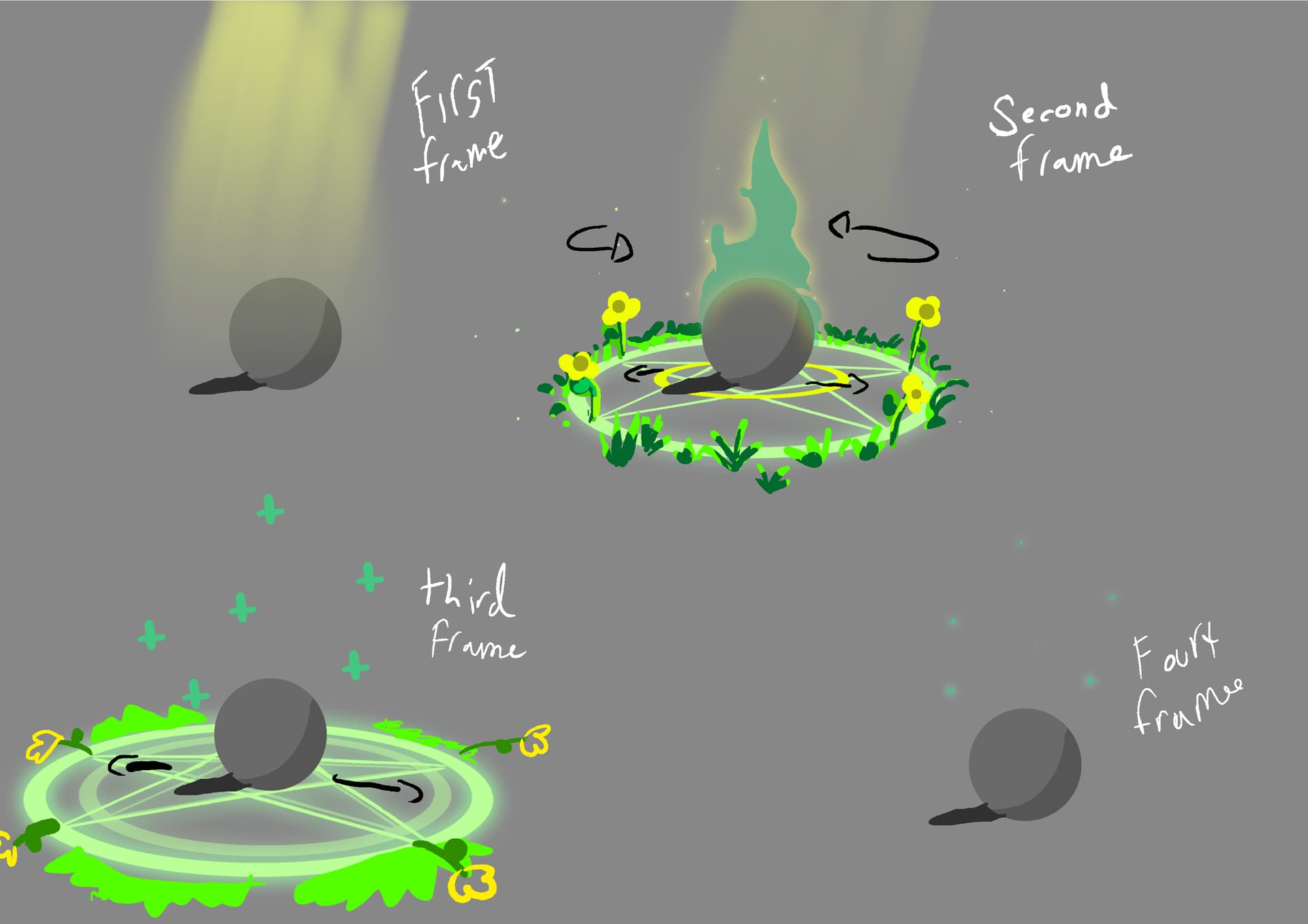
this is a healing spell i had in mind, i apologise if its hard to understand.
First frame:
God rays come down slightly above the player
Second frame:
Then a pentagram scales while spinning getting slower as it scales, from players position also the god ray fades at this point. grass and flowers slowly blooms out as the pentagram reach’s it scale point. also a green aura fades in and up from the player.
third frame:
this is where the aura jumps down back into the player and jumps back out as healing crossing and kind of just floats out a bit. and the pentagram also scales out again and then fading away, kind of goes for the flowers and grass they react to this like strong wind.
fourth frame:
I forgot to draw it but butterfly’s come out from the scaled pentagram and fly’s away, and the cross also fades.
Hello Ryukai!
welcome to the community
as you explicitly asked for feedback, here it comes.
First off:
The pentagram has very specific meaning in different cultures (mostly negative, which doesn’t fit to the positive healing effect). I suggest to refrain from using it, unless it is absolutely fitting the context. Just go with a ornamental summoning circle that fits better.
Second step:
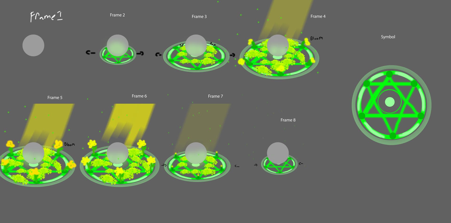
There is a lot going on here.
do flowers grow immediately?
do the flowers move with the edge of the summoning circle as it expands? (third step does imply so)
the flame, for me, is something that makes it look like a buff is being applied, not an heal. As a flame is something that is perceived as destructive in most context (of course not always).
I suggest, creating another step, to make the order of execution clearer.
Third step:
in the description, you state that the aura/flame goes down and up healing symbols. Besides that not being conveyed through the concept (which isn’t always necessary) It adds another motion to the whole effect. Things are moving outwards, up, down, rotate around… in my opinion a bit to much or this kind of effect. Especially with the “grass reacts to strong wind (out of nowhere?)” on top
My advice:
Of course, this is all subjective.
I think the effect is too loaded with different themes: holy/godly, nature/flowers, demon (pentagram), flame (aura), wind.
Mixing themes in itself isn’t bad, but I would say, pick two and have them established to work together.
It would also be great if you provide a rough timeframe in which this all should happen. (in about 2 seconds? ~10 seconds? ~30 seconds?) With that, it is easier to fathom the overall speed of each motion.
End note
Overall this already looks better than the first few concepts I have made. Putting your work out there and asking for feedback is a great way to get better, even if the things aren’t “good enough”. So keep at it and I am looking forward to see the next concepts
I hope my pointers help!
Thank you for the feedback! I realised soon after that I put a lot of different components to it, this really helps and I’ll be making another concept for it with less!
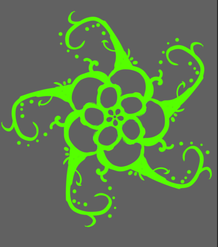
Here’s my second attempt! please tell me if this looks better or if I’m still using to many elements!
(Im not to sure if i wanna stick with the god rays)
I really like the change in shape, it feels much more organic and natural like vines. I personally think it could potentially benefit from having more vines coming out of the other sides of the main vines with a few less of the dots, unless you’re going for motion, it seems to me like it would spin with this shape. Overall I like the idea and can’t wait to see more!
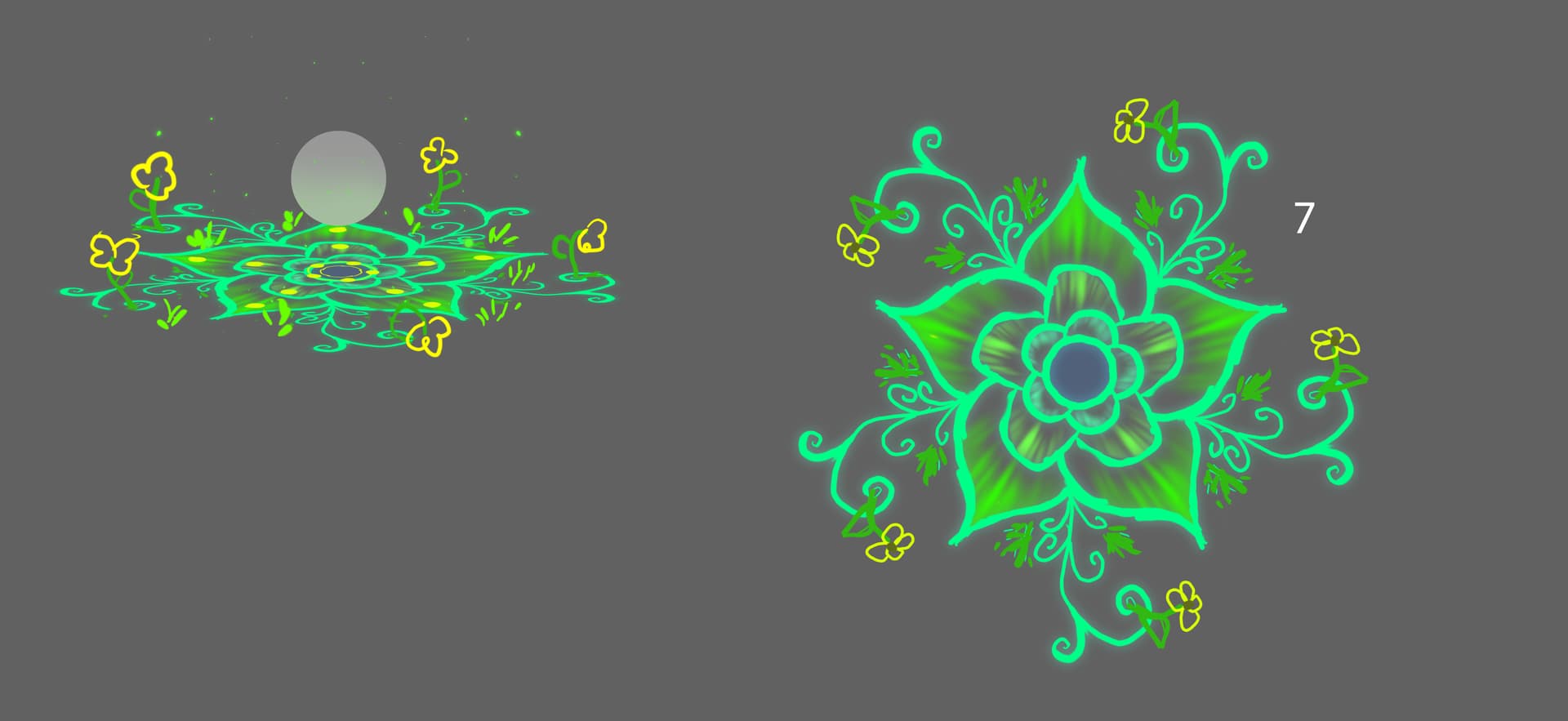
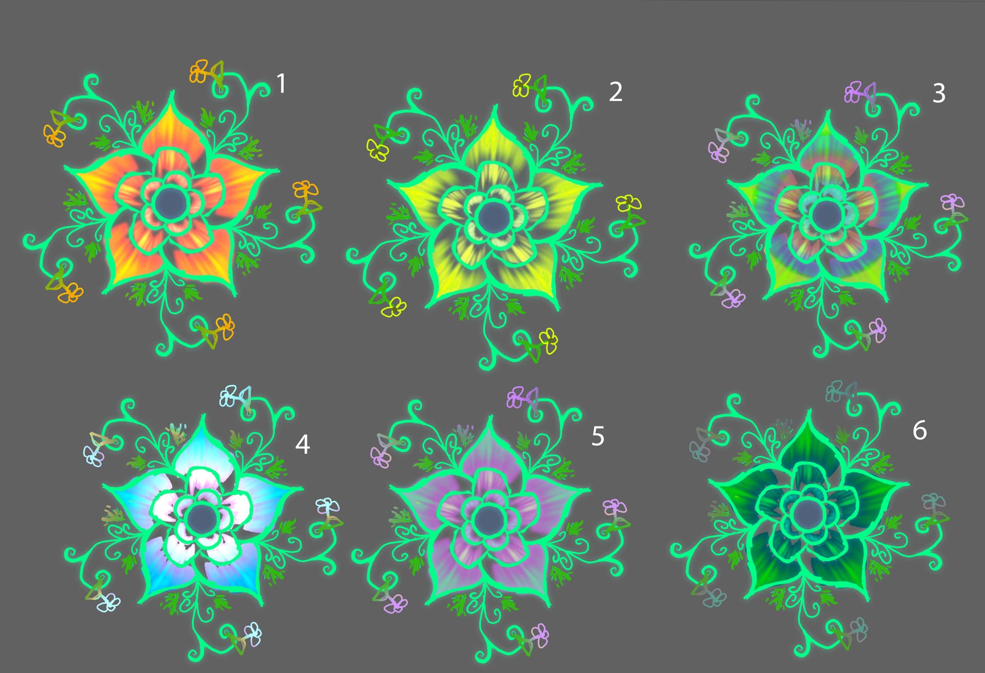
another note is I came up with some colour concepts for the design I’m no sure if I should just keep it green or if I should add other colours, I really only change the petals colours I was thinking of change the outlines as well. Let me know i any are good! feedback would be appreciated!